RSS

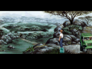
Day of the Tentacle

Although they didn’t know one another at the time, Dave Grossman and Tim Schafer both found themselves at a similar place in life in the summer of 1989: just out of university and uncertain what to do next. Both saw the same unusual advertisement in the newspaper: an advertisement for programmers who could also write. Both applied, both were shocked when they were called out to George Lucas’s beautiful Skywalker Ranch for an interview, and both were fortunate enough to be hired to work for a division of Lucas’s empire that was still known at the time as Lucasfilm Games rather than LucasArts. It was quite a stroke of luck for two innately funny and creative souls who had never before seriously considered applying their talents to game development. “If I hadn’t seen that job listing,” says Schafer, “I would have ended up a database engineer, I think.” Similar in age and background as they were, Grossman and Schafer would remain all but inseparable for the next four years.

They spent the first weeks of that time working intermittently as play testers while they also attended what their new colleagues had dubbed “SCUMM University,” a combination technical boot camp and creative proving ground for potential adventure-game designers. Schafer:

A group of us were thrown into SCUMM University, because all of the LucasArts games used SCUMM [Script Creation Utility for Maniac Mansion]. The four of us were messing around with it, writing our own dialogue. They gave us some old art to work with, so we were just writing goofy stuff and joking around, trying to make each other laugh. I think LucasArts was watching us the whole time, and they picked me and [Grossman] out and said that they liked the writing.

Grossman and Schafer were assigned to work as understudies to Ron Gilbert on the first two Monkey Island games. Here they got to hone their writing and puzzle-making chops, even as they absorbed the LucasArts philosophy of saner, fairer adventure-game design from the man most responsible for codifying and promoting it. In early 1992, shortly after the completion of Monkey Island 2, Gilbert announced that he was quitting LucasArts to start a company of his own specializing in children’s software. He left behind as a parting gift an outline of what would have been his next project had he stayed: the long-awaited, much-asked-for sequel to his very first adventure game, 1987’s Maniac Mansion. The understudies now got to step into the role of the stars; Maniac Mansion: Day of the Tentacle became Grossman and Schafer’s baby.

Times were changing quickly inside LucasArts, keeping pace with changes in the industry around them. After first conceiving of Day of the Tentacle as a floppy-disk-based game without voice acting, LucasArts’s management decided midway through its development that it should be a real technological showpiece in all respects — the first adventure game to be released simultaneously on floppy disk and CD-ROM. Along with X-Wing, the first actual Star Wars game LucasArts had ever been allowed to make, it would be one of their two really big, high-profile releases for 1993.

It was a lot of responsibility to heap on two young pairs of shoulders, but the end result demonstrates that Grossman and Schafer had learned their craft well as understudies. Day of the Tentacle is a spectacularly good adventure game; if not the undisputed cream of the LucasArts crop, it’s certainly in the conversation for the crown of their best single game ever. It achieves what it sets out to do so thoroughly that it can be very difficult for a diligent critic like yours truly to identify any weaknesses at all that don’t sound like the pettiest of nitpicking. The graphics are as good as any ever created under the limitations of VGA; the voice acting is simply superb; the puzzle design is airtight; the writing is sharp and genuinely, consistently laugh-out-loud funny; and the whole thing is polished to a meticulous sheen seldom seen in the games of today, much less those of 1993. It’s a piece of work which makes it hard for a critic to avoid gushing like a moon-eyed fanboy, as Evan Dickens of Adventure Gamers did when that site declared it to be the best game of its genre ever made:

The 1993 CD “talkie” version of Day of the Tentacle is a perfectly flawless adventure, the rarest of rare games, that which did nothing wrong. Nothing. There is no weakness in this game, no sieve. Stop waiting for the “but” because it won’t come. This is the perfect adventure game, the one adventure that brought every aspect of great adventures together and created such an enjoyable masterpiece, it almost seems to transcend the level of computer games.

Of course, there’s no accounting for taste. If you loathe cartoons, perhaps you might not like this game. If you prefer more serious plots or more rigorously cerebral puzzles, perhaps you won’t love it. Still, it’s hard for me to imagine very many people not being charmed by its gloriously cracked introductory movie and wanting to play further.

One of the few negative things I can say about Day of the Tentacle is that it’s more fun than it is truly innovative; it doesn’t break any new formal or thematic ground, being content to work entirely within a template which LucasArts and others had long since established by the point of its release. It remains at the end of the day a slapstick cartoon comedy, always the lowest-hanging fruit for an adventure-game design. Within that template, though, it executes everything so well that it’s almost annoying. This is the cartoon-comedy graphic adventure perfected, serving as the ultimate proof that much of what is sometimes forgiven or dismissed as “just the way adventure games are” is really the product of poor adventure-game design. Most of the problems that so many players consider to be intractable ones for the genre simply don’t exist here. The puzzles are goofy but always soluble, the dreaded sudden deaths and dead ends are nonexistent, and pixel hunts aren’t a problem amidst the game’s bright, clearly delineated scenes.


Day of the Tentacle‘s predecessor Maniac Mansion stood out from other adventure games in 1987, as it still does today, for allowing the player to select her own “party” of three characters, each with his or her own special skills, from a total of seven possibilities. The result was an unusual amount of replayability for the adventure-game genre; every possible combination of characters was capable of solving the game, but each would have to do so in a different way. Although this made Maniac Mansion a much more interesting game than it might otherwise have been, it was all nightmarishly complex for the game’s designer Ron Gilbert to map out. He would later state that only sheer naivete could ever have prompted him to expose himself to such pain — and, indeed, his first statement after finishing the game was, “I’m never doing anything like that again!” He held to that resolution throughout the rest of his time at LucasArts; his 1990 game The Secret of Monkey Island was at least as good as Maniac Mansion, but it owed its goodness to its writing, humor, art direction, and puzzle design, not to a similar formal ambition.

Against Gilbert’s advice, Grossman and Schafer first envisioned Day of the Tentacle operating along the same lines as Maniac Mansion, with another group of a half-dozen or so kids from which to choose a team. But the escalating cost of art and sound in the multimedia age played as big a role in nixing those plans as did the additional design complications; the two soon settled for giving the player control of a fixed group of three characters — which, they didn’t hesitate to point out, was still two more than most adventure games.

As this anecdote illustrates, Day of the Tentacle was never overly concerned with aping the details of its predecessor. Certainly if you play it without having played Maniac Mansion before, you’ll hardly be lost. Grossman:

We really couldn’t imitate the style of the original in the way you normally would with a sequel. Too much time had passed and the state of the art was radically different. We stopped thinking of it as a sequel almost immediately and just did our own thing, slathering our own personalities on top of that of Maniac Mansion.

Grossman and Schafer did reuse those elements of the earlier game that amused them most: the mad scientist Doctor Fred and his equally insane wife and son; the rambling old mansion where they all live; a memorable gag involving a hamster and a microwave; a pair of wise-cracking sentient tentacles, one of whom became the centerpiece of their plot and provided their sequel with its name. But of the kids the player got to control in Maniac Mansion, only Bernard, the über-nerd of the bunch, shows up again here. (Not coincidentally, Bernard had always been the favorite of the original game’s players, perhaps because of his range of unusual technical skills, perhaps because — if we’re being totally honest here — he was the teenage archetype who most resembled the typical young player.) Notably, Dave, the oddly bland default protagonist of the earlier game — he’s the only one you have to take with you, even though he’s the dullest of the lot — doesn’t show up at all here. In the place of Dave and the other kids, Grossman and Schafer augmented Bernard with two new creations of their own: a bro-dude “MegaBreth” roadie named Hoagie and a terminally nervous medical student named Laverne.

The story here does follow up on that of Maniac Mansion, but, once again, it doesn’t really matter whether you realize it or not. Five years after his previous adventure, Bernard receives a plea for help from Green Tentacle, informing him that Purple Tentacle has drunk some toxic sludge, which has instilled in him superhuman (supertentacle?) intelligence and a burning desire to enslave the world. Now, Doctor Fred has decided to deal with the problem by killing both tentacles; this is an obviously problematic plan from Green Tentacle’s perspective. Bernard convinces his two reluctant pals Hoagie and Laverne to head out to Doctor Fred’s mansion and stage an intervention. In attempting to do so, they unwittingly help Purple Tentacle to escape, and he sets out to take over the world. And so, just like that, we’re off to save the world.

It doesn’t take Day of the Tentacle long to introduce its secret puzzling weapon: time travel. Doctor Fred, you see, just happens to have some time machines handy; known as “Chron-O-Johns,” they’re made from outdoor port-a-potties. With his plan for summary tentacle execution having failed, he hatches an alternative plan: to send the kids one day back in time, where they’ll prevent Purple Tentacle from ever drinking the toxic waste in the first place. But the time machines turn out to work about as well as most of Doctor Fred’s inventions. One sends Hoagie back 200 years instead of one day into the past, where he finds Ben Franklin and other Founding Fathers in the midst of writing the American Constitution in what will someday become Doctor Fred’s mansion; another sends Laverne 200 years into the future, when Purple Tentacle has in fact taken over the world and the mansion is serving as the dictatorial palace for him, his tentacle minions, and their human slaves; and the last time machine leaves Bernard right where (when?) he started.

You can switch between the kids at any time, and many of the more elaborate puzzles require you to make changes in one time to pave the way for solving them in another. In some instances, the kids can “flush” objects through time to one another using the Chron-O-John. On other occasions, a kid must find a way to hide objects inside the mansion, to be collected by another kid two or four centuries further down the time stream. “It was really fun to think about the effects of large amounts of time on things like wine bottles and sweaters in dryers,” remembers Grossman, “and to imagine how altering fundamentals of history like the Constitution and the flag could be used to accomplish petty, selfish goals like the acquisition of a vacuum and a tentacle costume.” Of course, just like in Maniac Mansion, it doesn’t pay to question how the kids are communicating their intentions to one another over such gulfs. Just go with it! This is, after all, a cartoon adventure.

Hoagie’s part of the plot coincidentally shares a setting and to some extent a tone with another clever and funny time-traveling adventure game that was released in 1993: Sierra’s Pepper’s Adventures in Time. Both games even feature a cartoon Ben Franklin in important roles. Yet it must be said that LucasArts’s effort is even sharper and funnier, its wit and gameplay polished to a fine sheen, with none of the wooliness that tends to cling even to Sierra’s best games. The inability to die or get yourself irrevocably stuck means that you’re free to just enjoy the ride — free, for instance, to choose the funniest line of dialog in any conversation without hesitation, safe in the knowledge that you’ll be able to do it over again if it all goes horribly wrong. “The player is never, ever punished for doing something funny,” wrote Charles Ardai, the best writer ever to work for Computer Gaming World magazine, in his typically perceptive review of the game. “Doing funny things is the whole point of Day of the Tentacle.”

Although Grossman and Schafer were and are bright, funny guys, their game’s sparkle didn’t come from its designers’ innate brilliance alone. By 1993, LucasArts had claimed Infocom’s old place as makers of the most consistently excellent adventure games you could buy. And as with the Infocom of old, their games’ quality was largely down to a commitment to process, including a willingness to work through the hard, unfun aspects of game development which so many of their peers tended to neglect. Throughout the development of Day of the Tentacle, Grossman and Schafer hosted periodic “pizza orgies,” first for LucasArts’s in-house employees, later for people they quite literally nabbed off the street. They watched these people play their game — always a humbling and useful experience for any designer — and solicited as much feedback thereafter as their guinea pigs could be convinced to give. Which parts of the game were most fun? Which parts were less fun? Which puzzles felt too trivial? Which puzzles felt too hard? They asked their focus groups what they had tried to do that hadn’t worked, and made sure to code in responses to these actions. As Bob Bates, another superb adventure-game designer, put it to me recently, most of what the player tries to do in an adventure game is wrong in terms of advancing her toward victory. A game’s handling of these situations — the elses in the “if, then, else” model of game logic — can make or break it. It can spell the difference between a lively, “juicy” game that feels engaging and interesting and a stubbornly inscrutable blank wall — the sort of game that tells you things don’t work but never tells you why. And of course these else scenarios are a great place to embed subtle hints as to the correct course of action.

Indeed, Grossman and Schafer continually asked themselves the same question in the context of every single puzzle in the game: “How is the player supposed to figure this out?” Grossman:

That [question] has stuck with me as a hallmark of good versus bad adventure-game design. Lots of people design games that make the designer seem clever — or they’re doing it to make themselves feel clever. They’ve forgotten that they’re in the entertainment business. The player should be involved in this thing too. We always went to great lengths to make sure all the information was in there. At these “pizza orgies,” one of the things we were always looking for was, are people getting stuck? And why?

The use of three different characters in three completely different environments also helps the game to avoid that sensation every adventurer dreads: that of being absolutely stuck, unable to jog anything loose because of one stubborn roadblock of a puzzle. If a puzzle stumps you in Day of the Tentacle, there’s almost always another one to go work on instead while the old one is relegated to the brain’s background processing, as it were.

And yet, as in everything, there is a balance to strike here as well: gating in adventure design is an art in itself. Grossman:

We were very focused on making things non-linear, but what we weren’t thinking about was that it’s possible to take that too far. Then you get a paralysis of choice. There’s kind of a sweet spot in the middle between the player being lost because they have too much to do and the player feeling railroaded because you’re telling them what to do. People don’t like either of those extremes very much, but somewhere in the middle, it’s like, “I’ve got enough stuff to think about, and I’m accomplishing some things, and I’ve got some new challenges.” That’s the right spot.

Day of the Tentacle nails this particular sweet spot, as it does so many others. It could never have done so absent extensive testing and — just as importantly — an open-mindedness on the part of its designers about what the testers were saying. It’s due to a lack of these two things that the adventure games of LucasArts’s rivals tended to go off the rails more often than not.

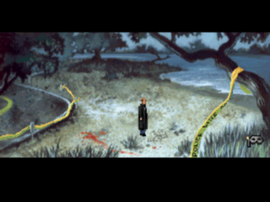
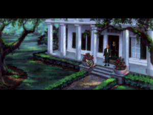
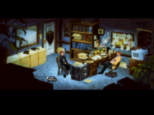
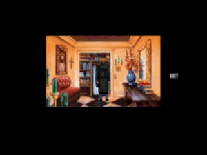
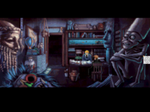
In addition to the superb puzzle design, Day of the Tentacle looks and sounds great — even today, even in its non-remastered version. The graphics are not only technically excellent but also evince an aesthetic sophistication rare in games of this era. The art department was greatly inspired by the classic Warner Bros. cartoons of Chuck Jones — Bugs Bunny, Daffy Duck, Wile. E. Coyote and the Road Runner, etc. One day near the beginning of the project, the entire team made a field trip to sit at the feet of the 80-year-old Jones for a day and absorb some of his wisdom. Warner Bros. cartoons were always more visually skewed, more manic, and more deviously subversive than the straighter, more wholesome reels of Disney, and both the visuals and writing in Day of the Tentacle consciously mimic their style. Just as in the cartoons, there isn’t a straight line or right angle to be seen anywhere in the game. Everything, right down to the font in which text is printed, is bent, leaning, crooked, a fun-house world viewed through a fish-eye lens.

The art team, the unsung heroes of Day of the Tentacle. Standing from left to right are Lela Dowling, Sean Turner, Larry Ahern, and Peter Chan. Kneeling in front are Jesse Clark and Purple Tentacle. One additional artist, Kyle Balda, wasn’t present for this photograph.

Peter Chan, one of the artists on the team, notes that Grossman and Schafer “really trusted us and just let us go to town with what we believed would look best. If anybody on the art team had a good idea or suggestion, it was considered.” Here’s Schafer, speaking in an interview at the time of the game’s release, and obviously somewhat in awe himself at what LucasArts’s animators have come up with:

The kids have all kinds of grimaces and gestures and facial twists and contortions while they’re talking. They smile and their mouths open bigger than their heads and their tongues can hang out. They don’t just stand there. They blink, tap their feet, sigh, and even scratch their butts.

As soon as a character appears, you laugh, and that’s really important. You stare at the main characters for about thirty hours when you play the game, so they’d better be entertaining. With Bernard, as soon as you see him walking around for the first time, before he even says or does anything, you laugh. He walks goofy, he talks goofy, he’s even entertaining when he stands still. Walking Hoagie around is like piloting a blimp through a china shop, and Laverne is fun just to walk around because she seems to have a mind of her own — like she might do something dangerous at any moment.

The sound effects are drawn from the same well of classic animation. LucasArts actually bought many of them from a “major cartoon house,” resulting in all of the good old “boings” and “ka-pows” you might expect.

Tamlynn Barra in the production booth at Studio 222.

And the voice acting too is strikingly good. LucasArts was better equipped than almost any of the other game studios to adapt to the brave new world of CD-ROM audio, thanks to the connections which went along with being a subsidiary of a major film-production company. The actors’ dialog, totaling more than 4500 lines in all, was recorded at Hollywood’s Studio 222 under the supervision of a LucasArts associate producer named Tamlynn Barra. Although still in her twenties at the time, she had previously worked with many stage and video productions. She was thus experienced enough to recognize and find ways to counteract the most fundamental challenge of recording voice work for a computer game: the fact that the actors are expected to voice their lines alone in a production box, with no other actors to play off of and, too often, little notion of the real nature of the scene being voiced. “Getting the actors into character is very difficult,” she acknowledged. “Half the studio [time] is spent cueing up the actor for the scene.” And yet the fact that she knew she had to do this cueing was in a way half the battle. In contrast to many other computer-game productions — even those featuring a stellar cast of experienced actors, such as Interplay’s two contemporaneous Star Trek adventuresDay of the Tentacle has an auditory liveliness to it. It rarely feels as if the actor is merely reading lines off a page in a sound-proof booth, even if that’s exactly what she’s doing in reality.

Jane Jacobs, who voiced the Irish maid found inside the past-tense version of the mansion, performs before the microphone.

Unsurprisingly given LucasArts’s connections, the voice actors, while not household names, were seasoned professionals who arrived with their union cards in hand. The most recognizable among them was Richard Sanders, best known for playing the lovable but inept newscaster Les Nessman on the classic television sitcom WKRP in Cincinnati. During their initial discussions with Barra, Grossman and Schafer had actually suggested Les as the specific role model for Bernard, whereupon Barra made inquiries and found that Sanders was in fact available. He really was a perfect fit for Bernard; the character was “a bit of a stretch” for him, he said with a wink, because he was used to playing “more manly sorts of roles.”

Barra found the other voice talent using a process typical of television and radio productions but not so much of computer games: she sent sketches and descriptions of the characters out to Hollywood agents, who called their clients in to record audition tapes of their impressions. Then she and the rest of the development team chose their favorites. Many another game studio, by contrast, was recruiting its voice talent from its secretarial pool.

All of it led to an end result that feels today like it’s come unstuck from the time which spawned it. Certainly my own feeling upon firing up Day of the Tentacle for the first time in preparation for this article was that I had crossed some threshold into modernity after living in the ancient past for all of the years I’d previously been writing this blog. This impression is undoubtedly aided by the way that LucasArts steered clear of the approaches that generally date a game indelibly to the mid-1990s. Just to name the most obvious dubious trend they managed to resist: there are no digitized images of real actors shoehorned into this game via once cutting-edge, now aesthetically disastrous full-motion-video sequences.

Yet the impression of modernity encompasses more than the game’s audiovisual qualities; it really does encompass the sum total of the experience of playing it. The interface too just works the way a modern player would expect it to; no need to pick up a manual here to figure out how to play, even if you’ve never played an adventure game before. (The sole exception to this rule is the save system, which still requires you to know to press the F5 key in order to access it. On the other hand, keeping it hidden away does allow the game to avoid cluttering up its carefully honed aesthetic impression with a big old disk icon or the like.) Polish is a difficult quality to quantify, but I nevertheless feel fairly confident in calling Day of the Tentacle the most polished computer game made up to its release date of mid-1993. It looks and feels like a professional media production in every way.

The most telling sign in Day of the Tentacle of how far computer gaming had come in a very short time is found on an in-game computer in the present-day mansion. There you’ll find a complete and fully functional version of the original Maniac Mansion in all its blocky, pixelated, bobble-headed glory. This game within a game was inspired by an off-hand comment which Grossman and Schafer had heard Ron Gilbert make during the Monkey Island 2 project: that the entirety of Maniac Mansion had been smaller than some of the individual animation sequences in this, LucasArts’s latest game. Placed in such direct proximity to its progeny, Maniac Mansion did indeed look “downright primitive,” wrote Charles Ardai in his review of Day of the Tentacle. “Only nostalgia or curiosity will permit today’s gamers to suffer through what was once state-of-the-art but is by today’s standards crude.” And yet it had only been six years…

Ardai concluded his review by writing that “it may not hold up for fifty years, like the cartoons that inspired it, but I expect that this game will keep entertaining people for quite some time to come.” And it’s here that I must beg to differ with his otherwise perceptive review. From the perspective of today, halfway already to the game’s 50th anniversary, Day of the Tentacle still holds up perfectly well as one of the finest examples ever of the subtle art of the adventure game. I see no reason why that should change in the next quarter-century and beyond.

(Sources: Computer Gaming World of July 1993 and September 1993; LucasArts’s newsletter The Adventurer of Fall 1992 and Spring 1993; Play of April 2005; Retro Gamer 22 and 81; Video Games and Computer Entertainment of July 1993. Online sources include Dev Game Club podcast 19; Celia Pearce’s conversation with Tim Schafer for Game Studies; 1Up‘s interview with Tim Schafer; The Dig Museum‘s interview with Dave Grossman; Adventure Gamers‘s interview with Dave Grossman.

A remastered version of Day of the Tentacle is available for purchase on GOG.com.)
 

Tags: , , , ,

The Last Works Before the Renaissance

By 1993, textual interactive fiction was reaching the end of the unsettled, uncertain half-decade-and-change between the shuttering of Infocom and the rise of a new Internet-centered community of amateur enthusiasts. Efforts by such collectives as Adventions and High Energy Software to sell text adventures via the shareware model had largely proved unfruitful, while, with the World Wide Web still in its infancy, advertisement and distribution were major problems even for someone willing to release her games for free. The ethos of text and parsers seemed about as divorced as anything could possibly be from the predominant ethos in game development more generally, with its focus on multimedia, full-motion video, and ultra-accessible mouse-driven interfaces. Would text adventures soon be no more than obscure relics of a more primitive past? To an increasing number even of the form’s most stalwart fans, an answer in the affirmative was starting to feel like a foregone conclusion. Few text-adventure authors had serious ambitions of matching the technical or literary quality of Infocom during this period, much less of exceeding it; the issue for the medium right now was one of simple survival. In this atmosphere, the arrival of any new text adventure felt like a victory against the implacable forces of technological change, which had conspired to all but strangle this new literary form before it had even had time to get going properly.

Thankfully, history would later mark 1993 as the year when the seeds of an interactive-fiction rebirth were planted, thanks to an Englishman who repurposed not only the Infocom aesthetic but also Infocom’s own technology in unexpected ways. Those seeds would flower richly in 1995, Year Zero of the Interactive Fiction Renaissance. I’ll begin that story soon.

Today, though, I’d like to tell you about some of the more interesting games to emerge from the final days of the interstitial period — games which actually overlap, although no one could realize it at the time, with the dawning of the modern interactive-fiction community. Indeed, the games I describe below manage to presage some of the themes of that community despite being the products of a text-adventuring culture that still spent more time looking backward than looking forward. I’m fond of all of them in one way or another, and I’m willing to describe at least one of them as a sadly overlooked classic.


The Horror of Rylvania

The hiking trip across Europe has been a wonderful experience for two recent college graduates like yourself and your friend Carolyn. From the mansions of England to the beaches of Greece, you’ve walked in the footsteps of the Crusaders and seen sights that few Americans have ever seen.

Carolyn had wanted to skip the Central European nation of Rylvania. “Why bother?” she’d said. “There’s nothing but farmers there, and creepy old castles - nothing we haven’t seen already. The Rylvanians are still living in the last century.”

That, you’d insisted, was exactly why Rylvania was a must-see. The country was an intact piece of living history, a real treasure in this modern age.

If only you hadn’t insisted! As night fell, as you approached a small farming village in search of a quaint inn to spend the night, the howling began. A scant hundred yards from the village, and it happened...the wolves appeared from the black forest around you and attacked. Big, black wolves that leaped for Carolyn’s throat before you could shout a warning, led by a great gray-black animal that easily stood four feet at the shoulder. Carolyn fell to the rocky path, blood gushing from her neck as the wolves faded back into the trees, unwilling, for some unknown reason, to press their attack.

If she dies, it will be your fault. You curse the darkening sky as you cradle Carolyn’s head, knowing that you have little time to find help. Perhaps in the village up the road to the north.

The Horror of Rylvania marks the last shareware release from Adventions, a partnership between the MIT graduate students Dave Baggett and D.A. Leary which was the most sustained of all efforts to make a real business out of selling interactive fiction during the interstitial period. Doubtless for this reason, the Adventions games are among the most polished of all the text adventures made during this time. They were programmed using the sophisticated TADS development system rather than the more ramshackle AGT, with all the benefits that accrued to such a choice. And, just as importantly, they were thoroughly gone over for bugs as well as spelling and grammar problems, and are free of the gawky authorial asides and fourth-wall-breakings that were once par for the course in amateur interactive fiction.

For all that, though, the Adventions games haven’t aged all that well in my eyes. The bulk of them take place in a fantasy land known as Unnkulia, which is trying so hard to ape Zork‘s Great Underground Empire that it’s almost painful to watch. In addition to being derivative, the Unnkulia games think they’re far more clever and hilarious than they actually are — the very name of the series/world is a fine case in point — while the overly fiddly gameplay can sometimes grate almost as much as the writing.

It thus made for a welcome change when Adventions, after making three and a half Unnkulia games, finally decided to try something else. Written by D.A. Leary, The Horror of Rylvania is more plot-driven than Adventions’s earlier games, a Gothic vampire tale in which you actually become a vampire not many turns in. It’s gone down in certain circles as a minor classic, for reasons that aren’t totally unfounded. Although the game has a few more potential walking-dead scenarios than is perhaps ideal, the puzzles are otherwise well-constructed, the implementation is fairly robust, and, best of all, most of the sophomoric attempts at humor that so marked Adventions’s previous games are blessedly absent.

That said, the end result still strikes me more as a work of craftsmanship than genius. The writing has been gone over for spelling and grammar without addressing some of its more deep-rooted problems, as shown even by the brief introduction above; really, now, have “few Americans ever seen” sights advertised in every bog-standard package tour of Europe? (Something tells me Leary hadn’t traveled much at the time he wrote this game.) The writing here has some of the same problems with tone as another Gothic horror game from 1993 set in an ersatz Romania: Quest for Glory IV. It wants to play the horror straight most of the time, and is sometimes quite effective at it — the scene of your transformation from man to vampire is particularly well-done — but just as often fails to resist the centrifugal pull which comedy has on the adventure-game genre.

Still, Horror of Rylvania is the Adventions game which plays best today, and it isn’t a bad choice for anyone looking for a medium-sized old-school romp with reasonably fair puzzles. Its theme adds to its interest; horror in interactive fiction tends to hew more to either H.P. Lovecraft or zombie movies than the Gothic archetypes which Horror of Rylvania intermittently manages to nail. Another extra dimension of interest is added by the ending, which comes down to a binary choice between curing your friend Carolyn from the curse of vampirism, which entails sacrificing yourself in the process, or curing yourself and letting Carolyn sod off. As we’ll shortly see, the next and last Adventions game perhaps clarifies some of the reasons for such a moral choice’s inclusion at the end of a game whose literary ambitions otherwise don’t seem to extend much beyond being a bit of creepy fun.


The Jeweled Arena

You let out a sigh of relief as you finish the last paper. “That’s the lot.”

“Good work, ma’am,” says Regalo, your squire. “I was almost afraid we’d be here until midnight.”

“Don’t worry, Regalo, I wouldn’t do a thing like that, especially on my first healthy day after the flu. In any case, Dora wants me home by eight. The papers look dry, so you can take them to Clara’s office.”

As Regalo carries the papers to the adjoining office, you stand up and stretch your aching muscles. You then look through the window and see a flash of lightning outside. It looks like quite a storm is brewing.

“I’m beginning to think my calendar is set wrong,” you say as Regalo returns. “Dibre’s supposed to be cool, dry, and full of good cheer; so far, we’ve had summer heat, constant rain, and far too many death certificates. Perhaps this storm will blow out the heat.”


“I hope it blows out the plague with it, ma’am. I’ve lost three friends already, and my wife just picked it up yesterday. No one likes it when the coroner’s staff is overworked.”

“It doesn’t help that Clara and Resa are both still sick. If we’re lucky, we’ll have Resa back tomorrow, which I’m sure your feet would appreciate. I presume Ernando and Miranda have already left for the day?”

“Yes ma’am.”

“Now I’m really worried. The only thing worse than being the victim of one of Miranda’s pranks is going a day without one of her pranks -– it usually means you missed something. Perhaps she decided to be discrete [sic] for a change.”

“I didn’t get the impression her sense of humor was taking the day off, but I don’t know what she did. It can wait until tomorrow. Is there anything else you need me to do before I leave?”

Written by David S. Raley, The Jeweled Arena was the co-winner of what would turn out to be the last of the annual competitions organized by AGT’s steward, David M. Malmberg, before he released the programming language as freeware and stepped away from further involvement with the interactive-fiction community. Set in a fantasy world, but a thankfully non-Zorkian and non-Tolkienesque one, it’s both an impressive piece of world-building and a game of unusual narrative ambition for its time.

In fact, the world of Valdalan seems like it must have existed in the author’s head for a long time before this game was written. The environment around you has the feeling of being rooted in far more lore and history than is explicitly foregrounded in the text, always the mark of first-class world-building. As far as I can tell from the text, Valdalan is roughly 17th-century in terms of its science and technology, but is considerably more enlightened philosophically. Interestingly, magic seems to have no place here, making it almost more of an alternative reality than a conventional fantasy milieu.

The story takes place in the city of Kumeran as it’s in the throes of a plague — a threat which is, like so much else in this game, handled with more subtlety than you might expect. The plot plays out in four chapters, during each of which you play the role of a different character. The first chapter is worthy of becoming a footnote in interactive-fiction history at the very least, in that it casts you as one half of a lesbian couple. In later years, certain strands of interactive fiction — albeit more of the hypertext than the parser-driven type — would become a hotbed of advocacy for non- hetero-normative lifestyles. The Jeweled Arena has perhaps aged better in this respect than many of those works have (or will); it presents its lesbian protagonist in a refreshingly matter-of-fact way, neither turning her into an easy villain or victim, as an earlier game might have done, nor celebrating her as a rainbow-flag-waving heroine, as a later game might have done. She’s just a person; the game takes it as a given that she’s worthy of exactly the same level of respect as any of the rest of us. In 1993, this matter-of-fact attitude toward homosexuality was still fairly unusual. Raley deserves praise for it.

Unfortunately, The Jeweled Arena succeeds better as a place and a story than it does as a game, enough so that one is tempted to ask why Raley elected to present it in the form of a text adventure at all. He struggles to come up with things for you to really do as you wander the city. This tends to be a problem with a lot of interactive fiction where the puzzles aren’t the author’s primary focus; A Mind Forever Voyaging struggles to some extent with the same issue when it sends you wandering through its own virtual city. But The Jeweled Arena, which doesn’t have a mechanic like A Mind Forever Voyaging‘s commandment to observe and record to ease its way, comes off by far the worse of the two. Most of the tasks it sets before you are made difficult not out of  authorial intention but due to poor authorial prompting and the inherent limitations of AGT. In other words, first you have to figure out what non-obvious trigger the game is looking for to advance the plot a beat, and then you have to figure out the exact way the parser wants you to say it. This constant necessity to read the author’s mind winds up spoiling what could have been an enjoyable experience, and makes The Jeweled Arena a game that can truly be recommended only to those with an abiding interest in text-adventure history or the portrayal of homosexuality in interactive media. A pity — with more testing and better technology, it could have been a remarkable achievement.


Klaustrophobia

You are standing at the top of an ocean bluff. Wind is whipping through your hair and blowing your voluminous black cape out behind you. You can hear the hiss of the surf crashing far below you. Out towards the horizon, a distant storm sends flickers of lightning across the darkening sky. The last rays of the setting sun reflect red off the windows of the grey stone mansion to the East. As you turn towards the house, you catch a glimpse of a haunting face in one of the windows. That face, you will never forget that face......

> wait
The surf and cliffs fade from sight............


You awake to find yourself in your living room,lying on the couch. Your cat, Klaus, is chewing and pulling on your hair. Static is hissing from the TV, as the screen flickers on a station long off the air. You look at your watch and realize that it is 3 AM.


You must have fallen asleep on the couch right after you got home from work, and settled down to read the newspaper.

I noted earlier that the Adventions games are “free of the gawky authorial asides and fourth-wall-breakings” that mark most early amateur interactive fiction. That statement applies equally to The Jeweled Arena, but not at all to Carol Hovick’s Klaustrophobia. The other winner of the final AGT competition, its personality could hardly be more different from its partner on the podium. This is a big, rambling, jokey game that’s anything but polished. And yet it’s got an unpretentious charm about it, along with puzzles that turn out to be better than they first seem like they’re going to be.

What Klaustrophobia lacks in polish or literary sophistication, it attempts to make up for in sheer sprawl. It’s actually three games in one — so big that, even using the most advanced and least size-constrained version of AGT, Hovick was forced to split it into three parts, gluing them together with some ingenious hacks that are doubtless horrifying in that indelible AGT way to any experienced programmer. The three parts together boast a staggering 560 rooms and 571 objects, making Klaustrophobia easily one of the largest text adventures ever created.

Like the Unnkulia series and so much else from the interstitial period, Klaustrophobia is hugely derivative of the games of the 1980s. The story and puzzles here draw heavily from Infocom’s Bureaucracy, which is at least a more interesting choice than yet another Zork homage. You’ve just won an all-expenses-paid trip to appear on a quiz show, but first you have to get there; this exercise comes to absorb the first third of the game. Then, after you’ve made the rounds of not one but several quiz shows in the second part, part three sends you off to “enjoy” the Mexican vacation you’ve won. As a member of that category of text adventure which the Interactive Fiction Database dubs the “slice of life,” the game has that time-capsule quality I’ve mentioned before as being such a fascinating aspect of amateur interactive fiction. Klaustrophobia is a grab bag of pop-culture ephemera from the United States of 1993: Willard Scott, Dolly Parton, The Price is Right. If you lived through this time and place, you might just find it all unbearably nostalgic. (Why do earlier eras of history almost invariably seem so much happier and simpler?) And if you didn’t… well, there are worse ways to learn about everyday American life in 1993, should you have the desire to do so, than playing through this unforced, agenda-less primary source.

The puzzles are difficult in all the typical old-school ways: full of time limits, requiring ample learning by death. Almost inevitably given the game’s premise, they sometimes fail to fall on the right side of the line between being comically aggravating and just being aggravating. And the game is rough around the edges in all the typical AGT ways: under-tested (a game this large almost has to be) and haphazardly written, and subject to all the usual frustrations of the AGT parser and world model. Yet, despite it all, the author’s design instincts are pretty good; most of the puzzles are clued if you’re paying attention. Many of them involve coming to understand and manipulate some surprisingly complex dynamic sequences taking place around you. The whole experience is helped immensely by the episodic structure which exists even within each of the three parts: you go from your home to the bank to the airport, etc., with each vignette effectively serving as its own little self-contained adventure game. This structure lets Klaustrophobia avoid the combinatorial explosion that can make such earlier text-adventure epics as Acheton and Zork Zero all but insoluble. Here, you can work out a single episode, then move on to the next at your leisure with a nice sense of achievement in your back pocket — as long, of course, as you haven’t left anything vital behind.

Klaustrophobia is a game that I regard with perhaps more affection than I ought to, given its many and manifest flaws. While much of my affection may be down to the fact that it was one of the first games I played when I rediscovered interactive fiction around the turn of the millennium, I like to believe this game has more going for it than nostalgia. It undoubtedly requires a certain kind of player, but, whether taken simply as a text adventure or as an odd sort of sociological study — a frozen-in-amber relic of its time and place — it’s not without its intrinsic appeal. Further, it strikes me as perfect for its historical role as the final major statement made with AGT; something more atypically polished and literary, such as Shades of Gray or even Cosmoserve, just wouldn’t work as well in that context. Klaustrophobia‘s more messy sort of charm, on the other hand, feels like the perfect capstone to this forgotten culture of text adventuring, whose games were more casual but perhaps in some ways more honest because of it.


The Legend Lives!

A pattern of bits shifts inside your computer. New information scrolls up the screen.


It is not good.

As the impact of the discovery settles on your psyche, you recall the preceding events: your recent enrollment at Akmi Yooniversity; your serendipitous discovery of the joys of Classical Literature – a nice change of pace from computer hacking; your compuarchaeological discovery of the long-forgotten treasures that will make your thesis one of the most important this decade. But now that’s all a bit moot, isn’t it?

How ironic: You were stunned at how *real* the primitive Unnkulian stories seemed. Now you know why.

David Baggett’s The Legend Lives! is the only game on this curated list that dates from 1994, the particularly fallow year just before the great flowering of 1995. The very last production of the Adventions partnership, it was originally planned as another shareware title, but was ultimately released for free, a response to the relatively tepid registration rate of Advention’s previous games. Having conceived it as nothing less than a Major Statement meant to prod the artistic growth of a nascent literary medium, Baggett stated that he wished absolutely everyone to have a chance to play his latest game.

Ironically, the slightly uncomfortable amalgamation that is The Legend Lives! feels every bit as of-its-time today as any of the less artistically ambitious text adventures I’ve already discussed in this article. Set in the far future of Adventions’s Unnkulia universe, it reads like a checklist of what “literary” interactive fiction circa 1994 might be imagined to require.

There must, first and foremost, be lots and lots of words for something to be literary, right? Baggett has this covered… oh, boy, does he ever. The first room description, for the humble dorm room of the university student you play, consists of six substantial paragraphs — two or three screenfuls of text on the typical 80-column monitor displays of the day. As you continue to play, every object mentioned anywhere, no matter how trivial, continues to be described to within an inch of its life. While Baggett’s dedication is admirable, these endless heaps of verbiage do more to confuse than edify, especially in light of the fact that this game is, despite its literary aspirations, far from puzzleless. There’s a deft art to directing the player’s attention to the things that really matter in a text adventure — an art which this game comprehensively fails to exhibit. And then there are the massive non-interactive text dumps, sometimes numbering in the thousands of words, which are constantly interrupting proceedings. Sean Molley, reviewing the game in the first gush of enthusiasm which accompanied its release, wrote that “I certainly don’t mind reading 10 screens of text if it helps to advance the story and give me something to think about.” I suspect that most modern players wouldn’t entirely agree. The Legend Lives! is exhausting enough in its sheer verbosity to make you long for the odd minimalist poetry of Scott Adams. “Ok, too dry. Fish die” starts looking pretty good after spending some time with this game.

And yet, clumsy and overwrought though the execution often is, there is a real message here — one I would even go so far as to describe as thought-provoking. The Legend Lives! proves to be an old-school cyberpunk tale — another thing dating it indelibly to 1994 — about a computer virus that has infected Unnkulia’s version of the Internet and threatens to take over the entirety of civilization. The hero that emerges and finally sacrifices himself to eliminate the scourge is known mostly by his initials: “JC.” He’s allegedly an artificial intelligence, but he’s really, it would seem, an immaculate creation, a divinity living in the net. An ordinary artificial intelligence, says one character, “is smart with no motivation, no goals; no creativity, ya see. JC, he’s like us.” What we have here, folks, is an allegory. I trust that I need not belabor the specific parallels with another famous figure who shares the same initials.

But I don’t wish to trivialize the message here too much. It’s notable that this argument for a non-reductionist view of human intelligence — for a divine spark to the human mind that can’t be simulated in silicon — was made by a graduate student in MIT’s artificial-intelligence lab, working in the very house built by Marvin Minsky and his society of mind. Whatever one’s feelings about the Christian overtones to Baggett’s message, his impassioned plea that we continue to allow a place for the ineffable has only become more relevant in our current age of algorithmization and quantization.

Like all of the Adventions games, this one has been virtually forgotten today, despite being widely heralded upon its release as the most significant work of literary interactive fiction to come along since A Mind Forever Voyaging and Trinity. That’s a shame. Yes, writers of later text adventures would learn to combine interactivity with literary texture in more subtle and effective ways, but The Legend Lives! is nevertheless a significant way station in the slow evolution of post-Infocom interactive fiction, away from merely reflecting the glory of a storied commercial past and toward becoming a living, evolving artistic movement in its own right.


Perdition’s Flames

*** You have died. ***

All is dark and quiet. There is no sensation, no time. Your mind floats peacefully in a void. You perceive nothing, you feel nothing, you think nothing. Sleep without dreams.

All is hazy and gray. Sensation is vague and indistinct. Your mind is sluggish, sleepy. You see gray shapes in a gray fog; you hear distant, muffled sounds. You think, but your thoughts are fleeting, disconnected, momentary flashes of light in a dark night. Time is still frames separated by eons of nothing, brief awakenings in a long sleep.

All is clear and sharp. Sensation crystalizes from a fog. You see, you hear, you feel. Your mind awakens; you become aware of a place, and a time.

You are on a boat.

Last but far from least, we come to the real jewel of this collection, a game which I can heartily recommend to everyone who enjoys text adventures. Perdition’s Flames was the third game written by Mike Roberts, the creator of the TADS programming language. While not enormous in the way of Klaustrophobia, it’s more than substantial enough in its own right, offering quite a few hours of puzzling satisfaction.

The novel premise casts you as a soul newly arrived in Hell. (Yes, just as you might expect, there are exactly 666 points to score.) Luckily for you, however, this is a corporate, postmodern version of the Bad Place. “Ever since the deregulation of the afterlife industry,” says your greeter when you climb off the boat, “we’ve had to compete with Heaven for eternal souls — because you’re free to switch to Heaven at any time. So, we’ve been modernizing! There really isn’t much eternal torment these days, for example. And, thanks to the Environmental Clean-up Superfund, we have the brimstone problem mostly under control at this point.”

As the game continues, there’s a lot more light satire along those lines, consistently amusing if not side-splittingly funny. Finishing the whole thing will require solving lots and lots of puzzles, which are varied, fair, and uniformly enjoyable. In fact, I number at least one of them among the best puzzles I’ve ever seen. (For those who have already played the game: that would be the one where you’re a ghost being pursued by a group of paranormal researchers.)

Although Perdition’s Flames is an old-school puzzlefest in terms of categorization, it’s well-nigh breathtakingly progressive in terms of its design sensibility. For this happens to be a text adventure — the first text adventure ever, to my knowledge — which makes it literally impossible for you to kill yourself (after all, you are already dead) or lock yourself out of victory. It is, in other words, the Secret of Monkey Island of interactive fiction, an extended proof that adventure games without deaths or dead ends can nevertheless be intriguing, challenging, and immensely enjoyable. Roberts says it right there in black and white:

Note that in Perdition’s Flames, in contrast to many other adventure games, your character never gets killed, and equally importantly, you’ll never find yourself in a position where it’s impossible to finish the game. You have already seen the only “*** You have died ***” message in Perdition’s Flames. As a result, you don’t have to worry as much about saving game positions as you may be accustomed to.

I can’t emphasize enough what an astonishing statement that is to find in a text adventure from 1993. Perdition’s Flames and its author deserve to be celebrated for making it every bit as much as we celebrate Monkey Island and Ron Gilbert.

Yet even in its day Perdition’s Flames was oddly overlooked in proportion to its size, polish, and puzzly invention alone, much less the major leap it represents toward an era of fairer, saner text adventures. And this even as the merciful spirit behind the humble statement above, found buried near the end of the in-game instructions, was destined to have much more impact on the quality of the average player’s life than all of the literary pretensions which The Legend Lives! so gleefully trumpets.

Roberts’s game was overshadowed most of all by what would go down in history as the text adventure of 1993: Graham Nelson’s Curses!. Said game is erudite, intricate, witty, and sometimes beautifully written — and runs on Infocom’s old Z-Machine, which constituted no small part of its appeal in 1993. But it’s also positively riddled with the types of sudden deaths and dead ends which Perdition’s Flames explicitly eschews. You can probably guess which of the pair holds up better for most players today.

So, as we prepare to dive into the story of how Curses! came to be, and of how it turned into the seismic event which revitalized the near-moribund medium of interactive fiction and set it on the path it still travels today, do spare a thought for Perdition’s Flames as well. While Curses! was the first mover that kicked the modern interactive-fiction community into gear, Perdition’s Flames, one might argue, is simply the first work of modern interactive fiction, full stop. All of its contemporaries, Curses! included, seem regressive next to its great stroke of genius. Go forth and play it, and rejoice. An Interactive Fiction Renaissance is in the offing.

(All of the games reviewed in this article are freely available via the individual links provided above and playable on Windows, Macintosh, and Linux using the Gargoyle interpreter among other options.)


Tags: , , , , , ,

Out with 1992, In with 1993

First, the bad news: I’m afraid I won’t have a new article for you this Friday. My wife Dorte and I are going to take a long weekend in beautiful Bornholm, and I’ve been using this shortened work week to do some preparations for my next few months of writing. Both this site and The Analog Antiquarian will be pushed back one week because of this.

By way of compensation, though, I do have a new ebook for you, covering 1992 in this blog’s chronology. As usual, its existence is down to the good offices of Richard Lindner. You’ll find his email address on the title page of the ebook, so if you enjoy it, by all means send him an email to thank him.

A new ebook means, of course, that we’ve made it through another year. In fact, we’ve already started on 1993 with the Return to Zork coverage.

This one isn’t just any old year: a strong argument could be made that 1993 was the pivotal year in the entire history of computer gaming, the dividing line between its antiquity and modernity. For this was the year when CD-ROM finally went mainstream, virtually eliminating any and all technical restrictions on the size of games. The transformation this wrought on the graphics and sound of games, on their budgets, on their potential consumer appeal, and, indeed, on their very nature is almost impossible to overstate. We’ll have to wait until the rise of ubiquitous digital distribution well into the 2000s before we again see any single technology remotely as disruptive.

But as if the CD-ROM revolution wasn’t enough to make 1993 a special year, there was also the 3D graphics revolution, as exemplified by Doom, the game many would doubtless consider the game of the 1990s, at least in terms of pure populist appeal.

In addition to these two seismic events, the year is positively bursting with other themes, technologies, and franchises that remain inescapable today. An exciting time indeed.

So, here’s a broad outline of the specific topics I anticipate covering as we make our way through this year for the ages. (Needless to say, if you want to be totally surprised by each new article, skip this section!)

  • In addition to all of the multimedia flash that marked 1993, it was also the year when the groundwork for an Interactive Fiction Renaissance was laid, thanks to a game called Curses! which re-purposed Infocom’s legendary Z-Machine for its own ends. We’ll look at where the technology to make that seminal title came from as well as the game itself.
  • In the view of many fans, 1993 was the year that LucasArts peaked as a maker of graphic adventures, with perhaps the two most beloved games they ever made that don’t have “Monkey Island” in their names. Both will get their due here.
  • 1993 was the year that Sierra went into an economic tailspin, thanks to budgets and multimedia ambitions that were increasing even faster than sales. We’ll follow them as they start down this beginning of the road to acquisition and eventual oblivion — and we’ll also look at some of Sierra’s individual adventure games from the year, especially the much-loved first Gabriel Knight title.
  • 1993 was the year that Legend Entertainment finally had to face market realities and drop the parser from their adventure games, marking the definitive end of the text adventure as a commercial proposition. (Lucky that aforementioned amateur Renaissance was waiting in the wings, eh?) We’ll look at this end of Legend’s first era and beginning of their second, during which they became a maker of point-and-click adventures.
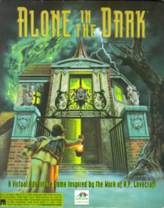
  • 1993 was the year that Alone in the Dark invented the survival-horror genre. We’ll look at where that game came from and how it holds up today.
  • 1993 was the last big year in CRPGs for quite some time, as a glut of samey titles tried gamers’ patience past the breaking point. We’ll look at Sierra’s Betrayal at Krondor, one of the less samey titles, and also at how the end of the CRPG gravy train affected Origin Systems and SSI, two of the leading practitioners of the genre.
  • 1993 was the year that the wheels came off for Commodore even in Europe, thanks to new Amiga models that arrived as too little, too late. We’ll look at the sad end of a company and a platform that once held so much promise.
  • 1993 was the year of the sequel to Lemmings! Enough said.
  • 1993 was the year of a little game from Interplay that I’ve always wished I could like more, Buzz Aldrin’s Race into Space. We’ll use the occasion of its release to examine the checkered history of space-program management simulations in general, a sub-genre that seems like it ought to have worked beautifully but somehow never quite did.
  • 1993 was the year of Master of Orion, perhaps not the first grand 4X space opera in absolute terms but the one to which every subsequent game of the type would always be compared. Enough said.
  • 1993 was the year when shareware peaked. We’ll look at this rich culture of amateurs and semi-professionals making games of many stripes and asking people to pay for them after they got them.
  • 1993 was the year that The 7th Guest, the poster child for form over substance in gaming, popularized SVGA graphics, pushing the industry onward at last after six years stuck on the VGA standard. Along with The 7th Guest itself and the meteoric rise and fall of its maker Trilobyte, we’ll find out how a computer industry that had always looked to IBM to set its standards finally learned to drive its own technological evolution in a world where IBM had become all but irrelevant.
  • 1993 was the year of Myst, the best-selling adventure game in history. Was it a brilliant artistic creation, or did it ruin adventure games for the rest of the decade? Or are both things true? We shall investigate.
  • And 1993 was, as mentioned, the year of Doom, the yang to Myst‘s yin, the only shareware product ever to make its sellers multi-millionaires. We’ll try to address the many and varied aspects of what some would consider to be the most iconic computer game of all time. We’ll start with its incredible technology, end with the way its defiantly low-concept, ultra-violent personality coarsened the culture of gaming, and cover a heck of a lot of ground in between.

As some of that last bullet point would imply, not everything that happened in 1993 was unadulteratedly positive, but it was all important. And certainly the year produced more than its share of classic games that still stand up wonderfully today. I’m looking forward to digging into it.

So, let me close by thanking all of you who support this ongoing project in one way or another. Without you, it just wouldn’t be possible. If you’ve been reading for a while and you haven’t yet become a supporter, please do think about contributing through Patreon or PayPal (you’ll find the links in the right-hand sidebar). It really does make all the difference in the world to my ability to continue this work. And if you’re interested in history more generally, do check out The Analog Antiquarian as well. I’m very proud of the writing I’m doing there.

See you all in a week and half, when we’ll buckle down and get started on the to-do list above. Until then, thanks again for being the best readers in the world!


Return to Zork

Where should we mark the beginning of the full-motion-video era, that most extended of blind alleys in the history of the American games industry? The day in the spring of 1990 that Ken Williams, founder and president of Sierra On-Line, wrote his latest editorial for his company’s seasonal newsletter might be as good a point as any. In his editorial, Williams coined the term “talkies” in reference to an upcoming generation of games which would have “real character voices and no text.” The term was, of course, a callback to the Hollywood of circa 1930, when sound began to come to the heretofore silent medium of film. Computer games, Williams said, stood on the verge of a leap that would be every bit as transformative, in terms not only of creativity but of profitability: “How big would the film industry be today if not for this step?”

According to Williams, the voice-acted, CD-based version of Sierra’s King’s Quest V was to become the games industry’s The Jazz Singer. But voice acting wasn’t the only form of acting which the games of the next few years had in store. A second transformative leap, comparable to that made by Hollywood when film went from black and white to color, was also waiting in the wings to burst onto the stage just a little bit later than the first talkies. Soon, game players would be able to watch real, human actors right there on their monitor screens.

As regular readers of this site probably know already, the games industry’s Hollywood obsession goes back a long way. In 1982, Sierra was already advertising their text adventure Time Zone with what looked like a classic “coming attractions” poster; in 1986, Cinemaware was founded with the explicit goal of making “interactive movies.” Still, the conventional wisdom inside the industry by the early 1990s had shifted subtly away from such earlier attempts to make games that merely played like movies. The idea was now that the two forms of media would truly become one — that games and movies would literally merge. “Sierra is part of the entertainment industry — not the computer industry,” wrote Williams in his editorial. “I always think of books, records, films, and then interactive films.” These categories defined a continuum of increasingly “hot,” increasingly immersive forms of media. The last listed there, the most immersive medium of all, was now on the cusp of realization. How many people would choose to watch a non-interactive film when they had the opportunity to steer the course of the plot for themselves? Probably about as many as still preferred books to movies.

Not all that long after Williams’s editorial, the era of the full-motion-video game began in earnest. The first really prominent exemplar of the species was ICOM Simulations’s Sherlock Holmes Consulting Detective series in 1992, which sent you wandering around Victorian London collecting clues to a mystery from the video snippets that played every time you visited a relevant location. The first volume of this series alone would eventually sell 1 million copies as an early CD-ROM showcase title. The following year brought Return to Zork, The 7th Guest, and Myst as three of the five biggest games of the year; all three of these used full-motion video to a greater or lesser extent. (Myst used it considerably less than the other two, and, perhaps not coincidentally, is the member of the trio that holds up by far the best today.) With success stories like those to look to, the floodgates truly opened in 1994. Suddenly every game-development project — by no means only adventure games — was looking for ways to shoehorn live actors into the proceedings.

But only a few of the full-motion-video games that followed would post anything like the numbers of the aforementioned four games. That hard fact, combined with a technological counter-revolution in the form of 3D graphics, would finally force a reckoning with the cognitive dissonance of trying to build a satisfying interactive experience by mixing and matching snippets of nonmalleable video. By 1997, the full-motion-video era was all but over. Today, few things date a game more instantly to a certain window of time than grainy video of terrible actors flickering over a background of computer-generated graphics. What on earth were people thinking?

Most full-motion-video games are indeed dire, but they’re going to be with us for quite some time to come as we continue to work our way through this history. I wish I could say that Activision’s Return to Zork, my real topic for today, was one of the exceptions to the rule of direness. Sadly, though, it isn’t.

In fact, let me be clear right now: Return to Zork is a terrible adventure game. Under no circumstances should you play it, unless to satisfy historical curiosity or as a source of ironic amusement in the grand tradition of Ed Wood. And even in these special cases, you should take care to play it with a walkthrough in hand. To do anything else is sheer masochism; you’re almost guaranteed to lock yourself out of victory within the first ten minutes, and almost guaranteed not to realize it until many hours later. There’s really no point in mincing words here: Return to Zork is one of the absolute worst adventure-game designs I’ve ever seen — and, believe me, I’ve seen quite a few bad ones.

Its one saving grace, however, is that it’s terrible in a somewhat different way from the majority of terrible full-motion-video adventure games. Most of them are utterly bereft of ideas beyond the questionable one at their core: that of somehow making a game out of static video snippets. You can almost see the wheels turning desperately in the designers’ heads as they’re suddenly confronted with the realization that, in addition to playing videos, they have to give the player something to actually do. Return to Zork, on the other hand, is chock full of ideas for improving upon the standard graphic-adventure interface in ways that, on the surface at any rate, allow more rather than less flexibility and interactivity. Likewise, even the trendy use of full-motion video, which dates it so indelibly to the mid-1990s, is much more calculated than the norm among its contemporaries.

Unfortunately, all of its ideas are undone by a complete disinterest in the fundamentals of game design on the part of the novelty-seeking technologists who created it. And so here we are, stuck with a terrible game in spite of it all. If I can’t quite call Return to Zork a noble failure — as we’ll see, one of its creators’ stated reasons for making it so callously unfair is anything but noble — I can at least convince myself to call it an interesting one.


When Activision decided to make their follow-up to the quickie cash-in Leather Goddesses of Phobos 2 a more earnest, better funded stab at a sequel to a beloved Infocom game, it seemed logical to find themselves a real Infocom Implementor to design the thing. They thus asked Steve Meretzky, whom they had just worked with on Leather Goddesses 2, if he’d like to design a new Zork game for them as well. But Meretzky hadn’t overly enjoyed trying to corral Activision’s opinionated in-house developers from a continent away last time around; this time, he turned them down flat.

Meretzky’s rejection left Activision without a lot of options to choose from when it came to former Imps. A number of them had left the games industry upon Infocom’s shuttering three years before, while, of those that remained, Marc Blank, Mike Berlyn, Brian Moriarty, and Bob Bates were all employed by one of Activison’s direct competitors. Activision therefore turned to Doug Barnett, a freelance artist and designer who had been active in the industry for the better part of a decade; his most high-profile design gig to date had been Cinemaware’s Lords of the Rising Sun. But he had never designed a traditional puzzle-oriented adventure game, as one can perhaps see all too well in the game that would result from his partnership with Activision. He also didn’t seem to have a great deal of natural affinity for Zork. In the lengthy set of notes and correspondence relating to the game’s development which has been put online by The Zork Library, a constant early theme on Activision’s part is the design’s lack of “Zorkiness.” “As it stands, the design constitutes more of a separate and unrelated story, rather than a sequel to the Zork series,” they wrote at one point. “It was noted that ‘Zork’ is the name of a vast ancient underground empire, yet Return to Zork takes place in a mostly above-ground environment.”

In fairness to Barnett, Zork had always been more of a state of mind than a coherent place. With the notable exception of Steve Meretzky, everyone at Infocom had been wary of overthinking a milieu that had originally been plucked out of the air more or less at random. In comparison to other shared worlds — even other early computer-game worlds, such as the Britannia of Richard Garriott’s Ultima series — there was surprisingly little there there when it came Zork: no well-established geography, no well-established history which everybody knew — and, most significantly of all, no really iconic characters which simply had to be included. At bottom, Zork boiled down to little more than a modest grab bag of tropes which lived largely in the eye of the beholder: the white house with a mailbox, grues, Flood Control Dam #3, Dimwit Flathead, the Great Underground Empire itself. And even most of these had their origin stories in the practical needs of an adventure game rather than any higher world-building purpose. (The Great Underground Empire, for example, was first conceived as an abandoned place not for any literary effect but because living characters are hard to implement in an adventure game, while the detritus they leave behind is relatively easy.)

That said, there was a distinct tone to Zork, which was easier to spot than it was to describe or to capture. Barnett’s design missed this tone, even as it began with the gleefully anachronistic, seemingly thoroughly Zorkian premise of casting the player as a sweepstakes winner on an all-expenses-paid trip to the idyllic Valley of the Sparrows, only to discover it has turned into the Valley of the Vultures under the influence of some pernicious, magical evil. Barnett and Activision would continue to labor mightily to make Return to Zork feel like Zork, but would never quite get there.

By the summer of 1992, Barnett’s design document had already gone through several revisions without entirely meeting Activision’s expectations. At this point, they hired one Eddie Dombrower to take personal charge of the project in the role of producer. Like Barnett, Dombrower had been working in the industry for quite some time, but had never worked on an adventure game; he was best known for World Series Major League Baseball on the old Intellivision console and Earl Weaver Baseball on computers. Dombrower gave the events of Return to Zork an explicit place in Zorkian history — some 700 years after Infocom’s Beyond Zork — and moved a big chunk of the game underground to remedy one of his boss’s most oft-repeated objections to the existing design.

More ominously, he also made a comprehensive effort to complicate Barnett’s puzzles, based on feedback from players and reviewers of Leather Goddesses 2, who were decidedly unimpressed with that game’s simple-almost-to-the-point-of-nonexistence puzzles. The result would be the mother of all over-corrections — a topic we’ll return to later.

Unlike Leather Goddesses 2, whose multimedia ambitions had led it to fill a well-nigh absurd 17 floppy disks, Return to Zork had been planned almost from its inception as a product for CD-ROM, a technology which, after years of false promises and setbacks, finally seemed to be moving toward a critical mass of consumer uptake. In 1992, full-motion video, CD-ROM, and multimedia computing in general were all but inseparable concepts in the industry’s collective mind. Activision thus became one of the first studios to hire a director and actors and rent time on a sound stage; the business of making computer games had now come to involve making movies as well. They even hired a professional Hollywood screenwriter to punch up the dialog and make it more “cinematic.”

In general, though, while the computer-games industry was eager to pursue a merger with Hollywood, the latter was proving far more skeptical. There was still little money in computer games in comparison with movies, and there was very little prestige — rather the opposite, most would say — in “starring” in a game. The actors whom games could manage to attract were therefore B-listers at best. Return to Zork actually collected a more accomplished — or at least more high-profile — cast than most. Among them were Ernie Lively, a veteran supporting player from television shows such as The Dukes of Hazzard; his daughter Robyn Lively, fresh off a six-episode stint as a minor character on David Lynch’s prestigious critics’ darling Twin Peaks; Jason Hervey, who was still playing older brother Wayne on the long-running coming-of-age sitcom The Wonder Years; and Sam Jones, whose big shot at leading-man status had come with the film Flash Gordon back in 1980 and gone with its mixed reception.

If the end result would prove less than Oscar-worthy, it’s for the most part not cringe-worthy either. After all, the cast did consist entirely of acting professionals, which is more than one can say for many productions of this ilk — and certainly more than one can say for the truly dreadful voice acting in Leather Goddesses of Phobos 2, Activision’s previous attempt at a multimedia adventure game. While they were hampered by the sheer unfamiliarity of talking directly “to” the invisible player of the game — as Ernie Lively put it, “there’s no one to act off of” — they did a decent job with the slight material they had to work with.

The fact that they were talking to the player rather than acting out scenes with one another actually speaks to a degree of judiciousness in the use of full-motion video on Activision’s part. Rather than attempting to make an interactive movie in the most literal sense — by having a bunch of actors, one of them representing the protagonist, act out each of the player’s choices — Activision went for a more thoughtful mixed-media approach that could, theoretically anyway, eliminate most of the weaknesses of the typical full-motion-video adventure game. For the most part, only conversations involved the use of full-motion video; everything else was rendered by Activision’s pixel artists and 3D modelers in conventional computer graphics. The protagonist wasn’t shown at all: at a time when the third-person view was the all but universal norm in adventure games, Activision opted for a first-person view.

The debate over whether an adventure-game protagonist ought to be a blank slate which the player can fill with her own personality or an established character which the player merely guides and empathizes with was a longstanding one even at the time when Return to Zork was being made. Certainly Infocom had held rousing internal debates on the subject, and had experimented fairly extensively with pre-established protagonists in some of their games. (These experiments sometimes led to rousing external debates among their fans, most notably in the case of the extensively characterized and tragically flawed protagonist of Infidel, who meets a nasty if richly deserved end no matter what the player does.) The Zork series, however, stemmed from an earlier, simpler time in adventure games than the rest of the Infocom catalog, and the “nameless, faceless adventurer,” functioning as a stand-in for the player herself, had always been its star. Thus Activision’s decision not to show the player’s character in Return to Zork, or indeed to characterize her in any way whatsoever, is a considered one, in keeping with everything that came before.

In fact, the protagonist of Return to Zork never actually says anything. To get around the need, Activision came up with a unique attitude-based conversation engine. As you “talk” to other characters, you choose from three stances — threatening, interested, or bored — and listen only to your interlocutors’ reactions. Not only does your own dialog go unvoiced, but you don’t even see the exact words you use; the game instead lets you imagine your own words. Specific questions you might wish to ask are cleverly turned into concrete physical interactions, something games do much better than abstract conversations. As you explore, you have a camera with which to take pictures of points of interest. During conversations, you can show the entries from your photo album to your interlocutor, perhaps prompting a reaction. You can do the same with objects in your inventory, locations on the auto-map you always carry with you, or even the tape recordings you automatically make of each interaction with each character.

So, whatever else you can say about it, Return to Zork is hardly bereft of ideas. William Volk, the technical leader of the project, was well up on the latest research into interface design being conducted inside universities like MIT and at companies like Apple. Many such studies had concluded that, in place of static onscreen menus and buttons, the interface should ideally pop into existence just where and when the user needed it. The result of such thinking in Return to Zork is a screen with no static interface at all; it instead pops up when you click on an object with which you can interact. Since it doesn’t need the onscreen menu of “verbs” typical of contemporaneous Sierra and LucasArts adventure games, Return to Zork can give over the entirety of the screen to its graphical portrayal of the world.

In addition to being a method of recapturing screen real estate, the interface was conceived as a way to recapture some of the sense of boundless freedom which is such a characteristic of parser-driven text adventures — a sense which can all too easily become lost amidst the more constrained interfaces of their graphical equivalent. William Volk liked to call Return to Zork‘s interface a “reverse parser”: clicking on a “noun” in the environment or in your inventory yields a pop-up menu of “verbs” that pertain to it. Taking an object in your “hand” and clicking it on another one yields still more options, the equivalent of commands to a parser involving indirect as well as direct objects. In the first screen of the game, for example, clicking the knife on a vulture gives options to “show knife to vulture,” “throw knife at vulture,” “stab vulture with knife,” or “hit vulture with knife.” There are limits to the sense of possibility: every action had to be anticipated and hand-coded by the development team, and most of them are the wrong approach to whatever you’re trying to accomplish. In fact, in the case of the example just mentioned as well as many others, most of the available options will get you killed; Return to Zork loves instant deaths even more than the average Sierra game. And there are many cases of that well-known adventure-game syndrome where a perfectly reasonable solution to a problem isn’t implemented, forcing you to devise some absurdly convoluted solution that is implemented in its stead. Still, in a world where adventure games were getting steadily less rather than more ambitious in their scope of interactive possibility — to a large extent due to the limitations of full-motion video — Return to Zork was a welcome departure from the norm, a graphic adventure that at least tried to recapture the sense of open-ended possibility of an Infocom game.

Indeed, there are enough good ideas in Return to Zork that one really, really wishes they all could have been tied to a better game. But sadly, I have to stop praising Return to Zork now and start condemning it.

The most obvious if perhaps most forgivable of its sins is that, as already noted, it never really manages to feel like Zork — not, at least, like the classic Zork of the original trilogy. (Steve Meretzky’s Zork Zero, Infocom’s final release to bear the name, actually does share some of the slapstick qualities of Return to Zork, but likewise rather misses the feel of the original.) The most effective homage comes at the very beginning, when the iconic opening text of Zork I appears onscreen and morphs into the new game’s splashy opening credits. It’s hard to imagine a better depiction circa 1993 of where computer gaming had been and where it was going — which was, of course, exactly the effect the designers intended.

Once the game proper gets under way, however, modernity begins to feel much less friendly to the Zorkian aesthetic of old. Most of Zork‘s limited selection of physical icons do show up here, from grues to Flood Control Dam #3, but none of it feels all that convincingly Zork-like. The dam is a particular disappointment; what was described in terms perfect for inspiring awed flights of the imagination in Zork I looks dull and underwhelming when portrayed in the cruder medium of graphics. Meanwhile the jokey, sitcom-style dialog that confronts you at every turn feels even less like the original trilogy’s slyer, subtler humor.

This isn’t to say that Return to Zork‘s humor doesn’t connect on occasion. It’s just… different from that of Dave Lebling and Marc Blank. By far the most memorable character, whose catchphrase has lived on to this day as a minor Internet meme, is the drunken miller named Boos Miller. (Again, subtlety isn’t this game’s trademark.) He plies you endlessly with whiskey, whilst repeating, “Want some rye? Course you do!” over and over and over in his cornpone accent. It’s completely stupid — but, I must admit, it’s also pretty darn funny; Boos Miller is the one thing everyone who ever played the game still seems to remember about Return to Zork. But, funny though he is, he would be unimaginable in any previous Zork.


Of course, a lack of sufficient Zorkiness need not have been the kiss of death for Return to Zork as an adventure game in the abstract. What really does it in is its thoroughly unfair puzzle design. This game plays like the fever dream of a person who hates and fears adventure games. It’s hard to know where to even start (or end) with this cornucopia of bad puzzles, but I’ll describe a few of them, ranked roughly in order of their objectionability.

The Questionable: At one point, you find yourself needing to milk a cow, but she won’t let you do so with cold hands. Do you need to do something sensible, like, say, find some gloves or wrap your hands in a blanket? Of course not! The solution is to light some of the hay that’s scattered all over the wooden barn on fire and warm your hands that way. For some reason, the whole place doesn’t go up in smoke. This solution is made still more difficult to discover by the way that the game usually kills you every time you look at it wrong. Why on earth would it not kill you for a monumentally stupid act like this one? To further complicate matters, for reasons that are obscure at best you can only light the hay on fire if you first pick it up and then drop it again. Thus even many players who are consciously attempting the correct solution will still get stuck here.

The Absurd: At another point, you find a bra. You have to throw it into an incinerator in order to get a wire out of it whose existence you were never aware of in the first place. How does the game expect you to guess that you should take such an action? Apparently some tenuous linkage with the 1960s tradition of bra burning and, as a justification after the fact, the verb “to hot-wire.” Needless to say, throwing anything else into the incinerator just destroys the object and, more likely than not, locks you out of victory.

The Incomprehensible: There’s a water wheel out back of Boos’s house with a chock holding it still. If you’ve taken the chock and thus the wheel is spinning, and you’ve solved another puzzle that involves drinking Boos under the table (see the video above), a trapdoor is revealed in the floor. But if the chock is in place, the trapdoor can’t be seen. Why? I have absolutely no idea.

Wait! Don’t do it!

The Brutal: In a way, everything you really need to know about Return to Zork can be summed up by its most infamous single puzzle. On the very first screen of the game, there’s a “bonding plant” growing. If you simply pull up the plant and take it with you, everything seems fine — until many hours later, when you finally find a use for the plant you’ve been carting around all this time. Great!, you think. But it turns out that you need a living version of it; you were supposed to have used a knife to dig up the plant rather than pulling or cutting it. Technically speaking, you can fix the damage you’ve done, but the method of doing so is crazy obscure; you have to eat the plant, then return to the site where you first found it, where you’ll discover that another has grown in its place. I maintain that almost nobody will figure that out without the help of a walkthrough or strategy guide.

All of the puzzles just described, and the many equally bad ones, are made still more complicated by the game’s general determination to be a right bastard to you every chance it gets. If, as Robb Sherwin once put it, the original Zork games hate their players, this game has found some existential realm beyond mere hatred. It will let you try to do many things to solve each puzzle, but, of those actions that don’t outright kill you, a fair percentage lock you out of victory in one way or another. Sometimes, as in the case of its most infamous puzzle, it lets you think you’ve solved them, only to pull the rug out from under you much later.

So, you’re perpetually on edge as you tiptoe through this minefield of instant deaths and unwinnable states; you’ll have a form of adventure-game post-traumatic-stress syndrome by the time you’re done, even if you’re largely playing from a walkthrough. The instant deaths are annoying, but nowhere near as bad as the unwinnable states; the problem there is that you never know whether you’ve already locked yourself out of victory, never know whether you can’t solve the puzzle in front of you because of something you did or didn’t do a long time ago.

It all combines to make Return to Zork one of the worst adventure games I’ve ever played. We’ve sunk to Time Zone levels of awful with this one. No human not willing to mount a methodical months-long assault on this game, trying every possibility everywhere, could possibly solve it unaided. Even the groundbreaking interface is made boring and annoying by the need to show everything to everyone and try every conversation stance on everyone, always with the lingering fear that the wrong stance could spoil your game. Adventure games are built on trust between player and designer, but you can’t trust Return to Zork any farther than you can throw it. Amidst all the hand-wringing at Activision over whether Return to Zork was or was not sufficiently Zorky, they forgot the most important single piece of the Infocom legacy: their thoroughgoing commitment to design, and the fundamental respect that commitment demonstrated to the players who spent their hard-earned money on Infocom games.  “Looking back at the classics might be a good idea for today’s game designers,” wrote Computer Gaming World‘s Scorpia at the conclusion of her mixed review of Return to Zork. “Good puzzle construction, logical development, and creative inspiration are in rich supply on those dusty disks.” None of these, alas, is in correspondingly good supply in Return to Zork.

The next logical question, then, is just how Return to Zork‘s puzzles wound up being so awful. After all, this game wasn’t the quickie cash grab that Leather Goddesses of Phobos 2 had been. The development team put serious thought and effort into the interface, and there were clearly a lot of people involved with this game who cared about it a great deal — among them Activision’s CEO Bobby Kotick, who was willing to invest almost $1 million to bring the whole project to fruition at a time when cash was desperately short and his creditors had him on a short leash indeed.

The answer to our question apparently comes down to the poor reception of Leather Goddesses 2, which had stung Activision badly. In an interview given shortly before Return to Zork‘s release, Eddie Dombrower said that, “based on feedback that the puzzles in Leather Goddesses of Phobos [2] were too simple,” the development team had “made the puzzles increasingly difficult just by reworking what Doug had already laid out for us.” That sounds innocent enough on the face of it. But, speaking to me recently, William Volk delivered a considerably darker variation on the same theme. “People hated Leather Goddesses of Phobos 2 — panned it,” he told me. “So, we decided to wreak revenge on the entire industry by making Return to Zork completely unfair. Everyone bitches about that title. There’s 4000 videos devoted to Return to Zork on YouTube, most of which are complaining because the title is so blatantly unfair. But, there you go. Something to pin my hat on. I made the most unfair game in history.”

For all that I appreciate Volk sharing his memories with me, I must confess that my initial reaction to this boast was shock, soon to be followed by genuine anger at the lack of empathy it demonstrates. Return to Zork didn’t “wreak revenge” on its industry, which really couldn’t have cared less. It rather wreaked “revenge,” if that’s the appropriate word, on the ordinary gamers who bought it in good faith at a substantial price, most of whom had neither bought nor commented on Leather Goddesses 2. I sincerely hope that Volk’s justification is merely a case of hyperbole after the fact. If not… well, I really don’t know what else to say about such juvenile pettiness, so symptomatic of the entitled tunnel vision of so many who are fortunate enough to work in technology, other than that it managed to leave me disliking Return to Zork even more. Some games are made out of an openhearted desire to bring people enjoyment. Others, like this one, are not.

I’d like to be able to say that Activision got their comeuppance for making Return to Zork such a bad game, demonstrating such contempt for their paying customers, and so soiling the storied Infocom name in the process. But exactly the opposite is the case. Released in late 1993, Return to Zork became one of the breakthrough titles that finally made the CD-ROM revolution a reality, whilst also carrying Activision a few more steps back from the abyss into which they’d been staring for the last few years. It reportedly sold 1 million copies in its first year — albeit the majority of them as a bundled title, included with CD-ROM drives and multimedia upgrade kits, rather than as a boxed standalone product. “Zork on a brick would sell 100,000 copies,” crowed Bobby Kotick in the aftermath.

Perhaps. But more likely not. Even within the established journals of computer gaming, whose readership probably didn’t constitute the majority of Return to Zork‘s purchasers, reviews of the game were driven more by enthusiasm for its graphics and sound, which really were impressive in their day, than by Zork nostalgia. Discussed in the euphoria following its release as the beginning of a full-blown Infocom revival, Return to Zork would instead go down in history as a vaguely embarrassing anticlimax to the real Infocom story. A sequel to Planetfall, planned as the next stage in the revival, would linger in Development Hell for years and ultimately never get finished. By the end of the 1990s, Zork as well would be a dead property in commercial terms.

Rather than having all that much to do with its Infocom heritage, Return to Zork‘s enormous commercial success came down to its catching the technological zeitgeist at just the right instant, joining Sherlock Holmes Consulting Detective, The 7th Guest, and Myst as the perfect flashy showpieces for CD-ROM. Its success conveyed all the wrong messages to game publishers like Activision: that multimedia glitz was everything, and that design really didn’t matter at all.

If it stings a bit that this of all games, arguably the worst one ever to bear the Infocom logo, should have sold better than any of the rest of them, we can comfort ourselves with the knowledge that Quality does have a way of winning out in the end. Today, Return to Zork is a musty relic of its time, remembered if at all only for that “want some rye?” guy. The classic Infocom text adventures, on the other hand, remain just that — widely recognized as timeless classics, their clean text-only presentations ironically much less dated than all of Return to Zork‘s oh-so-1993 multimedia flash. Justice does have a way of being served in the long run.

(Sources: the book Return to Zork Adventurer’s Guide by Steve Schwartz; Computer Gaming World of February 1993, July 1993, November 1993, and January 1994; Questbusters of December 1993; Sierra News Magazine of Spring 1990; Electronic Games of January 1994; New Media of June 24 1994. Online sources include The Zork Library‘s archive of Return to Zork design documents and correspondence, Retro Games Master‘s interview with Doug Barnett, and Matt Barton’s interview with William Volk. Some of this article is drawn from the full Get Lamp interview archives which Jason Scott so kindly shared with me. Finally, my huge thanks to William Volk for sharing his memories and impressions with me in a personal interview.)


Tags: , , ,

An Unlikely Savior

Activision Blizzard is the largest game publisher in the Western world today, generating a staggering $7.5 billion in revenue every year. Along with the only slightly smaller behemoth Electronic Arts and a few Japanese competitors, Activision for all intents and purposes is the face of gaming as a mainstream, mass-media phenomenon. Even as the gaming intelligentsia looks askance at Activision for their unshakeable fixation on sequels and tried-and-true formulas, the general public just can’t seem to get enough Call of Duty, Guitar Hero, World of Warcraft, and Candy Crush Saga. Likewise, Bobby Kotick, who has sat in the CEO’s chair at Activision for over a quarter of a century now, is as hated by gamers of a certain progressive sensibility as he is loved by the investment community.

But Activision’s story could have — perhaps by all rights should have — gone very differently. When Kotick became CEO, the company was a shambling wreck that hadn’t been consistently profitable in almost a decade. Mismanagement combined with bad luck had driven it to the ragged edge of oblivion. What to a large degree saved Activision and made the world safe for World of Warcraft was, of all things, a defunct maker of text adventures which longtime readers of this ongoing history have gotten to know quite well. The fact that Infocom, the red-headed stepchild a previous Activision CEO had never wanted, is directly responsible for Activision’s continuing existence today is one of the strangest aspects of both companies’ stories.


The reinvention of Activision engineered by Bobby Kotick in the early 1990s was actually the company’s third in less than a decade.

Activision 1.0 was founded in 1979 by four former Atari programmers known as the “Fantastic Four,” along with a former music-industry executive named Jim Levy. Their founding tenets were that Atari VCS owners deserved better games than the console’s parent was currently giving them, and that Atari VCS game programmers deserved more recognition and more money than were currently forthcoming from the same source. They parlayed that philosophy into one of the most remarkable success stories of the first great videogame boom; their game Pitfall! alone sold more than 4 million copies in 1982. It would, alas, be a long, long time before Activision would enjoy success like that again.

Following the Great Videogame Crash of 1983, Levy tried to remake Activision into a publisher of home-computer games with a certain high-concept, artsy air. But, while the ambitions of releases like Little Computer People, Alter Ego, and Portal still make them interesting case studies today, Activision 2.0 generated few outright hits. Six months after Levy had acquired Infocom, the preeminent maker of artsy computer games, in mid-1986, he was forced out by his board.

Levy’s replacement was a corporate lawyer named Bruce Davis. He nixed the artsy fare, doubled down on licensed titles, and tried to establish Activision 3.0 as a maker of mass-market general-purpose computer software as well as games. Eighteen months into his tenure, he changed the company’s name to Mediagenic to reflect this new identity. But the new products were, like the new name, mostly bland in a soulless corporate way that, in the opinion of many, reflected Davis’s own personality all too accurately. By decade’s end, Mediagenic was regarded as an important player within their industry at least as much for their distributional clout, a legacy of their early days of Atari VCS success, as for the games and software they published under their own imprint. A good chunk of the industry used Mediagenic’s network to distribute their wares as members of the company’s affiliated-labels program.

Then the loss of a major lawsuit, combined with a slow accretion of questionable decisions from Davis, led to a complete implosion in 1990. The piggy bank provided by Activision 1.0’s success had finally run dry, and most observers assumed that was that for Mediagenic — or Activision, or whatever they preferred to call themselves today.

But over the course of 1991, a fast-talking wiz kid named Bobby Kotick seized control of the mortally wounded mastodon and put it through the wringer of bankruptcy. What emerged by the end of that year was so transformed as to raise the philosophical question of whether it ought to be considered the same entity at all. The new company employed just 10 percent as many people as the old (25 rather than 250) and was headquartered in a different region entirely (Los Angeles rather than Silicon Valley). It even had a new name — or, rather, an old one. Perhaps the smartest move Kotick ever made was to reclaim the company’s old appellation of “Activision,” still redolent for many of the nostalgia-rich first golden age of videogames, in lieu of the universally mocked corporatese of “Mediagenic.” Activision 4.0, the name reversion seemed to say, wouldn’t be afraid of their heritage in the way that versions 2.0 and 3.0 had been. Nor would they be shy about labeling themselves a maker of games, full stop; Mediagenic’s lines of “personal-productivity” software and the like were among the first things Kotick trashed.

Kotick was still considerably short of his thirtieth birthday when he took on the role of Activision’s supreme leader, but he felt like he’d been waiting for this opportunity forever. He’d spent much of the previous decade sniffing around at the margins of the industry, looking for a way to become a mover and shaker of note. (In 1987, for instance, at the tender age of 24, he’d made a serious attempt to scrape together a pool of investors to buy the computer company Commodore.) Now, at last, he had his chance to be a difference maker.

It was indeed a grand chance, but it was also an extremely tenuous one. He had been able to save Activision — save it for the time being, that is — only by mortgaging some 95 percent of it to its numerous creditors. These creditors-cum-investors were empowered to pull the plug at any time; Kotick himself maintained his position as CEO only by their grace. He needed product to stop the bleeding and add some black to the sea of red ink that was Activision’s books, thereby to show the creditors that their forbearance toward this tottering company with a snot-nosed greenhorn at the head hadn’t been a mistake. But where was said product to come from? Activision was starved for cash even as the typical game-development budget in the industry around them was increasing almost exponentially year over year. And it wasn’t as if third-party developers were lining up to work with them; they’d stiffed half the industry in the process of going through bankruptcy.

To get the product spigot flowing again, Kotick found a partner to join him in the executive suite. Peter Doctorow had spent the last six years or so with Accolade (a company ironically founded by two ex-Activision developers in 1984, in a fashion amusingly similar to the way that restless Atari programmers had begotten Activision). In the role of product-development guru, Doctorow had done much to create and maintain Accolade’s reputation as a maker of attractive and accessible games with natural commercial appeal. Activision, on the other hand, hadn’t enjoyed a comparable reputation since the heyday of the Atari VCS. Jumping ship from the successful Accolade to an Activision on life support would have struck most as a fool’s leap, but Kotick could be very persuasive. He managed to tempt Doctorow away with the title of president and the promise of an opportunity to build something entirely new from the ground up.

Of course, building materials for the new thing could and should still be scrounged from the ruins of Mediagenic whenever possible. After arriving at Activision, Doctorow thus made his first priority an inventory of what he already had to work with in the form of technology and intellectual property. On the whole, it wasn’t a pretty picture. Activision had never been particularly good at spawning the surefire franchises that gaming executives love. There were no Leisure Suit Larrys or Lord Britishes lurking in their archives — much less any Super Marios. Pitfall!, the most famous and successful title of all from the Atari VCS halcyon days, might be a candidate for revival, but its simple platforming charms were at odds with where computer gaming was and where it seemed to be going in the early 1990s; the talk in the industry was all about multimedia, live-action video, interactive movies, and story, story, story. Pitfall! would have been a more natural fit on the consoles, but Kotick and Doctorow weren’t sure they had the resources to compete as of yet in those hyper-competitive, expensive-to-enter walled gardens. Their first beachhead, they decided, ought to be on computers.

In that context, there were all those old Infocom games… was there some commercial potential there? Certainly Zork still had more name recognition than any property in the Activision stable other than Pitfall!.

Ironically, the question of a potential Infocom revival would have been moot if Bruce Davis had gotten his way. He had never wanted Infocom, having advised his predecessor Jim Levy strongly against acquiring them when he was still a mere paid consultant. When Infocom delivered a long string of poor-selling games over the course of 1987 and 1988, he felt vindicated, and justified in ordering their offices closed permanently in the spring of 1989.

Even after that seemingly final insult, Davis continued to make clear his lack of respect for Infocom. During the mad scramble for cash preceding the ultimate collapse of Mediagenic, he called several people in the industry, including Ken Williams at Sierra and Bob Bates at the newly founded Legend Entertainment, to see if they would be interested in buying the whole Infocom legacy outright — including games, copyrights, trademarks, source code, and the whole stack of development tools. He dropped his asking price as low as $25,000 without finding a taker; the multimedia-obsessed Williams had never had much interest in text adventures, and Bates was trying to get Legend off the ground and simply didn’t have the money to spare.

When a Mediagenic producer named Kelly Zmak learned what Davis was doing, he told him he was crazy. Zmak said that he believed there was still far more than $25,000 worth of value in the Infocom properties, in the form of nostalgia if nothing else. He believed there would be a market for a compilation of Infocom games, which were now available only as pricey out-of-print collectibles. Davis was skeptical — the appeal of Infocom’s games had always been lost on him — but told Zmak that, if he could put such a thing together for no more than $10,000, they might as well give it a try. Any port in a storm, as they say.

As it happened, Mediagenic’s downfall was complete before Zmak could get his proposed compilation into stores. But he was one of the few who got to keep his job with the resurrected company, and he made it clear to his new managers that he still believed there was real money to be made from the Infocom legacy. Kotick and Doctorow agreed to let him finish up his interrupted project.

And so one of the first products from the new Activision 4.0 became a collection of old games from the eras of Activision 3.0, 2.0, and even 1.0. It was known as The Lost Treasures of Infocom, and first entered shops very early in 1992.

Activision’s stewardship of the legacy that had been bequeathed to them was about as respectful as one could hope for under the circumstances. The compilation included 20 of the 35 canonical Infocom games. The selection felt a little random; while most of the really big, iconic titles — like all of the Zork games, The Hitchhiker’s Guide to the Galaxy, the Enchanter trilogy, and Planetfall — were included, the 100,000-plus-selling Leather Goddesses of Phobos and Wishbringer were oddly absent. The feelies that had been such an important part of the Infocom experience were reduced to badly photocopied facsimiles lumped together in a thick, cheaply printed black-and-white manual — if, that is, they made the package at all. The compilers’ choices of which feelies ought to be included were as hit-and-miss as their selection of games, and in at least one case — that of Ballyhoo — the loss of an essential feelie rendered a game unwinnable without recourse to outside resources. Hardcore Infocom fans had good reason to bemoan this ugly mockery of the original games’ lovingly crafted packaging. “Where is the soul?” asked one of them in print, speaking for them all.

But any real or perceived lack of soul didn’t stop people from buying the thing. In fact, people bought it in greater numbers than even Kelly Zmak had dared to predict. At least 100,000 copies of The Lost Treasures of Infocom were sold — numbers better than any individual Infocom game had managed since 1986 — at a typical street price of about $60. With a response like that, Activision wasted no time in releasing most of the remaining games as The Lost Treasures of Infocom II, to sales that were almost as good. Along with Legend Entertainment’s final few illustrated text adventures, Lost Treasures I and II mark the last gasps of interactive fiction as a force in mainstream commercial American computer gaming.

The Lost Treasures of Infocom — the only shovelware compilation ever to spark a full-on artistic movement.

Yet these two early examples of the soon-to-be-ubiquitous practice of the shovelware compilation constitute a form of beginning as well as ending.  By collecting the vast majority of the Infocom legacy in one place, they cemented the idea of an established Infocom canon of Great Works, providing all those who would seek to make or play text adventures in the future with an easily accessible shared heritage from which to draw. For the Renaissance of amateur interactive fiction that would take firm hold by the mid-1990s, the Lost Treasures would become a sort of equivalent to what The Complete Works of William Shakespeare means to English literature. Had such heretofore obscure but groundbreaking Infocom releases as, say, Nord and Bert Couldn’t Make Head or Tail of It and Plundered Hearts not been collected in this manner, it’s doubtful whether they ever could have become as influential as they would eventually prove. Certainly a considerable percentage of the figures who would go on to make the Interactive Fiction Renaissance a reality completed their Infocom collection or even discovered the company’s rich legacy for the first time thanks to the Lost Treasures compilations.

Brian Eno once famously said that, while only about 30,000 people bought the Velvet Underground’s debut album, every one of them who did went out and started a band. A similar bit of hyperbole might be applied to the 100,000-and-change who bought Lost Treasures. These compilations did much to change perceptions of Infocom, from a mere interesting relic of an earlier era of gaming into something timeless and, well, canonical — a rich literary tradition that deserved to be maintained and further developed. It’s fair to ask whether the entire vibrant ecosystem of interactive fiction that remains with us today, in the form of such entities as the annual IF Comp and the Inform programming language, would ever have come to exist absent the Lost Treasures. Their importance to everything that would follow in interactive fiction is so pronounced that anecdotes involving them will doubtless continue to surface again and again as we observe the birth of a new community built around the love of text and parsers in future articles on this site.

For Activision, on the other hand, the Lost Treasures compilations made a much more immediate and practical difference. What with their development costs of close to zero and their no-frills packaging that hadn’t cost all that much more to put together, every copy sold was as close to pure profit as a game could possibly get. They made an immediate difference to Activision’s financial picture, giving them some desperately needed breathing room to think about next steps.

Observing the success of the compilations, Peter Doctorow was inclined to return to the Infocom well again. In fact, he had for some time now been eyeing Leather Goddesses of Phobos, Infocom’s last genuine hit, with interest. In the time since it had sold 130,000 copies in 1986, similarly risqué adventure games had become a profitable niche market: Sierra’s Leisure Suit Larry series, Legend’s Spellcasting series, and Accolade’s Les Manley series had all done more or less well. There ought to be a space, Doctorow reasoned, for a sequel to the game which had started the trend by demonstrating that, in games as just about everywhere else, Sex Sells. Hewing to this timeless maxim, he had made a point of holding the first Leather Goddesses out of the Lost Treasures compilations in favor of giving it its own re-release as a standalone $10 budget title — the only one of the old Infocom games to be accorded this honor.

Doctorow had a tool which he very much wanted to use in the service of a new adventure game. Whilst casting through the odds and ends of technology left over from the Mediagenic days, he had come upon something known as the Multimedia Applications Development Environment, the work of a small internal team of developers headed by one William Volk. MADE had been designed to facilitate immersive multimedia environments under MS-DOS that were much like the Apple Macintosh’s widely lauded HyperCard environment. In fact, Mediagenic had used it just before the wheels had come off to publish a colorized MS-DOS port of The Manhole, Rand and Robyn Miller’s unique HyperCard-based “fantasy exploration for children of all ages.” Volk and most of his people were among the survivors from the old times still around at the new Activision, and the combination of the MADE engine with Leather Goddesses struck Doctorow as a commercially potent one. He thus signed Steve Meretzky, designer of the original game, to write a sequel to this second most popular game he had ever worked on. (The most popular of all, of course, had been Hitchhiker’s, which was off limits thanks to the complications of licensing.)

But from the beginning, the project was beset by cognitive dissonance, alongside extreme pressure, born of Activision’s precarious finances, to just get the game done as quickly as possible. Activision’s management had decided that adventure games in the multimedia age ought to be capable of appealing to a far wider, less stereotypically eggheaded audience than the games of yore, and therefore issued firm instructions to Meretzky and the rest of the development team to include only the simplest of puzzles. Yet this prioritization of simplicity above all else rather belied the new game’s status as a sequel to an Infocom game which, in addition to its lurid content, had featured arguably the best set of interlocking puzzles Meretzky had ever come up with. The first Leather Goddesses had been a veritable master class in classic adventure-game design. The second would be… something else.

Which isn’t to say that the sequel didn’t incorporate some original ideas of its own; they were just orthogonal to those that had made the original so great. Leather Goddesses of Phobos 2: Gas Pump Girls Meet the Pulsating Inconvenience from Planet X really wanted to a be a CD-based title, but a critical mass of CD-ROM-equipped computers just wasn’t quite there yet at the time it was made. So, when it shipped in May of 1992 it filled 17 (!) floppy disks, using the space mostly for, as Activision’s advertisements proudly trumpeted in somewhat mangled diction, “more than an hour of amazing digital sound track!” Because a fair number of MS-DOS computer owners still didn’t have sound cards at this point, and because a fair proportion of those that did had older models of same that weren’t up to the task of delivering digitized audio as opposed to synthesized sounds and music, Activision also included a “LifeSize Sound Enhancer” in every box — a little gadget with a basic digital-to-analog circuit and a speaker inside it, which could be plugged into the printer port to make the game talk. This addition pushed the price up into the $60 range, making the game a tough sell for the bare few hours of content it offered — particularly if you already had a decent sound card and thus didn’t even need the hardware gadget you were being forced to pay for. Indeed, thanks to those 17 floppy disks, Leather Goddesses 2 would come perilously close to taking most gamers longer to install than it would to actually play.

That said, brevity was among the least of the game’s sins: Leather Goddesses 2 truly was a comprehensive creative disaster. The fact that this entire game was built from an overly literal interpretation of a tossed-off joke at the end of its predecessor says it all really. Meretzky’s designs had been getting lazier for years by the time this one arrived, but this game, his first to rely solely on a point-and-click interface, marked a new low for him. Not only were the brilliant puzzles that used to do at least as much as his humor to make his games special entirely absent, but so was all of the subversive edge to his writing. To be fair, Activision’s determination to make the game as accessible as possible — read, trivially easy — may have largely accounted for the former lack. Meretzky chafed at watching much of the puzzle design — if this game’s rudimentary interactivity can even be described using those words — get put together without him in Activision’s offices, a continent away from his Boston home. The careless writing, however, is harder to make excuses for.

In the tradition of the first Leather Goddesses, the sequel lets you choose to play as a man or a woman — or, this time, as an alien of indeterminate sex.

Still, this game is obviously designed for the proverbial male gaze. The real question is, why were all these attempts to be sexy in games so painfully, despressingly unsexy? Has anyone ever gotten really turned on by a picture like this one?

Earlier Meretzky games had known they were stupid, and that smart sense of self-awareness blinking through between the stupid had been their saving grace when they wandered into questionable, even borderline offensive territory. This one, on the other hand, was as introspective as one of the bimbos who lived within it. Was this really the same designer who just seven years before had so unabashedly aimed for Meaning in the most literary sense with A Mind Forever Voyaging? During his time at Infocom, Meretzky had been the Man of 1000 Ideas, who could rattle off densely packed pages full of games he wanted to make when given the least bit of encouragement. And yet by the end of 1992, he had made basically the same game four times in a row, with diminishing returns every time out. Just how far did he think he could ride scantily clad babes and broad innuendo? The shtick was wearing thin.

The women in many games of this ilk appear to be assembled from spare parts that don’t quite fit together properly.

Here, though, that would seem to literally be the case. These two girls have the exact same breasts.

In his perceptive review of Leather Goddesses 2 for Computer Gaming World magazine, Chris Lombardi pointed out how far Meretzky had fallen, how cheap and exploitative the game felt — and not even cheap and exploitative in a good way, for those who really were looking for titillation above all else.

The treatment of sex in LGOP2 seems so gratuitous, and adolescent, and (to use a friend’s favorite adjective for pop music) insipid. The game’s “explicit” visual content is all very tame (no more explicit than a beer commercial, really) and, for the most part, involves rather mediocre images of women in tight shirts, garters, or leather, most with impossibly protruding nipples. It’s the stuff of a Wally Cleaver daydream, which is appropriate to the game’s context, I suppose.

It appears quite innocuous at first, yet as I played along I began to sense an underlying attitude running through it all that can best be seen in the use of a whorehouse in the game. When one approaches this whorehouse, one is served a menu of a dozen or so names to choose from. Choosing a name takes players to a harlot’s room and affords them a “look at the goods.” Though loosely integrated into the storyline, it is all too apparent that it is merely an excuse for a slideshow of more rather average drawings of women.

You have to wonder what Activision was thinking. Do they imagine adults are turned on or, at minimum, entertained by this stuff? If they do, then I think they’ve misunderstood their market. And that must be the case, for the only other possibility is to suggest that their real target market is actually, and more insidiously, a younger, larger slice of the computer-game demographic pie.

On the whole, Lombardi was kinder to the game than I would have been, but his review nevertheless raised the ire of Peter Doctorow, who wrote in to the magazine with an ad hominem response: “It seems clear to me that you must be among those who long for the good old days, when films were black and white, comic books were a dime, and you could get an American-made gas guzzler with a distinct personality, meticulously designed taillights, and a grill reminiscent of a gargantuan grin. Sadly, the merry band that was Infocom can no longer be supported with text adventures.”

It seldom profits a creator to attempt to rebut a reviewer’s opinion, as Doctorow ought to have been experienced enough to know. His graceless accusation of Ludditism, which didn’t even address the real concerns Lombardi stated in his review, is perhaps actually a response to a vocal minority of the Infocom hardcore who were guaranteed to give Activision grief for any attempt to drag a beloved legacy into the multimedia age. Even more so, though, it was a sign of the extreme financial duress under which Activision still labored. Computer Gaming World was widely accepted as the American journal of record for the hobby in question, and their opinions could make or break a game’s commercial prospects. The lukewarm review doubtless contributed to Leather Goddesses of Phobos 2‘s failure to sell anywhere near as many copies as the Lost Treasures compilations — and at a time when Activision couldn’t afford to be releasing flops.

So, for more reasons than one, Leather Goddesses 2 would go down in history as an embarrassing blot on the CV of everyone involved. Sex, it seemed, didn’t always sell after all — not when it was done this poorly.

One might have thought that the failure of Leather Goddesses 2 would convince Activision not to attempt any further Infocom revivals. Yet once the smoke cleared even the defensive Doctorow could recognize that its execution had been, to say the least, lacking. And there still remained the counterexample of the Lost Treasures compilations, which were continuing to sell briskly. Activision thus decided to try again — this time with a far more concerted, better-funded effort that would exploit the most famous Infocom brand of all. Zork itself was about to make a splashy return to center stage.

(Sources: Computer Gaming World of April 1992, July 1992, and October 1992; Questbusters of February 1992 and August 1992; Compute! of November 1987; Amazing Computing of April 1992; Commodore Magazine of July 1989; .info of April 1992. Online sources include Roger J. Long’s review of the first Lost Treasures compilation. Some of this article is drawn from the full Get Lamp interview archives which Jason Scott so kindly shared with me. Finally, my huge thanks to William Volk and Bob Bates for sharing their memories and impressions with me in personal interviews.)


Tags: , , ,