“Demography is destiny,” said the French sociologist Auguste Comte apocryphally in the nineteenth century. That truism has been taken to heart by many in the time since — not least by our political classes. Yet it applies equally in the world of the arts and entertainment. For in any free market, the nature of production is dictated as much by the consumers as by the producers.
Certainly this is true of computer games. Throughout the 1980s and 1990s, they were largely the province of a rather specific demographic indeed: single white males between the ages of ten and thirty from relatively privileged socioeconomic circumstances, with a bent toward intellectual rather than active pursuits — i.e., the stereotypical “nerds” of pop culture. Computer games reflected the tastes of these boys and young men in other kinds of entertainment and leisure-time hobbies: Dungeons & Dragons, Star Wars, jet fighters, World War II, action movies, heavy-metal music, fast cars, and, when they could get a glimpse of them, fast women. Although I too have liked all of these things to a greater or lesser degree at some point in my life — I did, after all, grow up as a member of exactly the demographic in question — their extreme prevalence in the cultural ghetto about which I write has often left me searching, sometimes in vain, for games with a different set of values and antecedents.
But this article is not about one or more of those interesting cultural outliers. It’s rather about an interestingly scanty subgenre of games which seems like it ought to have been perfect for the demographic I’ve just described, but that for some reason just never quite took off. Specifically, I speak of games based on the realities of space exploration in a contemporary context, as opposed to the outer-space fantasias of Star Wars and the like. After all, just about every nerdy teenage boy goes through a race-for-the-Moon phase at some point. (And why not? Has humanity ever embarked on a grander collective adventure?) Further, games on this subject would seemingly have fit in well with the broader craze for realistic simulation, as manifested by everything from F-15 Strike Eagle to SimCity, which had taken a firm grip on the industry by the end of the 1980s.
And yet there just weren’t many simulations of this particular type, and even fewer of them that did very well. It strikes me that it’s worth asking why this is so. Was there something about this subject that just didn’t work as a game, or are we dealing with a mere historical accident here? Let’s begin with a brief survey of the field of earlier games that did venture out into this territory before we turn to the one that will be our main focus for today. To help in doing so, we’ll further divide the field into two categories: vehicular simulations of spaceflight and games of space-program management.
The earliest game of the former type actually predates the personal computer. Created on a big DEC PDP-8 by a Massachusetts high-school student named Jim Storer, inspired by the real Neil Armstrong’s nerve-wracking manual landing on the Moon in 1969, the very year it was first programmed, Lunar demanded that you set your own landing craft down gently before your fuel ran out. Implemented entirely in text — you simply entered the number of fuel units you wished to burn each turn in response to a changing textual status display — it inspired dozens of clones and variants, most going under the more accurately descriptive name of Lunar Lander. By the dawn of the personal-computing age in 1978, David Ahl was able to write in his landmark book BASIC Computer Games that Lunar Lander in all its incarnations was “far and away the most popular computer game” of them all. It was even converted into a graphical standup-arcade game by Atari in 1979, in which form its quiet, cerebral tension made it an incongruous outlier indeed in an arcade full of shoot-em-ups.
Other programmers got inevitably more expansive in their ambitions for spaceflight simulation after Lunar Lander. By 1986, with the release of Spectrum HoloByte’s Orbiter, they had graduated to offering up a complete Space Shuttle flight simulator, covering all the stages of a mission from liftoff to landing. (Sadly, it arrived just in time for the Challenger disaster…) In 1992, Virgin Software published an even more complex and complete iteration on the concept, entitled simply Shuttle.
Yet neither of these later simulations came close to matching their simplistic predecessor in popularity. Their subject matter, it seemed, just didn’t quite work as a hardcore simulation. A simulation of a jet fighter flying into a war zone — such as the popular and long-lived Falcon series which Spectrum HoloByte produced after Orbiter — offered an intriguing range of tactical possibilities which a simulation of a Space Shuttle did not. A fighter pilot flying into combat is lord of his domain, in complete control of his airplane; the outcomes of his battles are entirely up to him. An astronaut flying into space, on the other hand, is merely the tip of a long spear of cooperative hierarchy; situations like those last few minutes before the Eagle landed, when Neil Armstrong was making all of the decisions and executing them all alone, have been vanishingly rare in the history of space flight. If, as Sid Meier likes to say, a good game is “a series of interesting decisions,” this fact makes spaceflight as it has existed so far in our historical reality problematic as the subject of a compelling simulation. Too often, Orbiter and Shuttle felt like exercises in rote button-mashing — button-mashing which you were expected to do exactly when and how ground control told you. Perhaps you weren’t quite the spam in a can the test-pilot peers of the earliest astronauts had so mocked them for being, but it sure felt that way at times. “As strange as it may seem,” wrote Computer Gaming World magazine of Orbiter, “a lot of flying the Shuttle is boring — a lot of pushing buttons, running computer programs, and the like — and it shows.”
In light of this, it’s telling that arguably the most entertaining of these spaceflight simulators opted for a less hardcore, more impressionistic approach. Apollo 18, developed by the Canadian studio Artech and published by Accolade in 1987, posited an alternative history where at least one of NASA’s final trio of cancelled Moon missions actually did take place. In keeping with Artech designer and theoretician-in-chief Michael Bate’s concept of “aesthetic simulation,” Apollo 18 portrayed a mission to the Moon not as a holistic vehicular simulation but as a series of mini-games, jumping from the perspective of ground control to that of the astronauts in space whenever it felt the need. This more free-wheeling, almost cinematic approach, combined perhaps with the fact that going to the Moon is inherently more exciting than releasing yet another whatsit from the Shuttle’s cargo bay in low Earth orbit, made the game a more riveting experience than its Shuttle-centric peers. Still, even it ran out of legs fairly quickly; once you’d worked through the steps of getting to the Moon and back once or twice, there just wasn’t much motivation to do so again.
So much for simulation. In the category of strategic space-program managers, we have an equally mixed bag.
Just as with the venerable Lunar Lander, one of the very first attempts to portray the contemporary conquest of space in this way was also the most successful of its era, in both financial and artistic terms. I wrote at some length long ago about 1984’s Project: Space Station, an earnest effort, masterminded by a fellow named Lawrence Holland who would go on to become LucasArts’s flight-simulator guru, to portray the construction and operation of a commercial space station in Earth orbit. Both space stations and private enterprise in space were much in vogue at the time, thanks respectively to President Ronald Reagan’s announcement of plans to build a station called Freedom in his 1984 State of the Union address and the realities of a terminally underfunded NASA whose priorities shifted with the political winds — realities which would ensure that Freedom itself never got off the drawing board, although it would gradually morph into the joint project known as the International Space Station. As I wrote in that older article, Project: Space Station, which blended an overarching strategy game with light vehicular simulation, came heartbreakingly close to greatness. But in the end, it was somewhat undone by a lack of feedback mechanisms and poor command and control — weaknesses which, it should be said, feel more like a result of the limited 8-bit hardware on which it ran than a failure of design in the abstract. But whatever its failings, it was by all indications reasonably successful in its day, enough so that, when its original publisher HESware went bankrupt within a year of its release, it was picked up at auction by Accolade and re-released by them in the same year they published Apollo 18.
Alas, Project: Space Station‘s immediate successors would prove markedly less rewarding as games to play or products to sell. Space MAX, created and self-published by a former Jet Propulsion Laboratories engineer named Tom Keller in 1986, poured on the detail at the expense of playability, until it came to resemble one of NASA’s long-range planning tools more than a computer game. And Karl Buiter’s Earth Orbit Stations of 1987 buried a very appealing premise, focusing more on the mechanical details of building a modular space station than had either of the earlier games of its type, under an atrocious presentation layer which Computer Gaming World described as “a textbook case of how not to design a [graphical user] interface.” And after those two less-than-compelling efforts, the strategic space-program-management subgenre pretty much dried up.
This, then, was the underwhelming state of contemporary-spaceflight games in general in 1993, when Interplay published a new take on the subject matter bearing the name of one of the most famous astronauts of all — in fact, the one who had actually been sitting there beside Neil Armstrong when he was making that hair-raising landing on the Moon. Like Apollo 18, Buzz Aldrin’s Race into Space chose to turn back the clock to those glory days of the Moon race rather than focusing on present-day space stations engaged in the comparatively plebeian labor of developing new industrial-chemical compounds and new medical treatments, important though such things undoubtedly are. The managerial perspective it adopted, however, had more to do with Project: Space Station than Apollo 18. A noble effort in its way, as indeed were all those games I’ve just written about, its own points of failure have perhaps even more to tell us about game design than theirs do.
The driving force behind Buzz Aldrin’s Race into Space wasn’t its astronaut mascot — no surprise there, right? — but rather one Fritz Bronner, a less famous American whose name would have fit perfectly to one of the German rocket scientists who helped Wernher von Braun build the Saturn V rocket that sent men to the Moon. In the early 1980s, as a young man with dreams of becoming an actor, Bronner spent many an evening playing a variety of tabletop wargames and RPGs with his buddies in his home state of Florida. On one of those evenings, he had just finished an RPG session when he turned on the television to see a rocket launch on the news — an event he always watched with interest, being a self-described “space fanatic.” The thought process he went through then, with his mind still addled by game systems and dice rolls, will waken immediate recognition in anyone who has ever played Race into Space. For the most fundamental mechanic in that game has its origin right here:
The game player in me suddenly wondered what the odds were for a successful launch. The next thought I had was the chance of failure. I formulated in my mind a guess on the total number of [successful] launches versus failures. I quickly concluded that out of ten previous launches, nine of them were successful. Just before liftoff, I rolled the percentile dice and rolled below the range, which indicated to me that the launch would be successful. A few minutes later, another satellite reached orbit. I was elated that I had come up with a pseudo-model for launch success.
Immediately I wondered how a manned launch would work. I started to play with some rough mathematical figures. I selected a one-stage rocket and a two-stage rocket and then realized that I would have to devise a safety factor for a capsule. I think I came up with around 85 percent for the capsule. Then I plunged into what mission steps would occur in spaceflight. I rolled the dice on a three-step suborbital flight and to my excitement it worked! Suddenly each step of the mission was monumentally important. I became tense as I rolled the dice. It reminded me of the flavor of the early spaceflights.
I called [my friend] Steve [Stipp] over and told him of my successful suborbital flight. After his own successful flight, we both gleefully started scribbling notes on possible payload weights and additional mission steps. Soon we had scraps of paper filled with my horribly drawn stick figures of capsules that were lofting astronauts into space.
At this point, it was success or total failure on a mission step. We both realized that it was too crude and unrealistic for a rocket to always blow up on the pad. There were cancelled launches and aborts that should be considered. We laughed and played and scribbled more notes and sketched drawings for several hours, and then folded it up and forgot about it for several years.
In 1985, Bronner’s acting dream took him from Florida to New York City. His wife was working as a long-haul flight attendant, leaving him with plenty of solitude for contemplation in between auditions there in the big city. A television documentary called Spaceflight refreshed his memories of playing that improvised dice-throwing game of space launches. Just as importantly, it shifted his thinking toward an historical perspective. What if he made a game about the space race of the 1950s and 1960s, with one player in the role of the Americans and the other of the Soviets, each trying to be the first to reach the Moon? Each player would have to research the technology necessary for each stage of the endeavor, then test it with a live launch. The tension that would make for interesting choices was clear: that between researching everything exhaustively to achieve the best possible safety rating and pushing the timetable to beat out your opponent. At bottom, then, it would be a “press your luck” game — an evergreen in tabletop game design, but implemented here in the service of a thoroughly unique theme. For the next couple of years, Bronner continued to develop and refine the concept, even sending samples to many board-game publishers, albeit without managing to stir up much interest.
In 1987, Bronner’s acting dream took him from New York City to Hollywood. While he would never become the movie star he might have imagined back in Florida, he would carve out a solid career for himself as one of the film industry’s unglamorous but indispensable utility players; he would take bit parts in dozens of movies and television shows alongside starring roles in hundreds of commercials, and eventually also take on small-time writing, directing, and producing gigs. A year after arriving in Hollywood, he wrangled a meeting with the Los Angeles-based Task Force Games, best known for their Star Fleet Battles tactical space-combat games which took place in the Star Trek universe. He finally got a positive response from this publisher, and soon signed a contract with them to publish the board game Liftoff!.
Liftoff! made its public bow in the summer of 1989 at the Origins International Game Expo, one of the tabletop hobby’s two biggest American events, which happened to be held that year right there in Los Angeles. The reaction to Bronner’s game at Origins was cautiously favorable, but it never translated into much in the way of sales in the months that followed. Task Force Games had been bought by the computer-game publisher New World Computing the year before they signed the contract with Bronner; it was for this reason that they were in the Los Angeles area at all, having been moved there from Amarillo, Texas, to join their new parent. Yet the relationship wasn’t living up to either partner’s expectations. Profits, which tended to be scant at the best of times in the tabletop industry, had become nonexistent, as the expected synergies between the computer and the tabletop business failed to materialize. In 1990, Task Force’s head John Olsen scraped together enough funding to buy the company back from New World and moved with it back to Amarillo. Necessity forced the downsized entity to focus its resources on Star Fleet Battles, its most well-known and marketable franchise. Liftoff! died on the vine.
But Fritz Bronner wasn’t willing to let his game go so gently into that good night. Although he had never owned a computer in the past, his arrival in Hollywood had coincided with the beginnings of a buzz from the more forward-thinking members of the media elite about the future of interactive video and multimedia computing. It certainly hadn’t been lost on Bronner when signing the contract with Task Force Games that the company’s parent was a publisher of computer games. In fact, he had tried to interest New World in a digital version of Liftoff! repeatedly, but could never really get their attention. Fortunately, his attorney had assured that the contract he signed with Task Force/New World gave them just one year to develop a computerized version, if they wished to do so; afterward, those rights reverted to Bronner himself. He soon bought his first computer, a used Commodore Amiga 500, to consider the possibilities. In the summer of 1990, he started talking with a young programmer named Michael K. McCarty. At year’s end, the two of them formed a company which they named Strategic Visions, and began working on a demo to show to publishers.
It perhaps says something about the zeitgeist of gaming on the cusp of the multimedia age that Bronner and McCarty elected to make their demo a non-interactive video rather than an interactive game. From the start, Bronner’s vision for the project had been to move the mechanics of the board game onto the computer essentially intact, then spice them up with lots of video footage from the archives of NASA and the Soviet space program. His timing in this respect was perfect: the fall of the Iron Curtain helped immensely in getting access to the latter’s videos. Meanwhile the fact that all of the footage was the product of government agencies, and thus released into the public domain, helped in another way. Less positively, this overweening focus on the multimedia aspects of the project, which would continue throughout its duration, would rather distract from some worrisome flaws in the foundation of the actual rules set — an issue we’ll return to a bit later.
In the short term, though, the non-interactive demo served its purpose. In contrast to the relative lack of interest the tabletop design had garnered, the proposed digital version attracted lots of publishers when Bronner and McCarty brought their demo to the Summer Consumer Electronics Show for private screenings in June of 1991. The videos Bronner showed of rockets soaring and exploding were well-nigh irresistible to an industry all abuzz with talk of interactive movies incorporating just this type of real-world footage. Over thirty potential partners viewed the demo reel in the course of the show, and several of them came forward with serious offers.
Bronner settled on Interplay Productions for several reasons: they were also Los Angeles-based, always a nice advantage; he got on well with Interplay’s head Brian Fargo; and Fargo had immediately run with an idea Bronner had mentioned in passing, that of signing up Edwin “Buzz” Aldrin — by far the most gregarious and ambitious of the Apollo 11 astronauts in terms of media and marketing — to lend his endorsement to the game. Indeed, Fargo already had Aldrin on board when the contract was signed in August of 1991. Thus did Liftoff! become Buzz Aldrin’s Race into Space.
Aldrin’s direct participation encompassed nothing more than marketing — he regaled a long string of trade-show attendees and magazine editors with his well-worn tales of landing on the Moon, while saying next to nothing about the game itself — but it did lead to the computer game’s most significant substantive addition to the board game. Bronner added a roster of astronauts to be recruited and trained, who manifested differing strengths and weaknesses and even differing personalities which could cause them to be more or less effective when combined into crews. The idea and approach are so similar to the astronaut management found in Project: Space Station that one suspects they must have been inspired by that earlier game. That said, I have no proof that this was so.
Otherwise, though, Race into Space is a fairly straightforward re-implementation of Liftoff! rather than a major expansion upon it. In fact, some parts of the board game are actually trimmed away, such as the ability to play as the head of a fictional European or Asian space agency, which Bronner had included in order to allow up to four players to gather around the tabletop. Race into Space, on the other hand, is limited to two players, each of them controlled either by a human or the computer.
Pitched to Interplay with an absurdly optimistic six-month development timeline, Race into Space ran over that estimate by a factor of three. Indeed, it became the first game in history to get two feature-length previews in Computer Gaming World, one in January of 1992 and one in December of the same year. An early decision to switch development from the fading Amiga to MS-DOS didn’t help matters; nor did Strategic Visions’s need to rely on Interplay’s art team for most of the non-digitized graphics, work that got done only as time allowed betwixt and between other in-house projects. Most of all, though, the project began just a little bit too early, before the typical consumer computer was quite able to live up to Bronner’s multimedia ambitions. Even the version of the game that finally did ship on floppy disk in March of 1993 was heavily compromised by the limitations of its storage medium, with digitized still photographs standing in for most of the videos the original demo had promised. Players would have to wait for the CD-ROM version, which didn’t arrive until fourteen months later, to truly see the game as its designer had imagined it.
Race into Space is played in turns lasting six months each, beginning in 1957 and stretching until either 1977 arrives or someone manages to land on the Moon. Economics will play a big role in your success or lack thereof; you’re provided with a semiannual budget which increases only gradually, with the completion of major milestones according it a more substantial boost — especially if you manage them before your opponent — and catastrophic failures having the opposite effect. This approach is rather ahistorical on the face of it — in a classic example of throwing money at a problem until it bears fruit, the budget of NASA in particular was dictated more by the achievements of the Soviets than by the agency’s own accomplishments — but is probably necessary for Race into Space to work as a game.
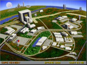
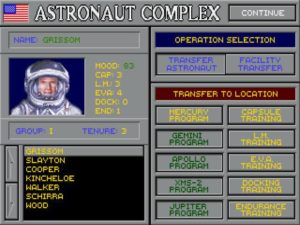
As the game goes on, you build up your program’s facilities — adding things like additional launch pads to let you carry out more launches per turn.
Still, the core of the experience remains what it was when a young Fritz Bronner first started experimenting with the idea of a space-program-management game in the early 1980s: watching with bated breath from mission control as your rockets go up, hoping each successive step will go off without a hitch to get you your next mission milestone. Said milestones encompass everything from launching the first unmanned satellite — the game begins in the year of Sputnik — to the Moon landing itself. Yet, beyond the first few milestones at any rate, they don’t break down into a mere linear progression of steps to be mindlessly walked through. You can combine milestones into one mission; for example, you might make your first flight of eight days or more duration the same one where your astronauts first execute a space walk. And you can also skip some of them entirely, if you’re pressed for time and are willing to forgo the budget boosts with which they tempt you; the aforementioned space walk, for example, isn’t even strictly necessary for a Moon landing.
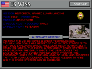
Most importantly, Race into Space lets you implement not only the historical method of getting to the Moon — that of employing a space capsule which orbits the Moon and a separate landing craft to take part of the crew down to the surface — but also a number of other approaches that were discussed at the time, such as an all-in-one-spacecraft approach (this requires developing a monster rocket that makes a Saturn V look like a kid’s toy) or even a reusable space shuttle (this requires both an enormous investment of time and money and a really slow opponent). The variety of alternate histories the game allows is not infinite — more on that momentarily — but is enough to provide for at least a few interesting and even educational playthroughs. If nothing else, you’ll walk away from your failed attempts to rewrite history with a better understanding of why NASA chose the approach they did.
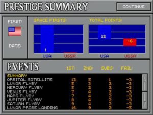
Achieving firsts is extremely important because it increases your program’s prestige — which in turn leads to an increase in its budget. If things go too disastrously wrong, you can even be fired from your post as program director.
But alas, Race into Space soon begins to show those cracks in its foundation which I alluded to earlier, which are partly born from the lack of a clear sense of its own goals as a game. One can imagine at least three abstract approaches fitting into the general framework of “a managerial game about the race to the Moon.” One would be a heavily experiential game, in the spirit of Michael Bate’s aesthetic simulations, de-emphasizing the competitive aspects in favor of taking the player on a journey through those heady early days of the space age. Another would be a replayable game of hardcore strategy, in which the fiction of the Moon race functions as a mere thematic skin for the mechanical underpinnings which quickly become the player’s real focus. And still another would be an open-ended sandbox, a learning tool that lets the player experiment with many different approaches to landing on the Moon and to spaceflight in general.
Race into Space never firmly commits to any one of these approaches, but rather feints toward all of them in various places. The end result is a confusing mishmash of elements that are constantly cutting against one another. The heavy reliance on photographs, video, and sound clips from the period in question seem to push it into the experiential camp, but its board-game-derived mechanics and relatively short play time — a full game usually takes no more than two or three hours to play — pull it in the second direction I outlined. And so the cognitive dissonances start to add up. The video clips lose their appeal when you’re forced to click through the same ones over and over, every time you play, even as it remains debatable whether the mechanics are really compelling enough to make it a game you want to return to again and again under any circumstances; there are really only one or two best paths to follow to get to the Moon, and once you’ve found them there’s little reason to keep playing. Meanwhile the game’s educational sandbox potential, while by no means nonexistent, is also sharply limited. True to its board-game roots, Race into Space doesn’t simulate spaceflight at all beyond rolling dice against an arbitrary set of success-or-failure percentiles. In terms of spaceflight hardware, it lets you mix and match a set of pieces it provides for you, and pour money into each piece’s research to push its reliability percentage up, but it’s nowhere near sophisticated enough to let you develop your own components from scratch. Here too, then, it feints in a promising direction without going far enough to truly satisfy over the long term.
Yet this sense of confusion about what Race into Space actually wants to be constitutes only its second biggest problem. Its biggest problem of all doesn’t require as much design philosophy to explain: the darn thing is just too darn hard. Something is badly off with the math behind this game — something you sense more than you can know. Playing it quickly begins to feel like that memorable montage of exploding and misguided rockets from the film The Right Stuff. You can recover in fairly short order from failed launches in the early phases, when you’re mostly launching unmanned craft, but they turn devastating when they start chewing through your astronaut corps like a wolf in a chicken coop. Failed missions not only destroy the morale of your surviving astronauts, causing them to perform worse, but knock the reliability of the failed component almost all the way back to zero, forcing you to research it up again from scratch. This of course makes no sense in strictly logical terms; in the absence of any new inputs, a defective component should be defective to exactly the same extent on the next flight. Rather than conveying the rounds of investigation and soul-searching that always accompanied a real loss of life in the space program, as it was doubtless intended to do, this mechanic just furthers the impression that the game is out to get you at any cost. The fact that the computer player mysteriously seems to be able to cut more corners than you without killing astronauts by the dozens contributes strongly to the same impression.
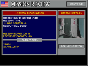
Screens like this one appear distressingly frequently, almost regardless of how thoroughly you research and develop your components. Either the real NASA was incredibly lucky, or something is off inside this game’s numbers. Perhaps a bit of both?
Unkind though it may sound to say, I can’t help but suspect that Race into Space‘s issues in this area reflect a fundamental misunderstanding of statistics on the part of a younger Fritz Bronner — a misunderstanding that somehow never got corrected through all his years of working on his game. A mission does not, as one might initially imagine, have a chance of success equal to the reliability percentage of its dodgiest hardware component. On the contrary: the various components actually undergo reliability checks at various times — often at multiple times — during a mission. Therefore even a stack of components which have all been researched up to a reliability of 95 percent still has a substantial chance of failing in some more or less disastrous way on a more complex mission. And yet you simply don’t have time to laboriously research every component up to its maximum reliability, which for many of them is substantially below 95 percent anyway. You’re in a Moon race, after all. You have to roll the dice. Small wonder that so many players over the years have advocated save-scumming — that dastardly practice of saving and reloading until the dice roll your way — as the only practical way to play. That, or play a two-human-player game, but just click through your “opponent’s” turns without doing anything. Playing that way, you might just be able to get to the Moon before 1977.
So, despite the historical verisimilitude it works so hard to inculcate via its video clips and all the other period-specific touches, Race into Space‘s mechanics lead to a simple game of luck at bottom, and one where the odds are stacked against you at that. There is no opportunity to jump in and make decisions when a mission starts to go wrong — no chance, in other words, to improvise your way through a drama like the Apollo 13 mission. You’re a mere helpless bystander from the moment a mission begins until it ends.
The game’s delight in making its players’ rockets go boom provoked such howls of protests from early purchasers of the original floppy-based release that Interplay soon released a patch to tweak the numbers somewhat — although still nowhere near enough in the opinion of most. The very fact that Bronner felt able to manipulate the numbers in this way, of course, demolished any remaining belief players might have harbored that the numbers had any real historical basis at all. Clearly they were strictly arbitrary. Bronner never did achieve a balance that felt both playable and true to history. And that failure makes it difficult to consider Race into Space as a whole as anything but another interestingly failed attempt at making a game out of real-world space exploration.
Race into Space sold in reasonable numbers for Interplay, but never huge ones, especially after word of just how frustrating it could be got around on the street. Thus none of Bronner’s plans for sequels, which he had publicly discussed at some length in the run-up to release, ever got off the metaphorical launching pad. Strategic Visions soon folded up shop, and Bronner continued his career in Hollywood. He’s never designed another game.
Ironically, the sequels Bronner discussed may actually have made for better games than this one. One idea, for example, would have focused on a manned mission to Mars. Removed from the context of real history, not being surrounded by all those grainy old video clips reminding players of what once was, such a game would have been able to exist entirely on its own terms, and may have wound up feeling more satisfying because of it even if its mechanics had been left largely unchanged.
As it is, though, Race into Space displays that most telling sign of an ingenious game idea with questionable execution: players lining up with ways to fix it. Their efforts were confined to the realms of speculation and hex editors until 2005, when, the rights having reverted to Fritz Bronner, he generously released the game and all of its source code under the General Public License. In the time since, a small community of enthusiasts has continued to port and refine the game on a sporadic basis, but it’s never managed to garner a critical mass of developers or players. Ditto an attempt at a full-fledged commercial revival of the concept by the wargame publisher Slitherine, which arrived complete with the original game’s astronaut mascot in 2014 under the name Buzz Aldrin’s Space Program Manager.
While Race into Space‘s most specific, practical design mistakes aren’t too hard to identify, the more generalized failings of it and its peers in the scanty tradition of contemporary-space-program games do rather prompt one to ask another question: is there something about the subject matter itself that causes it not to work as a satisfying game? I believe I’ve actually done a reasonable job of answering that question already for the case of spaceborne vehicular simulations: as I noted near the beginning of this article, an astronaut in space just doesn’t have enough independent agency in most situations to make for a reasonably realistic simulation that’s also engaging as a game. But what of the other broad category of games I’ve addressed today, the one to which Race into Space belongs: that of space-program managerial games?
For a long, long time after Race into Space, one might have been forgiven for assuming that space-program managers as well were indeed nonstarters as satisfying games. But then, in 2015, a game called Kerbal Space Program came along to prove such naysayers wrong. I don’t usually write about modern games here, but I will briefly outline the premise of this one.
The titular Kerbals are a species of furry green aliens who run a space program of their own on their planet of Kerbin. Despite their cartoony cuteness, said space program itself is simulated with meticulous attention to detail, including all of the particulars of physics and aeronautics which Race into Space so conspicuously lacks. Players with an interest in rocketry or aeronautical engineering can and do lose years of leisure time to it. It may or may not be a game for you, but it is, by any objective definition, an impressive piece of work, far more intrinsically fascinating than any other that I’ve written about today.
And how does it accomplish this feat? One obvious answer is that it knows what it wants to be first and foremost: a sandbox for exploring the practical possibilities and limitations of space travel using the technology of our own recent past, present, and near future. A dedicated modding community has helped the designers to graft on additional layers of competitive strategy and economics for those who want them. Nevertheless, the game’s central delight remains that of creation and discovery. Kerbal Space Program is, in other words, one of the preeminent sandbox games of our time. And it’s completely comfortable with itself in that role, being free of the cognitive dissonances of Race into Space.
This stronger sense of itself is certainly one of the secrets to Kerbal Space Program‘s success. And here’s another: having noted earlier that the proposed non-historical sequels to Race into Space may have led to more compelling games, I’ll now submit Kerbal Space Program as Exhibit One in evidence for that argument. Freed from the weight of all that real human history, existing as it does in a world of cartoon aliens, it can just be a game.
Games can be great tools for exploring other lives and other times, but sometimes you just want to play. History, after all, doesn’t occur for our ludic amusement. Every wargamer knows that the number of unaltered historical battles that lead to good games is very small indeed; most real battles have their outcomes foreordained before they even begin. Perhaps the Apollo program and the Space Shuttle and the International Space Station and all the rest just don’t have the right stuff to make a worthy game. But that’s okay — because it means that, instead of recreating the storied past, we can imagine an exciting future. That goal is at least equally worthy — and, as Kerbal Space Program so thoroughly illustrates, it’s something that a game about space exploration can most definitely do, and do well at that.
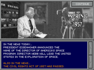
When you play Race into Space as the Americans, each turn begins with a newscast from “Carter Walcrite” — a nod to Walter Cronkite, the television anchorman whose dulcet tones were the voice of the space race for many Americans, whom a number of surveys revealed to be the most trusted person in the United States during the turbulent 1960s. (I’ll leave the comparisons with contemporary attitudes toward journalism as an exercise for the reader…) Although the inclusion of all this loving period detail is wonderful on one level, on another it can be oddly stultifying to your attempts to write your own history.
(Sources: the books The Buzz Aldrin’s Race into Space Companion by Fritz Bronner, Designers & Dragons, Volume 2 by Shannon Appelcline, and BASIC Computer Games by David Ahl; Computer Gaming World of August 1986, March 1987, October 1987, February 1988, January 1992, May 1992, December 1992, and August 1993; Strategy & Tactics 212. Online sources include Leon Baradat’s comprehensive Race into Space site, the article “The Buzz is Gone” at The Escapist, and Steve Stipp’s homepage.
You can download the current open-source edition of Race into Space for free, or purchase its spiritual successor Buzz Aldrin’s Space Program Manager.)


