RSS

Tag Archives: maniac mansion

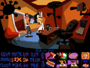
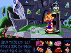
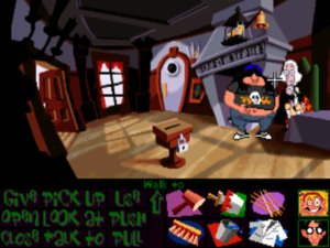
Day of the Tentacle

Although they didn’t know one another at the time, Dave Grossman and Tim Schafer both found themselves at a similar place in life in the summer of 1989: just out of university and uncertain what to do next. Both saw the same unusual advertisement in the newspaper: an advertisement for programmers who could also write. Both applied, both were shocked when they were called out to George Lucas’s beautiful Skywalker Ranch for an interview, and both were fortunate enough to be hired to work for a division of Lucas’s empire that was still known at the time as Lucasfilm Games rather than LucasArts. It was quite a stroke of luck for two innately funny and creative souls who had never before seriously considered applying their talents to game development. “If I hadn’t seen that job listing,” says Schafer, “I would have ended up a database engineer, I think.” Similar in age and background as they were, Grossman and Schafer would remain all but inseparable for the next four years.

They spent the first weeks of that time working intermittently as play testers while they also attended what their new colleagues had dubbed “SCUMM University,” a combination technical boot camp and creative proving ground for potential adventure-game designers. Schafer:

A group of us were thrown into SCUMM University, because all of the LucasArts games used SCUMM [Script Creation Utility for Maniac Mansion]. The four of us were messing around with it, writing our own dialogue. They gave us some old art to work with, so we were just writing goofy stuff and joking around, trying to make each other laugh. I think LucasArts was watching us the whole time, and they picked me and [Grossman] out and said that they liked the writing.

Grossman and Schafer were assigned to work as understudies to Ron Gilbert on the first two Monkey Island games. Here they got to hone their writing and puzzle-making chops, even as they absorbed the LucasArts philosophy of saner, fairer adventure-game design from the man most responsible for codifying and promoting it. In early 1992, shortly after the completion of Monkey Island 2, Gilbert announced that he was quitting LucasArts to start a company of his own specializing in children’s software. He left behind as a parting gift an outline of what would have been his next project had he stayed: the long-awaited, much-asked-for sequel to his very first adventure game, 1987’s Maniac Mansion. The understudies now got to step into the role of the stars; Maniac Mansion: Day of the Tentacle became Grossman and Schafer’s baby.

Times were changing quickly inside LucasArts, keeping pace with changes in the industry around them. After first conceiving of Day of the Tentacle as a floppy-disk-based game without voice acting, LucasArts’s management decided midway through its development that it should be a real technological showpiece in all respects — the first adventure game to be released simultaneously on floppy disk and CD-ROM. Along with X-Wing, the first actual Star Wars game LucasArts had ever been allowed to make, it would be one of their two really big, high-profile releases for 1993.

It was a lot of responsibility to heap on two young pairs of shoulders, but the end result demonstrates that Grossman and Schafer had learned their craft well as understudies. Day of the Tentacle is a spectacularly good adventure game; if not the undisputed cream of the LucasArts crop, it’s certainly in the conversation for the crown of their best single game ever. It achieves what it sets out to do so thoroughly that it can be very difficult for a diligent critic like yours truly to identify any weaknesses at all that don’t sound like the pettiest of nitpicking. The graphics are as good as any ever created under the limitations of VGA; the voice acting is simply superb; the puzzle design is airtight; the writing is sharp and genuinely, consistently laugh-out-loud funny; and the whole thing is polished to a meticulous sheen seldom seen in the games of today, much less those of 1993. It’s a piece of work which makes it hard for a critic to avoid gushing like a moon-eyed fanboy, as Evan Dickens of Adventure Gamers did when that site declared it to be the best game of its genre ever made:

The 1993 CD “talkie” version of Day of the Tentacle is a perfectly flawless adventure, the rarest of rare games, that which did nothing wrong. Nothing. There is no weakness in this game, no sieve. Stop waiting for the “but” because it won’t come. This is the perfect adventure game, the one adventure that brought every aspect of great adventures together and created such an enjoyable masterpiece, it almost seems to transcend the level of computer games.

Of course, there’s no accounting for taste. If you loathe cartoons, perhaps you might not like this game. If you prefer more serious plots or more rigorously cerebral puzzles, perhaps you won’t love it. Still, it’s hard for me to imagine very many people not being charmed by its gloriously cracked introductory movie and wanting to play further.

One of the few negative things I can say about Day of the Tentacle is that it’s more fun than it is truly innovative; it doesn’t break any new formal or thematic ground, being content to work entirely within a template which LucasArts and others had long since established by the point of its release. It remains at the end of the day a slapstick cartoon comedy, always the lowest-hanging fruit for an adventure-game design. Within that template, though, it executes everything so well that it’s almost annoying. This is the cartoon-comedy graphic adventure perfected, serving as the ultimate proof that much of what is sometimes forgiven or dismissed as “just the way adventure games are” is really the product of poor adventure-game design. Most of the problems that so many players consider to be intractable ones for the genre simply don’t exist here. The puzzles are goofy but always soluble, the dreaded sudden deaths and dead ends are nonexistent, and pixel hunts aren’t a problem amidst the game’s bright, clearly delineated scenes.


Day of the Tentacle‘s predecessor Maniac Mansion stood out from other adventure games in 1987, as it still does today, for allowing the player to select her own “party” of three characters, each with his or her own special skills, from a total of seven possibilities. The result was an unusual amount of replayability for the adventure-game genre; every possible combination of characters was capable of solving the game, but each would have to do so in a different way. Although this made Maniac Mansion a much more interesting game than it might otherwise have been, it was all nightmarishly complex for the game’s designer Ron Gilbert to map out. He would later state that only sheer naivete could ever have prompted him to expose himself to such pain — and, indeed, his first statement after finishing the game was, “I’m never doing anything like that again!” He held to that resolution throughout the rest of his time at LucasArts; his 1990 game The Secret of Monkey Island was at least as good as Maniac Mansion, but it owed its goodness to its writing, humor, art direction, and puzzle design, not to a similar formal ambition.

Against Gilbert’s advice, Grossman and Schafer first envisioned Day of the Tentacle operating along the same lines as Maniac Mansion, with another group of a half-dozen or so kids from which to choose a team. But the escalating cost of art and sound in the multimedia age played as big a role in nixing those plans as did the additional design complications; the two soon settled for giving the player control of a fixed group of three characters — which, they didn’t hesitate to point out, was still two more than most adventure games.

As this anecdote illustrates, Day of the Tentacle was never overly concerned with aping the details of its predecessor. Certainly if you play it without having played Maniac Mansion before, you’ll hardly be lost. Grossman:

We really couldn’t imitate the style of the original in the way you normally would with a sequel. Too much time had passed and the state of the art was radically different. We stopped thinking of it as a sequel almost immediately and just did our own thing, slathering our own personalities on top of that of Maniac Mansion.

Grossman and Schafer did reuse those elements of the earlier game that amused them most: the mad scientist Doctor Fred and his equally insane wife and son; the rambling old mansion where they all live; a memorable gag involving a hamster and a microwave; a pair of wise-cracking sentient tentacles, one of whom became the centerpiece of their plot and provided their sequel with its name. But of the kids the player got to control in Maniac Mansion, only Bernard, the über-nerd of the bunch, shows up again here. (Not coincidentally, Bernard had always been the favorite of the original game’s players, perhaps because of his range of unusual technical skills, perhaps because — if we’re being totally honest here — he was the teenage archetype who most resembled the typical young player.) Notably, Dave, the oddly bland default protagonist of the earlier game — he’s the only one you have to take with you, even though he’s the dullest of the lot — doesn’t show up at all here. In the place of Dave and the other kids, Grossman and Schafer augmented Bernard with two new creations of their own: a bro-dude “MegaBreth” roadie named Hoagie and a terminally nervous medical student named Laverne.

The story here does follow up on that of Maniac Mansion, but, once again, it doesn’t really matter whether you realize it or not. Five years after his previous adventure, Bernard receives a plea for help from Green Tentacle, informing him that Purple Tentacle has drunk some toxic sludge, which has instilled in him superhuman (supertentacle?) intelligence and a burning desire to enslave the world. Now, Doctor Fred has decided to deal with the problem by killing both tentacles; this is an obviously problematic plan from Green Tentacle’s perspective. Bernard convinces his two reluctant pals Hoagie and Laverne to head out to Doctor Fred’s mansion and stage an intervention. In attempting to do so, they unwittingly help Purple Tentacle to escape, and he sets out to take over the world. And so, just like that, we’re off to save the world.

It doesn’t take Day of the Tentacle long to introduce its secret puzzling weapon: time travel. Doctor Fred, you see, just happens to have some time machines handy; known as “Chron-O-Johns,” they’re made from outdoor port-a-potties. With his plan for summary tentacle execution having failed, he hatches an alternative plan: to send the kids one day back in time, where they’ll prevent Purple Tentacle from ever drinking the toxic waste in the first place. But the time machines turn out to work about as well as most of Doctor Fred’s inventions. One sends Hoagie back 200 years instead of one day into the past, where he finds Ben Franklin and other Founding Fathers in the midst of writing the American Constitution in what will someday become Doctor Fred’s mansion; another sends Laverne 200 years into the future, when Purple Tentacle has in fact taken over the world and the mansion is serving as the dictatorial palace for him, his tentacle minions, and their human slaves; and the last time machine leaves Bernard right where (when?) he started.

You can switch between the kids at any time, and many of the more elaborate puzzles require you to make changes in one time to pave the way for solving them in another. In some instances, the kids can “flush” objects through time to one another using the Chron-O-John. On other occasions, a kid must find a way to hide objects inside the mansion, to be collected by another kid two or four centuries further down the time stream. “It was really fun to think about the effects of large amounts of time on things like wine bottles and sweaters in dryers,” remembers Grossman, “and to imagine how altering fundamentals of history like the Constitution and the flag could be used to accomplish petty, selfish goals like the acquisition of a vacuum and a tentacle costume.” Of course, just like in Maniac Mansion, it doesn’t pay to question how the kids are communicating their intentions to one another over such gulfs. Just go with it! This is, after all, a cartoon adventure.

Hoagie’s part of the plot coincidentally shares a setting and to some extent a tone with another clever and funny time-traveling adventure game that was released in 1993: Sierra’s Pepper’s Adventures in Time. Both games even feature a cartoon Ben Franklin in important roles. Yet it must be said that LucasArts’s effort is even sharper and funnier, its wit and gameplay polished to a fine sheen, with none of the wooliness that tends to cling even to Sierra’s best games. The inability to die or get yourself irrevocably stuck means that you’re free to just enjoy the ride — free, for instance, to choose the funniest line of dialog in any conversation without hesitation, safe in the knowledge that you’ll be able to do it over again if it all goes horribly wrong. “The player is never, ever punished for doing something funny,” wrote Charles Ardai, the best writer ever to work for Computer Gaming World magazine, in his typically perceptive review of the game. “Doing funny things is the whole point of Day of the Tentacle.”

Although Grossman and Schafer were and are bright, funny guys, their game’s sparkle didn’t come from its designers’ innate brilliance alone. By 1993, LucasArts had claimed Infocom’s old place as makers of the most consistently excellent adventure games you could buy. And as with the Infocom of old, their games’ quality was largely down to a commitment to process, including a willingness to work through the hard, unfun aspects of game development which so many of their peers tended to neglect. Throughout the development of Day of the Tentacle, Grossman and Schafer hosted periodic “pizza orgies,” first for LucasArts’s in-house employees, later for people they quite literally nabbed off the street. They watched these people play their game — always a humbling and useful experience for any designer — and solicited as much feedback thereafter as their guinea pigs could be convinced to give. Which parts of the game were most fun? Which parts were less fun? Which puzzles felt too trivial? Which puzzles felt too hard? They asked their focus groups what they had tried to do that hadn’t worked, and made sure to code in responses to these actions. As Bob Bates, another superb adventure-game designer, put it to me recently, most of what the player tries to do in an adventure game is wrong in terms of advancing her toward victory. A game’s handling of these situations — the elses in the “if, then, else” model of game logic — can make or break it. It can spell the difference between a lively, “juicy” game that feels engaging and interesting and a stubbornly inscrutable blank wall — the sort of game that tells you things don’t work but never tells you why. And of course these else scenarios are a great place to embed subtle hints as to the correct course of action.

Indeed, Grossman and Schafer continually asked themselves the same question in the context of every single puzzle in the game: “How is the player supposed to figure this out?” Grossman:

That [question] has stuck with me as a hallmark of good versus bad adventure-game design. Lots of people design games that make the designer seem clever — or they’re doing it to make themselves feel clever. They’ve forgotten that they’re in the entertainment business. The player should be involved in this thing too. We always went to great lengths to make sure all the information was in there. At these “pizza orgies,” one of the things we were always looking for was, are people getting stuck? And why?

The use of three different characters in three completely different environments also helps the game to avoid that sensation every adventurer dreads: that of being absolutely stuck, unable to jog anything loose because of one stubborn roadblock of a puzzle. If a puzzle stumps you in Day of the Tentacle, there’s almost always another one to go work on instead while the old one is relegated to the brain’s background processing, as it were.

And yet, as in everything, there is a balance to strike here as well: gating in adventure design is an art in itself. Grossman:

We were very focused on making things non-linear, but what we weren’t thinking about was that it’s possible to take that too far. Then you get a paralysis of choice. There’s kind of a sweet spot in the middle between the player being lost because they have too much to do and the player feeling railroaded because you’re telling them what to do. People don’t like either of those extremes very much, but somewhere in the middle, it’s like, “I’ve got enough stuff to think about, and I’m accomplishing some things, and I’ve got some new challenges.” That’s the right spot.

Day of the Tentacle nails this particular sweet spot, as it does so many others. It could never have done so absent extensive testing and — just as importantly — an open-mindedness on the part of its designers about what the testers were saying. It’s due to a lack of these two things that the adventure games of LucasArts’s rivals tended to go off the rails more often than not.

In addition to the superb puzzle design, Day of the Tentacle looks and sounds great — even today, even in its non-remastered version. The graphics are not only technically excellent but also evince an aesthetic sophistication rare in games of this era. The art department was greatly inspired by the classic Warner Bros. cartoons of Chuck Jones — Bugs Bunny, Daffy Duck, Wile. E. Coyote and the Road Runner, etc. One day near the beginning of the project, the entire team made a field trip to sit at the feet of the 80-year-old Jones for a day and absorb some of his wisdom. Warner Bros. cartoons were always more visually skewed, more manic, and more deviously subversive than the straighter, more wholesome reels of Disney, and both the visuals and writing in Day of the Tentacle consciously mimic their style. Just as in the cartoons, there isn’t a straight line or right angle to be seen anywhere in the game. Everything, right down to the font in which text is printed, is bent, leaning, crooked, a fun-house world viewed through a fish-eye lens.
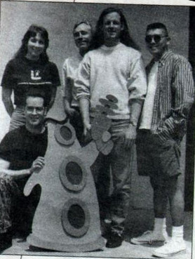
The art team, the unsung heroes of Day of the Tentacle. Standing from left to right are Lela Dowling, Sean Turner, Larry Ahern, and Peter Chan. Kneeling in front are Jesse Clark and Purple Tentacle. One additional artist, Kyle Balda, wasn’t present for this photograph.

Peter Chan, one of the artists on the team, notes that Grossman and Schafer “really trusted us and just let us go to town with what we believed would look best. If anybody on the art team had a good idea or suggestion, it was considered.” Here’s Schafer, speaking in an interview at the time of the game’s release, and obviously somewhat in awe himself at what LucasArts’s animators have come up with:

The kids have all kinds of grimaces and gestures and facial twists and contortions while they’re talking. They smile and their mouths open bigger than their heads and their tongues can hang out. They don’t just stand there. They blink, tap their feet, sigh, and even scratch their butts.

As soon as a character appears, you laugh, and that’s really important. You stare at the main characters for about thirty hours when you play the game, so they’d better be entertaining. With Bernard, as soon as you see him walking around for the first time, before he even says or does anything, you laugh. He walks goofy, he talks goofy, he’s even entertaining when he stands still. Walking Hoagie around is like piloting a blimp through a china shop, and Laverne is fun just to walk around because she seems to have a mind of her own — like she might do something dangerous at any moment.

The sound effects are drawn from the same well of classic animation. LucasArts actually bought many of them from a “major cartoon house,” resulting in all of the good old “boings” and “ka-pows” you might expect.

Tamlynn Barra in the production booth at Studio 222.

And the voice acting too is strikingly good. LucasArts was better equipped than almost any of the other game studios to adapt to the brave new world of CD-ROM audio, thanks to the connections which went along with being a subsidiary of a major film-production company. The actors’ dialog, totaling more than 4500 lines in all, was recorded at Hollywood’s Studio 222 under the supervision of a LucasArts associate producer named Tamlynn Barra. Although still in her twenties at the time, she had previously worked with many stage and video productions. She was thus experienced enough to recognize and find ways to counteract the most fundamental challenge of recording voice work for a computer game: the fact that the actors are expected to voice their lines alone in a production box, with no other actors to play off of and, too often, little notion of the real nature of the scene being voiced. “Getting the actors into character is very difficult,” she acknowledged. “Half the studio [time] is spent cueing up the actor for the scene.” And yet the fact that she knew she had to do this cueing was in a way half the battle. In contrast to many other computer-game productions — even those featuring a stellar cast of experienced actors, such as Interplay’s two contemporaneous Star Trek adventuresDay of the Tentacle has an auditory liveliness to it. It rarely feels as if the actor is merely reading lines off a page in a sound-proof booth, even if that’s exactly what she’s doing in reality.

Jane Jacobs, who voiced the Irish maid found inside the past-tense version of the mansion, performs before the microphone.

Unsurprisingly given LucasArts’s connections, the voice actors, while not household names, were seasoned professionals who arrived with their union cards in hand. The most recognizable among them was Richard Sanders, best known for playing the lovable but inept newscaster Les Nessman on the classic television sitcom WKRP in Cincinnati. During their initial discussions with Barra, Grossman and Schafer had actually suggested Les as the specific role model for Bernard, whereupon Barra made inquiries and found that Sanders was in fact available. He really was a perfect fit for Bernard; the character was “a bit of a stretch” for him, he said with a wink, because he was used to playing “more manly sorts of roles.”

Barra found the other voice talent using a process typical of television and radio productions but not so much of computer games: she sent sketches and descriptions of the characters out to Hollywood agents, who called their clients in to record audition tapes of their impressions. Then she and the rest of the development team chose their favorites. Many another game studio, by contrast, was recruiting its voice talent from its secretarial pool.

All of it led to an end result that feels today like it’s come unstuck from the time which spawned it. Certainly my own feeling upon firing up Day of the Tentacle for the first time in preparation for this article was that I had crossed some threshold into modernity after living in the ancient past for all of the years I’d previously been writing this blog. This impression is undoubtedly aided by the way that LucasArts steered clear of the approaches that generally date a game indelibly to the mid-1990s. Just to name the most obvious dubious trend they managed to resist: there are no digitized images of real actors shoehorned into this game via once cutting-edge, now aesthetically disastrous full-motion-video sequences.

Yet the impression of modernity encompasses more than the game’s audiovisual qualities; it really does encompass the sum total of the experience of playing it. The interface too just works the way a modern player would expect it to; no need to pick up a manual here to figure out how to play, even if you’ve never played an adventure game before. (The sole exception to this rule is the save system, which still requires you to know to press the F5 key in order to access it. On the other hand, keeping it hidden away does allow the game to avoid cluttering up its carefully honed aesthetic impression with a big old disk icon or the like.) Polish is a difficult quality to quantify, but I nevertheless feel fairly confident in calling Day of the Tentacle the most polished computer game made up to its release date of mid-1993. It looks and feels like a professional media production in every way.

The most telling sign in Day of the Tentacle of how far computer gaming had come in a very short time is found on an in-game computer in the present-day mansion. There you’ll find a complete and fully functional version of the original Maniac Mansion in all its blocky, pixelated, bobble-headed glory. This game within a game was inspired by an off-hand comment which Grossman and Schafer had heard Ron Gilbert make during the Monkey Island 2 project: that the entirety of Maniac Mansion had been smaller than some of the individual animation sequences in this, LucasArts’s latest game. Placed in such direct proximity to its progeny, Maniac Mansion did indeed look “downright primitive,” wrote Charles Ardai in his review of Day of the Tentacle. “Only nostalgia or curiosity will permit today’s gamers to suffer through what was once state-of-the-art but is by today’s standards crude.” And yet it had only been six years…

Ardai concluded his review by writing that “it may not hold up for fifty years, like the cartoons that inspired it, but I expect that this game will keep entertaining people for quite some time to come.” And it’s here that I must beg to differ with his otherwise perceptive review. From the perspective of today, halfway already to the game’s 50th anniversary, Day of the Tentacle still holds up perfectly well as one of the finest examples ever of the subtle art of the adventure game. I see no reason why that should change in the next quarter-century and beyond.

(Sources: Computer Gaming World of July 1993 and September 1993; LucasArts’s newsletter The Adventurer of Fall 1992 and Spring 1993; Play of April 2005; Retro Gamer 22 and 81; Video Games and Computer Entertainment of July 1993. Online sources include Dev Game Club podcast 19; Celia Pearce’s conversation with Tim Schafer for Game Studies; 1Up‘s interview with Tim Schafer; The Dig Museum‘s interview with Dave Grossman; Adventure Gamers‘s interview with Dave Grossman.

A remastered version of Day of the Tentacle is available for purchase on GOG.com.)
 

Tags: , , , ,

Ten Great Adventure-Game Puzzles

This blog has become, among other things, an examination of good and bad game-design practices down through the years, particularly within the genre of adventure games. I’ve always tried to take the subject seriously, and have even dared to hope that some of these writings might be of practical use to someone — might help designers of the present or future make better games. But, for reasons that I hope everyone can understand, I’ve spent much more time illuminating negative than positive examples of puzzle design. The fact is, I don’t feel much compunction about spoiling bad puzzles. Spoiling the great puzzles, however, is something I’m always loath to do. I want my readers to have the thrill of tackling those for themselves.

Unfortunately, this leaves the situation rather unbalanced. If you’re a designer looking for tips from the games of the past, it certainly helps to have some positive as well as negative examples to look at. And even if you just read this blog to experience (or re-experience) these old games through the sensibility of your humble author here, you’re missing out if all you ever hear about are the puzzles that don’t work. So, when my reader and supporter Casey Muratori wrote to me to suggest an article that singles out some great puzzles for detailed explication and analysis, it sounded like a fine idea to me.

It’s not overly difficult to generalize what makes for fair or merely “good” puzzles. They should be reasonably soluble by any reasonably intelligent, careful player, without having to fall back on the tedium of brute-forcing them or the pointlessness of playing from a walkthrough. As such, the craft of making merely good or fair puzzles is largely subsumed in lists of what not to do — yes, yet more negative reinforcements! — such as Graham Nelson’s “Bill of Player’s Rights” or Ron Gilbert’s “Why Adventure Games Suck and What We Can Do About It.” It’s much more difficult, however, to explain what makes a brilliant, magical puzzle. In any creative discipline, rules will only get you so far; at some point, codification must make way for the ineffable. Still, we’ll do the best we can today, and see if we can’t tease some design lessons out of ten corking puzzles from adventure games of yore.

Needless to say, there will be spoilers galore in what follows, so if you haven’t played these games, and you think you might ever want to, you should absolutely do so before reading about them here. All ten games are found in my personal Hall of Fame and come with my highest recommendation. As that statement would indicate, I’ve restricted this list to games I’ve already written about, meaning that none of those found here were published after 1992. I’ve split the field evenly between parser-driven text adventures and point-and-click graphic adventures. If you readers enjoy and/or find this article useful, then perhaps it can become a semi-regular series going forward.

And now, with all that said, let’s accentuate the positive for once and relive some classic puzzles that have been delighting their players for decades.


1. Getting past the dragon in Adventure

By Will Crowther and Don Woods, public domain, 1977.

How it works: Deep within the bowels of Colossal Cave, “a huge green dragon bars the way!” Your objective, naturally, is to get past him to explore the area beyond. But how to get him out of the way? If you throw your axe at him, it “bounces harmlessly off the dragon’s thick scales.” If you unleash your fierce bird friend on him, who earlier cleared a similarly troublesome snake out of your way, “the little bird attacks the green dragon, and in an astounding flurry gets burnt to a cinder.” If you simply try to “attack dragon,” the game mocks you: “With what? Your bare hands?” You continue on in this way until, frustrated and thoroughly pissed off, you type, “Yes,” in response to that last rhetorical question. And guess what? It wasn’t a rhetorical question: “Congratulations! You have just vanquished a dragon with your bare hands! (Unbelievable, isn’t it?)”

Why it works: In many ways, this is the most dubious puzzle in this article. (I do know how to make an entrance, don’t I?) It seems safe to say that the vast majority of people who have “solved” it have done so by accident, which is not normally a sign of good puzzle design. Yet classic text adventures especially were largely about exploring the possibility space, seeing what responses you could elicit. The game asks you a question; why not answer it, just to see what it does?

This is an early example of a puzzle that could never have worked absent the parser — absent its approach to interactivity as a conversation between game and player. How could you possibly implement something like this using point and click? I’m afraid a dialog box with a “YES” and “NO” just wouldn’t work. In text, though, the puzzle rewards the player’s sense of whimsy — rewards the player, one might even say, for playing in the right spirit. Interactions like these are the reason some of us continue to love text adventures even in our modern era of photo-realistic graphics and surround sound.

Our puzzling design lesson: A puzzle need not be complicated to delight — need barely be a puzzle at all! — if it’s executed with wit and a certain joie de vivre.


2. Exploring the translucent maze in Enchanter

By Marc Blank and David Lebling, Infocom, 1983

How it works: As you’re exploring the castle of the mad wizard Krill, you come upon a maze of eight identical rooms in the basement. Each location is “a peculiar room, whose cream-colored walls are thin and translucent.” All of the rooms are empty, the whole area seemingly superfluous. How strange.

Elsewhere in the castle, you’ve discovered (or will discover) a few other interesting items. One is an old book containing “The Legend of the Unseen Terror”:

This legend, written in an ancient tongue, goes something like this: At one time a shapeless and formless manifestation of evil was disturbed from millennia of sleep. It was so powerful that it required the combined wisdom of the leading enchanters of that age to conquer it. The legend tells how the enchanters lured the Terror "to a recess deep within the earth" by placing there a powerful spell scroll. When it had reached the scroll, the enchanters trapped it there with a spell that encased it in the living rock. The Terror was so horrible that none would dare speak of it. A comment at the end of the narration indicates that the story is considered to be quite fanciful; no other chronicles of the age mention the Terror in any form.

And you’ve found a map, drawn in pencil. With a start, you realize that it corresponds exactly to the map you’ve drawn of the translucent maze, albeit with an additional, apparently inaccessible room located at point P:

B       J
!      / \
!     /   \
!    /     \
!   K       V
!          / \
!         /   \
!        /     \
R-------M       F
 \     /
  \   /
   \ /
    H       P


Finally, you’ve found a badly worn pencil, with a point and an eraser good for just two uses each.

And so you put the pieces together. The Terror and the “powerful spell scroll” mentioned in the book are encased in the “living rock” of the maze in room P. The pencil creates and removes interconnections between the rooms. You need to get to room P to recover the scroll, which you’ll need to defeat Krill. But you can’t allow the Terror to escape and join forces with Krill. A little experimentation — which also causes you to doom the world to endless darkness a few times, but there’s always the restore command, right? — reveals that the Terror moves one room per turn, just as you do. So, your objective must be to let him out of room P, but trap him in another part of the maze before he can get to room B and freedom. You need to give him a path to freedom to get him moving out of room P, then cut it off.

There are many possible solutions. One is to go to room H, then draw a line connecting P and F. Sensing a path to freedom, the Terror will move to room F, whereupon you erase the connection you just drew. As you do that, the Terror moves to room V, but you erase the line between V and M before he can go further, trapping him once again. Now, you have just enough pencil lead left to draw a line between H and P and recover the scroll.

Why it works: Solving this puzzle comes down to working out how a system functions, then exploiting it to do your bidding. (Small wonder so many hackers have found text adventures so appealing over the years!) First comes the great mental leap of connecting these four disparate elements which you’ve found scattered about: an empty maze, a book of legends, a map, and a pencil. Then, after that great “a-ha!” moment, you get the pleasure of working out the mechanics of the Terror’s movements and finally of putting together your plan and carrying it out. Once you understand how everything works, this final exercise is hardly a brain burner, but it’s nevertheless made much more enjoyable by the environment’s dynamism. You feel encouraged to sit down with your map and work out your unique approach, and the game responds as you expect it to.  This simulational aspect, if you will, stands in marked contrast to so many static adventure-game puzzles of the “use X on Y because the designer wants you to” variety.

It’s worth taking note as well of the technology required to implement something like this. It demands a parser capable of understanding a construction as complicated as “draw line from H to P,” a game engine capable of re-jiggering map connections and rewriting room descriptions on the fly, and even a measure of artificial intelligence, including a path-finding algorithm, for the Terror. Nobody other than Infocom could have implemented a puzzle of this dynamic complexity in 1983. I’ve often noted that the keystone of Infocom’s design genius was their subtly advanced technology in comparison to anyone else working in their field; this puzzle provides fine proof of what I mean by that.

Our puzzling design lesson: Technology isn’t everything in game design, but it isn’t nothing either; the tools you choose to work with have a direct impact on the types of puzzles you can attempt. A corollary to this statement is that the technology which goes into design affordances is often far more subtle than that which allows whiz-bang graphics and sound.


3. Getting the babel fish in The Hitchhiker’s Guide to the Galaxy

By Douglas Adams and Steve Meretzky, Infocom, 1984

How it works: You’ve escaped planet Earth just seconds before its destruction at the hands of a Vogon Constructor Fleet. You’re now in the hold of one of the Vogon ships:

Vogon Hold
This is a squalid room filled with grubby mattresses, unwashed cups, and unidentifiable bits of smelly alien underwear. A door lies to port, and an airlock lies to starboard.

There is a satchel here.

In the corner is a glass case with a switch and a keyboard.
It looks like the glass case contains:
an atomic vector plotter

Along one wall is a tall dispensing machine.

That dispensing machine contains babel fish, which, when inserted into your ear, will allow you to understand the many strange alien languages you’ll soon be encountering. Rather than belabor this famously extended puzzle point by point, I’ll just provide you with a transcript of the steps you need to go through to solve it. In real life, of course, you would spend much more time bumbling and fumbling than does our ideal player here.

>examine machine
The dispenser is tall, has a button at around eye-level, and says "Babel Fish" in large letters. Anything dispensed would probably come out the slot at around knee-level. It bears a small label which reads "Another fine product of the Sirius Cybernetics Corporation."

>i
You have:
no tea
a thing your aunt gave you which you don't know what it is
a towel
It looks like your gown contains:
pocket fluff
The Hitchhiker's Guide
an electronic Sub-Etha signaling device
a loose pile of junk mail
a toothbrush
a flathead screwdriver

>push button
A single babel fish shoots out of the slot. It sails across the room and through a small hole in the wall, just under a metal hook.

>remove gown
Okay, you're no longer wearing your gown.

>hang gown on hook
The gown is now hanging from the hook, covering a tiny hole.

>push button
A single babel fish shoots out of the slot. It sails across the room and hits the dressing gown. The fish slides down the sleeve of the gown and falls to the floor, vanishing through the grating of a hitherto unnoticed drain.

>put towel on drain
The towel completely covers the drain.

>push button
A single babel fish shoots out of the slot. It sails across the room and hits the dressing gown. The fish slides down the sleeve of the gown and falls to the floor, landing on the towel. A split-second later, a tiny cleaning robot whizzes across the floor, grabs the fish, and continues its breakneck pace toward a tiny robot panel at the base of the wall. The robot zips through the panel, and is gone.

>cover panel with satchel
Okay, the satchel is lying on its side in front of the tiny robot panel.

>push button
A single babel fish shoots out of the slot. It sails across the room and hits the dressing gown. The fish slides down the sleeve of the gown and falls to the floor, landing on the towel. A split-second later, a tiny cleaning robot whizzes across the floor, grabs the fish, and continues its breakneck pace toward a tiny robot panel at the base of the wall. The robot plows into the satchel, sending the babel fish flying through the air in a graceful arc. A small upper-half-of-the-room cleaning robot flies into the room, catches the babel fish (which is all the flying junk it can find), and exits.

>put mail on satchel
Okay, the loose pile of junk mail is now sitting on the satchel.

>push button
A single babel fish shoots out of the slot. It sails across the room and hits the dressing gown. The fish slides down the sleeve of the gown and falls to the floor, landing on the towel. A split-second later, a tiny cleaning robot whizzes across the floor, grabs the fish, and continues its breakneck pace toward a tiny robot panel at the base of the wall. The robot plows into the satchel, sending the babel fish flying through the air in a graceful arc surrounded by a cloud of junk mail. Another robot flies in and begins madly collecting the cluttered plume of mail. The babel fish continues its flight, landing with a loud "squish" in your ear.

Why it works: This is easily the most famous text-adventure puzzle of all time, one whose reputation for difficulty was so extreme in the 1980s that Infocom took to selling tee-shirts emblazoned with “I got the babel fish!” In truth, though, its reputation is rather exaggerated. There are other puzzles in Hitchhiker’s which rely heavily — perhaps a little too heavily — on the ability to think with the skewed logic of Douglas Adams. This puzzle, however, really isn’t one of them. It’s certainly convoluted and time-consuming, but it’s also both logical in a non-skewed sense and thoroughly satisfying to work out step by step. From the standpoint of the modern player, its only really objectionable aspects are the facts that you can easily arrive at it without having everything you need to solve it, and that you have a limited amount of tries — i.e., a limited number of spare babel fish — at your disposal. But if you have made sure to pick up everything that isn’t nailed down in the early part of the game, and if you use the save system wisely, there’s no reason you can’t solve this on your own and have immense fun doing so. It’s simply a matter of saving at each stage and experimenting to find out how to progress further. The fact that it can be comfortably solved in stages makes it far less infuriating than it might otherwise be. You always feel like you’re making progress — coming closer, step by step, to the ultimate solution. There’s something of a life lesson here: most big problems can be solved by first breaking them down into smaller problems and solving those one at a time.

Importantly, this puzzle is also funny, fitting in perfectly with Douglas Adams’s comedic conception of a universe not out so much to swat you dead all at once as to slowly annoy you to death with a thousand little passive-aggressive cuts.

Our puzzling design lesson: Too many adventure-game designers think that making a comedy gives them a blank check to indulge in moon logic when it comes to their puzzles. The babel fish illustrates that a puzzle can be both funny and fair.


4. Using the T-removing machine in Leather Goddesses of Phobos

By Steve Meretzky, Infocom, 1986

How it works: While exploring this ribald science-fiction comedy, Infocom’s last big hit, you come upon a salesman who wants to trade you something for the “odd machine” he carries. When you finally find the item he’s looking for and take possession of the machine, he gives you only the most cryptic description of its function: “‘It’s a TEE remover,’ he explains. You ponder what it removes — tea stains, hall T-intersections — even TV star Mr. T crosses your mind, until you recall that it’s only 1936.”

Experimentation will eventually reveal that this “tee-remover” is actually a T-remover. If you put something inside it and turn it on, said something becomes itself minus all of the letter Ts in its name. You need to use the machine to solve one clever and rather hilarious puzzle, turning a jar of untangling cream into unangling cream, thereby to save poor King Mitre’s daughter from a tragic fate:

In the diseased version of the legend commonly transmitted on Earth, Mitre is called Midas. The King was granted his wish that everything he touched would turn to gold. His greed caught up with him when he transformed even his own daughter into gold.

King Mitre's wish was, in fact, that everything he touched would turn to forty-five degree angles. No one has ever explained this strange wish; the most likely hypothesis is a sexual fetish. In any case, the tale has a similar climax, with Mitre turning his own daughter into a forty-five degree angle.

This is pretty funny in itself, but the greatest fun offered by the T-remover is in all the other places you can use it: on a tray (“It looks a little like Ray whatsisname from second grade.”); on a rabbit (“A bearded rabbi wearing a prayer shawl leaps out of the machine, recites a Torah blessing, and dashes off in search of a minyan.”); a raft (“It sinks like a stone. I guess a raf doesn’t float nearly as well as a raft.”); a pair of cotton balls (“Let’s just say that some poor male raccoon is speaking in a particularly high-pitched voice.”).

Why it works: The T-removing machine is sometimes held up as another puzzle concept that couldn’t possibly work in any other medium than text. I’m not sure if that’s literally true — later in this very list we’ll see another funny wordplay-based puzzle that does work inside a graphic adventure — but it certainly is true that no responsible producer would agree to pay for all the work required to implement all those one-off, just-for-fun responses in graphics. In text, though, they’re just a matter of an additional sentence or two.

Adventure designer Bob Bates likes to point out that the vast majority of what the player attempts to do will always be wrong; that’s just the nature of the endeavor. When she does one of these wrong things, the designer needs to do as much as possible to entertain her. A later generation would dub this the “juicy” approach to game design: rewarding curiosity and creativity, even if none of it contributes directly to the prosaic task of finishing the game. Steve Meretzky had a great puzzle already with the T-remover, King Mitre, and the untangling/unangling cream. He could have left it at that by coming up with excuses for why you couldn’t put other things in the T-remover. Instead he stayed faithful to his invention and implemented many alternatives alongside the “correct” use of the machine.

Our puzzling design lesson: Don’t ignore the “else” in the “if, then, else” of an adventure game. It makes your game feel like a living world rather than an arbitrary collection of logic gates to be navigated, and shows that you respect your player’s creativity.


5. Escaping the pirate Lafond in Plundered Hearts

By Amy Briggs, Infocom, 1987

How it works: Would I be engaging in too much gender stereotyping if I noted that the puzzles in the only Infocom game to be written by a woman often deal in social intelligence rather than abstract logic? This is another fairly lengthy sequence, so it’s best if I once again just show you what happens if you do everything correctly.

"Welcome, ma petite." Lafond bows you in.

Lafond's Bedroom
Lafond's bedroom shows all the outpourings of his megalomania. Royal hues of
purple and gold weigh down the hangings on the bed and the eastward window, as if trying to smother the moonbeam shining in.

Lafond is leering, lip curled.

A lace-covered table crouches beside a wing-backed chair in one corner. Sitting on the table is a green goblet, a blue goblet and a flagon.

"Have some wine." Lafond pours wine into two glasses, giving a blue one to you. "Drink this down. We have a long night ahead of us." He drains his own.

>drink wine
You empty the blue goblet of wine.

"Good girl," he says, "Let's see more cooperation of this sort."

Suddenly, the door slams open. It is Jamison, coatless, sword bared, his shirt ripped. "Thank God I am not too late. Leave, darling, before I skewer this dog to his bedposts," he cries. The scar on his cheek gleams coldly.

With a yell, Crulley and the butler jump out of the darkness behind him. Nicholas struggles, but soon lies unconscious on the floor.

"Take him to the dungeon," Lafond says, setting down his glass. "You, butler, stay nearby. I do not wish to be disturbed again.

"Now that we are rid of that intrusion, cherie, I will change into something more comfortable. Pour me more wine." He crosses to the wardrobe removing his coat and vest, turned slightly away from you.

>pour wine into green goblet
You fill the green goblet with wine.

"In private, call me Jean, or whatever endearment you choose, once I have approved it." Lafond is looking into the wardrobe.

>squeeze bottle into green goblet
You squeeze three colorless drops into the green goblet. You sense Lafond
hesitate, then continue primping.

The butler enters, laying a silver tray of cold chicken on the table. "The kitchen wench has gone, your grace. I took the liberty of fetching these
myself." He bows and leaves the room.

"Sprinkle some spices on the fowl, ma petite," Lafond says, donning a long brocade robe, his back to you. "They are hot, but delicious."

>get spices
You take a pinch of spices between your thumb and forefinger.

"Tsk. The cook has gone too far. She shall be 'leaving us' tomorrow." Lafond adjusts the lace at his neck.

>put spices on chicken
You sprinkle some spices on a wing and nibble it. The peppery heat hits you like a wave, leaving you gasping, eyes watering.

Lafond strolls to the table smiling slyly. "But you haven't finished pouring the wine." He tops off both glasses. "Which glass was mine? I seem to have forgotten." He points at the green goblet and smiles in a way that does not grant you confidence. "Is this it?"

>no
You shake your head, teeth clenched.

"Ah yes, of course." Lafond obligingly takes the blue goblet.

He inhales deeply of the bouquet of his wine, then turns to you. "You must think me very naive to fall for such a trick. I saw you pour something into one of these glasses -- although I cannot smell it." He switches goblets, setting the blue goblet into your nerveless grasp and taking up the other, smiling evilly. "Now you will drink from the cup intended for me."

>drink from blue goblet
You empty the blue goblet of wine.

"Good girl," he says. Lafond takes the leather bottle and drops it out the window. "You shall not need this. You may suffer no headaches in my employ."

He lifts his glass to drink, but stops. "Your father, for all his idiotic meddling in other people's business, is not a fool. I doubt you are, either." He calls in the butler, ordering him to empty the green goblet. The man reports no odd taste and returns to his post.

>get spices
You take a pinch of spices between your thumb and forefinger.

Lafond draws near, whispering indecencies. He caresses your lily white neck, his fingers ice-cold despite the tropic heat.

>throw spices at lafond
You blow the spices off your fingertips, directly into Lafond's face. He
sneezes, his eyes watering from the heat of the peppers. Reaching blindly for some wine, he instead upsets the table, shattering a glass. Lafond stumbles cursing out of the room, in search of relief.

>s
You run out -- into the butler's barrel chest and leering grin. You return to the bedroom, the butler following. "The governor said you were not to leave this room."

>z
Time passes...

The butler seems to be having some problems stifling a yawn.

>z
Time passes...


The butler's eyes are getting heavier.

>z
Time passes...

The butler collapses, head back, snoring loudly.

>s
You creep over the prostrate butler.

Why it works: Plundered Hearts is an unusually driven text adventure, in which the plucky heroine you play is constantly forced to improvise her way around the dangers that come at her from every direction. In that spirit, one can almost imagine a player bluffing her way through this puzzle on the first try by thinking on her feet and using her social intuition. Most probably won’t, mark you, but it’s conceivable, and that’s what makes it such a good fit with the game that hosts it. This death-defying tale doesn’t have time to slow down for complicated mechanical puzzles. This puzzle, on the other hand, fits perfectly with the kind of high-wire adventure story — adventure story in the classic sense — which this game wants to be.

Our puzzling design lesson: Do-or-die choke point should be used sparingly, but can serve a plot-heavy game well as occasional, exciting punctuations. Just make sure that they feel inseparable from the narrative unfolding around the player — not, as is the case with so many adventure-game puzzles, like the arbitrary thing the player has to do so that the game will feed her the next bit of story.


6. Getting into Weird Ed’s room in Maniac Mansion

By Ron Gilbert, Lucasfilm Games, 1987

How it works: In Ron Gilbert’s first adventure game, you control not one but three characters, a trio of teenage stereotypes who enter the creepy mansion of Dr. Fred one hot summer night. Each has a unique skill set, and each can move about the grounds independently. Far from being just a gimmick, this has a huge effect on the nature of the game’s puzzles. Instead of confining yourself to one room at a time, as in most adventure games, your thinking has to span the environment; you must coordinate the actions of characters located far apart. Couple this with real-time gameplay and an unusually responsive and dynamic environment, and the whole game starts to feel wonderfully amenable to player creativity, full of emergent possibilities.

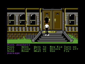
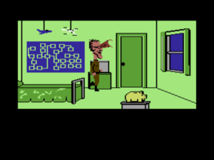
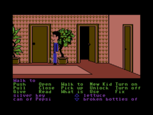
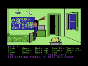
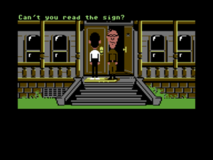
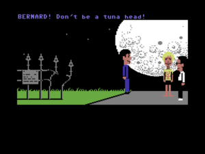
In this example of a Maniac Mansion puzzle, you need to search the bedroom of Weird Ed, the son of the mad scientist Fred and his bonkers wife Edna. If you enter while he’s in there, he’ll march you off to the house’s dungeon. Thus you have to find a way to get rid of him. In the sequence below, we’ve placed the kid named Dave in the room adjacent to Ed’s. Meanwhile Bernard is on the house’s front porch. (This being a comedy game, we won’t question how these two are actually communicating with each other.)
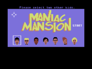
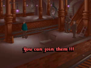
Dave is poised to spring into action in the room next to Weird Ed’s.

Bernard rings the doorbell.

Ed heads off to answer the door.

Dave makes his move as soon as Ed clears the area.

Dave searches Ed’s room.

But he has to hurry because Ed, after telling off Bernard, will return to his room.

Why it works: As graphics fidelity increases in an adventure game, the possibility space tends to decrease. Graphics are, after all, expensive to create, and beautiful high-resolution graphics all the more expensive. By the late 1990s, the twilight of the traditional adventure game as more than a niche interest among gamers, the graphics would be very beautiful indeed, but the interactivity would often be distressingly arbitrary, with little to no implementation of anything beyond the One True Path through the game.

Maniac Mansion, by contrast, makes a strong argument for the value of primitive graphics. This game that was originally designed for the 8-bit Commodore 64 uses its crude bobble-headed imagery in the service of the most flexible and player-responsive adventure design Lucasfilm Games would ever publish over a long and storied history in graphic adventures. Situations like the one shown above feel like just that — situations with flexible solutions — rather than set-piece puzzles. You might never have to do any of the above if you take a different approach. (You could, for instance, find a way to befriend Weird Ed instead of tricking him…) The whole environmental simulation — and a simulation really is what it feels like — is of remarkable complexity, especially considering the primitive hardware on which it was implemented.
Our puzzling design lesson: Try thinking holistically instead of in terms of set-piece roadblocks, and try thinking of your game world as a responsive simulated environment for the player to wander in instead of as a mere container for your puzzles and story. You might be surprised at what’s possible, and your players might even discover emergent solutions to their problems which you never thought of.


7. Getting the healer’s ring back in Hero’s Quest (later known as Quest for Glory I)

By Lori Ann and Corey Cole, Sierra, 1989

How it works: Hero’s Quest is another game which strains against the constrained norms in adventure-game design. Here you create and develop a character over the course of the game, CRPG-style. His statistics largely define what he can do, but your own choices define how those statistics develop. This symbiosis results in an experience which is truly yours. Virtually every puzzle in the game admits of multiple approaches, only some (or none) of which may be made possible by your character’s current abilities. The healer’s lost ring is a fine example of how this works in practice.

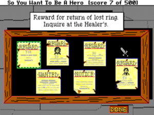
The bulletin board at the Guild of Adventurers tells you about the missing ring.

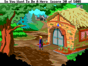
You go to inquire with the healer. Outside her hut is a tree, and on the tree is the nest of a sort of flying lizard.

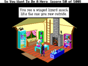
Hmm, there’s another of these flying lizards inside.

I’ll reveal now that the ring is in the nest. But how to get at it? The answer will depend on the kind of character you’ve built up. If your “throwing” skill is sufficient, you can throw rocks at the nest to drive off the lizard and knock it off the tree. If your “magic” skill is sufficient and you’ve bought the “fetch” spell, you can cast it to bring the nest to you. Or, if your “climb” skill is sufficient, you can climb the tree. If you can’t yet manage any of this, you can continue to develop your character and come back later. Or not: the puzzle is completely optional. The healer rewards you only with six extra gold pieces and two healing potions, both of which you can earn through other means if necessary.

Why it works: This puzzle would be somewhat problematic if solving it was required to finish the game. Although several lateral nudges are provided that the ring is in the nest, it strikes me as dubious to absolutely demand that the player put all the pieces together — or, for that matter, to even demand that the player notice the nest, which is sitting there rather inconspicuously in the tree branch. Because solving the puzzle isn’t an absolute requirement, however, it becomes just another fun little thing to discover in a game that’s full of such generosity. Some players will notice the nest and become suspicious, and some won’t. Some players will find a way to see what’s in it, and some won’t. And those that do find a way will do so using disparate methods at different points in the game. Even more so than Maniac Mansion, Hero’s Quest gives you the flexibility to make your own story out of its raw materials. No two players will come away with quite the same memories.

This melding of CRPG mechanics with adventure-game elements is still an underexplored area in a genre which has tended to become less rather than more formally ambitious as it’s aged. (See also Origin’s brief-lived Worlds of Ultima series for an example of games which approach the question from the other direction — adding adventure-game elements to the CRPG rather than the other way around — with equally worthy results.) Anything adventures can do to break out of the static state-machine paradigm in favor of flexibility and dynamism is generally worth doing. It can be the difference between a dead museum exhibition and a living world.

Our puzzling design lesson: You can get away with pushing the boundaries of fairness in optional puzzles, which you can use to reward the hardcore without alienating your more casual players. (Also, go read Maniac Mansion‘s design lesson one more time.)


8. Blunting the smith’s sword in Loom

By Brian Moriarty, Lucasfilm Games, 1990

How it works: Games like Hero’s Quest succeed by being generously expansive, while others, like Loom, succeed by boiling themselves down to a bare essence. To accompany its simple storyline, which has the rarefied sparseness of allegory, Loom eliminates most of what we expect out of an adventure game. Bobbin Threadbare, the hero of the piece, can carry exactly one object with him: a “distaff,” which he can use to “spin” a variety of magical “drafts” out of notes by tapping them out on an onscreen musical staff. Gameplay revolves almost entirely around discovering new drafts and using them to solve puzzles.

The ancestor of Loom‘s drafts is the spell book the player added to in Infocom’s Enchanter series. There as well you cast spells to solve puzzles — and, in keeping with the “juicy” approach, also got to enjoy many amusing effects when you cast them in the wrong places. But, as we saw in our earlier explication of one of Enchanter‘s puzzles, you can’t always rely on your spell book in that game. In Loom, on the other hand, your distaff and your Book of Patterns — i.e., drafts — is all you have. And yet there’s a lot you can do with them, as the following will illustrate.

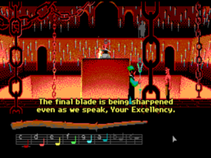
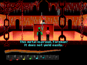
Bobbin eavesdrops from the gallery as Bishop Mandible discusses his plan for world domination with one of his lackeys. His chief smith is just sharpening the last of the swords that will be required. Bobbin has a pattern for “sharpen.” That’s obviously not what we want to do here, but maybe he could cast it in reverse…

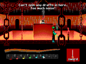
Unfortunately, he can’t spin drafts as long as the smith is beating away at the sword.

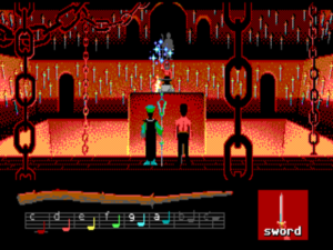
Luckily, the smith pauses from time to time to show off his handwork.

Why it works: Loom‘s minimalist mechanics might seem to allow little scope for clever puzzle design. Yet, as this puzzle indicates, such isn’t the case at all. Indeed, there’s a certain interactive magic, found by no means only in adventures games, to the re-purposing of simple mechanics in clever new ways. Loom isn’t a difficult game, but it isn’t entirely trivial either. When the flash of inspiration comes that a draft might be cast backward, it’s as thrilling as the thrills that accompany any other puzzle on this list.

It’s also important to note the spirit of this puzzle, the way it’s of a piece with the mythic dignity of the game as a whole. One can’t help but be reminded of that famous passage from the Book of Isaiah: “And they shall beat their swords into ploughshares, and their spears into pruning hooks: nation shall not lift up sword against nation, neither shall they learn war any more.”

Our puzzling design lesson: Wonderful games can be and have been built around a single mechanic. If you’ve got a great one, don’t hesitate to milk it for all it’s worth. Also: puzzles can illuminate — or undermine — a game’s theme as well as any other of its aspects can.


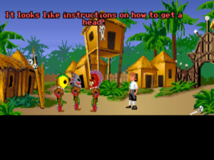
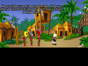
9. Teaching the cannibals how to get a head in The Secret of Monkey Island

By Ron Gilbert, Lucasfilm Games, 1990

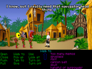
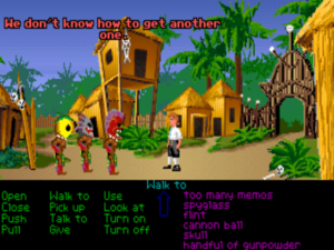
How it works: For many of us, the first Monkey Island game is the Platonic ideal of a comedic graphic adventure: consistently inventive, painstakingly fair, endlessly good-natured, and really, truly funny. Given this, I could have chosen to feature any of a dozen or more of its puzzles here. But what I’ve chosen — yes, even over the beloved insult sword-fighting — is something that still makes me smile every time I think about it today, a quarter-century after I first played this game. Just how does a young and ambitious, up-and-coming sort of cannibal get a head?

Hapless hero Guybrush Threepwood needs the human head that the friendly local cannibals are carrying around with them.

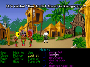
Wait! He’s been carrying a certain leaflet around for quite some time now.

What’s the saying? “If you teach a man to fish…”

Why it works: One might call this the graphic-adventure equivalent of the text-adventure puzzle that opened this list. More than that, though, this puzzle is pure Ron Gilbert at his best: dumb but smart, unpretentious and unaffected, effortlessly likable. When you look through your inventory, trying to figure out where you’re going to find a head on this accursed island, and come upon that useless old leaflet you’ve been toting around all this time, you can’t help but laugh out loud.

Our puzzling design lesson: A comedic adventure game should be, to state the obvious, funny. And the comedy should live as much in the puzzles as anywhere else.


10. Tracking down the pendant in The Lost Files of Sherlock Holmes

By Eric Lindstrom and R.J. Berg, Electronic Arts, 1992

How it works: This interactive mystery, one of if not the finest game ever to feature Arthur Conan Doyle’s legendary detective, is notable for its relative disinterest in the physical puzzles that are the typical adventure game’s stock in trade. Instead it has you collecting more abstract clues about means, motive, and opportunity, and piecing them together to reveal the complicated murder plot at the heart of the story.

It all begins when Holmes and Watson get called to the scene of the murder of an actress named Sarah Carroway: a dark alley just outside the Regency Theatre, where she was a star performer. Was it a mugging gone bad? Was it the work of Jack the Ripper? Or was it something else? A mysterious pendant becomes one of the keys to the case…

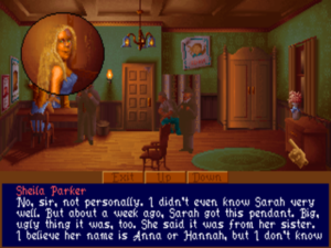
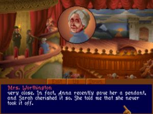
We first learn about Sarah Carroway’s odd pendent when we interview her understudy at the theater. It was a recent gift from Sarah’s sister, and she had always worn it since receiving it. Yet it’s missing from her body.

We find the workplace of Sarah’s sister Anna. She’s also in show biz, a singer at the Chancery Opera House. The woman who shared a box with Sarah during Anna’s performances confirms the understudy’s story about the pendant. More ominously, we learn that Anna too has disappeared.

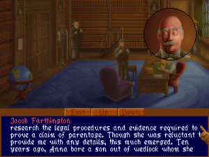
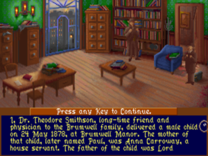
We track down Anna’s solicitor and surrogate father-figure, a kindly old chap named Jacob Farthington. He tells us that Anna bore a child to one Lord Brumwell some years ago, but was forced to give him up to Brumwell without revealing his parentage. Now, she’s been trying to assert her rights as the boy’s mother.

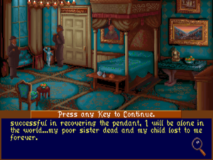
More sleuthing and a little bit of sneaking leads us at last to Anna’s bedroom. There we find her diary. It states that she’s hired a detective following Sarah’s murder — not, regrettably, Sherlock Holmes — to find out what became of the pendant. It seems that it contained something unbelievably important. “A humble sheet of foolscap, depending on what’s written upon it, can be more precious than diamonds,” muses Holmes.

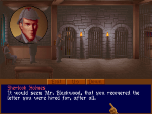
Yet more detecting on our part reveals that a rather dense blackguard named Blackwood pawned the pendant. Soon he confesses to Sarah’s murder: “I got overexcited. I sliced her to make her stop screaming.” He admits that he was hired to recover a letter by any means necessary by “an old gent, very high tone,” but he doesn’t know his name. (Lord Brumwell, perhaps?) It seems he killed the wrong Carroway — Anna rather than Sarah should have been his target — but blundered onto just the thing he was sent to recover anyway. But then, having no idea what the pendant contained, he pawned it to make a little extra dough out of the affair. Stupid is as stupid does…

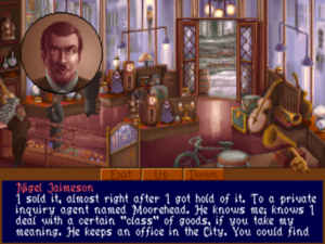
So where is the pendant — and the proof of parentage it must have contained — now? We visit the pawn shop where Blackwood unloaded it. The owner tells us that it was bought by an “inquiry agent” named Moorehead. Wait… there’s a Moorehead & Gardner Detective Agency listed in the directory. This must be the detective Anna hired! Unfortunately, we are the second to ask about the purchaser of the pendant. The first was a bit of “rough trade” named Robert Hunt.

We’re too late. Hunt has already killed Gardner, and we find him just as he’s pushing Moorehead in front of a train. We manage to nick Hunt after the deed is done, but he refuses to say who hired him or why — not that we don’t have a pretty strong suspicion by this point.

Luckily for our case, neither Gardner nor Moorehead had the pendant on him at the time of his death. We find it at last in their safe. Inside the pendant, as we suspected, is definitive proof of the boy’s parentage. Now we must pay an urgent visit to Lord Brumwell. Is Anna still alive, or has she already met the same fate as her sister? Will Brumwell go peacefully? We’ll have to play further to find out…

Why it works: Even most allegedly “serious” interactive mysteries are weirdly bifurcated affairs. The game pretty much solves the mystery for you as you jump through a bunch of unrelated hoops in the form of arbitrary object-oriented puzzles that often aren’t all that far removed from the comedic likes of Monkey Island. Even some pretty good Sherlock Holmes games, like Infocom’s Sherlock: The Riddle of the Crown Jewels, wind up falling into this trap partially or entirely. Yet The Lost Files of Sherlock Holmes stands out for the way it really does ask you to think like a detective, making connections across its considerable length and breadth. While you could, I suppose, brute-force your way through even the multifaceted puzzle above by visiting all of the locations and showing everything to every suspect, it’s so much more satisfying to go back through Watson’s journal, to muse over what you’ve discovered so far, and to make these connections yourself. Lost Files refuses to take the easy way out, choosing instead to take your role as the great detective seriously. For that, it can only be applauded.

Our puzzling design lesson: Graham Nelson once indelibly described an adventure game as “a narrative at war with a crossword.” I would say in response that it really need not be that way. A game need not be a story with puzzles grafted on; the two can harmonize. If you’re making an interactive mystery, in other words, don’t force your player to fiddle with sliding blocks while the plot rolls along without any other sort of input from her; let your player actually, you know, solve a mystery.


(Once again, my thanks to Casey Muratori for suggesting this article. And thank you to Mike Taylor and Alex Freeman for suggesting some of the featured puzzles.)


Tags: , , , , , , , , , , , ,

A New Force in Games, Part 3: SCUMM

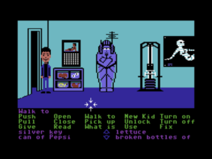
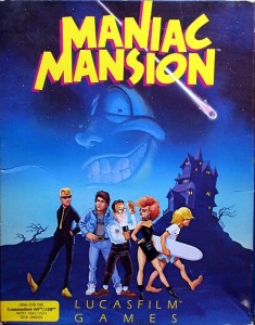
Maniac Mansion

As part of a general rearranging of the deck chairs at Lucasfilm in late 1985, the Games Group got moved from their nondescript offices in San Rafael to nearby Skywalker Ranch, the “filmmaker’s retreat” at the very heart of George Lucas’s empire. They were housed in an ornate structure of Victorian brick called the Stable House, with crackling fireplaces in almost every room. Later, old-timers would tell newcomers stories of the Games Group’s time at Skywalker Ranch, which would last for just a few years, like legends from before the Fall: catching a sneak preview of a new David Lynch film in the company of Lynch himself in the Ranch’s beautiful 300-seat art-deco theater; hanging out on a regular basis with Steven Spielberg, who wanted to play everything the Games Group had in development every time he stopped by, sometimes for hours at a stretch; playing softball on the Ranch’s gorgeously manicured field with rock star Huey Lewis; hiking up to the observatory after a long day at the office to do another sort of stargazing; eating gourmet lunches every day at the Ranch’s restaurant for $5 a pop. They might not have been able to make Star Wars games, but they could surround themselves with its trappings: when first moving in, they were given a chance to rummage through an enormous warehouse full of old props and concept art for office decorations. It’s questionable whether any other game studio, ever, has worked in quite such a nerd Elysium.

Continuing to blow through Skywalker Ranch as they had San Rafael, however, were winds of change that had been steadily altering Lucasfilm’s expectations of their little Games Group. As the middle years of the decade wore on, the company was becoming a very different place from what it had been during the free-and-easy early 1980s, when money seemed to flow like water. Lucasfilm’s financial outlook had changed almost overnight in 1983 when, even as Return of the Jedi was doing the expected huge numbers in theaters, George Lucas announced that he and his wife Marcia were getting a divorce. An accomplished film editor in her own right, Marcia had been a huge contributor to the Star Wars movies, especially the first, for which she’d won an Oscar — something her ex-husband has never managed — for her editing work. Now her divorce settlement would cost Lucasfilm big, to the tune of $50 to $100 million (precise estimates vary). Lucasfilm’s financial advisers were able to convince her to take her settlement as a series of payments spread over years rather than the lump sum the initial agreement demanded, but those payments nevertheless put a tremendous drain on the company’s finances.

And soon the other side of the ledger, that of incoming earnings, also began to diminish. George Lucas had long since declared that Star Wars was to be but a single trilogy of films, that there would be no more after Return of the Jedi. The lack of new films inevitably meant not just the loss of box-office receipts but also diminished sales of the toys and other merchandise that had always been the franchise’s biggest cash cow. Meanwhile the Indiana Jones series, which had turned into almost as successful a franchise as Star Wars, fell into a five-year hiatus after 1984’s Indiana Jones and the Temple of Doom. Filling that gap for Lucasfilm were a series of middling disappointments — Labyrinth, Tucker: The Man and His Dream, Willow, some almost perversely low-stakes Star Wars television programs featuring R2-D2 and C-3PO and, God help us, the Ewoks — and at least one outright bomb big enough to have become a punchline for the ages in Howard the Duck. It seemed that Lucas, who could do no wrong in the eleven years between American Graffiti and Indiana Jones and the Temple of Doom, had suddenly seen his Midas Touch desert him.

Never much of a manager and certainly not a numbers guy, Lucas hired a no-nonsense sort named Doug Norby to become Lucasfilm’s president in 1985. “Do what you have to do,” he told him, “and I’m just going to stay out of it.” Norby declared that there needed to be a culture change. Every division would now be expected to justify their existence by earning money for the company rather than costing it money. Those who couldn’t see a way to do so would get the axe. Ditto individual personnel within departments that had become too bloated; Norby orchestrated the first significant wave of layoffs ever to sweep over Lucasfilm. As the conflict-averse Lucas had likely intended, Norby was blamed for all of the pain and chaos, became for some time the most hated name at Lucasfilm, while Lucas himself was largely given a pass, as if he somehow didn’t know about the changes underway in his own namesake company.

As part of the restructuring, it was decided that Lucasfilm would now engage in only two specific lines of business: providing production services to the film industry (Industrial Light and Magic, Skywalker Sound) and making mass-market entertainments. The old Computer Graphics Group that had awkwardly spawned the Games Group still hadn’t really proved themselves to belong in the former category, while the Games Group, at least if you squinted just right, pretty much did belong in the latter. Thus, while the Games Group got to remain at Lucasfilm, the Graphics Group in February of 1986 was spun off to a collection of investors that included many of their own current personnel as well as, as ringmaster of the whole proceeding, Steve Jobs, recently exiled from Apple. The old Graphics Group was now known as Pixar, selling a $135,000 graphics workstation which they had developed during their years with Lucasfilm. Most of the rest of Lucasfilm’s computer-oriented research was either cancelled outright or similarly packaged up and sold off. (Most notably, Lucasfim’s EditDroid digital-editing project became an independent company called Droid Works.)

Soon the old Games Group represented the only significant hacker presence left at Lucasfilm. It was during this period of colossal change that George Lucas took rare personal notice of Games for long enough to deliver his most oft-quoted piece of advice to Steve Arnold: “Stay small, be the best, don’t lose any money.” This commandment has often been taken to represent a sort of creative carte blanche for Arnold and his charges. Taken in the context in which it was uttered, however, it’s probably better seen as a warning. The Games Group was free to continue to trade on the Lucasfilm name and enjoy their gourmet lunches at the company cafeteria, but they’d have to start paying their own way from here on. Should they fail at that, their rope would not be a long one, for Lucas had little personal investment in their work.

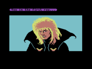
Given this situation, when Lucasfilm’s brass decided to throw the Games Group a bone in the form of an actual piece of intellectual property with which to work Arnold certainly didn’t turn up his nose at the prospect. It wasn’t Star Wars or even Indiana Jones, but it was a much-anticipated film called Labyrinth, a fantasy adventure directed by Jim Henson and starring David Bowie that was to be released in the summer of 1986. Beginning in November of 1985, Arnold poured most of his resources into the project, Lucasfilm Games’s first adventure game. The Henson connection secured the involvement of Christopher Cerf, a Sesame Street stalwart and all-around Renaissance man of the arts who seemed to know everyone and be involved with everything in the world of entertainment. Cerf was a good friend of Douglas Adams, a frequent guest at his legendary gala dinner parties; it had in fact been Cerf who had largely brokered the deal with Infocom that had led to the Hitchhiker’s Guide to the Galaxy computer game. In January much of the Games Group flew to London for an intense week of consultation with Henson, Cerf, and their buddy Adams.

Labyrinth

Labyrinth had been conceived from the beginning as a graphic adventure, a genre that was just beginning to emerge from the primordial muck thanks largely to the work of Sierra and ICOM Simulations. It was Adams who suggested the game’s brilliant cold open: it begins as an ordinary text adventure, and not a very good one at that, until you arrive at a cinema and get sucked into the movie playing there by a pixelated David Bowie. It’s a ludic version of that iconic moment in The Wizard of Oz when the film suddenly shifts from black and white to color. Some of his other subversive touches, playing as he loved to do with the artificiality of the medium itself, weren’t so easily implemented. The team particularly lamented that they wouldn’t be able to use Adams’s idea for a film-editing room found in the game. He suggested that you should be able to view the scraps of film to see snippets of your own previous adventures, maybe even forgotten tributaries down which you’d wandered before restoring the game to its current state. Alas, something like that just wasn’t going to happen on the likes of a Commodore 64.

Not really a bad game but also not quite a fully baked one, Labyrinth would prove to be something of a steppingstone on the way to a grand tradition of Lucasfilm adventure games still to come. Your character can be moved about using the joystick, but other commands must be constructed rather awkwardly, by using the arrow keys to cycle through two separate lists, one of available verbs and one of nouns. Notably, when a verb is selected the list of nouns is limited to only those which logically apply, thus making it at least theoretically impossible to construct a completely nonsensical “sentence.” Driving much of the design was a philosophy that adventure games should be friendlier, less tedious, and much less deadly than was the norm from competitors like Sierra. It is, for instance, almost impossible to get yourself killed in Labyrinth, and David Fox noted in contemporaneous interviews how he had strained to “eliminate the dead-end or ‘insoluble’ situation.” In years to come Lucasfilm Games would virtually define themselves in opposition to what they saw as the Bad Old Way of doing adventure games, as particularly personified by the games of Sierra. It’s an idea that would take some experience and some technology upgrades to reach complete fruition, but it’s interesting to note that it was present right from the beginning.

Note the "slot-machine" verb-noun selector at the bottom of the screen.

Labyrinth. Note the “slot-machine” verb-noun selector at the bottom of the screen.

Released in June of 1986, the movie version of Labyrinth thoroughly underwhelmed by the standards of an expensive would-be blockbuster, spending just one week inside the top ten in the United States and garnering mixed (at best) reviews. The odor of a flop inevitably clung to the game as well when it was released two months later. Despite lots of advertising and the usual free publicity garnered from journalists eager to come out to Skywalker Ranch and bask in the aura of Star Wars, it became on the whole a commercial disappointment. This was now becoming a depressingly common theme for the Games Group. They were perilously close to violating that last and most important of Lucas’s commandments.

Their savior would come from a much smaller, quieter project than the big Labyrinth tie-in — indeed, a project from which Steve Arnold seemed to have no real expectations at all. Its father had himself been heretofore one of the less noticeable employees of the Games Group, a friendly, unassuming fellow with a wry sense of humor and a great aptitude for programming. His name was Ron Gilbert, and he was motivated by that most compelling of all workplace impulses: he was just trying not to get fired.

Born in 1964 in the rural Oregon town of La Grande, Gilbert had been programming since 1977, when his father brought home the family’s first Texas Instruments programmable calculator. Soon after starting at his hometown Eastern Oregon State College in 1982, he bought his first Commodore 64, and immediately discovered one of that machine’s most conspicuous weaknesses: its BASIC interpreter had no support whatsoever for the very graphics and sound capabilities that made the 64 so special. Working with a buddy named Tom McFarlane, he developed a BASIC extension called Graphics BASIC to change all that, adding over a hundred new commands to the language. It was impressive enough that they were able to sell it to HESWare, one of the biggest publishers in software at the time. In fact, HESWare was so impressed with Gilbert personally that they offered him a full-time job as an in-house programmer. So, he dropped out of university to move to Brisbane, California.

It didn’t work out. HESWare turned out to be a flash in the pan that had made a ton of unwise financial decisions in their eagerness to rule the software roost. Within months of Gilbert’s arrival the company collapsed, well before releasing anything he had worked on. He was forced to return sheepishly to La Grande to contemplate re-enrolling at Eastern Oregon — luckily, his dad was the president there — and getting back to the real world of adult employment; maybe he could get a job as a programmer at a bank or something. Then, one day in October of 1984, the telephone rang just as he was leaving the house. Prompted by he wasn’t quite sure what, he decided to rush back inside and answer it. It was Steve Arnold from Lucasfilm Games. He and his colleagues had seen Graphics BASIC and heard about Gilbert’s talents through the grapevine, Arnold explained. They needed someone to help port their games, which had been originally developed for Atari 8-bit machines, to the Commodore 64. Would he be willing to come down to San Rafael to talk about a possible contract? Like most prospective employees Arnold spoke to, Gilbert didn’t have to think twice when the company behind Star Wars came calling. It was just an interview, and for a contract position at that, but he nevertheless packed all of his possessions into his 280Z and took off for California. He had no intention of coming back.

He didn’t need to; he got the job. Still, as a contractor rather than a regular employee he was left perpetually uncertain about how long he’d get to live the dream. His anxiety only increased after the Commodore 64 versions of the Games Group’s modest early catalog of four action games were all pretty much complete and nobody seemed to be giving him any clear information about what he was expected to do next. Working with a couple of the other guys, he came up with a fanciful game proposal for Arnold’s bulging ideas file: I Was a Teenage Lobot, a “science-fiction role-playing strategy adventure game.” (Better check again, guys; I think you may have missed a genre or two.) But then the big Labyrinth project came along, depriving him of his would-be partners. Ominously, Gilbert was one of the few people in the Games Group not earmarked to that game.

Whether Steve Arnold was really snubbing him or whether he saw something special in him and wanted to give him his own space to figure out for himself what that was is still an open question. What is clear is that Gilbert started toying with another idea to justify his existence there at Skywalker Ranch, involving a group of kids sent, Scooby-Doo-style, to explore a creepy old mansion.

Gilbert claims that he didn’t originally conceive of Maniac Mansion as an adventure game at all, perhaps because one of its central conceits had rarely been done in an adventure game before. From the beginning, he was determined that you should be able to control several kids rather than just one, each of whom would have her own personality and abilities. Much of the gameplay would hinge on coordinating the kids’ actions to achieve things none of them could manage on her own. And that was pretty much the whole idea; just about everything else about the design seemed to be up in the air. But then, visiting home for the Christmas of 1985, he saw his eight-year-old cousin obsessively playing Sierra’s King’s Quest. Gilbert loved the graphics, but didn’t care for Roberta Williams’s death-heavy philosophy of game design any more than he did for Sierra’s primitive parser, which made a particularly poor fit with a game that was otherwise so graphics-oriented. He decided that he wanted to do an adventure game “because I hate adventure games,” because he wanted to show the world how they could be so much better.

I hated that you died all the time. You’d be walking along and you would step somewhere and out of the blue you would die. That just seemed frustrating to me. I think a lot of designers must think that’s fun. But it’s not. It’s horrible.

And too often the game devolved into what Gilbert calls “second-guess the parser”:

You would see a bush on the screen, and you’d type, “Pick up bush,” and it would say, “I don’t know what a ‘bush’ is.” Then you’d type, “Pick up plant,” and it would say, “I don’t know what a ‘plant’ is.” Then you’d type, “Pick up shrubbery,” and it would say, “I don’t know what a ‘shrubbery’ is.” Pretty soon you’d type, “Fuck you,” and it would say, “I don’t understand what ‘fuck’ is.”

So, I’m looking at this bush or plant or shrub and I cannot figure out the word that the game designer is using for it. That’s very frustrating because I can see it right on the screen. Why can’t I just click on it?

And the next logical step is: if I can just click on objects on the screen, why can’t I just click on verbs as well? Really, despite what the marketing departments and the backs of the boxes were telling us, these games only understood a very small number of verbs.

Beginning from textual lists of verbs and nouns much like the interface of Labyrinth, Maniac Mansion evolved into a much more intuitive experience: a clickable list of verbs at the bottom of the screen, which can be combined with hotspots in the pictures proper to build commands. In its day it was simply the best, most elegant interface for graphical adventuring yet devised. One might call it a combination of the best traits of the two most prominent systems for graphic adventuring already extant at the time: Sierra’s AGI games that debuted with King’s Quest and the ICOM Simulations line of adventures that began with Déjà Vu. Like the former, you can see your avatar (or avatars in this case) and move them about onscreen, but like the latter you don’t have to wrestle with a parser, being able instead to simply click on verbs and objects in your inventory or in the environment proper to construct commands. It’s afflicted with neither the perpetual disconnect between textual parser and graphical worldview that can make the AGI games so frustrating nor the cluttered, cramped feel of ICOM’s overly baroque interface. Maniac Mansion would prove to be by far the most graphical graphical adventure of its time, willing to do most of its storytelling through visuals and the occasional well-chosen sound effect rather than the big text dumps that mark the Sierra and ICOM games. Tellingly, it devotes exactly one line of the screen to text messages.

On the job in Maniac Mansion. Note the selectable list of verbs (including the immortal "New Kid") and the character's inventory below.

On the job in Maniac Mansion. Note the selectable list of verbs (including the immortal “New Kid”) and the character’s inventory below.

Gilbert found a great supporter of his budding adventure game in Gary Winnick, the Games Group’s indefatigable visual artist. In between contributing much of the art found in both Labyrinth and Habitat, Winnick found time to brainstorm Maniac Mansion and to create heaps of sample art. Yet progress was painfully slow. Gilbert was trying to build Maniac Mansion in the same way that Labyrinth was being built, by coding it from scratch in pure assembly language. Problem was, he was trying to do it alone. As 1986’s midpoint approached, Steve Arnold was getting noticeably annoyed at his apparent lack of productivity and Gilbert was surer than ever that he would be sent back to La Grande any day now.

It was at this juncture that Chip Morningstar made the suggestion that would change the direction of Lucasfilm Games forever. Why didn’t he devise a high-level scripting language that could be compiled on the Games Group’s big Unix workstations, then run on the Commodore 64 itself via an interpreter? Morningstar even took the time to help him design the language, a sort of cut-down version of some of the tools he and Randall Farmer were using to build the virtual world of Habitat, and to write the first compiler. SCUMM — the Script Creation Utility for Maniac Mansion — was born.

It wasn’t precisely a new idea, but it was vastly complicated by the need a graphic adventure like Maniac Mansion had to do many things concurrently, in real time. Many different “scripts” would need to run at the same time, forcing Gilbert to code what amounted to a multitasking kernel for the whole system on the little Commodore 64. Even with Morningstar’s help, it took Gilbert a full six months to get the SCUMM system up and running. Meanwhile Gary Winnick’s art continued to pile up, looking for a home, and Gilbert continued to tremble every time Steve Arnold looked his way. At last at the end of 1986 SCUMM was complete enough that he could return to the game proper. Arnold, evidently beginning to feel that his work had real potential, allowed David Fox to join him as a SCUMM scripter. Winnick as well was now working virtually full-time on the project, contributing not only all of the art but also major swathes of design and story.

Gilbert credits SCUMM and the relative ease with which it let the programmer script interactions for making the world of the finished Maniac Mansion much more interactive and alive than it could otherwise have been. Not least amongst the little gags and Easter eggs SCUMM facilitated was a certain soon-to-be-infamous hamster-in-a-microwave bit. Gilbert insists that it was actually Fox and Winnick who came up with and implemented this particular piece of tasteless humor, so angry missives should be directed their way rather than to him.


Winnick drew the kids you control and the other characters that inhabit the mansion like bobblehead dolls, heads out of all proportion to their bodies, to make sure their personalities came across despite the low screen resolution of the Commodore 64. He had already used the same technique in both Labyrinth and Habitat and would continue to do so for some time to come; it would become the most instantly recognizable graphical trait of early Lucasfilm adventure games. Gilbert’s original plan had called for the kids to literally be kids — children. Realizing, however, that no one wanted to see children endangered and potentially dispatched in gruesome ways, Gilbert and Winnick decided to make the kids teenagers, which made a better demographic fit anyway with the teenage players who were the biggest audience for computer games. They form a group of seven broad high-school archetypes, sketched with just a hint of a satirical edge, from amongst which you choose three to see you through the game. Bernard is an electronics buff, physics champion, and all-around nerd; Wendy is a prim and proper “aspiring novelist” who seems to have been born at age 40; Michael is Yearbook Guy at the school, an ace photographer; Jeff is a surfer dude who seems to have wandered into Maniac Mansion whilst looking for California Games; and, betraying perhaps a slight flagging of the creative muscles, both Sid and Razor are would-be rock stars (Sid’s a new waver, Razor a punk, for whatever that’s worth). And finally there’s Dave, a Good Kid of the sort who runs for Class President. He’s the leader of the group and the one kid you have to play with. It’s his girlfriend Sandy — a cheerleader, naturally — who’s been kidnapped by Dr. Fred, the creepy owner of the mansion, to feed to aliens. Some real people found themselves immortalized inside these archetypical shells: Razor’s look was based on Winnick’s girlfriend, Wendy on an accountant (what else?) at the office, Dave on Ron Gilbert himself. All of the kids have unique talents, some expected, some less so; clueless Jeff’s inexplicable hidden talent for fixing telephones is actually one of the funniest gags in the game. The idea was that any combination of kids should be capable of solving the game.

The kids. From left: Dave, Sid, Michael, Wendy, Bernard, Razor, and Jeff.

The kids. From left: Dave, Sid, Michael, Wendy, Bernard, Razor, and Jeff.

It was an idea that would cause Gilbert and Winnick no small amount of angst. Neither had ever designed an adventure game before, much less a knotty tapestry like this with its combinatorial explosion of protagonists, and their design document consisted of little more than a map of the mansion and a list of objects and the puzzles to which they applied. They desperately wanted to create an adventure game that would be more friendly and forgiving than the typical Sierra effort, but, inevitably, their lack of experience and planning and time, not to mention play-testing — the Games Group’s testing department consisted of exactly one guy sitting in front of a Commodore 64 with a pad of paper — led to a game fairly riddled with potential dead ends and unwinnable situations despite its designers’ best intentions. Gilbert, a great and much-needed advocate for fairness in adventure design, still castigates himself for that to this day.

Both Gilbert and Winnick were fans of knowingly schlocky B-grade horror movies like the then-recent Re-AnimatorManiac Mansion was conceived very much as an homage to the genre. The actual plot, of the mad scientist who owns the mansion attempting to tap the power of a mysterious meteorite that fell on his property, was inspired by one of the vignettes in Creepshow, an anthology of short horror films. Other references, like the man-eating plant lifted whole cloth from Little Shop of Horrors, are even more obvious. Still, it was going to have to be a much more family-friendly affair if it was to bear the Lucasfilm name. When Arnold demanded that all traces of swearing be removed from the game, Gilbert and Winnick did so only under duress, and to the tune of plenty of grumbling about “artistic vision” and the like. If you can tell me exactly why Dave has to call Bernard a “shithead” at the outset of the night, said Arnold, you can keep it. No one could. Gilbert says that the lesson thus imparted about the pointlessness of gratuitous profanity has stuck with him to this day.

Maniac Mansion

Better a tuna head than a shithead…

For the mansion itself, they found a fecund source of inspiration very close to home indeed: the big neo-Victorian “Main House” at Skywalker Ranch. The spiral staircase inside the library in Maniac Mansion is lifted straight from the “filmmaker’s research library” in the Main House. In the game, the staircase has an “out of order” sign on it and cannot be climbed under any circumstances. This was a subtle inside joke: George Lucas’s personal office was on the balcony at the top of those stairs in the real house, and nobody was allowed to go up there without an invitation.

Skywalker Ranch

Maniac Mansion

Given that it was a game inspired largely by movies that was being developed at a movie studio, Gilbert wanted to give Maniac Mansion a cinematic flavor. He imagined little episodes that would “cut away” from the player’s current actions to advance the plot and show what the captive Sally, her captor Dr. Fred, and the other creepy inhabitants of the mansion were up to. He asked Arnold if there was a filmmaking term for this technique that he could employ. Arnold said that “cut scene” sounded more than good enough to him. Thus did a new term enter the gaming lexicon. Maniac Mansion was hardly the first game to employ them — there was Jordan Mechner’s 1984 classic Karateka and Sierra adventure games like Space Quest and even the old Ms. Pac-Man game in the arcades — but it had been left to Lucasfilm to finally give them a name. The concept was baked right into the SCUMM language, with a special kind of script called simply “cut-scene” that when triggered would automatically save the player’s state, play the cut scene as a little animated movie all its own, and then restore the player to control.


One ironic consequence of the cut scenes is to make the game harder in just the ways that Gilbert would have preferred to avoid. Most of them are triggered by simple timers. While some are just there for atmosphere or to convey information, others directly affect the state of the world, such as when a postman arrives with a package. There are often things you must do to react or to prepare for these dynamic events; failing to do so can lock you out of victory. Had anyone been paying attention, Infocom’s Ballyhoo had already pioneered a better way to advance the plot inside an adventure game, by tying events to the player’s progress rather than hard-coded timers. Like many such lessons, it would be learned only slowly by game designers, and largely by a process of reinventing the wheel at that. As it is, Maniac Mansion has some of the feel of the earlier Infocom mysteries, of needing to learn how to steer events just right over the course of multiple restores.

Shortly before the release of Labyrinth, Lucasfilm Games had severed their relationship with Epyx and moved on to Activision. It was thus under that company’s banner that Maniac Mansion made its public debut at the June 1987 Summer Consumer Electronics Show, host to so much of the last great wave of Commodore 64 software. Before Maniac Mansion could actually be released, however, Arnold made the huge decision to self-publish it under Lucasfilm’s own banner. Lucasfilm Games changed from being a mere developer to being an “affiliated publisher” of Activision, a status that gave them more independence and put their own name alone on their boxes but still gave them access to the larger company’s distribution network and other logistical support. Even with Activision’s support, publishing entailed engaging with entire facets of the software industry from which they’d always been happily insulated before. They learned a harsh lesson about the sensitivities of some Americans when Toys ‘R’ Us, one of the biggest Commodore 64 game retailers in the country, abruptly pulled the game off their shelves in response to a customer complaint. It seemed some old biddy had seen the tongue-in-cheek copy on the back of the box, which declared Maniac Mansion to be (amongst other things) a story of “love, lust, and power,” and had objected in no uncertain terms. Lucasfilm was forced to hurriedly redesign the box in order not to lose Toy ‘R’ Us forever.

Lucasfilm Games's Maniac Mansion advertisements took aim at "most story game designers" who "seem to think people love to get clobbered." Here's looking at you, Sierra.

Lucasfilm Games’s advertisements took aim at “most story game designers” who “seem to think people love to get clobbered.” I wonder which designers they’re talking about…

But it all worked out in the end. Coming out as it did with the Lucasfilm Games logo — and only the Lucasfilm Games logo — all over its box, Maniac Mansion proved a pivotal release for this little concern that, despite brilliant personnel and a name to die for, had struggled for years now to come up with a definitive commercial identity. One of the huge advantages of the SCUMM system was that it made porting games to new platforms relatively easy, just a matter of writing a new interpreter. Thus by 1988 Maniac Mansion could be bought in versions for the Amiga, Atari ST, Apple II, and MS-DOS in addition to the Commodore 64 original. In time it would even make its way to the Nintendo Entertainment System. (See Doug Crockford’s “The Expurgation of Maniac Mansion to learn of the hilarious lengths the Games Group had to go through to get it accepted by Nintendo’s censorious management regime, who made the Toys “R” Us lady look like a libertine.) While it never topped many sales charts, Maniac Mansion turned into a perennial back-catalog star, selling far more units when all was said and done than any game the Games Group had released before. Its continuing popularity was such that in 1990 it spawned a successful children’s television series, a claim to fame that very few games can boast. Such success enabled Lucasfilm Games at last to firmly plant their feet and adhere to Lucas’s dictum to “not lose any money” while they built upon the reputation it engendered for them. They were now known first and foremost as a maker of graphic adventure games, the yin to Sierra’s yang. They had traveled a long and winding road to get here, but it seemed they had finally found a calling.

Maniac Mansion’s intrinsic value as a game is often dismissed today in favor of its historical role as the urtext for the many much-loved SCUMM games that followed it. That, however, is a shame, for its charms as the best graphic adventure ever made for the Commodore 64 are real, varied, and considerable. Yes, it’s a bit of shaggy beast in contrast to those later Lucasfilm classics, but it’s also in many ways the most complex and interesting of any of them; no other SCUMM game boasts anything like its seven different playable characters, with all of the alternate storylines and solutions they bring with them.

Yet the most winning thing about Maniac Mansion is its personality, which is in turn a tribute to the personalities who created it. Gilbert and Winnick, one senses, want you to have a good time, want you to solve the game and then come back for more, trying on new combinations of characters for size. Thanks largely to the essential good faith and sense of fair play with which its authors approached it, Maniac Mansion is a game that’s hard to dislike, despite its occasional sins in the form of a puzzle or two that could have been clued slightly better and one really egregious example of hunt-the-hotspot (hint: check the library very carefully). Its puzzles are varied, usually logical in their wacky way, and always entertaining, and are given a wonderful added dimension by the need to coordinate two or sometimes even all three kids in far-flung corners of the mansion to solve some of the more intricate problems. (Interestingly, Level 9 in Britain was doing much the same thing during the same time period in the realm of text adventures.) One other thing that helps immeasurably is that the mansion is a relatively constrained environment, limiting the scope of possibility enough to keep things manageable. And of course it also helps that the game manages to evoke the sylvan atmosphere of a long teenage summer night so beautifully using the blunt instrument of 8-bit graphics and sound. Likeability, good faith, and good intentions will get you a long way, in games as in life, and talent doesn’t hurt one bit either. Thankfully, Ron Gilbert, Gary Winnick, and their colleagues were possessed of all of the above in spades.

(Sources: the book Droidmaker by Michael Rubin; The Transactor of July 1986; The LucasArts Adventurer of Spring 1991; Commodore Magazine of June 1987 and November 1988; Computer and Video Games of December 1986; Retro Gamer 94 and 116. Ron Gilbert has a wealth of material on his own history on his website and his “Making of Maniac Mansion” presentation was also invaluable.

Feel free to download the Commodore 64 version of Maniac Mansion from here.)


Tags: , , , , ,