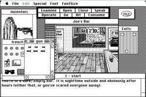
In addition to the obvious goals of making a hit game and not getting himself fired, one of Ron Gilbert’s implicit goals in making Maniac Mansion was to force a dialog about the sorry state of the nascent art of graphic-adventure design. Sadly, his message wouldn’t be terribly well-heeded by designers other than his own colleagues at Lucasfilm Games for quite some time. Indeed, I have a theory that there have been far more really bad adventure games created than bad examples of any other gaming genre over the years since Gilbert first tried to set the world on a better path. If that is indeed the case, the causes come largely down to two factors.
The first is that it’s uniquely easy to make an unfair — i.e., a bad — adventure game. Adventures are built not from systems of rules that can clearly be whole or broken, fair or unfair to the player, but rather from reams and reams of hand-crafted content. A designer of a strategy or action game can play her own game to get a good idea of whether it works as it should. A designer of an adventure game, who knows all of the puzzles already, cannot. What separates a good puzzle from one that is too obscure? The only way to find out is to put it in front of people. Thus is adventure design, even more so than other forms of game design, hugely dependent on player feedback — the sort of feedback that’s dangerously easy to dismiss or not solicit at all when the budget starts to go into the red and the calendar starts to slip and everyone just wants to be done with a project already.
The other factor also has to do with feedback, albeit of a slightly different kind, and applies more to graphic than to text adventures. The textual interactive-fiction community, the supposed “amateurs” of the adventure genre, have over the decades developed a rich body of critical theory and best practices explaining how to do text adventures right (not that it’s always followed). The critical dialog around graphic adventures, however, has sadly failed the sub-genre. I get so frustrated when I read reviews of adventure games that tell me that, yes, you’ll probably need to play this one from a walkthrough, but it’s a good game, really it is. No. Just no. Interactivity is the point of games, the thing that sets them apart from every other medium. Why should I play a game from a walkthrough when I can just go watch a movie or read a book? Occasionally there might be a broken game that shines so brightly or innovates so wildly in some other way that it’s worth playing just to appreciate what it tries to be. Even here, though, that appreciation should be tempered with the understanding that what’s being played is still a broken game — a bad game. It’s just broken in more interesting ways than other bad games.
The failure of professional reviewers of the 1980s and 1990s to really address the many problems of the games they wrote about, regardless of the genres in question, isn’t that hard to explain. Not only were the publications they wrote for usually supported by advertisements from the companies whose games they reviewed, but the typical reviewer was harried, given precious little time to cobble together an opinion before the next deadline when the hot new games just had to be inside the magazine to drive sales. Publications that required their reviewers to actually finish the games they wrote about were few and far between. These practical realities plagued the critical dialog around all of the gaming genres, but were, once again, almost uniquely problematic in the case of adventure games. Taken in the context of the mid-1980s, games like (for instance) those in Sierra’s King’s Quest and Space Quest series looked great at first blush, colorful and lively and full of possibility. It took more time than many reviewers were willing and/or able to devote to them to divine their tendency to confound and annoy the player who is earnestly playing them to win, to discern how rotten the game-design meat hidden under all of the audiovisual garnishing really is.
When we turn away from the professionals to look at the everyday players who continued to support the genre despite the constant abuses they suffered, the question of why so few adventure games ever seemed to get called out, to get punished for their bad designs becomes more fraught. It’s honestly hard for me to imagine, but there apparently were fans of the genre who actually enjoyed what most people regarded as its most notorious pitfalls. Others were less enthused, but noted with resignation that “that’s just how adventure games are,” and were apparently more willing to lump it than to leave the genre behind. (For what it’s worth, neither group ever included me. I can remember trying to play Space Quest circa 1988, getting stuck, finally tracking down a walkthrough — no easy task back then — and learning that my problem had been that I’d been standing at the wrong angle whilst examining my space capsule. I just knew right then that that was bullshit, and didn’t play another Sierra game for years.)
The dialog amongst actual designers of graphic adventures has likewise been a historically parched one. Once again, this state of affairs is in marked contrast to the active, ever-questioning conversations that have marked practitioners of the art of text-adventure design for decades now. In the realm of the graphic adventure, bold considerations of the state of the sub-genre by its practitioners, like Ron Gilbert’s own indelible “Why Adventure Games Suck,” have always been thin on the ground. The most thoughtful critical commentary has tended to come from people who dislike conventional adventure games on principle, such as Chris Crawford.
As someone who loves a good adventure game, whether done in text or graphics, maybe I can do my modest little something to change the way we talk about the form’s graphical variant. It seems anyway that this is a good time to try, moving in this blog’s timeline as we are into the late 1980s, when graphic adventures were steadily replacing the old text games in the world of commercial software. Because a concrete example is usually worth a thousand abstract words, I’m going to use as exemplars of all the things one shouldn’t do in a graphic adventure two pieces of terrible design craft from 1986, the year before Ron Gilbert’s frustration with the state of the art led him to try to show the industry a better way with Maniac Mansion.
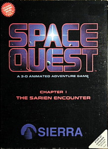
Space Quest, Chapter 1: The Sarien Encounter was one of the first graphic adventures Sierra released that did not bear the King’s Quest name. As the “Chapter 1” attests, the series was conceived from the beginning as the science-fiction parallel to Roberta Williams’s thriving fantasy franchise. This first chapter, like those that followed, was written by Mark Crowe and Scott Murphy, a couple of Sierra staffers who knocked together a demo for a science-fiction comedy in their spare time that made Ken Williams laugh — always an excellent way to get him to green-light a project. You play a less than motivated space janitor whose ship gets attacked by aliens, forcing you to rush to an escape pod to get away to the nearest planet. Despite the obvious similarity of the premise to that of Infocom’s Planetfall, Crowe and Murphy have always maintained that they weren’t even aware of Steve Meretzky’s game at the time that they wrote Space Quest. Its wit isn’t quite as sharp as that of Meretzky, much less Douglas Adams, but it’s silly and good-natured in its knowing stupidity, and if the game that houses it didn’t persist in screwing you over all the time — we’ll get to that shortly — it’d be quite a fun little romp.
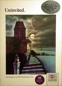
Uninvited, the second graphic adventure from ICOM Simulations, is a horror entry, a relatively underrepresented fictional genre in adventure games of its day. Its premise is as classic — not to say clichéd — as they come: you’ve wrecked your car on a deserted country road and stagger up to a creepy old mansion looking for help. Created by largely the same people who had made Déjà Vu, it mixes, sometimes rather jarringly, an unsettling Gothic atmosphere with some of the sarcastic humor of that older game. But, as with Space Quest, I’d have little to really complain about if only this game’s design wasn’t more evil than the mansion that houses it.
I want to say something very clearly: Space Quest and Uninvited are bad games. This really does need to be stated just that baldly. Yes, they have their charms in the form of humor, graphics, atmosphere, even a fair number of puzzles each that don’t suck, that could actually be fun to solve. Yet none of that matters in the face of one overriding reality: an adventure game that cannot be solved unaided, or for that matter that can be solved only through sheer doggedness and refusal to give in to tedium, is a bad game.
There’s going to be a lot of snark in what follows directed at our two victims, at least one of which, Space Quest, is actually quite a beloved title amongst nostalgics of the genre. I’m not apologizing for this. These are bad games whose designers should and could have known better; they should have taken their craft more seriously before selling these things to the public for $35 or more a pop, and they could have found plenty of examples of better game designs to emulate if they’d just looked around. I do, however, want to emphasize that this doesn’t mean that the folks who worked at Sierra or ICOM are bad people. John Williams of Sierra in particular has been a great friend of this blog, passing along all kinds of insights about the business of games in the 1980s and Sierra’s place there, and I’m sure that most everyone else at both companies was just doing what seemed best to them. As always when I write criticism, it isn’t personal.
So, with that said, let the snark begin.
The 14 Deadly Sins of Graphic-Adventure Design
1. Making puzzles that aren’t solvable through logic or even intuition, only through brute force.
Bad puzzles — not hard puzzles, but bad puzzles — are deadly to a game. Even a single really bad puzzle spoils a game holistically because it means that the player can never trust the game again. Every puzzle that follows will be accompanied by the question of whether it’s worth spending time on or whether it’s just going to be something stupid again. I’m not saying that every player should always be able to solve every puzzle, but I am saying that recourse to the hints should be followed by a sigh and a nod of understanding, not a cry of “How was I supposed to figure that out?” or, even worse, “I’ve just ‘solved’ this puzzle and I still don’t know what actually happened.” An adventure game’s puzzles can never be taken in isolation from either one another or from the rest of the design as a whole, meaning that an adventure can only be as good as its worst puzzle.
Note that I’m not saying that all adventure games should be easy. A difficult game, aimed at the hardcore, is as defensible a creative choice as any other. Still, a fact that all too many designers never grasp is that it’s possible for a game to be hard as nails and yet also to be rigorously fair. (See, for instance, Infocom’s Spellbreaker in the realm of text adventures, or the Myst series in that of graphic adventures.) The conflation of difficulty with unfairness is perhaps the most persistent fallacy in adventure games. The tedious try-everything-on-everything-else mode of play to which it leads has dogged graphic adventures in particular for decades.
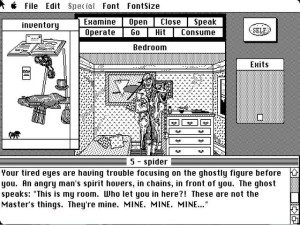
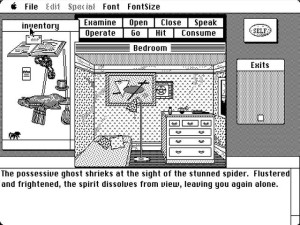
Uninvited is a notable offender here. There is for instance the ghost who’s inexplicably afraid of spiders.
A good adventure-game puzzle leaves the player feeling smart. A bad puzzle, even if solved unaided, just leaves her feeling persistent. That’s a big difference.
2. Cluttering up the game with so much junk that the player has no idea what to do with it all.
The nonsensical puzzles in Uninvited are only compounded by the deadly combination of a limited player inventory and a huge number of takeable objects. Because so many puzzles just don’t make any sense, you have no way of knowing which seemingly useless items amongst all of the innocuous clutter might actually be useful for something. Thus solving a puzzle like the one described above means not just trying everything you’re carrying on the ghost but actually scurrying back and forth in shifts, each time with a new load of objects to try out.
3. Killing the player constantly and without warning.
Frequent, unforeshadowed deaths have always been such a hallmark of Sierra adventures that it almost seems pointless to discuss the subject much further in that context. It was of course this facet of the original King’s Quest that first caused Ron Gilbert to decide that he “hated adventure games” and wanted to make a better one. Writing about Space Quest on his blog, an adventure-game fan who calls himself The Trickster discusses the alleged “hilarity” of all of the constant death: “It’s a credit to the developers that you not only happily restore and try again, but you do so with a big smile on your face.” I must say that I’m not sure that most of the deaths strike me as all that hilarious, but that’s as may be. You know what would really be a credit to the developers if the deaths truly are so intrinsic to their comedy vision? If they rewound the story each time you died to let you automatically continue instead of having to save every three minutes, that’s what.
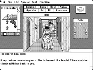
It’s not often that anyone manages to out-Sierra Sierra in this department, but, astonishingly, Uninvited just about pulls it off. You encounter a ghost…
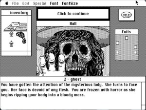
…and this happens the next turn if you don’t do the one arbitrary right thing — and no, trying to just back out of the room again won’t save you.
You can expect to die and restore a few dozen times here alone before you figure out how to proceed, if you’re even lucky enough to be carrying the item you need in the first place. If not, hope you have a recent save handy. How is this fun again?
4. Locking the player out of victory without her knowledge.
This is perhaps the most problematic and arguable of these sins, in that it comes down to a question of degree and intention more so than any of the others. Many of the bad examples described elsewhere in this article can precipitate this sin as well, but it’s a notoriously hard problem to work around even when a designer makes other, better choices. Virtually all adventure games of the 1980s, including even the best designs from the textual realm of Infocom, offered plenty of opportunities to lock yourself out of victory in the course of their normal interactivity. Those designs that strain the most mightily to make the walking-dead syndrome impossible, like the later adventures of Lucasfilm Games, are often forced to use contrived means that arguably sacrifice too much of that all-important illusion of freedom.
That said, I think we should reserve a special layer of Hell for those designs whose dead ends feel not just like byproducts of their puzzles and other interactive possibilities but rather intentional traps inserted in the name of… what, exactly? Increasing the length of the experience to make the player feel she got her money’s worth? Well, I’m not sure most players will thank you. Both Space Quest and Uninvited are riddled with these sorts of pitfalls that seem to arise from sheer, egregious bloody-mindedness.
Midway through Space Quest, for instance, you encounter a fellow who offers to buy your skimmer (yes, the Force is strong with this game). If you accept his offer, all seems well. The 30 buckazoids he gives you is enough to do the needful, and you can continue merrily on through the plot. Until, that is, you get all the way to the climax, where you gradually discover that you seem to be missing something vital. You needed to refuse his initial offer, holding out for a toss-in jetpack that’s key to winning the game.
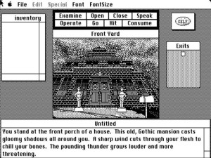
When you leave your wrecked car in Uninvited, the first scene you encounter is the “Front Yard” above. If amidst all the excitement you happen to neglect to look in the mailbox tucked away in the right side of the frame, that’s it for you. As soon as you go inside, you become a walking dead, albeit of another stripe from the mansion’s inhabitants: the front door locks behind you, rendering the front yard inaccessible forevermore. Many hours later, you might begin to realize that you missed something somewhere. Now, at first glance this may seem a relatively mild sin compared to the perverse intentionality of the Space Quest example above, a simple result of the interactive nature of adventure games. But think again. Why lock the door behind the player at all? After all, it’s not as if you can actually go anywhere else from here. I can think of two reasons, one being that the designers just wanted to be cruel, the other that they thought it would be good for the atmosphere to be trapped inside the house, and never stopped to consider how this would impact the experience of actually playing the game. Neither does them much credit.
5. Indulging in hunt-the-pixel.
In some ways this sin wouldn’t really come into its own until the 1990s, when screen resolutions increased enough and pixels thus became small enough that it was possible to hide that one fiddly little hotspot inside a detailed scene. Most of us with any experience at all with the sub-genre know and loathe what followed: endless bleary-eyed hours spent slowly painting the screen with the mouse, clicking everywhere. Sierra, still working as they were with their wonky arrow-key-and-parser-driven interface and blocky screens filled with primary colors, couldn’t quite manage that delightful experience in the 1980s. But, never fear, they found other ways to make the player’s life hell that were similar in spirit if not quite in detail.
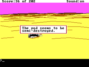
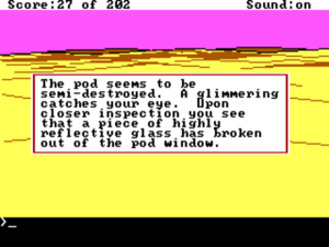
After crash-landing in your escape capsule in Space Quest, you dutifully examine it. Nothing of note there. Right?
Wrong. You have to not just examine it, but be standing at just the right position whilst doing so. Then, you get this:
6. Prioritizing the simulational over the experiential even when it spoils the game.
Adventure games are not simulations. This fact seems fairly self-evident, yet it’s amazing how many designers manage to forget it. Space Quest and Uninvited aren’t about the real experience of a marooned space janitor or a marooned car-crash victim; they’re experiential gaming in one of its purest forms, ideally offering you interesting puzzles and other interactions in a highly artificial but very exciting, atmospheric environment. There’s no need for elements like the timer in Uninvited that dutifully counts down the hours of the night and kills you if you haven’t cracked the case when a certain number of them have passed. The game is perfectly capable of evoking the delicious tension of exploring a haunted house without actually needing to bring the hammer down — an event that only cheapens the atmosphere anyway in making the unseen horrors seen. Ditto the scant few real-time minutes you have to get off the spaceship at the beginning of Space Quest. One could instead escalate the tension via a narratological approach like that pioneered in Infocom’s Ballyhoo, emphasizing the player’s sense of encroaching doom via little things that occur as she crosses certain milestones in her puzzle-solving and exploring. As it is, the hard timers are just one more annoyance to deal with, forcing her to replay yet again even once she’s bypassed all the other pitfalls in order to optimize her path. It adds nothing to her experience.
7. Actively misleading the player about what she needs to do.
At one point in Uninvited you come upon the scene above, of a grinning disembodied head blocking a passage. The description more than implies that it has something to tell you: “It bounces up and down as if trying to tell you something. However, you can’t figure out what it’s trying to say.” Obviously the puzzle here must be to find a way to communicate. Obviously this creature must have some vital information for you. Right?
Well, no. It turns out that it’s simply sitting on top of an item you need, nothing more. If you happen to be carrying a bird in a cage and fling it at the creature, it becomes “utterly fascinated” and “gives chase to eat it.” Nothing anywhere indicates that it has any special fondness for birds, making this yet another example of a completely inexplicable puzzle solution (ref: Sin #1), but whatever. This puzzle destroys your experience as a player even more so than the usual crappy puzzle because, given Uninvited‘s malicious glee in locking you out of victory as subtly as possible (ref: Sin #4), you’re doomed to spend the rest of the game wondering what more you needed to do here before scaring the creature away. In reality, there’s nothing else you can do — but you can’t know that. And so that nagging worry will remain every time you come upon another puzzle, whether it be sensical or nonsensical, leaving you unable to trust that you aren’t about to beat your head against a puzzle you rendered unsolvable hours ago.
I would guess that this puzzle was not intended to be as cruel as it is. I would further guess that the original puzzle did involve communicating with the creature in some way, that it was changed at some point late in the design, but the text was never updated. Possibly no one ever even thought about it. Still, neglect is no more forgivable than malice in game design. If anything, it only goes to illustrate even more what a slipshod development process this game had. If anyone — anyone — had ever really tried to play Uninvited before its release, it’s hard to imagine how this could have gotten through.
8. Making dynamic events that the player may never see essential to victory.
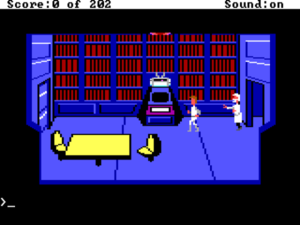
In Space Quest, the wounded scientist you see above may stagger into your spaceship’s library at the very beginning of the game to deliver a vital message. I say “may” because it’s quite unpredictable when or even whether he will make an appearance. If you know he’s coming, you can be sure to meet him by moving in and out of the room a few times and waiting around therein. If you don’t, however, he’s very easy to miss. This missed connection means that through no fault of your own you will get to spend hours playing through the rest of the game, only to arrive at the climax not understanding how to win and not understanding why you don’t understand. Exactly these sorts of timing issues also made Sierra’s Time Zone from four years before virtually insoluble. I can hardly express how dismaying it is to see Sierra still making these basic design blunders.
9. Confusing diegetic and extra-diegetic functions.
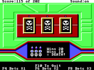
For some reason — maybe because the code was already written? — Sierra loved to put little gambling minigames into their adventures. The problem here is that gambling is obviously dictated by chance, and with a built-in advantage to the house at that, and thus the sums you need to earn require either an astronomical run of good luck or an endless, tedious cycle of saving after wins and restoring after losses. If Sierra must include these minigames — and they can actually be kind of fun in limited doses — why not have the game put a thumb on the scales when necessary to make sure you can’t go bankrupt through no fault of your own and that you can always win the money you need to before the whole thing becomes unbearably boring? Far from doing you any such kindnesses, Sierra instead added a little poison pill to Space Quest just to make the experience extra ugly: if the slot machine comes up all death’s heads, guess what happens (ref: Sin #3).
10. Indulging in guess-the-verb.
Just as hunt-the-pixel is confined to graphic adventures, you might think that guess-the-verb applies only to text adventures. You would, alas, be wrong. Both of our suspects today found a way to implement every text-adventure player’s bête noire, each in its own way. Space Quest, like most Sierra adventures of this period, actually combines the mechanics of a graphic and a text adventure by including a primitive parser for issuing commands that leaves much to be desired, but does manage to shoehorn both hunt-the-pixel and guess-the-verb into the same game.
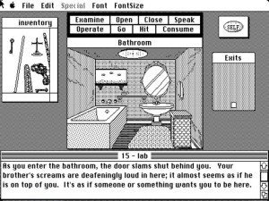
But the real star of the two in this department is Uninvited, which despite offering just eight clickable verbs to choose from still manages to confound and frustrate its player. You might think you need to “operate” the water taps in the bathroom, but, no, you have to “open” and “close” them. Later versions corrected this, proof that a) the difficulty arose from carelessness rather than malice and b) that no one had ever actually played Uninvited before it got released (I think we’ve heard both of these before).
11. Requiring fiddly and arbitrary text inputs without clarifying what is needed.
Again, you might think that this syndrome would be confined to text adventures. Again, you’d be wrong.
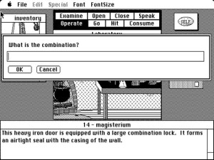
At one point in Uninvited you need to enter the combination to a safe. Trouble is, even once you think you’ve figured out what the combination should be you don’t know what format the game expects. (It turns out to be XX-XX-XX, for anyone unwise enough to be playing along at home.) So, you’re left to not only contend with piecing together three numbers from clues spread all over the game and then trying to guess their order, but you can never feel quite sure whether a rejected input was rejected because you actually had the wrong combination or because you didn’t type it in using the exact format the game expects. Would it have killed the designers to allow a range of possible formats? And weren’t graphic adventures supposed to get us beyond stuff like this?
12. Insulting your player, especially after you’re the jerk who’s just capriciously and unfairly killed her.
This is my personal pet peeve.
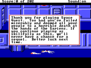
At the beginning of Space Quest, your ship is beset with marauding bands of space pirates who, if they catch up to you, shoot you down instantly. A message that “you hear footsteps” is the vital clue that you have a few seconds to seek cover, but often, if you’re caught in the middle of an open room, there’s just nowhere to go (ref: Sin #3). After it kills you, the game adds insult to injury via the charming message above. Screw you too, game. No, really. Screw you.
13. Not paying any attention to any of the games anyone else is making.
A quote from Ken Williams, co-founder of Sierra, upon being asked about his own reaction to Lucasfilm’s Maniac Mansion:
We were fairly phobic about playing or studying competitors’ products. I refused to hire anyone who had worked at a competitor, and really didn’t want our team focused on competitors’ products. Sierra always tried to consider ourselves as leaders, and wanted to forge our own path into the world. I didn’t want to fall into the trap of watching what competitors did and then releasing a “me too” product a year later. That’s a formula for disaster.
Even leaving aside the vaguely passive-aggressive quality of these words, I’m rendered speechless. I found this attitude breathlessly wrong-headed back when Scott Adams expressed it, and it doesn’t sound any better coming from Ken Williams. What kind of work could one expect from a novelist who never reads novels? From a musician who never listens to music? In the case of games, what you can expect — from the companies helmed by Scott Adams and Ken Williams alike — is a stream of “products” that relentlessly continue to make the same mistakes over and over, blissfully unaware that others have demonstrated how to do it so much better. No one has a monopoly on good ideas, and to imagine that being culturally aware of the very creative form that you’ve chosen to make your career equates to becoming a follower rather than a leader is, to borrow from Ken, “a formula for disaster” in terms of good game design if not the commercial market. I’ve learned again so many times whilst researching for this blog how the best designers, the makers of the best games, are characterized by an openness to the world around them, a willingness to play and study “competitors’ products” that’s just the opposite of the sentiment expressed here, all in order to meld those ideas with their own to create a better whole. See, for instance, Sid Meier, who has always been very forthright about the huge debt his masterpiece Pirates! owes to Danielle Bunten Berry’s innovative but not-quite-there-yet Seven Cities of Gold. A creative form can’t hope to develop without this sort of cultural dialog. This is simply how the culture of creativity works.
Small wonder, then, that so many Sierra games were so broken. It’s a miracle that their track record wasn’t worse. One of the most frustrating things about early graphic adventures is that most of the problems from which they suffered had already been encountered, discussed, and at least to some extent solved by Infocom. After all, graphic and text adventures share enough in common that all but one or two items on this list apply equally to both. Yet here were the graphic-adventure designers starting again from square one, doomed to repeat design mistakes due to their unwillingness to consider the lessons of a closely related sub-genre.
But then, the games industry has always fetishized technological developments at the expense of the fundamentals of good game design. One can’t help but think here of Ken Williams’s longstanding “ten-foot rule” — “If someone says WOW! when they see the screen from ten feet away, you have them sold.” — a philosophy that neatly sums up everything good and bad about Sierra over the course of almost two decades as a leading light in adventure games. In an extended 2007 conversation with Warren Spector, Richard Garriott of Ultima fame described how in his opinion the industry’s obsession with the technology that goes into game-making serves as a continual reset button on the basics of game design.
Each time you get one of those major technology influxes, the quality of the graphics goes way up but the gameplay goes back to the simplest again because the bells and whistles have become so much cooler that you don’t need any depth. However, to compete with that [technologically pioneering title] you have to add depth, and to compete with that you have to add more depth, etc., until the next big technological advancement, when everything resets again back to that lowest common denominator of gameplay.
The arrival of marvelous new technologies for making graphic adventures — the ICOM engine, Sierra’s AGI, Lucasfilm’s SCUMM — served to blow away a growing library of design wisdom as if it had never existed, leading to games like Space Quest and Uninvited that tried to survive on the bells and whistles of their technological gimmicks alone. Back in the late 1980s, with the punters eager to show off the audiovisual capabilities of their new 16-bit machines, perhaps that was good enough. But in the context of today it certainly isn’t, leaving us with nothing more than — one more time, with feeling — two really bad adventure games.
14. Not soliciting player feedback.
Not listening to your peers is one thing, but not listening to your own players is quite another. This is the deadliest sin of all, the most surefire way to make a bad adventure game.
The adventure genre is sometimes characterized as a contest between designer and player, but that’s entirely the wrong way to look at it, for in such a contest the deck must always be hopelessly stacked in favor of the designer. It’s simplicity itself to design an unwinnable adventure game: just include some necessary interaction that’s so bizarre, so obscure that no player would ever try it. We as players are dependent on the designer’s good-faith willingness to play fair with us, her ability to pose problems that are satisfyingly challenging but reasonable and solvable. That’s a tough balance to find, one that can only be attained by putting a game in front of lots of eyes, getting lots and lots of player feedback. Testing is vital to any other form of game, but with adventures it can mean everything. A terrible adventure can become a great one following just a few weeks of testing. In no other genre is the line between success and failure so fine. Tell me whether and how much testing an adventure has received and I can generally tell you, right there and then, whether it’s an adventure that’s worth playing.
Sierra’s testing process for Space Quest can be summed up easily: there wasn’t one. No, really. It wasn’t until 1987’s Leisure Suit Larry in the Land of the Lounge Lizards that Sierra started putting their games through a testing period. Even afterward, testing was too often shortened or dropped when market pressures demanded. I don’t have the same specific knowledge of ICOM, but given Uninvited‘s constant crimes against its player I’d be shocked to learn that they bothered to collect any feedback at all on it.
Much as I hate to always be using Infocom as a bludgeon with which to beat Sierra and others, I have to make note of the huge contrast between Sierra on the one hand and Infocom on the other when it comes to testing. Infocom had by far the most extensive and serious testing program in the industry. By 1985 their internal testing department numbered around ten employees, who would spend many hours each with each new game. This would be followed by two rounds of outside testing involving a total of about fifteen to twenty loyal Infocom customers. Sierra, in contrast, did… nothing. This meant that they had no idea how people were actually experiencing the games they made. Sierra’s technology was looking pretty snazzy by the late 1980s, Infocom’s (at least at first glance) pretty moldy, but can you guess which company made better games?
(The first three Space Quest games — and, in another package, the last three — can be purchased from GOG.com. Uninvited is available on Steam.)
