RSS

Tag Archives: c64

A New Force in Games, Part 2: A Habitat in Cyberspace

Habitat

Shortly before the departure of Peter Langston from the Lucasfilm Games Group, he and Steve Arnold hired one Chip Morningstar as a tools programmer. The latter was coming off a stint spent working for Ted Nelson, a sort of philosopher of information management who had coined the terms “hypertext” and “hypermedia” back in the 1960s. Morningstar, who says that “few people could actually work with Ted for more than a day or two without becoming clinically insane,” was initially thrilled to just hunker down making practical tools for game development on the Games Group’s Unix workstations.

But then, on one of his final days at the office, Langston tried to interest everyone in a joint playthrough of his own old multiplayer grand-strategy classic Empire, for the purpose of, according to Morningstar, “getting us to think about alternative modalities of game design.” They all played for many hours and then, with Langston’s encouragement, picked apart what they liked and didn’t like about the experience. Morningstar found he didn’t much like the very thing that seemingly made Empire a game: the cycle of build-up, increasing conflict, and the final triumph of one player — or, more frequently, the final nuclear annihilation of all of them. He would prefer it if “the world was much bigger and the player goals more open-ended.” He wrote up a proposal for an online portal to host a “10,000-player computer game” that showed the influence of Ted Nelson’s visions of networked consciousness as well as the cyberpunk science fictions that he’d been reading a lot of lately — works like True Names by Vernor Vinge and William Gibson’s brand new, seminal Neuromancer. The poetic language he employed in his proposal rather self-consciously echoes Gibson’s own descriptions of cyberspace.

Picture, if you will, a network, an intricate web of knots and threads spanning thousands of miles. The knots are machines, made of silicon, metal, and plastic. The threads are metal wires. It is a computer network. The machines are computers, sitting in homes, schools, and offices across the continent. The wires are telephone lines, tying the hundreds upon hundreds of individual processors into a single, unified whole. At each of these machines sit people. People of all kinds and all ages… they experience the signs and sounds of that which exists only in the wholeness of the web, and in their own minds.

Steve Arnold made a habit of filing away all of the ideas that poured out of his charges, even seemingly outlandish ones like this one. After all, you never knew what might be worth considering if the right partner and/or situation came along.

We haven’t had much occasion to talk about it yet on this blog, but PCs had always been seen by hackers as, amongst other things, tools of communication. One might even say it was in the PC industry’s very DNA. Well before Apple, for instance, Steve Jobs and Steve Wozniak had gotten their start as businessmen by selling “blue boxes” for purposes of “phone phreaking,” hacking the telephone system to make free long-distance calls. (The widespread application of telecommunications technology to illegal activities would also be an ongoing theme of the young industry.) The first modems were available almost as soon as the first PCs, using hardware designs adapted from bigger institutional computer systems.

To say that using a computer for telecommunications was challenging in the early days hardly begins to describe the situation. “Modem” stands for “modulator/demodulator.” It converts data into sound and transmits it over a phone line, the “modulating” part of the process. What sounds like an unholy racket to human ears can be converted — “demodulated” — back into data that a computer can understand by another modem at the other end of the line. A modem monopolized the phone line, meaning that unless you lived alone or could afford to spring for a second line, negotiations on its use with other householders were likely to be tense ones. Once made, modem connections were notoriously unstable. In many areas even the “call waiting” tone resulting from an incoming call would knock you off the line while simultaneously leaving you no way to answer the second call, a useless double whammy if ever there was one. And Modems were slow. A 300-baud modem, for many years the standard, could transmit or receive at about 35 characters per second, meaning a single line of text on an 80-column screen took well over two seconds to print, a full screen of 25 lines almost a full minute.

Assuming you were willing to put up with all these annoyances, whom should you actually call using your computer? The World Wide Web was still many years in the future, the Internet itself largely restricted to users at big universities and other research institutions, discussing esoteric subjects using specialized messaging software. Your realistic options could thus largely be divided into two categories: the so-called computerized bulletin-board systems, or BBSes, and, in time, bigger commercial dial-up services.

The typical BBS operator was a guy not that different from you who had elected to set up a little online presence with a spare computer — or a primary computer when he wasn’t actually using it — and a second phone line. Since these systems usually only had one modem and one phone line, only one user could actually be online at a time. Accessing a popular system was thus generally a matter of setting up a “war dialer,” a program to dial the BBS’s number again and again until the busy signal was replaced with a modem’s answering tone — all the while, of course, tying up your own phone line with the effort. Once online, you could read and post messages and upload and download software, within reason; you didn’t want to be That Guy staying online for hours and blocking everyone else out of the system. Indeed, popular systems often strictly limited your time to make sure that didn’t happen. Many of the BBSes were engines of software piracy. Thanks to phone phreaking, the necessary numbers and techniques for which were also widely distributed on pirate BBSes, pirates could call systems all over the country and the world, while more legitimate users unwilling to spend a fortune in long-distance fees were limited to those in their own hometowns. BBSes, even — especially! — the legitimate ones, were thus by their very nature very limited affairs, bound to a certain geographic area and, with only 24 hours in a day and only one phone line, sharply restricted in how many users they could realistically support. Many old-timers today will tell you that that was a big part of their charm.

Still, there was obvious potential for larger services that could bring more people together. In the late 1970s one Bill von Meister had an epiphany that would establish the model for such services for many years to come. When corporate America shut down for the evening, he realized, millions of processing hours on time-shared institutional computers went unused, as did much of the telecommunications infrastructure that linked all of those machines together. He founded an online service called The Source to take advantage of this excess capacity by essentially selling it to ordinary computer users at home, who could access his system via modem using local phone numbers that served as entrance ramps to normally business-focused packet-switched networks like Tymnet and Uninet. After The Source was announced at a gala event in June of 1979 — special guest/paid spokesman Isaac Asimov was there to declare it to represent nothing less than “the start of the information age” — similar online services began to spring up in considerable numbers, their user counts to climb steadily. CompuServe, the second entrant in the burgeoning field and always the largest and most lavishly promoted, had 5000 subscribers in 1980; 145,000 in 1984; 300,000 in 1986; 460,000 in 1988.

What people did on these services was in some senses mostly the same as what they do on the Internet today. By mid-decade CompuServe offered discussion forums and chat rooms on a huge variety of topics; an online encyclopedia; electronic editions of newspapers and magazines; online banks, stockbrokers, and other financial services; worldwide weather forecasts; online shopping malls, airplane tickets, and hotel reservations; and of course your very own private email address. Games were also popular; amongst the expected slate of traditional board and card games one could find the occasional standout, like CompuServe’s MegaWars, an elaborate and addictive multiplayer strategy game played on a universal scale, not all that far removed from Peter Langston’s Empire. The first accredited online university, called simply The Electronic University, already had 10,000 students by 1985, offering seven degrees from an Associates in the Arts to an MBA. The mainstream media began to publish the occasional skeptical report on a new phenomenon known as “online personals,” noting with shock that some people had supposedly ended up marrying others that they had first met online. Indeed, the amount of sharing that took place online was a constant source of surprise to the unwired. An apocryphal tale made the rounds, winding up eventually even on PBS’s Computer Chronicles program, of a woman who had announced on a chat room that she had had enough, that she was about to kill herself right there and then, only to be talked down from the brink by her interlocutors. Less positively but more inevitably, politicians began to fret about online pornography and child predation, making it an explicit crime to use a computer to traffic in child pornography — it was anyway, but that’s politics for you — with the Child Protection and Obscenity Enforcement Act of 1988.

It’s easy enough to see these services, described as I just have in the abstract, as essentially equivalent to the World Wide Web of today. That, however, would be a mistake. I really need to emphasize just how limited and primitive online services of the 1980s were by modern standards. Without the bandwidth to send pictures and with few computers capable of displaying them with any fidelity at all anyway, the online services were made of nothing but text, laboriously transmitted page by page at speeds of 300 or at best 1200 baud. There were no hyperlinks, no mouse support, no color, no sound, no fonts, no page layout, no windows or columns, just walls of slowly printing monospaced monochrome text separated by menu prompts in the form of blinking cursors. And each of these services was a world unto itself: if you signed up for CompuServe, you could only use those facilities that CompuServe offered, could only chat or send mail to other CompuServe subscribers. The interoperability and interconnectedness that define the World Wide Web of today didn’t exist, making your choice of which service to splurge for a fraught one indeed.

Finally, these services were expensive, staggeringly so by modern standards. In 1985 it cost $40 just to sign up with CompuServe, then $6 per hour at 300 baud or $12.50 per hour at 1200 baud during non-business hours. As for usage during business hours, that was so expensive that you didn’t even want to think about it — which was, after all, kind of the point. The other services charged similar rates. Small wonder that avid users devised and shared a multitude of techniques, from command shortcuts for bypassing layers of menus to ways of collecting digests of messages for reading offline, to minimize their time spent connected. And small wonder as well that, despite the services’ steadily increasing user bases, for many years relatively few computer owners had the requisite combination of financial wherewithal and patience to make use of them. At mid-decade it was estimated that less than 5 percent of active home-computer users subscribed to one of the commercial online services, while less than 40 percent of them even owned modems.

Those numbers represented opportunity. That, anyway, was how they were seen by Steve Case, marketing director for a heretofore underwhelming would-be purveyor of telecommunications services called Quantum Computer Services. Case came up with a scheme that would address some if not all of the reasons that most users still stayed away from the big online services. His QuantumLink would work only on Commodore 64s. Rather than using generic text-oriented terminal software, it would be given away as a user-friendly, colorful, point-and-click-driven application that would nevertheless interface with Quantum’s online databases via modem. And, aware that the Commodore market was the most price-conscious in computing, Case made QuantumLink dramatically cheaper than any other service: a flat fee of $10 per month, plus $3.60 per hour for certain “premium services,” whether delivered at 300 or 1200 baud. The scheme did come with its drawbacks, like the fact that major additions to the service would require the mailing of a new disk to every customer, and of course the fact that it would be limited to Commodore users, but on the whole Case believed the advantages would far outweigh the disadvantages.

QuantumLink

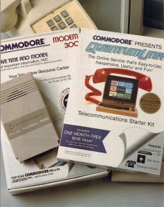
Critically, Case was able to convince Commodore themselves to sign on as sponsor and principal investor, making QuantumLink the “official” online service for Commodore owners. QuantumLink “telecommunications starter kits” were soon being inserted into every Commodore modem package, not to mention everywhere else Case could find to stick them. He was determined to make QuantumLink the easier, friendlier online service, suitable for the non-technical. “For the average guy,” he says, “we needed to offer the market something that was a little easier and cheaper and more useful.” Case’s “average guys” would sign up with QuantumLink to the tune of about 50,000 members one year after the service made its debut in November of 1985 — not bad numbers at all for a brand new, platform-specific online service that was starting from scratch.

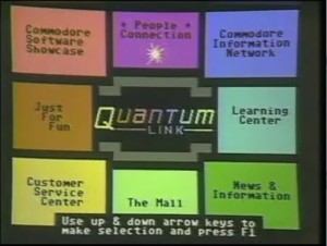
QuantumLink's point-and-click main menu.

QuantumLink’s point-and-click main menu.

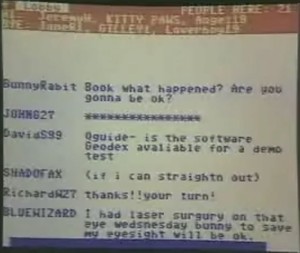
An online chat on QuantumLink

An online chat on QuantumLink.

QuantumLink featured a fairly typical slate of offerings, including plenty of games. The Commodore 64 was after all the premier gaming computer in the country, and the QuantumLink software had actually been built from the remnants of an earlier, failed venture called PlayNet, an attempt to create an online service revolving exclusively around games. QuantumLink’s games were largely inherited from that effort, including old standbys like backgammon, chess, checkers, hangman, and Go, as well as an online casino that dealt in perks rather than money. There were also heaps of public-domain games to download and play offline, plus demo versions of commercial games. Still, right from the outset QuantumLink and Commodore looked for an online game that was newer, bigger, and more exciting, something the likes of which had never been seen before. It was this quest that brought Clive Smith, a vice president of strategic planning at Commodore, out to Lucasfilm Games one day in the summer of 1985, well before the QuantumLink service was planned to actually go live. Smelling a chance to do something unprecedented on someone else’s dime, Steve Arnold pulled Chip Morningstar’s old proposal for a networked virtual world out of his ideas folder. Somewhat to everyone’s surprise, Smith immediately loved it. He quickly secured for Arnold and Morningstar a chance to pitch it in person to Quantum at their headquarters in Vienna, Virginia.

For his presentation, Morningstar dropped all vestiges of an “outer space/conquer the galaxy” type of game like Empire, or for that matter CompuServe’s MegaWars, in favor of a game that “looked kind of funky and suburban,” a “game” in name only that would ultimately be all about “the social dimension — people interacting with other people.” It was an idea so unprecedented that even its originator had difficulty describing or even completely envisioning it. The closest analogues would be MUDs — “multi-user dungeons,” essentially elaborate online text adventures in the spirit of Adventure and Zork that could be occupied by dozens of players at a time. Yet, while there was certainly a strong social element at play there, most MUDs also placed a heavy emphasis on dungeon-crawling, monster-killing, and leveling-up, whilst taking place in exactly the sorts of fantasy or science-fiction worlds that Morningstar had so definitively rejected. And of course MUDs consisted solely of text, while Morningstar’s world was imagined from the start as a richly graphical environment. Groping for the right vocabulary to describe his ideas, he found himself coining new jargon of his own, some of which has persisted to this day. Most notably, he borrowed the term “avatar” from Hinduism, where it represents a deity’s earthly incarnation. Morningstar used it to describe the onscreen figure that each player — the god in the machine, the deity pulling the strings — would control. That said, her avatar wouldn’t quite be her, at least not all the time, for Morningstar’s world would amongst other things be a space for role play, a space for trying new identities on for size. [1]Richard Garriott applied the same term to a game even earlier than Morningstar, during the development of Ultima IV: Quest of the Avatar, but his usage applies specifically to the ethical quest that forms the plot of that game: the player’s goal is to become an “avatar of virtue.” The more generalized use of the term in videogames is better attributed to Morningstar, even if Garriott’s usage probably better reflects its real implications in Hinduism. Whatever else you could say about “avatar,” it at least sounded more dignified than “puppet.”

The project, first dubbed Universe and then MicroCosm, was a hard sell. For some months Steve Case and the others at Quantum remained intrigued but uncertain. The contract wasn’t finalized and signed at last until December of 1985, after QuantumLink itself was already up and running. By this time the name had been changed yet again, this time to simply Habitat. Hoping to make a splash, the new partners rented the Palladium, the hottest new nightclub in New York City, to officially announce the project in mid-1986, despite the fact that there was still lots of work to be done before it could possibly go live. “It was quite an anomaly to have this essentially hip nightclub where people dressed in black… and then all these computer geeks showing off their multiplayer computer games,” admits Steve Arnold. “It was a little bit of a mismatch between PR positioning and target audience.”

Habitat

Undaunted, Quantum continued to hype Habitat quite heavily in their advertising. It was perpetually “coming soon,” first in the summer of 1986, then in the fall, then at some undetermined point in 1987. An initial spate of intrigued articles in the Commodore trade press dissipated as the months went by and the project started to look more and more like vaporware. Through it all Chip Morningstar struggled to actually build his monster with the help of a partner, another recent Lucasfilm hire named F. Randall Farmer. Only gradually did it dawn on them just what they had gotten themselves into. Making Habitat come alive was going to be hard. Really hard. Farmer has called the Habitat project the most complicated single thing ever done with a Commodore 64. While he’s hardly unbiased, it’s also difficult to think of a more ambitious rival. To help you appreciate Habitat‘s scope, I’d like to give you a description of the experience it was meant to provide for the player.

Habitat

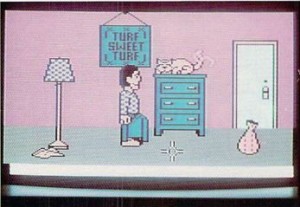
When you signed up for Habitat, your first task must be to create your new avatar, choosing your sex, your hair color, the shape of your head and your facial features. Your avatar was then given a room of his own to live in, complete with a dresser for storing things and a cat for cuddling. (Yes, dog lovers were out of luck — and no, it wasn’t possible to kill your cat.) You commanded your avatar by moving the cursor about the screen and tapping the joystick button, which yielded a radial menu of four items: “go” (walk to where the cursor points), “do” (manipulate some object or machine to which the cursor points), “get” (pick something up), and “put” (drop something, possibly inside a container). You could, for instance, select “do” over the dresser to open a drawer and reveal its contents, which you could then manipulate via “get” and “put.” Your avatar could normally only carry one thing at a time, but you could use a container, like the handy sack seen in the screenshot above, to carry many more.

The discrete areas, called regions in Habitat terminology, were linked with one another to form a grid or map, like the individual rooms of a text adventure. This, however, was one huge adventure game. There were many thousands of public regions, plus a “Turf Sweet Turf” for every player. By “going” to the door of your home turf, you could access the grand world outside your avatar’s humble abode. It was there that you’d begin to meet others.

Habitat

Due to technical constraints, only six avatars could occupy a region at the same time, but you could communicate with all of your region-mates simply by typing whatever you liked on the keyboard. The text you typed appeared as comic-style thought bubbles over your avatar’s head for all to read.

And that’s largely all you needed to know in order to interact with Habitat. Yet that’s enough to allow for a huge scope of social possibility, a fact of which Morningstar and Farmer were well aware and of which they were determined to take full advantage. Your room contained a telephone with a functioning telephone number other players could use to call you. Likewise, you could call them by looking them up in a virtual telephone book and dialing. If you preferred the dying art of letter-writing, every avatar had a mailbox before her domicile, with a functioning post system for delivering letters. There was a bank; every player got a stipend of 100 tokens every day she logged in, which she could spend as she would. There was a travel agency and resort destinations to which it could send you, stores to buy clothes and gadgets, bars and galleries and theaters. To facilitate large-scale events like plays, concerts, and poetry readings despite the six-avatars-per-region limit, Lucasfilm implemented something called “ghost mode,” which let you peer into a region without your avatar being actually embodied there — ideal for being a passive member of an audience. There was a “teleport” system for getting around the thousands of regions as quickly and easily as possible, and hotels for overnight trips to far-flung corners of the world. For those needing a definite external goal to work toward, an “Oracle” found in a park near the center of the world assigned adventure-game-like quests: “find the mystic orb of Xebop and return it to the Temple of Zak.” But even they were envisioned as social rather than solitary affairs, often requiring multiple avatars to pull off.


Perhaps the most amazing thing about Habitat is that it actually worked at all on a purely technical level, on client machines that Morningstar himself describes as little more than “toys,” with 1 MHz 8-bit processors, 64 K of memory, and an unstable connection running at as slow as 300 baud. The servers that housed this virtual world and managed all of the clients did have a few more resources at their disposal: QuantumLink, and thus Habitat, ran on a cluster of Motorola 68000-based computers built by a company called Stratus. Still, managing a virtual community proved to be far more expensive in both human and computer hours than anyone had anticipated. Lucasfilm’s contract with Quantum called for an environment capable of supporting 20,000 users, with the possibility of scaling it up easily to 50,000 if necessary. By the time the active user base reached 50 employees and insiders, Morningstar admits, Lucasfilm was already starting to feel “over our heads.”

We needed things for 20,000 people to do. They needed interesting places to visit — and since they can’t all be in the same place at the same time, they needed a lot of interesting places to visit — and things to do in those places. Each of those houses, towns, roads, shops, forests, theaters, arenas, and other places is a distinct entity that someone needs to design and create. Attempting to play the role of omniscient central planners, we were swamped.

Morningstar and Farmer nevertheless continued to plug away. In the first weeks of 1988 QuantumLink finally began a public beta test consisting of about 500 players who had been lucky enough to wind up with membership packets containing a special “early-access pass” for Habitat. It’s here that the Habitat story gets really fascinating, as Morningstar and Farmer bring the world’s first massively-multiplayer virtual community fully online. Many of the questions they were soon being forced to address, the situations they confronted, will sound familiar to anyone who’s ever played in Ultima Online, World of Warcraft, or Second Life, or for that matter just read about them. Here, then, are some dispatches from the front of an 8-bit Second Life that lived for just a few months in 1988.


Addiction!

From the bureau of things that never change: some users promptly became addicted, which was a real problem for them given that this was a paid beta test, billed at the usual QuantumLink “premium” rate of $3.60 per hour. Some were soon racking up monthly bills of $200 or more, corresponding to well over 50 hours of play. One managed to hit $1000 in one month, despite warnings sent to his email address at $300 and $600 that he might want to “check out his usage in the billing section.” Horrifying as this was on one level, Lucasfilm and QuantumLink couldn’t help but note that in theory they would only need twenty more users just like him to cover all of their operating expenses and make Habitat profitable.

The One-Percenters

Seeking to make Habitat a believable place, Lucasfilm included richer and poorer areas, discount shops and luxury boutiques with largely the same goods but very different prices. Trouble began when a few players realized that they could actually pawn items in a rich area for more money than it cost to buy them new in a poor. They spent an entire night trekking back and forth, buying low and selling high. By morning they had effectively wrecked Habitat‘s economy, inflating the money supply by a factor of five and making themselves almost inconceivably rich in contrast to everyone else. These nouveaux riches began to usurp power for themselves, getting others to do their bidding for trifling (to them) amounts of money, dispensing bread and circuses to the masses in the form of games and treasure hunts. With little outlet for their immense fortunes in spite of all their best efforts to spend them, the superrich ended up establishing a lucrative trade amongst themselves in what became Habitat‘s most ostentatious symbol of conspicuous consumption: custom heads for their avatars.

Robbery! Murder!

Weapons could be purchased in Habitat and player-versus-player conflict was allowed in the so-called “wilderness areas” outside of city limits, although the consequences of “death” were relatively mild: everything the dead avatar was carrying would be dumped onto the ground where she had been standing, and she would then be teleported back to her home turf, once again intact. Of course, it took about five minutes for someone to start randomly shooting people in order to take their stuff. This led to…

Law and Order Must Be Imposed!

The inhabitants decided that a police department must be established, and held elections for sheriff. Inevitably, the guy who won by a landslide was one of the one-percenters, who could afford a campaign on a scale of which the other candidates could only dream. Did someone say something about the role of money in politics?

Christianity Under Siege!

The first virtual church was opened by a Greek Orthodox minister. Those who wanted to join his flock were forbidden from stealing or engaging in any sort of violence. Unfortunately, whenever the minister and his flock weren’t around other players would march in, strip the church bare, and pawn the lot. The minister finally had to appeal directly to Lucasfilm for a special dispensation: a lock for his church.

Family Values

While there is no record of any relationships formed inside Habitat escaping into the real world, there were at least three virtual-world weddings, all taking place in that aforementioned church. Lucasfilm helpfully joined the newlyweds’ turfs together for cohabitation. The first virtual divorce followed the first virtual marriage by just two weeks.

Dangerous Bedfellows

It was possible for players to “sleep over” in other players’ turfs rather than their own, if invited inside. Soon con artists started finagling such invitations from naive players, then logging in while the victim still slept blissfully and absconding with everything in the room.

It’s About Ethics in In-Game Journalism!

A couple of enterprising players founded a newspaper, The Weekly Rant, consisting of as many as fifty pages full of news, fiction, classified advertisements, and announcements (including news of weddings and divorces). Absolutely everyone in Habitat was soon using it as an essential resource until, after a dispute about editorial content — the publisher wanted a shorter newspaper with less fiction — the editor abruptly quit. Habitat felt the loss keenly for all of its remaining days.

Arms Negotiations

For a special area they were creating called “The Dungeon of Death,” two players convinced Lucasfilm to build them special “elephant guns” that could kill another avatar in one shot instead of the usual twelve or so, on the condition that they would use them only in the person of their alter egos “Death” and “The Shadow” who lurked within the dungeon. Embarrassingly, one day while playing Death on loan Randall Farmer himself managed to get himself killed by another player, who promptly scooped up the gun. An ordinary player, unbound by any strictures whatsoever, now had this massively destabilizing weapon in her hot little hands. After threats and negotiations, a deal was struck: 10,000 tokens to buy the gun back. Echoing a thousand Hollywood thrillers, the two parties met on the grounds of Habitat‘s largest public park to make a tense exchange through a neutral intermediary; one can’t help but imagine their respective posses lurking tensely in the bushes all around in case trouble started.


The immediate transplantation of real-world societal structures and, one might say, societal woes into Habitat might be read as depressing. On another level, though, it was a sign that Habitat worked, that it had become a real community. “In a real system that is going to be used by real people,” wrote Morningstar and Farmer later, “it is a mistake to assume that the users will all undertake the sorts of noble and sublime activities which you created the system to enable. Most of them will not. Cyberspace may indeed change humanity, but only if it begins with humanity as it really is.”

In time, Morningstar and Farmer came to categorize the inhabitants of Habitat into five categories that perhaps apply almost equally well to the real world.

The Passive: Easily 50 percent of the number of users fall into this category, but they probably use only 20 percent of the connect time (rough estimates). They tend to show up for events ad-hoc and when the mood strikes. This group must be led by the hand to participate. They tend to want to “be entertained” with no effort, like watching TV.

The Active: This group is the next largest, and made up the bulk of the paying user-hours. The Active user participates in two to five hours of activities a week. They ALWAYS have a copy of the latest paper (and gripe if it comes out late).

The Motivators: The real heroes of Habitat. The Motivators understand that Habitat is what they make of it. They set out to change it. They throw parties, start institutions, open businesses, run for office, start moral debates, become outlaws, win contests.

The Caretakers: The Caretakers are “mature” Motivators. They tend to help the new users, control personal conflicts, record bugs, suggest improvements, run their own contests, officiate at functions, and in general keep things running smoothly.

The Geek Gods: The operator’s job is most important. It really is like being a Greek God from the ancient writings. The Oracle grants wishes and introduces new items/rules into the world. With one bold stroke of the keyboard, the operator can create/eliminate bank accounts, entire city blocks, or the family business. This is a difficult task as one must consider the repercussions of any “external” events to the world. Think about this: would you be mad at “God” if one day suddenly electricity didn’t work anymore? Habitat IS a world. As such, someone should run it that has experience in that area. A Geek God must understand both consistency in fictional worlds and the people who inhabit it.

In the beginning, Morningstar and Farmer tried to micromanage the world, but it quickly became clear that this would be impossible, even with just 500 players. Designing a massively-multiplayer game is a fundamentally different discipline than designing for a single player. A player in a single-player game expects and deserves to have the world revolve around her; a player in a massively-multiplayer game is but one among many would-be heroes. The reality of this difference, a difference which Morningstar and Farmer were amongst the first people in the world to confront, became clear with their first attempt at a large-scale community treasure hunt, the so-called “D’nalsi Island Adventure.” Farmer spent weeks designing and building the quest and the 100-region island that would house its goal, the lost “Amulet of Salesh,” hidden away in a remote, seldom-visited corner of the world. After announcing the quest at a special community meeting held in the county courthouse, Farmer and Morningstar sat back to watch the players go to work, anticipating it would take them some days to return with the amulet. As it turned out, someone found the island within fifteen minutes, then recovered the amulet therein within eight hours. Most players were never even aware that the quest was happening before it was all over.

Clearly, Habitat could not depend on such externally imposed quests, quests which the most knowledgeable and the most powerful were always destined to win. What happened inside Habitat would instead have to be driven by the players themselves. By the time the beta ended, Morningstar and Farmer had shifted their thinking entirely, realizing that the success of this virtual world would depend on them being able to move enough users along each step of the continuum outlined above, from curious but Passive non-participants to Geek Gods who had the competency and the interest to start to play a major role in the underlying workings of the world itself. (One might also say that this is the main goal a real-world society has for each succeeding generation.) From the standpoint of game design, this would prove to be the number-one lesson of Habitat — a sort of transcendence of game design. Morningstar and Farmer made a conscious effort to begin to think more like facilitators than game designers. When players came to them asking for an elephant gun or a church, they asked them what they planned to use it for and, if all seemed kosher, did their best to provide.

And then, just like that, it was suddenly all over. The beta ended and Habitat went dark forever, leaving a million might-have-beens in its wake.  Steve Arnold:

We found that we had pushed the C-64 to its limits, and, if we had to do it all over again — and I’m not trying to insult C-64 owners — we really would have developed the Habitat program on a different system. Once we finished Habitat and really sat down and looked at it, we realized there was a lot more technology needed to do multiplayer gaming — a lot more than we could do effectively on the C-64.

Habitat just didn’t scale well, wasn’t going to work with 20,000 or 50,000 players. In addition to the problems on the client side, Quantum noted that Habitat, even with just 500 players, had already consumed an inordinate amount of processing power on their servers during the beta period. They claimed that trying to deliver a full-scale Habitat would require a massive investment in infrastructure that they just weren’t in a position to pay for.

That said, there were doubtless other factors at play in the mutual reluctance of both Quantum and Lucasfilm to commit yet more resources to making Habitat live for real. They were now well into 1988, and it was becoming clear that the Commodore 64, a computing evergreen for so long, was beginning to fade at last. This reality left neither partner eager to commit more resources to expensive long-range projects for the platform. Lucasfilm was shifting to MS-DOS as their front-line development platform, while Quantum was now pouring most of the revenue they were earning from QuantumLink into new online services targeting other platforms rather than continuing to make major improvements to the old service.

Lucasfilm washed their hands of Habitat in mid-1988 by selling the whole technology package to Fujitsu, who used it to create Club Caribe, a stripped-down environment of a relatively compact 500 regions, on QuantumLink in 1989. It essentially functioned as an amusing chat interface, with most of the elements that made Habitat a real, functioning community stripped away. “Don’t get the idea that Club Caribe is a half-baked attempt to implement a vision that was too far ahead of its time,” wrote one magazine reviewer eager not to lose QuantumLink’s advertising dollars but also not quite willing to completely avoid the truth. That, of course, was exactly what it was, although even as Club Caribe the technology was still more than able to impress those who weren’t aware of the full scope of Chip Morningstar’s original dream. Habitat‘s technology continued to live on to one degree or another in other Fujitsu projects spanning much of the next decade, such as the Habitat Japan that was launched in 1990 and another virtual world called WorldsAway that was launched on CompuServe during that service’s twilight years of the mid-1990s. Yet it wouldn’t be until Ultima Online in 1997 that an online virtual world of quite the same scope and complexity as the original Habitat would be attempted again, and not until Second Life in 2003 that a functioning virtual community of quite the same player-driven character would be dared again. (Second Life also has a more direct connection to Habitat: F. Randall Farmer was a consultant on the later venture.) Such spans are practically millennia in the fast-paced world of computers. Habitat was perhaps doomed to fail from the beginning, but if you’re going to fail you might as well make it a failure for the ages.

QuantumLink, and the Club Caribe to be found within it, persisted as what might be most charitably described as a “legacy service” for a surprisingly long time, not finally going dark until November 1, 1994, just a few days shy of its ninth birthday and after the death of Commodore itself. By that time, however, it was little more than an afterthought for its parent company, now one of the biggest success stories of the nascent Internet boom. After some hiccups in the form of failed AppleLink and PCLink services, you see, Steve Case had finally hit paydirt with America Online, which became the new name of Quantum Computer Services itself in 1991. I’m going to guess that you might have heard of them. If not… well, stick around. We’ll get there.

(Sources: the book Droidmaker by Michael Rubin; Compute!’s Gazette of January 1985, May 1985, March 1986, January 1987, December 1987, and January 1989; Run of August 1986 and November 1989; Commodore Microcomputers of November/December 1986; Computer and Video Games of May 1987. Two episodes of the television show Computer Chronicles, “Modems and Bulletin Boards” from 1985 and “Online Services Part One” from 1987, are pertinent. The Internet Archive gives access to a now-defunct site created by Keith Elkin that was devoted to Habitat. The Museum of Art and Digital Entertainment’s site hosts a Lucasfilm-to-Fujitsu technology-transfer document dating from the summer of 1988 that’s full of fascinating information and insights. Finally, Chip Morningstar and F. Randall Farmer have a website full of still more invaluable information and insights.)

Footnotes

Footnotes
1 Richard Garriott applied the same term to a game even earlier than Morningstar, during the development of Ultima IV: Quest of the Avatar, but his usage applies specifically to the ethical quest that forms the plot of that game: the player’s goal is to become an “avatar of virtue.” The more generalized use of the term in videogames is better attributed to Morningstar, even if Garriott’s usage probably better reflects its real implications in Hinduism.
 

Tags: ,

Pirates!

Pirates!

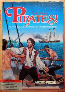
Shortly after designing and programming F-15 Strike Eagle and Silent Service, the two huge hits that made MicroProse’s reputation as the world’s premier maker of military simulations, Sid Meier took a rare vacation to the Caribbean. Accompanying him was his new girlfriend, whom he had met after his business partner Wild Bill Stealey hired her as one of MicroProse’s first employees. A few days after they left, she called Stealey in a panic: “I can’t find Sid!” It eventually transpired that, rather than being drowned or abducted by drug smugglers as she had suspected, he had gotten so fascinated with the many relics and museums chronicling the era of Caribbean buccaneering that he’d lost all track of time, not to mention the obligations of a boyfriend taking his girlfriend on a romantic getaway. She would just have to get used to Sid being a bit different from the norm if she hoped to stay together, Stealey explained after Meier finally resurfaced with visions of cutlasses and doubloons in his eyes. Meier had had a not-so-secret agenda in choosing this particular spot in the world for a romantic getaway. He was, you see, already working on his next game, a game about Caribbean piracy. The end result would be a dizzying leap away from military simulations into a purer form of game design — a leap that would provide the blueprint for his brilliant future career. If there’s something that we can legitimately label as a Sid Meier school of game design, it was for the game called simply Pirates! that it was first invented. As for the girlfriend, she apparently decided that she could indeed accept the vagaries of life with a game-design genius: she became his first wife.

Pirates! was first conceived by another Microprose designer, Arnold Hendrick, as a fairly rigorous simulation of ship-to-ship combat in the Age of Sail, heavily inspired by the old Avalon Hill naval board game Wooden Ships and Iron Men. Such a game would have marked a bit of a departure for MicroProse, whose military simulations and strategy games had to date reached no further back into history than World War II, but would still broadly speaking fit in with their logo’s claim that they were makers of “Simulation Software.” Problem was, there were already computer games out there that claimed to scratch that itch, like SSI’s Broadsides and Avalon Hill’s own Clear for Action. While few outside the ultra-hardcore grognard set had found either of those games all that satisfying, Hendrick couldn’t seem to figure out how to do any better. And so Pirates! found itself on the back burner, and Hendrick moved on to do Gunship instead.

Greg Tavares's windowing engine in action.

Gregg Tavares’s windowing engine in action.

Sid Meier was inspired to pick up Hendrick’s idea of a pirate game by a seemingly innocuous bit of technological plumbing developed by Gregg Tavares, a MicroProse programmer who specialized in user interfaces and the decorative graphics and menus that went around the heart of their simulations. Like programmers at many other companies around this time, Tavares had developed what amounted to a very simplistic windowing engine for the Commodore 64, allowing one to wrap text messages or menus or graphics into windows and place them in arbitrary spots on the screen quickly and easily. “We had this way of bringing the game to life in a series of pictures and text, almost like a literary-ish — for the time — approach,” Meier says. It started him thinking in terms for which MicroProse was not exactly renowned: in terms of storytelling, in terms of adventure.

With the idea starting to come together at last, Meier soon declared Pirates! to be his official next project. In contrast to the large (by 1986 standards) team that was still busy with Gunship, the original Commodore 64 Pirates! would be created by a team of just 2.5: Meier as designer and sole programmer and Michael Haire as artist, with Arnold Hendrick coming aboard a bit later to do a lot of historical research and help with other design aspects of the game (thus returning a number of huge favors that Meier had done his own Gunship project). Meier, never a fan of design documents or elaborate project planning, worked as he still largely works to this day, by programming iteration after iteration, keeping what worked and cutting what didn’t to make room for other ideas. By project’s end, he would estimate that he had cut as much code from the game as was still present in the finished version.

Stealey was, to say the least, ambivalent about the project. “I said to Bill, ‘I’m going to work on this game about pirates,'” says Meier. “And he said, ‘Pirates? Wait a minute, there are no airplanes in pirates. Wait a minute, you can’t do that.’ And I said, ‘Well, I think it’s going to be a cool game.'” Stealey’s disapproval was an obvious result of his personal fixation on all things modern military, but there were also legitimate reasons to be concerned from the standpoint of image and marketing. He had worked long and hard to establish MicroProse as the leader in military simulations, and now Meier wanted to peel away, using time and resources on this entirely new thing that risked diluting his brand. Even a less gung-ho character might have balked. But, as Stealey had had ample opportunity to learn by now, the shy, mild-mannered Meier could be astonishingly stubborn when it came to his work. If he said he was doing a pirates game next, then, well, he was going to do a pirates game. Stealey could only relish the small victories — he had only recently convinced Meier at last to give up his beloved but commercially moribund Atari 8-bit machines and start developing on the Commodore 64 — and hope for the best.

Pirates! represented more than just a shift in subject matter. It introduced an entirely new approach to game design on Meier’s part, amounting to a radical rejection of the status quo at MicroProse. Fred Schmidt, MicroProse’s director of marketing at the time, described the company’s standard research-first approach to design thus in a 1987 interview:

We do nothing but research on a subject before we begin a project. We spend time in the library, with military personnel, with Major Stealey (U.S.A.F. Reserve) and his contacts to really find out what a subject is all about. We try to take all that information and digest it before we begin to design a game.

But Pirates! would be a very, very different sort of proposition. As Meier has often admitted in the years since, its design is based largely on his memories of the old Errol Flynn pirate movies he’d loved as a kid, refreshed by — and this must have really horrified Stealey — children’s picture books. Those, says Meier today with a sheepish look, “would really highlight the common currency” of the topic: “What are the cool things? That would give us some visual ideas, but also tell us what to highlight in the game.” “The player shouldn’t have to read the same books the designer has read in order to play,” he notes in another interview. Indeed, piracy is a classic Sid Meier topic in that everyone has some conception of the subject, some knowledge that they bring with them to the game. Far from undercutting swashbuckling fantasies with the grim realities of scurvy and the horrors of rape and pillage, Pirates! revels in a romanticized past that never actually existed. Most of its elements could be the result of a game of free-association played with the word itself in the broadest of pop-culture strokes: “There’s gotta be swordfighting, there’s gotta be ship battles, there’s gotta be traveling around the Caribbean, and the evil Spaniard guy.”

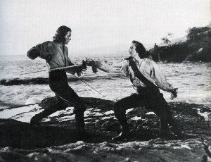
Errol Flynn duels Basil Rathbone in 1935's Captain Blood.

Errol Flynn duels Basil Rathbone in 1935’s Captain Blood.

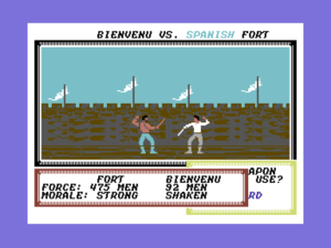
Dueling in Pirates!.

Dueling in Pirates!.

Meier and his colleagues at MicroProse derisively referred to adventure games — a term which in the mid-1980s still largely meant parser-driven text adventures — as “pick up the stick” games, noting that for all their promises of fantastic adventure they were awfully fixated on the fiddly mundanities of what the player was carrying, where she was standing, and how much fuel was left in her lantern. Theirs wasn’t perhaps an entirely fair characterization of the state of the art in interactive fiction by 1985 or 1986, but it was true that even most of the much-vaunted works of Infocom didn’t ultimately offer all that much real story in comparison to a novel or a film. If Meier was going to do an adventure game, he wanted to do something much more wide-angle, something with the feel of the pirate movies he’d watched as a kid. In fact, the idea of Pirates! as an “interactive movie” became something of a bedrock for the whole project, odd as that sounds today after the term has been hopelessly debased by the many minimally interactive productions to bear the label during the 1990s. At the time, it was a handy shorthand for the way that Meier wanted Pirates! to be more dramatic than other adventure games. Instead of keeping track of your inventory and mapping a grid of rooms on graph paper he wanted you to be romancing governors’ daughters and plotting which Spanish town to raid next. You would, as he later put it, be allowed to focus on the “interesting things.” You’d go “from one scene to the next quickly, and you didn’t have to walk through the maze and pick up every stick along the way.”

Allowing the player to only worry about the “interesting things” meant that the decisions the player would be making would necessarily be plot-altering ones. Therefore a typical fixed adventure-game narrative just wouldn’t do. What Meier was envisioning was nothing less than a complete inversion of a typical adventure game’s narrative structure. In an Infocom interactive fiction, the author has made the big decisions, mapping out the necessary beginning and end of the story and the high points in between, leaving the player to make the small decisions, to deal with the logistics, if you will, of navigating the pre-set plot. As the previous contents of this blog amply illustrate, I think the latter approach can be much more compelling than it sounds from the description I’ve just given it. I think the interactivity adds an experiential quality to the narrative that can make this type of approach, done right, a far more immersive and potentially affecting experience than a traditional static narrative. However, I also think there’s something to be said for the approach that Meier opted for in Pirates!: to have the player make the big decisions about the direction the story goes, and let the game make — or abstract away — all of the small decisions. Put another way, Pirates! should let you write your own story, a story you would own after it was complete. To return to the movie metaphor, you should indeed be the star. “You could go wherever you wanted to and you were clearly the central character in the story and you could take it wherever you wanted to go,” says Meier.

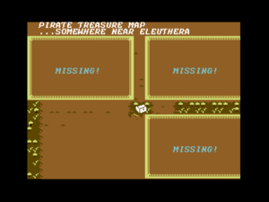
What would a pirate game be without a treasure map? "X" -- or in this case a chest icon -- marks the spot!

What would a pirate story be without a treasure map? “X” — or in this case a chest icon — marks the spot!

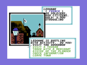
But how to offer that freedom? One key was, paradoxically, to limit the player’s options. When one is not in one of its action-oriented sub-games, Pirates! is entirely menu-driven, resulting in an experience simultaneously more accessible and more limiting than the parser’s cryptically blinking cursor with its admittedly unfulfillable promise of limitless interactive possibility. With his menus filled only with appropriately piratey choices, Meier could fill his game, not with stories per se, but with story possibilities drawn from the rich heritage of romanticized maritime adventure. Dodgy characters who hang out in the bars will occasionally offer to sell you pieces of treasure maps; evil Spaniards have enslaved four of your family members, and it’s up to you to track them down by following a trail of clues; the Spanish Silver Train and Treasure Fleet move across the map each year carrying fortunes in gold and silver, just waiting to be pounced on and captured. There are obvious limits to Pirates!‘s approach — you certainly aren’t going to get a narrative of any real complexity or depth out of this engine — but having the freedom to write your own story, even a shallow one, can nevertheless feel exhilarating. With no deterministic victory conditions, you can become just what you like in Pirates! within the bounds of its piratey world: loyal privateer aiding your nation in its wars, bloodthirsty equal-opportunity scoundrel, peaceful trader just trying to get by and stay alive (granted, this option can be a bit boring).

Which isn’t to say that there’s no real history in Pirates!. Once the design was far along, Arnold Hendrick came aboard to become a sort of research assistant and, one senses, an advocate for including as much of reality as possible in the game. It was Hendrick who convinced Meier to go against the grain of basing his game on the legends of piracy rather than the realities in at least a few respects. For instance, Pirates! takes place in the Caribbean between, depending on the historical period chosen, 1560 and 1680, thus forgoing the possibility of meeting some of the most famous names associated with piracy in the popular imagination: names like Edward Teach (the infamous Blackbeard), William Kidd, Jean Lafitte. The eventual 80-page manual, largely the work of Hendrick and itself something of a classic of the golden age of game manuals with its extensive and fascinating descriptions of the history of Caribbean piracy, dismisses pirates like Teach as unworthy of attention.

Those men were psychotic remnants of a great age, criminals who wouldn’t give up. They were killed in battle or hung for evils no European nation condoned. There was no political intrigue or golden future to their lives, just a bullet or a short rope. We found them unattractive and uninteresting compared to the famous sea hawks and buccaneers that preceded them.

That’s perhaps laying it on a bit thick — those getting raped and pillaged by the “sea hawks” might beg to differ with the characterization of their era as a “great age” — but the historical texture Hendrick brought added much to the game. Amongst other things, Hendrick researched the six different starting years available for free-form play, each with their own personality; designed six shorter historical scenarios based on famous expeditions and battles; researched the characteristics of the nine different vessels available to fight and sail, including the dramatic differences in the sailing characteristics of square-rigged versus fore-and-aft-rigged ships. And then there was the appropriately weathered-looking cloth map of the Caribbean that shipped in the game’s box and that was faithfully recreated in the game proper. MicroProse would hear from many a schoolchild in the years to come who had amazed her teacher with her knowledge of Caribbean geography thanks to Pirates!.

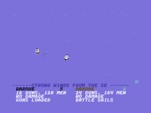
A battle at sea.

A battle at sea.

At the same time, though, Meier held Hendrick’s appetite for historical reality on a tight leash, and therein lies much of the finished game’s timeless appeal. We can see his prioritization of fun above all other considerations, a touchstone of his long career still to come, in full flower for the first time in Pirates!. Over the years I’ve been writing this blog, I’ve described a number of examples of systems that ended up being more interesting and more fun for their programmers to tinker with than for their players: think for instance of the overextended dynamic simulationism of The Hobbit or the Magnetic Scrolls text adventures. Pirates!, whose open dynamic world made for a fascinating plaything in its own right for any programmer, could easily have gone down the same path, but Meier had the discipline to always choose player fun over realism. “We could totally overwhelm the player if we tossed everything into the game, so it’s a question of selecting,” he says. “What are the most fun aspects of this topic? How can we present it in a way that the player feels that they’re in control, they understand what’s happening?”

In a 2010 speech, Meier made a compelling argument that early flight simulators such as the ones from MicroProse on which he’d cut his teeth managed to be as relatively straightforward and entertaining as they were as an ironic byproduct of the sharply limited hardware on which they had to run. When more powerful machines started allowing designers to layer on more complexity, everything started to go awry.

One of the things we pretend as designers is that the player is good. You’re really good! That’s kind of a mantra from us. We want the player to feel good about the play experience and themselves as they’re playing.

One example of where this perhaps went off the tracks is the history of flight simulators, going back a number of years. Early on they were easy to play, very accessible. You’d shoot down a lot of planes, have a lot of fun. But then we got to where every succeeding iteration of flight simulators became a little more realistic, a little more complex, a little more of a “simulation.” Pretty soon the player went from “I’m good!” to “I’m not good! I’m confused! My plane is on fire! I’m falling out of the sky!” The fun went out of them.

We have to be aware that it’s all about the player. The player is the star of the game. Their experience is what’s key. Keeping them feeling good about themselves is an important part of the experience we provide.

Notably, Meier abandoned flight simulators just as vastly more powerful MS-DOS-based machines began to replace the humble Commodore 64 as the premier gaming computers in North America. Still more notably for our purposes, Pirates! is an astonishingly forgiving game by the standards of its time. It’s impossible to really lose at Pirates!. If you’re defeated in battle, for instance, you’re merely captured and eventually ransomed and returned to your pirating career. This, suffice to say, is one of the most ahistorical of all its aspects; historical pirates weren’t exactly known for their long life expectancies. Pirates!‘s approach of using the stuff of history to inform but not to dictate its rules, of capturing the spirit of a popular historical milieu rather than obsessing over its every detail, wasn’t precisely new even at the time of its development. There are particular parallels to be drawn with Canadian developer Artech’s work for Accolade on what designer Michael Bate called “aesthetic simulations”: games like Ace of Aces, Apollo 18, and The Train. Still, Pirates! did it ridiculously well, serving in this sense as in so many others as a template for Meier’s future career.

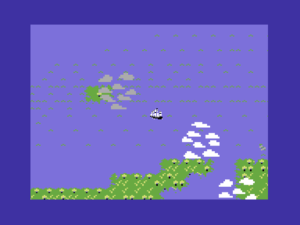
Sailing the Caribbean, the wind at my back. If only it was possible to sail west all the time...

Sailing the Caribbean, the wind at my back. If only it was possible to sail west all the time…

Pirates! in general so successfully implements Meier’s player-centric, fun-centric philosophy that the few places where it breaks down a bit can serve as the exceptions that prove the rule. He admits today that its relatively strict simulation of the prevailing air currents in the region that can often make sailing east an exercise in frustration, especially at the higher of the game’s four difficulty levels, is arguably going somewhat too far out on the limb of realism. But most disappointing is the game’s handling of women, who exist in its world as nothing more than chattel; collecting more treasure and honors gives you better chances with better looking chicks, and marrying a hotter chick gives you more points when the final tally of your career is taken at game’s end. It would have been damnably difficult given the hardware constraints of the Commodore 64, but one could still wish that Meier had seen fit to let you play a swashbuckling female pirate; it’s not as if the game doesn’t already depart from historical reality in a thousand ways. As it stands, it’s yet one more way in which the games industry of the 1980s subtly but emphatically told women that games were not for them. (Much less forgivable from this perspective is Meier’s 2004 remake, which still persists in seeing women only as potential mates and dancing partners.) Despite it all, MicroProse claimed after Pirates!‘s release that it was by far the game of theirs with the most appeal to female purchasers — not really a surprise, I suppose, given the hardcore military simulations that were their usual bread and butter.

This governor's daughter is at least liberated enough to spy for me...

This governor’s daughter is at least liberated enough to spy for me…

Pirates! is a famously difficult game to pigeonhole. There’s a fair amount of high-level strategic decision-making involved in managing your fleet and your alliances, choosing your next targets and objectives, planning your journeys, keeping your crew fed and happy. When the rubber meets the road, however, you’re cast into simple but entertaining action games: one-on-one fencing, ship-against-ship or ship-against-shore battling, a more infrequent — thankfully, as it’s not all that satisfying — proto-real-time-strategy game of land combat. And yet the whole experience is bound together with the first-person perspective and the you-are-there, embodied approach of an adventure game. Small wonder that MicroProse, who weren’t quite sure what to do with the game in marketing terms anyway, gave it on the back of the box the mouthful of a label of “action-adventure simulation.” It doesn’t exactly roll off the tongue, does it?

The adventure elements in particular can make Pirates! seem like something of an anomaly in the catalog of Sid Meier, generally regarded as he is as the king of turn-based grand-strategy gaming. In reality, though, he’s much less a slave to that genre than is generally acknowledged. Pirates!‘s genre-blending is very much consistent with another design philosophy he has hewed to to this day, that of prioritizing topic over genre.

I find it dangerous to think in terms of genre first and then topic. Like, say, “I want to do a real-time-strategy game. Okay. What’s a cool topic?'” I think, for me at least, it’s more interesting to say, “I want to do a game about railroads. Okay, now what’s the most interesting way to bring that to life? Is it in real-time, or turn-based, or is it first-person…” To first figure out what your topic is and then find interesting ways and an appropriate genre to bring it to life as opposed to coming the other way around and saying, “Okay, I want to do a first-person shooter; what hasn’t been done yet?” If you approach it from a genre point of view, you’re basically saying, “I’m trying to fit into a mold.” And I think most of the really great games have not started from that point of view. They first started with the idea that “Here’s a really cool topic. And by the way it would probably work really well as a real-time strategy game with a little bit of this in it.”

I think a good example of this is Pirates!. The idea was to do a pirate game, and then it was “Okay, there’s not really a genre out there that fits what I think is cool about pirates. The pirate movie, with the sailing, the sword fighting, the stopping in different towns, and all that kind of stuff, really doesn’t fit into a genre.” So we picked and chose different pieces of different things like a sailing sequence in real-time and a menu-based adventuring system for going into town, and then a sword fight in an action sequence. So we picked different styles for the different parts of the game as we thought were appropriate, as opposed to saying, “We’re going to do a game that’s real-time, or turn-based, or first-person, or whatever,” and then make the pirates idea fit into that.

This approach to design was actually quite common in the 1980s. See for example the games of Cinemaware, who consistently used radically different formal approaches from game to game, choosing whatever seemed most appropriate for evoking the desired cinematic experience. As game genres and player expectations of same have calcified over the years since, this topic-first — or, perhaps better said, experience-first — approach to design has fallen sadly out of fashion, at least in the world of big-budget AAA productions. Mainstream games today are better in many ways than they were in the 1980s, but this is not one of them. Certainly it would be very difficult to get an ambitious cross-genre experience like Pirates! funded by a publisher today. Even Meier himself today seems a bit shocked at his “fearlessness” in conjuring up such a unique, uncategorizable game. In addition to sheer youthful chutzpah, he points to the limitations of the Commodore 64 as a counter-intuitive enabler of his design imagination. Because its graphics and sound were so limited in contrast to the platforms of today, it was easier to prototype ideas and then throw them away if they didn’t work, easier in general to concentrate on the game underneath the surface presentation. This is something of a wistfully recurring theme amongst working designers today who got their start in the old days.

Pirates! was not, of course, immaculately conceived from whole cloth. Its most obvious gaming influence, oft-cited by Meier himself, is Danielle Bunten Berry’s Seven Cities of Gold, a design and a designer whom he greatly admired. There’s much of Seven Cities of Gold in Pirates!, at both the conceptual level of its being an accessible, not-too-taxing take on real history and the nuts and bolts of many of its mechanical choices, like its menu-driven controls and its interface for moving around its map of the Caribbean both on ship and on foot. Perhaps the most important similarity of all is the way that both games create believable living worlds that can be altered by your own actions as well as by vagaries of politics and economy over which you have no control: territories change hands, prices fluctuate, empires wax and wane. I would argue, though, that in giving you more concrete goals to strive for and a much greater variety of experiences Pirates! manages to be a much better game than its inspiration; Seven Cities of Gold often feels to me like a great game engine looking for something to really do. Both games are all about the journey — there’s no explicitly defined way to win or lose either of them, another significant similarity — but in Pirates! that journey is somehow much more satisfying. The extra layers of story and characterization it provides, relatively minimal though they still are, make a huge difference, at least for this player.

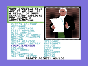
After you retire, you're ranked based on your accomplishments and the amount of wealth you've accrued. This is as close as you can come to winning or losing at Pirates!.

After you retire, you’re ranked based on your accomplishments and the amount of wealth you’ve accrued. This is as close as you can come to winning or losing at Pirates!.

Just about all of the other elements in Pirates!, from the trading economy to the sword-fighting, had also been seen in other games before. What was unusual was to build so many of them into one game and, most importantly, to have them all somehow harmonize rather than clash with one another. Meier himself is somewhat at pains to explain exactly why Pirates! just seemed to work so well. A few years after Pirates! he attempted a similar cross-genre exercise, a spy game that combined action and strategy called Covert Action. He himself judged the end result of that effort to have been much less successful. It seemed that, while the various elements played well enough on their own, they felt disconnected in the context of the whole, like two or more games rudely crammed together: “You would have this mystery you were trying to solve, then you would be facing this action sequence, and you’d do this cool action thing, and you’d get out of the building, and you’d say, ‘What was the mystery I was trying to solve?'” Pirates! was charmed in contrast; its various elements seem to fortuitously just work together. Meier has since theorized that this may be because all of its individual elements, taken in isolation, are quite simple — one might even say simplistic. But when blended together they turn out to be a perfect mixture of easily digestible experiences that never last long enough to lose the overall plot, a classic example of the whole being greater than the sum of its parts.

I’d be remiss not to also briefly mention just what a little technical marvel Pirates! is in its original Commodore 64 incarnation. It’s all too easy to overlook Sid Meier the brilliant programmer when thinking about Sid Meier the brilliant game designer. Yet it’s as much a credit to the former as the latter that the Commodore 64 Pirates! remains amazingly playable to this day. The disk loads are snappy enough to barely be noticeable; the fonts and graphics are bright and atmospheric; the occasional music stings are well-chosen; the various action games play fast and clean; the windowing system that got this whole ball rolling in the first place does its job perfectly, conveying lots of information elegantly on what is by modern standards an absurdly low-resolution display. And of course behind it all is that living world that, if not quite complex by the standards of today, certainly is by the standards of a 64 K 8-bit computer. While I’ve placed a lot of emphasis in my other recent articles on how far Commodore 64 graphics and sound had come by 1987, Pirates! is a far better work of pure game design than any I’ve talked about so far in this little series, worthy of attention for far more than its polished appearance or its important place in history, even if it is well-possessed of both. In fact, I’d go so far as to call it the greatest game ever born on the little breadbox, the peak title of the Commodore 64’s peak year.

Once Pirates! was ready in the spring of 1987 there was still the matter of trying to sell it. Director of marketing Schmidt was clearly uncertain about the game when Commodore Magazine interviewed him just before its release. Indeed, he was almost dismissive. “It takes us into territory MicroProse has never gone before,” he declared, accurately enough. “It is a combination text, graphic, simulation, action game.” (More of those pesky genre difficulties!) But then he was eager to move on to the firmer ground of Meier’s next project of Red Storm Rising, a modern-day submarine simulation based on Tom Clancy’s bestselling technothriller that was about as firmly in MicroProse’s traditional wheelhouse as it was possible for a game to be. As that project would indicate, Meier didn’t immediately abandon his old role of Wild Bill’s simulation genius to fully embrace the purer approach to game design that had marked the Pirates! project, not even after Pirates! defied all of Stealey and Schmidt’s misgivings to become MicroProse’s blockbuster of 1987, joining 1984’s F-15 Strike Eagle, 1985’s Silent Service, and 1986’s Gunship in a lineup that now constituted one of the most reliable moneyspinners in computer gaming; all four titles would continue to sell at a healthy clip for years to come. One suspects that Meier, still feeling his way a bit as a designer in spite of his successes, did Red Storm Rising and the game that would follow it, another flight simulator called F-19 Stealth Fighter, almost as comfort food, and perhaps as a thank you to Stealey for ultimately if begrudgingly supporting his vision for Pirates!. That, however, would be that for Sid Meier the military-simulation designer; too many other, bolder ideas were brewing inside that head of his.

There’s just one more part of the Pirates! story to tell, maybe the strangest part of all: the story of how the introverted, unassuming Sid Meier became a brand name, the most recognizable game designer on the planet. Ironically, it all stemmed from Stealey’s uncertainty about how to sell Pirates!. The seed of the idea was planted in Stealey by someone who had a little experience with star power himself: comedian, actor, and noted computer-game obsessive Robin Williams. Stealey was sitting at the same table as Williams at a Software Publishers Association dinner when the latter mused that it was strange that the world was full of athletic stars and movie stars and rock stars but had no software stars. A light bulb went on for Stealey: “We’ll make Sid a famous software star.” It wasn’t exactly a new idea — Trip Hawkins, for one, had been plugging his “electronic artists” for years by that point with somewhat mixed results — but by happenstance or aptitude or sheer right-place/right-time Stealey would pull it off with more success than just about anyone before or since. When the shy Meier was dubious, Stealey allegedly gave him a live demonstration of the power of stardom:

I had my wife, he had his girlfriend, and we’re sitting at dinner at a little restaurant. I said, “Sid, watch this. I’ll show you what marketing can do for you.” I went over to the maître d’ and I said, “Sir, my client doesn’t want to be disturbed.” He said, “Your client, who’s that?” I said, “It’s the famous Sid Meier. He’s a famous author. Please don’t let anybody bother us at dinner.” Before we got out of there, he had given 20 autographs. You know, we were a small company. You do whatever you can do to get a little attention, right?

As with many of Stealey’s more colorful anecdotes, I’m not sure whether we can take that story completely at face value. We are, however, on firmer ground in noting that when Pirates! made its public debut shortly thereafter it bore that little prefix that in later years would come to mark a veritable genre onto itself in many people’s eyes: the game’s full name was Sid Meier’s Pirates!. Gaming has generally been anything but a star-driven industry, but for some reason, just this one time, this bit of inspired star-making actually worked. Today Sid Meier’s name can be found tacked onto the beginning of a truly bewildering number of titles, including quite a few with which he had virtually nothing to do. The supreme irony is that this should have happened to one of the nicest, most unassuming, most humble souls in an industry replete with plenty of big egos that would kill for the sort of fame that just kind of walked up to Meier one day and sat down beside him while he hacked away obliviously in front of his computer. Not that it’s undeserved; if we’re to have a cult of personality, we might as well put a genius at its center.

Like Meier’s new approach to design, it wasn’t initially clear whether the “Sid Meier’s” prefix was destined to really become a long-term thing at all; Stealey judged the names and topics of Red Storm Rising and F-19 Stealth Fighter strong enough stand on their own. But then old Sid went off the military-simulation reservation and started to get crazy innovative again, and Stealey faced the same old questions about how to sell his stuff, and… but now we’re getting ahead of the story, aren’t we?

(Paper Sources: Gamers at Work by Morgan Ramsay; Game Design: Theory and Practice by Richard Rouse III; Computer Gaming World of November 1987; Commodore Magazine of September 1987; Retro Gamer 38, 57, and 82; Game Developer of February 2002, October 2007, January 2009, November 2010, and February 2013.

Online sources: Metro’s interview with Meier; Adam Sessler’s interview with Meier; Meier playing the 2004 Pirates! on IGN; Meier’s 2010 GDC keynote; Matt Chat 78.

You can download from this site disk images of the Commodore 64 Pirates! that Meier himself still considers the “definitive” version of the original game. Note, however, that this zip doesn’t include the essential manual and map. You can get them by buying Pirates! Gold Plus from GOG.com. Trust me, it’s worth it.)


Tags: , , ,

Accolade Gets Distinctive

Only a few publishers managed to build a reputation to rival that of Epyx as masters of Commodore 64 graphics and sound. Foremost amongst this select group by 1987 was Accolade, riding high on hits like Dam Busters and Ace of Aces. Both of those games were created by Canadian developers Artech, who in 1987 would deliver to Accolade two more of their appealing “aesthetic simulations” of history. Chosen this time were the glory days of NASA for Apollo 18 and of the French Resistance for The Train. Yet Accolade’s big hit of the year would come not from Artech but from another group of Canadians who called themselves Distinctive Software.

Don Mattrick and Jeff Sember, the founders of Distinctive, were barely into their twenties in 1987, but were already has-beens in a sense, veterans of the peculiar form of celebrity the home-computer boom had briefly engendered for a lucky few. The two first met in their high school in late 1981 in the Vancouver suburb of Burnaby, bonding quickly over the Apple II computers that both had at home. During their summer break, Mattrick suggested to Sember that they should design their own game and try to sell it. Thus, while Mattrick worked at a local computer store to raise money for the endeavor, Sember wrote a simple little collection of action games called Evolution in all of three weeks. Its theme was an oddly popular one in 1980s gaming, a chronicle of the evolution of life through six rather arbitrary phases: amoeba, tadpole, rodent, beaver (a tribute to the duo’s home country), gorilla, and human. They took the game to the Vancouver-based Sydney Development Corporation, a finger-in-every-pie would-be mainstay of Canadian computing whom we’ve met before in connection with Artech. Sydney liked Evolution enough to buy it, giving it its public debut in October of 1982 at a Vancouver trade show. With this software thing taking off so nicely, Mattrick and Sember soon incorporated themselves under the name Distinctive Software.

A very young Don Mattrick and Jeff Sember on CBC's Front Page Challenge, March 20, 1983.

A very young Don Mattrick and Jeff Sember on CBC’s Front Page Challenge, March 20, 1983.

They had arrived on the scene at the perfect zeitgeist moment, just as Canada was waking up to the supposed home-computer revolution burgeoning to its south and was beginning to ask where Canadians were to be found amongst all the excitement. These two young Vancouverites, personable, good-looking, and, according at least to Sydney, the first Canadians ever to write a popular computer game that was sold in the United States as well as its home country, were the perfect answer. They became modest media celebrities over the months that followed, working their way up from the human-interest sections of newspapers to glossy lifestyle magazines and finally to television, where they appeared before a panel of tedious old fuddy-duddies on CBC television’s game-show/journalism hybrid Front Page Challenge. The comparisons here come easily, perhaps almost too easily when we think back to the other software partnerships I’ve already chronicled. It’s particularly hard not to think of David Braben and Ian Bell, who would soon be receiving mainstream coverage of much the same character in Britain. Mattrick was the Braben of this pair, personable, ambitious, and focused on the bottom line; it was he who had gotten the ball rolling in the first place and who would largely continue to drive their business. Sember was the Bell, two years younger, quieter, more technically proficient, and more idealistic about games as a creative medium.

It’s not clear to what extent all of the hype around Mattrick and Sember translated into sales of Evolution. On the one hand, it apparently did well enough on the Apple II for Sydney to fund ports to a number of other platforms and to advertise them fairly heavily across Canada and the United States. And most of the big trade magazines, prompted to some extent no doubt by Sydney’s advertising dollars, saw it as a big enough deal to be worthy of a review. On the other hand, most of those reviews were fairly lukewarm. Typical of them was Electronic Games‘s conclusion that it was okay, but “not really one of the world’s great games.” Nor is it all that well-remembered — whether fondly or otherwise — amongst gaming nostalgics today.

Regardless, after the hype died down Sydney ran into huge problems as the home-computer market in general took a dive. Looking to simplify things and reduce their overhead in response, they elected to get out of the notoriously volatile games-publishing business. Thus the follow-up to Evolution, promised by Mattrick and Sember in many an interview during 1983, never arrived. Their fifteen minutes now apparently passed, it seemed that they would become just one more amongst many historical footnotes to the abortive home-computer revolution.

But then in 1985 Distinctive unexpectedly resurfaced. Alan Miller and Bob Whitehead, having recently founded Accolade, released their own first in-house-developed games, and begun a fruitful developer/publisher partnership with Artech, were looking for more outside developers. They were very receptive to the idea of continuing to work with Canadian developers, believing that they had begun to tap into a well of talent heretofore ignored by the other big publishers. Not the least of their considerations was the Canadian dollar, which was now reaching historic lows in comparison to the American; this meant that that talent came very cheap. When Distinctive’s old connections with Sydney and by extension Artech brought them to Accolade’s attention, they soon had a contract as well.

That said, in the beginning Distinctive was clearly the second-string team in comparison to the more established Artech, hired not to make original games but rather to port Accolade’s established catalog to new platforms. But after some months of doing good work in that capacity, Mattrick, whose sales skills had been evident even in that first summer job working at the computer store — his first boss once declared that he could “sell a refrigerator to an Eskimo” — convinced Miller and Whitehead to let his company tackle an original project of their own.

Over the course of a long career still to come in games, Mattrick would earn himself a reputation as a very mainstream sort of fellow, a fan of the proven bet who would be one of the architects of Electronic Arts’s transformation following Trip Hawkins’s departure in 1991 from a literal band of “electronic artists” to the risk-averse corporate behemoth we know today. Seen in that light, this first game for Accolade, as ambitious as it is boldly innovative, seems doubly anomalous. Given what I know of the two, I suspect that it represents more of Sember’s design sensibility than Mattrick’s, although both are co-credited as its designers and I have no hard facts to back up my suspicion. The game in question is called simply Comics — or, to make it sound a bit less generic, Accolade’s Comics. It is, the box proclaims, the “first living comic book.” “First” anything is often a problematic claim, particularly when it appears in promotional copy, but in this case the claim was justified. While a few earlier games like the licensed Dan Dare: Pilot of the Future had dabbled in a comic-book-style presentation, none had tried to actually be an interactive comic book like this one.

Accolade's Comics. Notice the arrow sticking out of Steve Keene in the top left panel. If you think that's so stupid it's funny, you'll probably enjoy this game. If you think it's just stupid, probably not.

Accolade’s Comics. Notice the arrow sticking out of Steve Keene in the top left panel (“I got your message…”). If you think that’s so stupid it’s funny, you’ll probably enjoy this game. If you think it’s just stupid, probably not. In the same spirit: your boss runs a “Pet Alterations” shop, which is the reason for the poster of the fish with legs at top right.

At its heart, then, Comics is a choice-based narrative which is presented not in text but in comic form, an under- if not completely unexplored approach even today. You make choices every few panels for Steve Keene, a likable but not entirely competent secret-agent sort of fellow who trots the globe on the trail of a kidnapped cable-television inventor or reproducing fire hydrants — no, this isn’t a very serious game. Every once in a while the story will dump you into a little action game which you must get through successfully — you have five lives in total, which you expend by failing at the action games or making choices that result in death — to continue. Like the rest of Comics, these are fun but not too taxing. The look was retro even in its time, drawn to evoke Archie Comics during their 1960s heyday; the price of 20 cents on the virtual front cover that opens the story is a dead giveaway. There’s even a gag based on those perennial old back-of-the-comic-book advertisements for remedies for bullies kicking sand in one’s face and making off with one’s girl. Indeed, there are lots and lots of gags here, most really stupid but in a really clever sort of way. Mileages are notoriously variable when it comes to humor, but personally I find it thoroughly charming.

It’s very difficult to convey the real spirit of the game through words or even through still screenshots, so here’s a movie clip that shows it off to better effect. Old Steve Keene looks a bit like an orangutan in the beginning because I’ve just completed an action game that had him swinging across bars above a pool of water containing something best described as a sharktopus (don’t ask!).


There are a couple of things I’d like you to pay attention to in the clip above, starting with the high production values of the thing (by which I mean the game, sadly not the clip). Note that the music plays while the disk drive loads the next panel, a tricky feat that you simply wouldn’t have seen in an earlier Commodore 64 game. Note how the art, despite the low resolution and the limitation of 16 colors, manages to ooze personality; you’ll never mistake this game for any other. Note the aesthetic professionalism of the whole, as seen in the way each new panel is drawn in with a transition effect rather than just popping into place, the page-flipping animation that introduces a new chapter of the story in lieu of a jarringly abrupt screen-blanking, and the way the music themes also fade out and in during transitions rather than cutting out abruptly.

And then there’s another great gag in the sequence above, one of my favorites in the game. The portrayal of the all too typical American abroad displays a lot more cultural knowingness than one might expect from a couple of sheltered Canadian kids barely out of their teens — as does, for that matter, the decision to reach back so far into comics heritage for inspiration. Comics is filled with dumb jokes, but they don’t really feel like dumb teenage jokes. As someone who’s been exposed to all too much in-game teenage humor in researching this blog over the past years, that may just be the best compliment I can give it.

By the standards of a Commodore 64 game, Comics is an absolutely massive production, spilling across six disk sides and containing almost 400 unique panel illustrations (many with spot animations), a couple of dozen different musical themes, and eight arcade games that each had to be coded from scratch. The team that made it was correspondingly huge for the times, including five artists, a composer, and four programmers in addition to Sember — quite a logistical and financial achievement for a still tiny company run by a 22- and a 20-year-old. For all that, though, Comics hardly feels epic when you play it. It is by design a casual trifle to be enjoyed over the course of just a couple of evenings — one for each of its two completely separate stories that branch off from the very first decision point in the game. That’s fair enough from the perspective of today, but, not for the first time, it was almost untenable in light of the way that commercial software was actually distributed in the 1980s. Upon its release in February of 1987, reviewers noted that Comics had lots of charm, but also noted, reasonably enough, that its price of $35 or more was awfully steep for a couple of evenings’ light entertainment. Many adventure-game purists, not always the most tolerant bunch, complained as well about the action games and the casual nature of the whole endeavor. Shay Addams of the respected Questbusters newsletter, for instance, pronounced that what it really needed was fewer action games and “more puzzles,” proof of the way that genres were already beginning to calcify to a rather depressing degree. Comics had been built with a view to turning it into a series, but, especially in light of how expensive it had been to make, it proved to be a commercial disappointment and thus a one-off in a market that just didn’t quite have a place for it. It nevertheless remains one of my favorite forgotten Commodore 64 gems, and, despite all of its silliness, an interesting experiment in interactive narrative in its own right.

With Comics having failed to set the world alight, the indefatigable Don Mattrick buckled down to try to deliver to Accolade a guaranteed, can’t-miss hit that would establish the Distinctive brand once and for all. At the same time, he began the process of easing Sember out of the company; the latter’s name begins to disappear from Distinctive’s credits at this time, and Mattrick would soon buy him out entirely to take complete control. For his part, Sember would continue to work independently for more than a decade with Accolade as a designer and programmer, most notably of their long-running Hardball series of baseball simulations, before dropping out of the industry around the millennium. As for Mattrick, his first game as a solo designer would be a blueprint for his long future career, evolutionary rather than revolutionary, extrapolating on known trends rather than leaping into the blue. While perhaps not as interesting to revisit via emulator today as its predecessor, it would prove to be much more important in the context of the commercial history of the games industry and, indeed, of Distinctive and Mattrick’s own futures. It would be called Test Drive.

On the road in Test Drive. Note the police in my rear-view mirror.

On the road in Test Drive. Note the police in my rear-view mirror.

Commercially calculated as it was, Test Drive was also an oddly personal game for Mattrick, very much inspired by his own obsessions. It becomes almost uncomfortably clear on the first page of the manual that you’re living his own personal fantasy: “Your lifelong quest has been to drive one of the world’s most exotic sports cars. Now’s your chance. You just made your first million going public with your software company.”

Don Mattrick has always loved fast cars. One can practically chart the progress of his career merely by looking to what he had in his garage during any given year. He used his first royalty check from Evolution for the down payment on a Toyota Supra; the scenario of Test Drive, of driving as quickly as possible up a twisty mountain road whilst avoiding or outrunning the fuzz, was inspired by his own early adventures therein. By 1987 Distinctive’s success as an Accolade porting house had enabled him to step up to a Porsche 944. But already, as Test Drive‘s manual attests, he was dreaming of an IPO and of leaving his poor man’s Porsche behind to get behind the wheel of a real supercar. I hope I’m not spoiling the story if I reveal that he would indeed soon have a Ferrari in his garage. Decades later, when he was head of Microsoft’s Xbox division and thus one of the most powerful and well-compensated people in gaming, he would reportedly have a ten-car garage stuffed with exotic European metal. If Test Drive represents the dream of every young man, Mattrick would be one of the few to get to actually live it.

Yes, the genius of Test Drive — or, if you like, the luck of the thing — was that Don Mattrick’s personal fantasy was also an almost universal one of young men all over the world. In retrospect, perhaps the most surprising thing about it is that no one had done it before. Driving games of various stripes had been a staple of the arcades for years; Outrun, for instance, arguably the biggest arcade hit of the year prior to Test Drive, had prominently featured a Ferrari Testarossa. Yet virtually no one had created even an alleged simulation of driving, a state of affairs that seems doubly odd when one considers how crazily popular aircraft simulations were, with two of them of 1980s vintage, SubLogic’s Flight Simulator and MicroProse’s F-15 Strike Eagle, eventually exceeding one-million copies in sales in an era when such numbers were all but unimaginable. A car simulation was low-hanging fruit by comparison. As Mattrick himself once said, “A car still has more controls than you’ll find on a joystick, but the components of movement and your choices are fewer.” And yet it just never seemed to occur to anyone to make one.

Test Drive

Test Drive would correct that oversight, resoundingly and for all time. At the same time, however, Mattrick and his small team at Distinctive lavished at least as much attention on the lifestyle fantasy as they did on the mechanics of the game. Each of the five featured supercars — the Porsche 911 Turbo, Ferrari Testarossa, Lotus Esprit Turbo, Lamborghini Countach, and Chevrolet Corvette — gets its own loving literal and statistical portrait like the one above, while the dash and interior layouts in the game proper also change to reflect the model you’ve chosen to drive. Test Drive is pure, unabashed car porn. As such, it was tremendously appealing to the demographic that tended to buy computer games.

Still, some reviewers couldn’t help but notice that there just wasn’t really that much to the game. Despite the aspirations to simulationism, it’s hard not to notice that, say, the heavy Corvette with its big, torquey American iron in the front doesn’t drive quite as differently as one might expect from the lighter, notoriously spin-prone Porsche 911 with its buzzy little high-revving engine in the rear. In fact, all of the cars handle rather disconcertingly like they’re on rails, until they suddenly derail and you fall off the side of the mountain. And then there’s the fact that there’s just not that much to really do in Test Drive; you just get to drive up the same mountain over and over again, avoiding the same cops and presumably trying to improve your personal time, with no multiplayer options and no other challenges to add interest. And yet for hundreds of thousands of car-mad kids it just didn’t matter. Test Drive in its day was peculiarly immune to such practical complaints, proof just as much as the works of Cinemaware of just how much the experiential side of a game — the fantasy — can trump the nuts and bolts of gameplay.

Previewed at that same 1987 Summer Consumer Electronics Show to which we’ve been paying so much attention lately and released in plenty of time for Christmas, Test Drive became a hit. More than a hit, it spawned a franchise that is still at least ostensibly alive to this day (the last game to bear the title was released in 2012). More than a franchise, it became the urtext of an entire genre, the automotive-simulation equivalent to Adventure. After going public, buying that first Ferrari, and making his own personal Test Drive fantasy come true, Mattrick sold out to Electronic Arts in 1991, where he morphed Test Drive, whose intellectual property he had left behind with Accolade, into the even more successful Need for Speed series, another franchise that seems destined to continue eternally. At the core of Need for Speed and the several showrooms’ worth of contenders and pretenders that have joined it over the years is that same lifestyle fantasy that Test Drive first tapped into, of having access to a garage full of really sexy cars to inspect and drool over and drive really, really fast. As long as there are young and not-so-young people whose dreams are redolent of well-weathered leather, hot metal and oil, and sunlight on chrome, their continuing popularity seems assured.

(Sources: Questbusters of June 1987; Retro Gamer 59; Computer Gaming World of March 1987, June/July 1987, and February 1988; Compute!’s Gazette of October 1983 and March 1989; Electronic Games of December 1983; Kilobaud of June 1983; The Montreal Gazette of December 15 1982. See also The Escapist’s online article on Mattrick and Distinctive.

Most of the copies of Comics floating around the Internet have one or more muddy disk images. I’ve assembled a set that seems to be 100 percent correct; you’re welcome to download it. It still makes for a very unique and enjoyable experience if you can see fit to install a Commodore 64 emulator to run it. Test Drive, on the other hand, is probably best left to history. Given that, and given that it’s an entry in a still-active franchise, I’m going to leave you on your own to find that one if you want it.)


Tags: , , , ,

The Evolution of the (Epyx) Games

The American home-computer industry entered 1987 feeling more optimistic than it had in several years. With the bloodletting of 1985 now firmly in the past, there was a sense amongst the survivors that they had proved themselves the fittest and smartest. If the ebullient a-computer-for-every-home predictions of 1983 weren’t likely to be repeated anytime soon, it was also true that the question on everybody’s lips back in 1985, of whether there would even still be a home-computer industry come 1987, felt equally passé. No, the home-computer industry wasn’t going anywhere. It was just too much an established thing now. Perhaps it wasn’t quite as mainstream as television, but it had built a base of loyal customers and a whole infrastructure to serve them. And with so many companies having dropped by the wayside, there was now again the potential to make a pretty good living there. The economic correction to a new middle way was just about complete. The industry, in other words, was beginning to grow up — and thank God for it. Even Atari and Commodore, the two most critical hardware players in the field of low-cost computing, had seemingly gotten their act together after being all but left for dead a couple of years ago; both were beginning to post modest profits again.

The mood of the industry was, as usual, reflected by the trade shows. The second of the two big shows that served as the linchpin of every year on the circuit, the Summer Consumer Electronics Show in Chicago in June, was a particularly exciting place to be, with more and more elaborate displays than had been seen there in a long, long time. Compute! magazine couldn’t help but compare it to “the go-go days of 1983,” but also was quick to note that “introductions are positioned to avoid any repeat of the downturn.” “Excited but wiser” could have served as the slogan of the show. But an even better slogan for entertainment-software publishers in particular might have been, “The more things change, the more they stay the same.”

I’ve been writing quite a lot in recent articles about the new generation of 68000-based machines that were causing so much excitement. Yet the fact is that the Apple Macintosh, Atari ST, and Commodore Amiga were little more than aspirational dreams for the majority of the mostly young people actually buying games. The heart of that market remained the cheaper, tried-and-true 8-bit machines which continued to outsell their flashier younger brothers by factors of five or ten to one. And the most popular 8-bit machine had remained the same since 1983: the Commodore 64. A chart published in the December 1986 Compute! gives a sense of the state of the industry at the time.

U.S. Home Computer Market -- 1986

If anything, this chart undersells the importance of the Commodore 64 and its parent company to the games industry. Plenty of those IBMs and Apples, as well as the “Other” category, made up mostly of PC clones, were being used in home offices and the like, playing games if at all only as an occasional sideline. The vast majority of Commodore 64s, however, were being used primarily or exclusively as games machines. Many a publisher that dutifully ported their titles to each of the six or seven commercially viable platforms found that well over half of their sales were racked up by the Commodore 64 versions alone. No wonder so many made it their first and sometimes only target. Not all were thrilled about this state of affairs; with its antiquated BASIC, chunky 40-column text, and molasses-slow disk drives the Commodore 64 was far from a favorite of many programmers, so much so that a surprising number developed elaborate cross-compiler setups to let them write their 64 programs anywhere else but on an actual 64. Many others who had had personal dealings with Commodore, particularly in the double-crossing bad old days of Jack Tramiel, simply hated the company and by extension its products on principle. Yet you couldn’t hate them too much: fact was that the 64 was the main reason there still was any games industry to speak of in 1987.

Already the best-selling microcomputer in history well before 1987, the Commodore 64 just kept on selling, with sales hitting 7 million that year. Meanwhile sales of the newer Commodore 128 that could also play 64 games cruised past 1 million. This continued success was a tribute to the huge catalog of available games. As Bing Gordon of Electronic Arts put it, “The Commodore 64 is the IBM of home computing; no one thinks you’re dumb if you buy it.” Of course, this aberrational era when a full-fledged computer rather than a games console was the most popular way to play games in the country couldn’t last forever. Anyone sufficiently prescient could already see the writing on the wall by wandering to other areas of that Summer CES show floor, where an upstart console from Japan called the Nintendo Entertainment System was coming on strong, defying the conventional wisdom of just a year or two before that consoles were dead and buried. But for now, for just a little while longer, the Commodore 64 was still king, and Summer CES reflected also that reality with a final great flowering of games. Love it or hate it, programmers knew the 64 more intimately by 1987 than they possibly can the complex systems of today. They knew its every nook and cranny, its every quirk and glitch, and exploited all of them in the course of pushing the little breadbox to places that would have been literally unimaginable when it had made its debut five years before; plenty of games and other software stole ideas from the bigger, newer machines that simply didn’t yet exist to steal in 1982.

Starting today, I want to devote a few articles to chronicling the Commodore 64 at its peak, as represented by the games and companies on display at that 1987 Summer CES. We’ll start with Epyx, whose display was amongst the most elaborate on the show floor, an ersatz beach complete with sand, surfboards, Frisbees, and even a living palm tree. It was all in service of something called California Games, the fifth and newest entry in a series that would go down in history as the most sustainedly popular in the long life of the Commodore 64. If we were to try to name a peak moment for Epyx and their Games series, it would have to be the same as that for the platform with which they were so closely identified: Summer CES, June 1987.

You can get a pretty good sense of the advancement of Commodore 64 graphics and sound during its years as the king of North American gaming just by looking at the Games series. In fact, that’s exactly what we’re going to do today. We’re going to take a little tour of four of the five Games, hitting on just a couple of events from each that will hopefully give us a good overview of just how much Commodore 64 graphics and sound, along with gamer expectations of same, evolved during the years of the platform’s ascendency. These titles were so popular, so identified with the Commodore 64, that they strike me as the perfect choice for the purpose. And they also occupy a soft spot in my heart as games designed to be played with others; they’re really not that much fun played alone, but they can still be ridiculously entertaining today if you can gather one to seven friends in your living room. Any game that encourages you to get together in the real world with real people already has a huge leg up in my critical judgment. I just wish there were more of them.

Let’s start by taking another look at the original 1984 Summer Games, a game I already covered in considerable technical detail in an earlier article. Its graphics — particularly the fluid and realistic movements of the athletes themselves — were quite impressive in their day, but look decidedly minimalist in light of what would come later. Also notable is the complete lack of humor or whimsy or, one might even say, personality. Those qualities, allowed as they to a large extent are by better and richer audiovisuals, would arrive only in later iterations.

 
Few concepts in the history of gaming have lent themselves as well to almost endless iteration as the basic Games concept of a themed collection of sporting minigames. Thus after Summer Games turned into a huge hit more Games were inevitable, even if they wouldn’t be able to piggyback on an Olympics as Summer Games had so adroitly managed despite the lack of an official license. The first thought of Epyx’s programmers was, naturally enough, to follow Summer Games with a similar knock-off version of the Winter Olympics. By this time, however, it was late 1984, and Epyx’s marketing honcho Robert Botch said, probably correctly — he tended to be correct in most things — that a winter-sports game would be a hard sell when they finished it up in six or eight months; at that time, you see, it would be high summer. So they instead turned their attention to Summer Games II, consisting of eight more events, many of which had been proposed for the original collection but rejected for one reason or another. It proved to be if anything a better collection than its predecessor, with more variety and without the cheat of inserting two swimming events that were exactly the same but for their differing lengths. Graphics and sound were also modestly improved.

But the first really dramatic leap forward in those areas came with the next iteration, the long-awaited Winter Olympics-themed Winter Games that followed hot on the heels of Summer Games II. With Epyx’s in-house programmers and artists still busy with the latter, Winter Games was outsourced along with detailed specifications provided by Epyx’s own designers to another developer called Action Graphics. The partnership between the Silicon Valley-based Epyx and the Chicago-based Action Graphics was apparently a somewhat troubled one, with delays caused by poor communication threatening to scupper the planned Christmas 1985 launch. The project’s savior proved to be one Matt Householder, a recently arrived refugee from Atari who would play a huge role in the series going forward. Upon his hiring in July of 1985, his first role became that of Epyx’s official liaison to Action Graphics; he spent many weeks in Chicago pushing the game along to completion. A programmer himself with much experience with videogames, Householder suggested lots of extra little touches, sometimes helped out with technical problems, and, with the deadline ever looming, occasionally advanced the timetable via some artful deletion.

The bobsled was a particularly problem-plagued event. The original conception would have had the riders pushing the sled to get it started, just like in the real thing, but no one could quite figure out how to make it work. Householder made an executive decision to just excise that element entirely in favor of making the rest of the event as good as possible. Note in the video below how the clouds in the sky also move when the bobsled goes through a curve. This late Householder-prompted addition is a classic example of a little touch of the realistic whose presence might not be noticed but whose absence almost certainly would — perhaps not consciously, but only as a feeling that something is somehow “off” with the experience. Note also the music that now plays before this and all of the other Winter Games events to leaven the somewhat sterile feel of the original Summer Games.


The bobsled is actually quite graphically spare in contrast to some of the other events in Winter Games. See for example the biathlon, the most time-consuming single event to appear in any of the Games games and one of the most strategic. The speed of the targeting cursor in the shooting sections — and thus the difficulty of each shot — is determined by your heart rate when you arrive. Success is all about pacing yourself, setting up a manageable rhythm that keeps you moving along reasonably well but that also lets you make your shots. According to Householder, “It was put in there to make something completely different. It breaks up the pace of the other events, which are more tense, action/reaction type of things. You have to learn a different set of skills.” Barely a week before the deadline, Householder, bothered that the shooting just somehow didn’t feel right, suddenly suggested adding a requirement to eject the spent round and cock a new one before firing. They managed to shoehorn it in, and it does go a long way in adding verisimilitude to the experience. It’s not so important to make a game like this realistic per se, but to make the player feel like she’s really there, to capture the spirit of the event, if you will.


The original plan for the graphic depictions of this event was, as with the bobsled, somewhat more ambitious than the final version. The skier was to be shown from different angles on every screen, a scheme that Householder quickly excised in favor of a consistent if less graphically interesting side view. The lush backgrounds were inspired by photos of the actual event taken at the 1984 Winter Olympics in Sarajevo, recreated freehand by artist Steve Johnson. I must say that I love the winter-wonderland atmosphere this event and, indeed, much of Winter Games conjures up. Like the opening and closing ceremonies, the bobsled, and a couple of other events in Winter Games that clearly take inspiration from the Sarajevo Olympics, the biathlon is made bittersweet today by the knowledge of what was in store for so many of those sites and, more importantly, for the people who lived near them.

Having now covered most of the Olympics events that seemed practical to implement on a Commodore 64, there was some debate within Epyx on the best way to consider the series after Winter Games; it had turned into such a cash cow that no one was eager to bring it to a close. Marketing director Robert Botch suggested that Epyx effectively create their own version of the Olympics using interesting non-Olympic sports from all over the world, under the title of World Games. Householder ran with the idea, proposing turning the game into a sort of globe-trotting travelogue that would not only let the player participate in the unique sports of many nations but also get a taste of their cultures.

World Games

You’ll notice in the World Games screenshot above an advertisement for Continental Airlines, perhaps the first of its kind in a game that wasn’t itself blatant ad-ware and yet another example of Botch’s prescience as a marketer. If the times were changing, though, they were still changing slowly: Continental was able to buy this exposure in a game that would end up selling hundreds of thousands of copies by providing Epyx with nothing more than a handful of free tickets to Disney World for use in contests. On the other hand, perhaps Continental paid a fair price when one starts to consider demographic realities; the young people who made up the vast majority of Epyx’s customers generally weren’t much in the market for airline tickets quite yet.

Much as the documentary tone of the travelogue-style descriptions might lead you to believe otherwise, the Epyx design team was made up of a bunch of young American males who weren’t exactly well-traveled themselves, nor much versed in global sporting culture. They chose the majority of the sports in World Games by flipping through books and magazines, looking for things that seemed interesting and implementable. They then designed the events without ever having actually seen them in real life. This led to some bizarre decisions and outright mistakes, like their choice of barrel-jumping (on ice skates!) as the supposed national sport of Germany; absolutely no one in Germany had any idea what they were on about when the game came out. Their original plan to make soccer penalty kicks Germany’s national sport would have hit closer to home, even if a love for soccer is hardly confined to that country. But it proved to be technically infeasible.

With Epyx’s in-house programming team once again too busy with other projects to take it up, World Games was again contracted to outside programmers. This time a company called K-Byte did the honors, albeit under much closer supervision, with the art and music supplied by Epyx’s own people. Freed as they were from the rigid strictures of traditional Olympic disciplines and a certain fuddy-duddy air of solemnity that always accompanies them, the designers, artists, and programmers were able to inject much more creative whimsy, even humor. See for example what happens when you screw up badly in Scotland’s caber toss.


Speaking of screwing up: Epyx’s designers managed to completely miss the point of the caber toss. Athletes participating in the real sport are judged on aesthetics, on how cleanly and straightly they toss the caber. The objective is not, as in World Games, to simply chunk the bloody thing as far as possible.

The music tries its best — if, again, only within the limits of Epyx’s international awareness —  to echo the “national music” of each country represented. The bagpipe sound is quite impressive in its way; listen for the initial “squawk” each time the instrument changes pitch, so like the real thing.

But Mexico’s cliff-diving provides perhaps the best illustration of how far Epyx had come already by the time of World Games. It’s superficially similar to the diving event from Summer Games, as seen in my very first video above, but the difference is night and day. I speak not just of the heightened drama inherent in jumping off a rocky cliffside as opposed to a diving board, although that’s certainly part of it. Look also at the improved graphics, the addition of music, all of the little juicy touches that add personality and interest: the way the diver fidgets nervously as he waits to take the plunge, the way you can send him careening off the rocks in various viscerally painful ways, the seagull at the bottom of the cliff who will turn and fly off if you wait long enough. (Rumor has it that it’s possible to hit the seagull somehow if you botch a dive badly enough, but I’ve never succeeded in doing so.)


California Games, the fifth entry in the series and the culmination of the audiovisual progression we’ve been charting, was done completely in-house at Epyx. Indeed, it was also inspired much closer to home than any of the games that had come before. Walking through Golden Gate Park one weekend, watching bicyclists and skateboarders doing tricks for the crowds, Matt Householder’s wife Candi suggested that Epyx should use those sorts of sports in their next Games game.

But there’s a bit more than that to be said about California Games‘s origins, in terms of both universals and the specific context of the mid-1980s. In the case of the former, there’s the eternal promised land of California itself that’s been a part of the collective mythical landscape of Americans and non-Americans alike almost from the moment that California itself existed as a term of geography: Hollywood, Route 66, Disneyland, the Sunset Strip, the Beach Boys, palm trees, hot rods, surfboards, and of course bikinis and the sun-kissed beach bunnies who fill them out so fetchingly. (Botch wouldn’t be shy about incorporating the latter elements in particular into his marketing campaign.) “Go west, young man!” indeed. California Games combined this eternal California with a burgeoning interest amongst the young in what would come to be called “extreme sports” that saw many a teenager picking up BMX or half-pipe skateboarding. The first proposal that Householder submitted actually skewed much more extreme than the eventual finished product, including wind-surfing, hang-gliding, and parachuting events that were all excised in favor of some more sedate pursuits like Frisbee and Hacky Sack. He also proposed for the collection the almost instantly dating appellation of Rad Games; thankfully, Botch soon settled on the timeless California Games instead.

Which is not to say that California Games itself is exactly “timeless”; this is about as clearly a product of 1987 as it’s possible for a game to be. At that time the endlessly renewable California Dream was particularly hot. Even the name California Games, timeless or no, also managed to evoke the zeitgeist of 1987, when California Coolers and the California Raisins were all the rage. The manual includes a helpful dictionary of now painfully dated surfer and valley-girl slang.

LIKE (lik) prep. Insert anywhere you like, like, in any sentence, in, like, any context. Used most effectively when upset: “it’s, like, geez…” Or the coolest way to use “like” is with “all” (for more description). “It’s, like — I’m all — duuude, you’ve got sand in your jams.”

Replacing the chance to represent a country, Olympics-style, that had persisted through World Games are a bunch of prominent 1987 brands, some of which have survived (Costa Del Mar, Kawasaki, Ocean Pacific, Casio), some of which have apparently not (Auzzie Surfboards and Ray-D-O BMX, my favorite for its sheer stupidity). All paid Epyx to feature their logos in the game, with those willing to invest a bit more getting more prominent placement. Yes, Botch was figuring out this in-game-advertising thing fast. See for instance the logos plastered behind the skateboarding half pipe.


California Games was the first title in the series for which Epyx could draw on a fair amount of direct personal experience. Enthusiasts of the various sports inside the company demonstrated their skills for the cameras, the resulting video used as models for their onscreen versions. Some of the less athletic programmers and designers also had a go by way of getting into the spirit of the thing. Householder notes that “I nearly broke my skull a couple of times” on a skateboard in the Epyx parking lot.

To see how far Commodore 64 games came in less than four years, look at the colorful-in-both-senses-of-the-word surfing video below, with its gags like the shark. (A cute dolphin also shows up from time to time, albeit not so often as the shark and never, alas, when you’re trying to make a video.) Notice how the music, a rock song this time, plays during the action now to elevate the whole experience. The bagpipes and the like may have been impressive, but rock and roll was to be the sound of California Games, with Botch even managing to officially license “Louie Louie” for the title screen. And notice how the little surfer dude is an individual with his own look and, one might even say, personality, in comparison to the faceless (literally!) papier-mâché silhouettes of Summer Games.


California Games became an even bigger international hit than the previous four games in the series, one more symbol of the power of the California Dream. Epyx now had 200 employees, and was possessed of an almost unblemished record of commercial success that made them the envy of the industry, their catalog including not only hit games but also their Fast Load cartridge that many Commodore 64 owners considered indispensable and a very popular “competition-quality” joystick. But California Games would mark the end of an era. The downfall of this company and series that had been able to do no wrong for years would happen with stunning speed.

Nor could the Commodore 64 itself keep going forever. Having reached its peak at last in mid-1987, with programmers beginning to get a sense that it just wasn’t possible to push this little machine, extraordinarily flexible as it had proved to be, much further, the downward slope loomed. We, however, will stay perched here a little longer, to appreciate in future articles some more of the most impressive outpouring of games ever to grace the platform.

(Sources: Family Computing of September 1987; Commodore Magazine of July 1988 and August 1989; Commodore User of February 1986; Compute!’s Gazette of December 1986; Compute! of December 1986 and August 1987; Retro Gamer 46 and 49.

Such was the popularity of the first five of the Games that the property still holds some nostalgia value to this day, seeing periodic re-releases and revivals. The latest of these is from the German publisher Magnussoft, who have versions available for Windows, Macintosh, and Android. I must say, however, that there’s little left of the original feel in such efforts. I prefer to just play them in an emulator on the old Commodore 64. An intrepid fan who calls himself “John64” has packaged all five titles onto a cartridge image who loads and plays almost instantly in an emulator like VICE. I take the liberty of providing the cartridge here as well along with all of the manuals.)


Tags: , ,

Leader Board

Leader Board

Like just about every other sport, golf made it to computer screens quite early. A textual version was passed around in BASIC circles even before the arrival of the trinity of 1977, and was included in the landmark 1978 book BASIC Computer Games. Two years later, Atari released their blandly if descriptively named Golf cartridge for the VCS. Yet neither of these crude efforts, nor the ones which followed over the next few years, did the sport much justice. Those that had graphics at all were all played from a disembodied overhead perspective that could make them feel more like pinball than golf, and no one came close to computerizing the mix of science, art, and exquisite terror that is the golf swing. Then, as these things so often happen, a whole field of golf games appeared in 1986 which showed their courses from an actual golfer’s perspective and put the player’s focus squarely where it belongs, on the swing itself.

BASIC Golf running on a Commodore PET

BASIC Golf running on a Commodore PET

Atari's Golf cartridge for the VCS

Atari’s Golf cartridge for the VCS

Of this suddenly crowded field the two most popular turned out to be Accolade’s Mean 18 and Access’s Leader Board. If you try them both out today, you’re likely to be more impressed, at least initially, by the former than the latter. Mean 18 is a much more complete simulation of the real game, including trees, sand traps, water hazards, varying elevations, re-creations of actual courses, even the chance to make more courses of your own with an included editor. Leader Board, on the other hand, turns you loose in a surreally minimalist environment of empty land and water and absolutely nothing else. On a bullet list of features, there’s no comparison. Yet if you play them both a bit you might just find that Leader Board, for all that it lacks, nevertheless feels better. For me anyway, it’s just somehow more fun. But even if you still prefer Mean 18, Leader Board deserves respect, as well as the chance to be graded on something of a curve. While Mean 18, you see, ran only on the bigger 16-bit machines, Leader Board was born and bred on the humble Commodore 64.

Mean 18

Mean 18

Leader Board

Leader Board

Given the technical and conceptual achievement it represents, I thought we’d do something we haven’t done in quite a while: look at Leader Board as the Carver brothers would have seen it, from the perspective of designers and programmers putting it together piece by piece. I will get just a bit technical in some of what follows, so you might want to review my earlier articles on the Commodore 64 and its capabilities, as well as the parts of my Elite history that dealt with the fraught transition from 2D to 3D graphics.

So, the Carver brothers wanted to create a golf simulation from a 3D perspective on a computer with a 1 MHz processor and 64 K of memory. Where to start? Well, the first thing to do was to simplify the bounds of the simulation brutally, out of the knowledge that anything you abstract away today represents the best kind of work, the kind that you don’t have to do at all. Any simulation is a simplification of reality. The art of the science is figuring out just how much detail is necessary. Suffice to say that the Carver brothers drew that line much farther along than anyone could get away with today. Maybe they could add some complications back in later, once they had an initial working version. In the meantime, much of what we think of when we think of the game of golf got tossed out the window, not without the occasional groan of regret: trees, sand traps, any notion of fairways as opposed to roughs, any notion of a putting green as anything other than a perfectly circular area around the hole with a radius of 64 feet, any concept of elevation when not on the green. Wind made the cut, but with the odd yet simplifying quality that it will always blow in the same direction relative to the golfer no matter which way he faces.

Despite all the editing, the Carvers still needed to map a 3D landscape, simplified though it may be, into the Commodore 64’s memory and be able to display the scenery in proper perspective from any location, facing in any direction, as the player hacked her way toward the hole. Additionally, given the success their earlier games had enjoyed in Europe it was critical to them that this one also be playable from cassette, meaning the whole program — including the four separate 18-hole courses they wanted to include — should reside in memory at once. This was hardly playing to the natural strengths of the 64, whose graphics had been designed with 2D sprite-based games in mind. The solution they arrived at was to first design and store about 30 different polygons, each of which could be used to represent an “island” on the course, which was otherwise assumed to be pure water. Each hole of each course could then be built by arranging these islands, up to seven of them per hole, in different, often overlapping configurations. Just as his tile-graphics system allowed Richard Garriott to build huge worlds by mixing and matching reusable chunks of landscape, these reusable polygons saved the Carvers gobs of precious memory. The views of the course must be drawn using the Commodore 64’s multicolor bitmap mode; they were too irregular for character graphics. Thus every bit of memory saved was doubly precious, as a multicolor bitmap display consumes a full 10 K of the 64’s 64 K. If you look at the diagrams of the holes, you can see how they’re all built from the same pile of interchangeable parts.

Leader Board course diagrams

By applying the mathematics of 3D perspective, it was now possible to display views from any arbitrary location and facing for every hole — the first necessary step for a 3D golf game. As you can see from the video clip a bit further down the page, when playing the game you can actually watch each polygon/island being drawn in outline form and then filled in with color as each new perspective of the course is generated.

Next must come the golfer himself. It was hugely important to the Carvers that he should make a correct, believable swing. Bruce therefore filmed Roger taking swings under carefully controlled conditions using a high-quality video camera. About every fourth frame of the swing was developed as a slide and projected onto a glass screen, from which Roger could trace it onto graph paper using colored pencils, to be translated from there into the grid of bits that makes up each frame of each sprite in the Commodore 64’s memory. Or rather, six different areas of the image were each individually translated: the actual golfer, club included, is built from no fewer than six of the 64’s eight available sprites, each of a single color and carefully placed in relation to its siblings; thus the golfer’s white shirt and hat are made from one sprite, his brown pants from another, his black club from yet another, etc. (Although Bruce Carver first made his reputation through his mastery of multicolor sprites, Leader Board actually makes no use of them.) As the golfer goes through his swing, each sprite steps through its own sequence of bitmaps to recreate as closely as possible the smooth swing that had been originally captured on video.

Bruce Carver films Roger taking a golf swing.

Bruce Carver films Roger taking a golf swing.

Roger Carver traces his own image from a frame of video.

Roger Carver traces his own image from a frame of video.

Now how to have the player actually control the swing? After much experimentation, the Carvers hit upon a system that didn’t try to duplicate the actual motions of a swing via complicated joystick jerks of the sort Epyx tended to favor in their Games series, but somehow just felt better than anything else. (The developers of Mean 18 came up with an almost identical system simultaneously but apparently independently.) This so-called “three-click” system has persisted with only modest variations for decades as the go-to control scheme for computerized golf; any new game that deviates from it always provokes intense debate, and those that opt for something other than this by now traditional approach often all but define themselves by their rejection of the golf-swing status quo.

In Leader Board, then, you first aim the shot horizontally with a small targeting cursor, then press and hold the joystick button to begin your back swing. You release it when you’re ready to end the back swing — more back swing will hit the ball farther — but must be careful not to wait too long. The golfer now begins his forward swing. Hit the button again just as the club strikes the ball to “snap” it straight, or slightly before or after to deliberately — or, more likely, accidentally — hook or slice it to the left or right. Timing being so critical in this, the very heart of the game of golf whether played in the real world or on a computer, the simulation here had to be absolutely smooth, consistent, and precise. As in many other places in Leader Board, the Carvers took advantage of the Commodore 64’s timer-interrupt system to be sure of this. (Timer interrupts work similarly to the raster interrupts I discussed in an earlier article, except that they are triggered not by the movements of the electron gun which paints the screen but rather can be set to occur at a precise interval of microseconds.)


After the ball is struck, its X, Y, and Z vectors are calculated, taking into account the swing itself, gravity and air resistance, and, if you’re playing at “Professional” level, the wind. The ball is represented by a seventh sprite, which can have a number of possible sizes depending on its distance from you. In a nice touch that adds a welcome note of verisimilitude, the eighth sprite is employed as the shadow of the ball in flight; before the ball is struck, when it’s lying on the ground before you, this sprite is used to represent the targeting cursor. The movement of the ball and its shadow are again tied to the 64’s interrupt timer to assure that they are absolutely smooth and believable. If the sprite lands in the water, you have to try again; likewise, in yet another simplification, if you send it off the screen to left or right. Otherwise another view is generated from where the ball landed, and the hole continues. It is possible to hit the ball directly into the hole from the fairway, even to score a hole in one on some of the shorter holes, but it’s very, very difficult; in the couple of dozen complete games I’ve played recently (we got a bit obsessed with Leader Board around here for a while), I’ve managed it exactly once.

More commonly, you’ll eventually end up on the putting green, defined in Leader Board as simply an arbitrary circle 64 feet in radius around the hole. With no need for the concept of a snap, the control scheme is here simplified: just aim with the targeting cursor, then hold down the button until the power meter reaches the desired level, keeping in mind that a ball that’s traveling too fast when it reaches the hole will bounce right over it.


In order to make putting any real challenge, the Carvers were forced to add back in the concept of elevation they had excised from the rest of the simulation. The problem became how to portray slope on the relatively small surface of the green given a screen resolution of just 160 X 200. The ideal method would have been to add color shading to visually indicate contour, but they already needed to keep available four colors — the maximum permitted by the Commodore 64’s VIC-II graphics chip in any 4 X 8-pixel region — for drawing the other elements of the landscape. The somewhat kludgy and not entirely intuitive solution became a visual indicator, conveniently drawn in two of the available colors, to the left of the golfer. The vertical line represents the magnitude of the slope; the other represents its direction. The same system is used to represent wind intensity and direction when not on the green.

With that, plus a small battery of sound effects which are often cleverly reused — for instance, the splash when a ball strikes water is always the same waveform played at one of four volumes depending on the distance of the ball — the Carvers had something quite special, if also something that was, like any game, full of sacrifices and compromises. They had always seen this minimalist world of green land and blue water as a mere jumping-off point. Now, however, their planned shipping date loomed, and Access wasn’t in a financial position to miss it. Therefore Leader Board went out the door as-is very early in 1986. When it proved a hit, the Carvers happily returned to the Leader Board well again and again: via Leader Board Tournament, a bare-bones sequel featuring four new courses but the same engine; via Executive Leader Board later in 1986, which added sand traps and trees; and finally via World Class Leader Board and three course expansion disks (Famous Courses of the World) in 1987 and 1988. By this time, the Carvers had something that approached a real game of golf, with real-world golf courses like St. Andrews and Pebble Beach, fairways and roughs and a whole variety of trees and other hazards, and variably shaped and sized greens. They had also largely remade Access in the eyes of gamers, from the Beach-Head company to the Leader Board company. Having accomplished all they felt they could on the Commodore 64 and seeing which way the industry winds were blowing, the Carvers now turned to bigger MS-DOS machines and what would become the most successful golf franchise of all, Links — a story for another time.

Executive Leader Board

Executive Leader Board

World Class Leader Board

World Class Leader Board

Before we say goodbye to Leader Board, I want to take a moment here to say just how ridiculously entertaining it is, even in its most minimalist configuration. There’s something elegant and classic about those bifurcated, abstract landscapes of the first Leader Board — enough so that, while the later Leader Boards are certainly more impressive as golfing simulations, I’m not entirely sure they’re all that much better as computer games. Leader Board is an engaging little diversion played alone against the course, trying to come in under par (there is no computer opponent available). But get some friends together and it’s absolute magic, like so many of the best Commodore 64 games and so many of my personal favorites. Find yourself an open-minded friend or two or three who are willing to overlook 8-bit-era graphics and give it a shot; I’ve prepared a download that includes the original Leader Board, Executive Leader Board, and World Class Leader Board — which I think I can without causing a great deal of controversy call the definitive 8-bit golf game — with all the course disks also included courtesy of some ingenious hackers from the days of yore. Fire up a Commodore 64 emulator and try it even if you wouldn’t be caught dead on a real golf course. Golf just works on a computer, as millions of players with no interest whatsoever in the real game have discovered over the years. A grand tradition begins in earnest right here.

(Sources this time out are the same as for the last article.)


Tags: , ,