RSS

Monkey Island (or, How Ron Gilbert Made an Adventure Game That Didn’t Suck)

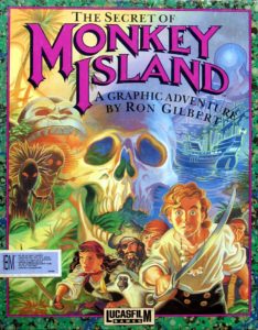
Shortly after completing Maniac Mansion, his first classic graphic adventure, Ron Gilbert started sketching ideas for his next game. “I wanted to do something that felt like fantasy and might kind of tap into what was interesting about fantasy,” he remembers, “but that wasn’t fantasy.” Gilbert loved the Pirates of the Caribbean ride at Disneyland, which took guests through a whole pirate adventure in fifteen minutes. He only wished that he could linger there, could get out of the little boat that carried guests through the attraction and wander amid the scenery. What the need to keep shoveling amusement-park guests through a paid attraction disallowed, a computer game could allow. Thus was the idea for The Secret of Monkey Island born.

The game casts you in the role of Guybrush Threepwood, a lovable loser who wants to become a pirate. Arriving on Mêlée Island, a den of piratey scum and villainy, he has to complete a set of trials to win the status of Official Pirate. Along the way, he falls in love with the island’s beautiful governor Elaine — her name sets the game up for a gleeful The Graduate homage — and soon has to rescue her from the villain of the story, the evil ghost pirate LeChuck.

The Disneyfied piracy wasn’t hard to do, especially after Gilbert discovered a charming little historical-fantasy novel by Tim Powers called On Stranger Tides. Nor was the goofy humor that was so much his stock in trade as a game designer. What did make things complicated, however, was his desire to create a more playable, forgiving adventure game than even Maniac Mansion had managed to be. Gilbert admits that he was struggling, with no more than the beginnings of a design document or, for that matter, a design philosophy, when a mandate came down from Lucasfilm Games’s parent company’s management: they wanted an adventure game to go with the upcoming film Indiana Jones and the Last Crusade. Such a mandate was unusual for the privileged little artists’ enclave that still was Lucasfilm Games at this time, but, given the freedom they had so generously been granted for so long, they were hardly in a position to argue about it. Ron Gilbert, Noah Falstein, and David Fox joined forces to grind out the Indiana Jones game, while Monkey Island went on hold for more than six months.

It was just possibly the best thing that could have happened. The delay gave Gilbert time to continue thinking about adventure-game design in the abstract, to continue groping toward that elusive something — or, better said, somethings — that would make his future games different. Hardly a theorist by nature, he nevertheless sat down and wrote out a manifesto of sorts as a way of codifying his opinions, titling it, in inimitable Ron Gilbert fashion, “Why Adventure Games Suck.” This semi-legendary document, probably the most influential ever written on the subject of adventure-game design, was published in the December 1989 issue of The Journal of Computer Game Design (the paper-based adjunct to the Computer Game Developers Conference).

Some of what Gilbert has to say in his manifesto feels a little rambling and esoteric today, while the vast majority of what does feel relevant we’ve already had reasons to discuss on other occasions — what with the general state of adventure-game design in the 1980s, sometimes on all too many other occasions. Still, the document itself and the ideas it contains can only be regarded as hugely important to the evolution of the adventure game.

Consider what the manifesto has to say about the age-old problem of locking the player out of victory without her knowledge.

I forgot to pick it up

Never require a player to pick up an item that is used later in the game if she can’t go back and get it when it is needed. It is very frustrating to learn that a seemingly insignificant object is needed, and the only way to get it is to start over or go back to a saved game. From the player’s point of view, there was no reason for picking it up in the first place. Some designers have actually defended this practice by saying that “adventure-game players know to pick up everything.” This is a cop-out. If the jar of water needs to be used on the spaceship and it can only be found on the planet, create a use for it on the planet that guarantees it will be picked up. If the time between the two uses is long enough, you can be almost guaranteed that the player forgot she even had the object.

The other way around this problem is to give the player hints about what she might need to pick up. If the aliens on the planet suggest that the player find water before returning to the ship, and the player ignores this advice, then failure is her own fault.

In The Secret of Monkey Island and all of the Lucasfilm adventure games that would follow it, Gilbert and his colleagues implemented an extreme remedy to this problem. Rather than admitting a failure to pick up the right object at the right time to be even potentially the player’s “own fault,” they made certain it was always possible to go back and get said item. Locking yourself out of victory, in other words, became literally impossible.

Now consider what the manifesto has to say about arbitrarily killing the player and about another related old bugaboo, requiring knowledge from past lives.

Live and learn

As a rule, adventure games should be able to be played from beginning to end without “dying” or saving the game if the player is very careful and very observant. It is bad design to put puzzles and situations into a game that require a player to die in order to learn what not to do next time. This is not to say that all death situations should be designed out. Danger is inherent in drama, but danger should be survivable if the player is clever.

As an exercise, take one complete path through a story game and then tell it to someone else, as if it were a standard story. If you find places where the main character could not have known a piece of information that was used (the character who learned it died in a previous game), then there is a hole in the plot.

Again, Gilbert and the rest of Lucasfilm would push much further than even the above would imply in their own future designs. Despite the claim that “danger is inherent to drama” — a claim, one has to assume, about which Gilbert must have come to think better — they made it impossible for the player to die, no matter what she did.

Gilbert tells us at the end of his manifesto that he’d like to “get rid of save games” altogether.

If there have to be save games, I would use them only when it was time to quit playing until the next day. Save games should not be a part of game play. This leads to sloppy design. As a challenge, think about how you would design a game differently if there were no save games. If you ever have the pleasure of watching a non-game player playing an adventure game you will notice they treat save games very differently than the experienced user. Some start using it as a defense mechanism only after being slapped in the face by the game a few times, the rest just stop playing.

It’s this idea of designing adventure games as if saves didn’t exist that’s the real key to understanding what made The Secret of Monkey Island and the Lucasfilm adventures which would follow it so different, even so revolutionary. Everything else springs from this one adjustment in perspective. I last played The Secret of Monkey Island nine months or so ago, when my wife and I were on a little holiday in Venice. Each evening, after a long day spent exploring the alleys and canals, we’d retire back to our cozy little hotel and I’d poke at Monkey Island for an hour or two on my laptop before bed. Having played heaps of older adventure games for years prior to getting to Monkey Island — the life of a digital antiquarian sadly doesn’t leave much time for games that aren’t on the syllabus! — I must have experienced it much as its first players did. And I have to say, it’s downright difficult to express how freeing it was to know that I didn’t need to save every ten minutes, didn’t need to stress over the potential of somehow locking myself out of victory with every action. Instead, I could feel free to explore and experiment, knowing the game would take care of me. I don’t say that every game needs to be this way, but I do know that The Secret of Monkey Island is, along with its immediate Lucasfilm predecessor Loom, perhaps the first adventure games I’ve ever played for this blog that felt like natural holiday companions, things to relax into and just enjoy rather than assault with deadly seriousness. And yet The Secret of Monkey Island in particular manages this feat without ever feeling trivial. The game represents a remarkable historical watershed, as of an entire culture of game makers and players waking up and realizing that all the little aggravations they had thought adventure games had to include really didn’t need to be in there at all.
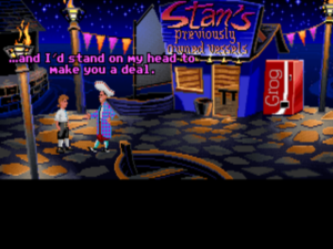
Cheerfully blatant anachronisms like the grog machine and Stan the used-boat salesman are everywhere. Ron Gilbert has mentioned the grog machine as one of his great lessons in “copyrights and trademarks.” Apparently getting it to look enough like a Coke machine to make the joke work but not so much that Lucasfilm was likely to get sued was quite the exercise in triangulation.

Taken apart from its immense importance as a model for future designs at Lucasfilm and elsewhere, The Secret of Monkey Island might initially seem a less than overwhelming package. It exists in very typical adventure-game territory for its era, at first glance dismayingly so. We’ve got yet another sad-sack loser of a protagonist, wandering through a comedy landscape built from pop-culture detritus, anachronisms, and meta-humor. The whole ought to read as lazy as most such efforts. Yet two things save the day, both of which feel intrinsic to the people who wrote the game, Ron Gilbert and his two assistant writers Tim Schafer and Dave Grossman. The first is the marvelously unaffected quality of the humor. The game is consistently, off-handedly funny without ever conspicuously straining to be in the manner of its peers. Where their humor is labored, Monkey Island‘s is effortless. And then there’s the related quality of a certain sweetness about the game. Guybrush Threepwood is the ultimate innocent. He just wants to be a Disney version of a pirate and to rescue and win the hand of the beautiful Elaine; guile is a foreign concept to him. Not only is The Secret of Monkey Island that rarest of beasts, a self-styled comedy adventure that’s genuinely, consistently funny, it’s about as likeable a game as has ever been made. This is a game where when a cannibal asks you how to “get ahead” he means… no, that one’s just too much fun to spoil.

The Secret of Monkey Island isn’t flashy or self-consciously spectacular in the way that so many contemporaneous Sierra adventures strained to be, but it is sophisticated in its aesthetics in a way few other games of its era can match. Still working with 16-color EGA graphics (a 256-color VGA version, from which the screenshots in this article are drawn, was released within a few months of the original), artists Steve Purcell and Mark Ferrari used their limited color palette to good effect to evoke the various moods of the various environments, while Michael Land crafted a gentle reggae-influenced soundtrack to plink away unobtrusively in the background or swell up into the foreground as circumstances dictated. Playing The Secret of Monkey Island really does feel like wandering through a delightful pirate theme park (a quality which the rather infamous ending of the sequel, which we won’t go into further in this article, would take very much to heart).

Most of all, The Secret of Monkey Island thrives on its puzzle design. The game’s plot plays out in four chapters, within each of which you have broad discretion to solve puzzles at your own pace and in your own order. (“Give the player options” is another commandment in “Why Adventure Games Suck.”) Its most famous puzzle, “insult sword-fighting,” says much about the game’s personality as a whole: instead of fighting with swords, pirates in this game like to fight via insults. You need to collect these insults and their ripostes as you explore, then apply them just right to win the “sword fight.” (Hey, anything’s better than a sharp sword in the gut, right?) The idea was born as Ron Gilbert was watching old pirate movies of the Errol Flynn stripe, and noticed that the opponents spent as much time verbally as physically assaulting one another. What with a verbal joust being far easier to implement in an adventure game than a sword-fighting engine, it didn’t take him long to run with the idea.

But really the entirety of the puzzle design, top to bottom, is just superb, managing to be funny and clever and occasionally challenging without ever devolving into the random using of each object on each other object. Throughout, attention is paid to you the player’s time and sanity in a way very few games of the era bother to do. For instance, at one point you need to follow another character through the jungle to find a secret location. Most games of the time would happily make you do this over and over, every time you want to return to said location — not least because doing so could serve to boost the length of the game at no expense. The Secret of Monkey Island only makes you do it once, then proceeds to do it for you from then on. “No point in having to solve the same puzzle over and over,” said Gilbert. Amen to that.

The game’s system of nudging you on to the correct solution to many puzzles is subtle to the extent that many players never even notice it’s there — and this, it must be said, again feels like the way it ought to be. At the beginning of the game, you’re expected to fulfill three tasks to prove to the pirates on the island that Guybrush has what it takes to become a pirate as well. As you poke around the island, your challengers actually take note of what you’ve done, and will offer some hints based on your progress if you go back and talk to them. “We want to guide the player subtly through the game,” said Gilbert’s colleague David Fox. “If the game works right, it should know that you’re stuck somewhere and it should give you a little help in a subtle way, so that you can solve the puzzle without feeling like it was solved for you.” In the context of 1990, the year of The Secret of Monkey Island‘s release, this was astonishingly progressive design. “As opposed,” remarked Fox wryly, “to the kind of game where the designer seems to be saying, ‘Aha! I’ve got you this time!’ and you have to spend three hours of gameplay to find some hidden object that you need to solve one puzzle.”

A rare example of a game where every element complements every other element, The Secret of Monkey Island has gone down in history as one of the finest, most justly beloved graphic adventures ever made. And for any aspiring adventure designer, even today, it’s a veritable master class in how to make an adventure game that most definitively doesn’t suck.

Released in October of 1990 as Lucasfilm’s second adventure of the year, The Secret of Monkey Island shared with its immediate predecessor Loom its pretend-the-player-can’t-save approach to design. Loom, however, had been a bridge too far for many traditionalist adventure gamers. What with its aggressively minimalist interface and portentous setting and story, it felt like an adventure game filtered through the aesthetics of a European avant-garde film. But The Secret of Monkey Island was, to strain the metaphor, all Hollywood. Whatever its innovations, it was also very much a meat-and-potatoes adventure game in the old style, complete with a menu of verbs, a comic tone, lots of object-oriented puzzles to solve, and a length more in keeping with that people had come to expect from a $40 boxed adventure game. It was thus far better equipped to deliver the gospel of “Why Adventure Games Suck” than Loom had been. While Loom had been greeted with critical uncertainty, reviewers fell over themselves to praise The Secret of Monkey Island, which wasted no time in becoming Lucasfilm Games’s biggest hit to date. It marks an enormously important watershed in the history of Lucasfilm’s adventure games in general, the moment when they commercially and creatively came fully into their own. The classic era of Lucasfilm adventures begins in earnest with The Secret of Monkey Island, which would become nothing less than the ideal most of the games that would follow would strive, sometimes perhaps a little too self-consciously, to reach.

Its commercial performance aside, The Secret of Monkey Island‘s enormous importance in the history of the art of adventure-game design in general shouldn’t be neglected. For many designers working at other companies, Ron Gilbert’s no-deaths-and-no-dead-ends approach hit home with the force of revelation. Both Corey Cole, co-designer of the Quest for Glory series for Sierra, and Bob Bates, co-founder of Legend Entertainment, brought up The Secret of Monkey Island unprompted in recent interviews with me as a work that made a huge impression on them. By no means would all designers push as far as Ron Gilbert had in the name of making a more playable adventure game. Corey Cole’s design partner Lori Ann Cole, for example, pronounced herself to be against “capricious” death in adventure games, but insisted that the possibility of death needed to be present to foster “personal involvement” and “an emotional stake” and to elevate the game above “mere amusement” — all of which positions strike me as perfectly reasonable for the very different sort of adventure games she and Corey were making. Still, everyone serious about the art of adventure-game design simply had to reckon with The Secret of Monkey Island, had to decide what its lessons really were and how to apply them. The game’s impact was such that to speak of a pre-Monkey Island and post-Monkey Island era of adventure games wouldn’t be at all out of order.

As the 1990s began, times were beginning to change inside Lucasfilm Games. With the fire hose of cash that had been the Star Wars and Indiana Jones film franchises now ebbing and no new sequels in either blockbuster franchise on the horizon, Lucasfilm in general was concentrating on becoming a more commercially savvy organization. These changes inevitably affected the games division. Just about the instant that The Secret of Monkey Island was hitting store shelves, a major corporate reorganization was in progress at Lucasfilm, which saw the games division given far more resources — their personnel roll grew from about 25 to more than 100 between 1989 and 1991 — but also given much closer supervision. They would now be expected to justify each of their projects to the accountants. This transformation of Lucasfilm Games from sideline to major profit center was by no means viewed as a comprehensively bad thing by everyone working inside the games division — it did after all lead to them finally being let loose on the Star Wars intellectual property, something they’d been wishing for for years — but it would change the character of the place and the games that came from it forever.

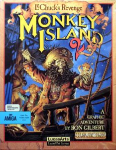
The changes meant that the two sequels to Loom which Brian Moriarty had hoped to make would never be realized; Moriarty was instead sent off to work on a new educational-games initiative. A sequel to the big hit The Secret of Monkey Island, however, became a major priority under the new order, especially as Lucasfilm, now devoting lots of resources to flight simulators and those aforementioned Star Wars games, had no other adventures on their calendar for 1991. Released in December of 1991, Monkey Island 2: LeChuck’s Revenge didn’t disappoint commercially. Benefiting from the enormous good will accrued by its predecessor, it became another bestseller, and won a number of the game-of-the-year awards that a tardy industry should have been awarding to its predecessor (inertia being the force it is, most of the awards for 1990 had gone to Sierra’s pretty but horribly designed King’s Quest V, which served as its own argument for “why adventure games suck”). Today, the sequel remains almost as beloved as the original among hardcore Lucasfilm fans.

Personally, though, I’m not such a big fan of Monkey Island 2 as I am of its predecessor. Ron Gilbert had spent two and a half years designing, writing, and developing the first Monkey Island, alone or with others. He was given just a year for Monkey Island 2, a game that’s at least 50 percent larger, and I fancy I can see this disparity in the end result. The writing is neither as sharp nor as sweet. For the first time in a Ron Gilbert game, some of the humor is more gross than clever — spitting, with attention to the color and consistency of your loogies, is a major puzzle mechanic — and some of the rest is weirdly mean-spirited. Guybrush Threepwood has been transformed from the gee-whiz innocent of the first game to a bit of a raging asshole, the type of guy who steals a monocle from an innocent character who can’t see a thing without it and locks another guy who didn’t do anything to him inside a coffin. I don’t know to what I should attribute the change in tone — whether to changes going on inside Lucasfilm Games at the time, to changes going on in the personal lives of Ron Gilbert and/or the other members of his writing team, to the pressure of getting a bigger game out in much less time, or simply to happenstance. I know only that it doesn’t sit that well with me.
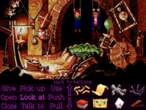
Captured by LeChuck in Monkey Island 2. The game will arbitrarily let you use only one item you’re carrying to effect your escape, and there’s no way to know ahead of time what that item is. Guess what that means you have to do…

In terms of puzzle design, the sequel also marks a big step down from its predecessor. While the no-deaths-and-no-dead-ends approach to design is still present, Monkey Island 2 constantly violates another of the dicta found in Ron Gilbert’s manifesto.

Arbitrary puzzles

Puzzles and their solutions need to make sense. They don’t have to be obvious, just make sense. The best reaction after solving a tough puzzle should be, “Of course, why didn’t I think of that sooner!” The worst, and most often heard after being told the solution, is, “I never would have gotten that!” If the solution can only be reached by trial and error or plain luck, it’s a bad puzzle.

Monkey Island 2 is full of these sorts of, to use Ron Gilbert’s own words, “bad puzzles.” Many solutions are so outlandish that you can stumble upon them only by using every object on every other object. At one point, for instance, you’re carrying a monkey around in your inventory (don’t ask!) when you come upon a closed water valve you need to open. Using the monkey on the valve does the trick because “monkey wrench.” Now, credit where it’s due, there’s some real wit to this. Yet it’s the sort of thing absolutely no player will ever think of on her own, especially given that the game hasn’t heretofore shown any interest in this sort of wordplay. (And that’s without even beginning to consider the problems of localization to other languages than English, which tends to render a puzzle like this into a complete non sequitur.) As you get deeper into the game, there’s more and more of this sort of thing, along with pixel hunts, an infuriating maze, and puzzles that can only be solved by trying to pick up every seemingly immovable item on the screen. Monkey Island 2 at times seems like an experiment in how annoying an adventure game can be without technically violating Lucasfilm’s no-deaths-and-no-dead-ends policy.

Arbitrary puzzles that can be solved only through trial and error would prove to be Lucasfilm’s Achilles heel going forward; too many of the games to come would feature puzzles designed more to create a laugh at how ridiculous they are than to be interesting or satisfying to solve. The end result is to create a feeling in the player of playing the interface rather than participating actively in the game world.
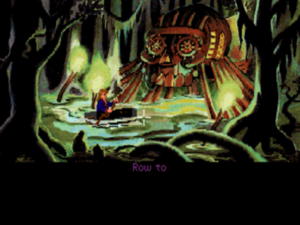
Despite my complaints, by no means was Lucasfilm’s progressive design philosophy completely abandoned for Monkey Island 2. The puzzle you need to solve to get through the swamp is a prime example. After you figure out what object to use as a paddle, the game solves the puzzle for you on each return visit.

Perhaps aware that they had crossed a line in trying to make Monkey Island 2 more difficult than its predecessor, Lucasfilm added a “Lite” mode to the game which scales the complexity of the puzzle structure back dramatically. Unfortunately, most players agree that the Lite mode goes too far in the other direction, removing most of the interest from the game. Taken together, the very presence of the two modes speaks to a design that didn’t quite hit the sweet spot of the first game, and to a design team that at some intuitive level may have realized this.

Shortly after completing Monkey Island 2, Ron Gilbert left Lucasfilm Games, resulting in a long hiatus for Guybrush, Elaine, LeChuck, and company. Given my snail’s pace through history, there will thus likely be an almost equally lengthy hiatus before they’ll grace these pages again. For now, I can only strongly encourage you to make the time to play The Secret of Monkey Island if you haven’t already. It’s as strong a comedy adventure as you’ll ever see, and as historically important an adventure game as any released since Crowther and Woods’s seminal original Adventure. While you can take or leave its sequel as you see fit, The Secret of Monkey Island is one adventure game that everybody really ought to play. It’s just that important. And even better, it’s just that good.

(Sources: the films From Bedrooms to Billions: The Amiga Years and its associated extras; the book Droidmaker: George Lucas and the Digital Revolution by Michael Rubin; A.C.E. of April 1990; The Adventurer of Fall 1990, Spring 1991, and Fall 1991; Computer Gaming World of December 1990, June 1991, October 1991, November 1991, January 1992, May 1992, and November 1992; Retro Gamer 34. Also Ron Gilbert’s blog, The Grumpy Gamer.)


Tags: , , ,

A Little Status Update

As the subject line says, just wanted to let you all know about the latest goings-on here at Digital Antiquarian corporate headquarters. My Patreon supporters know already that I visited Rochester a couple of weeks ago to spend more time in the archives of the Strong Museum of Play. This time I spent an entire week going through their recently acquired collection of papers from Brian Fargo and Interplay. What I’ve come back with will do a lot to inform future articles. It’s really interesting and occasionally exciting stuff.

Unfortunately, everything went a little sidewise on the week of my return. I came back sick — it was cold in Rochester, even compared to Denmark! — and then my wife Dorte had a bunch of complications from a root canal and ended up having to spend a night in the hospital. So, we made something of a sorry pair last week. I guess we’ve had a little preview of what it will be like when we’re a decrepit old couple.

We’re both doing better now, but I did lose a lot of working time. What that means for you is that what I had originally planned as a one-week hiatus somewhere around this time has turned into a two-week hiatus. I did write an article this week, but my approach for the last year or so has been to hold articles for a week to look at them one more time with fresh eyes prior to publication, and I’d like to get back to that rather than jump the gun now; I think it’s really done a lot for the end result, even as you all continue to help me with the typos and small errors that do creep in in spite of my best efforts. Just bear with me for one more week, then, and all will be back to normal.

Thanks as always for your support!


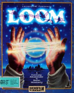
Loom (or, how Brian Moriarty Proved That Less is Sometimes More)

In April of 1988, Brian Moriarty of Infocom flew from the East Coast to the West to attend the twelfth West Coast Computer Faire and the first ever Computer Game Developers Conference. Hard-pressed from below by the slowing sales of their text adventures and from above by parent company Activision’s ever more demanding management, Infocom didn’t have the money to pay for Moriarty’s trip. He therefore had to go on his own dime, a situation which left him, as he would later put it, very “grumpy” about the prospect of his ongoing employment by the very company at which he had worked so desperately to win a spot just a few years before.

The first West Coast Computer Faire back in 1977 had hosted the public unveiling of the Apple II and the Commodore PET, thus going down in hacker lore as the moment when the PC industry was truly born. By 1988, the Faire wasn’t the hugely important gathering it once had been, having been largely superseded on the industry’s calendar by glitzier events like the Consumer Electronics Show. Nevertheless, its schedule had its interesting entries, among them a lecture by Chris Crawford, the founder of the Computer Game Developers Conference which Moriarty would attend the next day. Moriarty recalls showing up a little late to Crawford’s lecture, scanning the room, and seeing just one chair free, oddly on the first row. He rushed over to take it, and soon struck up a conversation with the man sitting next to him, whom he had never met before that day. As fate would have it, his neighbor’s name was Noah Falstein, and he worked for Lucasfilm Games.

Attendees to the first ever Computer Game Developers Conference. Brian Moriarty is in the reddish tee-shirt at center rear, looking cool in his rock-star shades.

Falstein knew and admired Moriarty’s work for Infocom, and knew likewise, as did everyone in the industry, that things hadn’t been going so well back in Cambridge for some time now. His own Lucasfilm Games was in the opposite position. After having struggled since their founding back in 1982 to carve out an identity for themselves under the shadow of George Lucas’s Star Wars empire, by 1988 they finally had the feeling of a company on the rise. With Maniac Mansion, their big hit of the previous year, Falstein and his colleagues seemed to have found in point-and-click graphical adventures a niche that was both artistically satisfying and commercially rewarding. They were already hard at work on the follow-up to Maniac Mansion, and Lucasfilm Games’s management had given the go-ahead to look for an experienced adventure-game designer to help them make more games. As one of Infocom’s most respected designers, Brian Moriarty made an immediately appealing candidate, not least in that Lucasfilm Games liked to see themselves as the Infocom of graphical adventures, emphasizing craftsmanship and design as a way to set themselves apart from the more slapdash games being pumped out in much greater numbers by their arch-rivals Sierra.

Brian Moriarty on the job at Lucasfilm.

For his part, Moriarty was ripe to be convinced; it wasn’t hard to see the writing on the wall back at Infocom. When Falstein showed him some photographs of Lucasfilm Games’s offices at Skywalker Ranch in beautiful Marin County, California, and shared stories of rubbing elbows with movie stars and casually playing with real props from the Star Wars and Indiana Jones movies, the contrast with life inside Infocom’s increasingly empty, increasingly gloomy offices could hardly have been more striking. Then again, maybe it could have been: at his first interview with Lucasfilm Games’s head Steve Arnold, Moriarty was told that the division had just two mandates. One was “don’t lose money”; the other was “don’t embarrass George Lucas.” Anything else — like actually making money — was presumably gravy. Again, this was music to the ears of Moriarty, who like everyone at Infocom was now under constant pressure from Activision’s management to write games that would sell in huge numbers.

Brian Moriarty arrived at Skywalker Ranch for his first day of work on August 1, 1988. As Lucasfilm Games’s new star designer, he was given virtually complete freedom to make whatever game he wanted to make.

Noah Falstein in Skywalker Ranch’s conservatory. This is where the Games people typically ate their lunches, which were prepared for them by a gourmet chef. There were definitely worse places to work…

For all their enthusiasm for adventure games, the other designers at Lucasfilm were struggling a bit at the time to figure out how to build on the template of Maniac Mansion. Zak McKracken and the Alien Mindbenders, David Fox’s follow-up to Ron Gilbert’s masterstroke, had been published just the day before Moriarty arrived at Skywalker Ranch. It tried a little too obviously to capture the same campy charm, whilst, in typical games-industry fashion, trying to make it all better by making it bigger, expanding the scene of the action from a single night spent in a single mansion to locations scattered all around the globe and sometimes off it. The sense remained that Lucasfilm wanted to do things differently from Sierra, who are unnamed but ever-present — along with a sly dig at old-school rivals like Infocom still making text adventures — within a nascent manifesto of three paragraphs published in Zak McKracken‘s manual, entitled simply “Our Game Design Philosophy.”

We believe that you buy games to be entertained, not to be whacked over the head every time you make a mistake. So we don’t bring the game to a screeching halt when you poke your nose into a place you haven’t visited before. In fact, we make it downright difficult to get a character “killed.”

We think you’d prefer to solve the game’s mysteries by exploring and discovering. Not by dying a thousand deaths. We also think you like to spend your time involved in the story. Not typing in synonyms until you stumble upon the computer’s word for a certain object.

Unlike conventional computer adventures, Zak McKracken and the Alien Mindbenders doesn’t force you to save your progress every few minutes. Instead, you’re free to concentrate on the puzzles, characters, and outrageous good humor.

Worthy though these sentiments were, Lucasfilm seemed uncertain as yet how to turn them into practical rules for design. Ironically, Zak McKracken, the game with which they began publicly articulating their focus on progressive design, is the most Sierra-like Lucasfilm game ever made, with the sheer nonlinear sprawl of the thing spawning inevitable confusion and yielding far more potential dead ends than its designer would likely wish to admit. While successful enough in its day, it never garnered the love that’s still accorded to Maniac Mansion today.

Lucasfilm Games’s one adventure of 1989 was a similarly middling effort. A joint design by Gilbert, Falstein, and Fox, Indiana Jones and the Last Crusade: The Graphic Adventure — an Action Game was also made — marked the first time since Labyrinth that the games division had been entrusted with one of George Lucas’s cinematic properties. They don’t seem to have been all that excited at the prospect. The game dutifully walks you through the plot you’ve already watched unfold on the silver screen, without ever taking flight as a creative work in its own right. The Lucasfilm “Game Design Philosophy” appears once again in the manual in almost the exact same form as last time, but once again the actual game hews to this ideal imperfectly at best, with, perhaps unsurprisingly given the two-fisted action movie on which it’s based, lots of opportunities to get Indy killed and have to revert to one of those save files you supposedly don’t need to create.

So, the company was rather running to stand still as Brian Moriarty settled in. They were determined to evolve their adventure games in design terms to match the strides Sierra was making in technology, but were uncertain how to actually go about the task. Moriarty wanted to make his own first work for Lucasfilm a different, more somehow refined experience than even the likes of Maniac Mansion. But how to do so? In short, what should he do with his once-in-a-lifetime chance to make any game he wanted to make?

Flipping idly through a computer magazine one day, he was struck by an advertisement that prominently featured the word “loom.” He liked the sound of it; it reminded him of other portentous English words like “gloom”, “doom,” and “tomb.” And he liked the way it could serve as either a verb or a noun, each with a completely different meaning. In a fever of inspiration, he sat down and wrote out the basis of the adventure game he would soon design, about a Loom which binds together the fabric of reality, a Guild of Weavers which uses the Loom’s power to make magic out of sound, and Bobbin Threadbare, the “Loom Child” who must save the Loom — and thus the universe — from destruction before it’s too late. It would be a story and a game with the stark simplicity of fable.

Simplicity, however, wasn’t exactly trending in the computer-games industry of 1988. Since the premature end of the would-be Home Computer Revolution of the early 1980s, the audience for computer games had grown only very slowly. Publishers had continued to serve the same base of hardcore players, who lusted after ever more complex games to take advantage of the newest hardware. Simulations had collected ever more buttons and included ever more variables to keep track of, while strategy games had gotten ever larger and more time-consuming. Nor had adventure games been immune to the trend, as was attested by Moriarty’s own career to date. Each of his three games for Infocom had been bigger and more difficult than the previous, culminating in his adventure/CRPG hybrid Beyond Zork, the most baroque game Infocom had made to date, with more options for its onscreen display alone than some professional business applications. Certainly plenty of existing players loved all this complexity. But did all games really need to go this way? And, most interestingly, what about all those potential players who took one look at the likes of Beyond Zork and turned back to the television? Moriarty remembered a much-discussed data point that had emerged from the surveys Infocom used to send to their customers: the games people said were their favorites overlapped almost universally with those they said they had been able to finish. In keeping with this trend, Moriarty’s first game for Infocom, which had been designed as an introduction to interactive fiction for newcomers, had been by far his most successful. What, he now thought, if he used the newer hardware at his disposal in the way that Apple has historically done, in pursuit of simplicity rather than complexity?

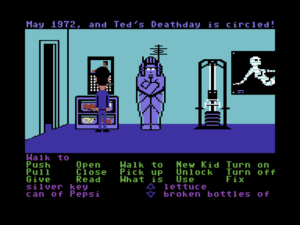
The standard Lucasfilm interface of the late 1980s, shown here in Maniac Mansion.

Lucasfilm Games’s current point-and-click interface, while undoubtedly the most painless in the industry at the time, was nevertheless far too complicated for Moriarty’s taste, still to a large extent stuck in the mindset of being a graphical implementation of the traditional text-adventure interface rather than treating the graphical adventure as a new genre in its own right. Thus the player was expected to first select a verb from a list at the bottom of the screen and then an object to which to apply it. The interface had done the job well enough to date, but Moriarty felt that it would interfere with the seamless connection he wished to build between the player sitting there before the screen and the character of Bobbin Threadbare standing up there on the screen. He wanted something more immediate, more intuitive — preferably an interface that didn’t require words at all. He envisioned music as an important part of his game: the central puzzle-solving mechanic would involve the playing of “drafts,” little sequences of notes created with Bobbin’s distaff. But he wanted music to be more than a puzzle-solving mechanic. He wanted the player to be able to play the entire game like a musical instrument, wordlessly and beautifully. He was thus thrilled when he peeked under the hood of Lucasfilm’s SCUMM adventure-game engine and found that it was possible to strip the verb menu away entirely.

Some users of Apple’s revolutionary HyperCard system for the Macintosh were already experimenting with wordless interfaces. Within weeks of HyperCard’s debut, a little interactive storybook called Inigo Gets Out, “programmed” by a non-programmer named Amanda Goodenough, had begun making the rounds, causing a considerable stir among industry insiders. The story of a house cat’s brief escape to the outdoors, it filled the entire screen with its illustrations, responding intuitively to single clicks on the pictures. Just shortly before Moriarty started work at Lucasfilm Games, Rand and Robyn Miller had taken this experiment a step further with The Manhole, a richer take on the concept of an interactive children’s storybook. Still, neither of these HyperCard experiences quite qualified as a game, and Moriarty and Lucasfilm were in fact in the business of making adventure games. Loom could be simple, but it had to be more than a software toy. Moriarty’s challenge must be to find enough interactive possibility in a verb-less interface to meet that threshold.

In response to that challenge, Moriarty created an interface that stands out today as almost bizarrely ahead of its time; not until years later would its approach be adopted by graphic adventures in general as the default best way of doing things. Its central insight, which it shared with the aforementioned HyperCard storybooks, was the realization that the game didn’t always need the player to explicitly tell it what she wanted to do when she clicked a certain spot on the onscreen picture. Instead the game could divine the player’s intention for itself, based only on where she happened to be clicking. What was sacrificed in the disallowing of certain types of more complex puzzles was gained in the creation of a far more seamless, intuitive link between the player, the avatar she controlled, and the world shown on the screen.


The brief video snippet above shows Loom‘s user interface in its entirety. You make Bobbin walk around by clicking on the screen. Hovering the mouse over an object or character with which Bobbin can interact brings up an image of that object or character in the bottom right corner of the screen; double-clicking the same “hot spot” then causes Bobbin to engage, either by manipulating an object in some way or by talking to another character. Finally, Bobbin can cast “spells” in the form of drafts by clicking on the musical staff at the bottom of the screen. In the snippet above, the player learns the “open” draft by double-clicking on the egg, an action which in this case results in Bobbin simply listening to it. The player and Bobbin then immediately cast the same draft to reveal within the egg his old mentor, who has been transformed into a black swan.

Moriarty seemed determined to see how many of the accoutrements of traditional adventure games he could strip away and still have something that was identifiable as an adventure game. In addition to eliminating menus of verbs, he also excised the concept of an inventory; throughout the game, Bobbin carries around with him nothing more than the distaff he uses for weaving drafts. With no ability to use this object on that other object, the only puzzle-solving mechanic that’s left is the magic system. In the broad strokes, magic in Loom is very much in the spirit of Infocom’s Enchanter series, in which you collect spells for your spell book, then cast them to solve puzzles that, more often than not, reward you with yet more spells. In Loom the process is essentially the same, except that you’re collecting musical drafts to weave on your distaff rather than spells for your spell book. And yet this musical approach to spell weaving is as lovely as a game mechanic can be. Lucasfilm thoughtfully included a “Book of Patterns” with the game, listing the drafts and providing musical staffs on which you can denote their sequences of notes as you discover them while playing.

The audiovisual aspect of Loom was crucial to capturing the atmosphere of winsome melancholia Moriarty was striving for. Graphics and sound were brand new territory for him; his previous games had consisted of nothing but text. Fortunately, the team of artists that worked with him grasped right away what was needed. Each of the guilds of craftspeople which Bobbin visits over the course of the game is marked by its own color scheme: the striking emerald of the Guild of Glassmakers, the softer pastoral greens of the Guild of Shepherds, the Stygian reds of the Guild of Blacksmiths, and of course the lovely, saturated blues and purples of Bobbin’s own Guild of Weavers. This approach came in very handy for technical as well as thematic reasons, given that Loom was designed for EGA graphics of just 16 onscreen colors.

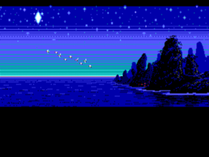
The overall look of Loom was hugely influenced by the 1959 Disney animated classic Sleeping Beauty, with many of the panoramic shots in the game dovetailing perfectly with scenes from the film. Like Sleeping Beauty, Loom was inspired and accompanied by the music of Pyotr Ilyich Tchaikovsky, whom Moriarty describes as his “constant companion throughout my life”; while Sleeping Beauty draws from Tchaikovsky’s ballet of the same name, Loom draws from another of his ballets, Swan Lake. Loom sounds particularly gorgeous when played through a Roland MT-32 synthesizer board — an experience that, given the $600 price tag of the Roland, far too few players got to enjoy back in the day. But regardless of how one hears it, it’s hard to imagine Loom without its classical soundtrack. Harking back to Hollywood epics like 2001: A Space Odyssey, the MT-32 version of Loom opens with a mood-establishing orchestral overture over a blank screen.


To provide the final touch of atmosphere, Moriarty walked to the other side of Skywalker Ranch, to the large brick building housing Skywalker Sound, and asked the sound engineers in that most advanced audio-production facility in the world if they could help him out. Working from a script written by Moriarty and with a cast of voice actors on loan from the BBC, the folks at Skywalker Sound produced a thirty-minute “audio drama” setting the scene for the opening of the game; it was included in the box on a cassette. Other game developers had occasionally experimented with the same thing as a way of avoiding having to cover all that ground in the game proper, but Loom‘s scene-setter stood out for its length and for the professional sheen of its production. Working for Lucasfilm did have more than a few advantages.

If there’s something to complain about when it comes to Loom the work of interactive art, it must be that its portentous aesthetics lead one to expect a thematic profundity which the story never quite attains. Over the course of the game, Bobbin duly journeys through Moriarty’s fairy-tale world and defeats the villain who threatens to rip asunder the fabric of reality. The ending, however, is more ambiguous than happy, with only half of the old world saved from the Chaos that has poured in through the rip in the fabric. I don’t object in principle to the idea of a less than happy ending (something for which Moriarty was becoming known). Still, and while the final image is, like everything else in the game, lovely in its own right, this particular ambiguous ending feels weirdly abrupt. The game has such a flavor of fable or allegory that one somehow wants a little more from it at the end, something to carry away back to real life. But then again, beauty, which Loom possesses in spades, has a value of its own, and it’s uncertain whether the sequels Moriarty originally planned to make — Loom had been envisioned as a trilogy — would have enriched the story of the first game or merely, as so many sequels do, trampled it under their weight.

From the practical standpoint of a prospective purchaser of Loom upon its initial release, on the other hand, there’s room for complaint beyond quibbling about the ending. We’ve had occasion before to observe how the only viable model of commercial game distribution in the 1980s and early 1990s, as $40 boxed products shipped to physical store shelves, had a huge effect on the content of those games. Consumers, reasonably enough, expected a certain amount of play time for their $40. Adventure makers thus learned that they needed to pad out their games with enough puzzles — too often bad but time-consuming ones — to get their play times up into the region of at least twenty hours or so. Moriarty, however, bucked this trend in Loom. Determined to stay true to the spirit of minimalism to the bitter end, he put into the game only what needed to be there. The end result stands out from its peers for its aesthetic maturity, but it’s also a game that will take even the most methodical player no more than four or five hours to play. Today, when digital distribution has made it possible for developers to make games only as long as their designs ask to be and adjust the price accordingly, Loom‘s willingness to do what it came to do and exit the stage without further adieu is another quality that gives it a strikingly modern feel. But in the context of the times of the game’s creation, it was a bit of a problem.

When Loom was released in March of 1990, many hardcore adventure gamers were left nonplussed not only by the game’s short length but also by its simple puzzles and minimalist aesthetic approach in general, so at odds with the aesthetic maximalism that has always defined the games industry as a whole. Computer Gaming World‘s Johnny Wilson, one of the more sophisticated game commentators of the time, did get what Loom was doing, praising its atmosphere of “hope and idealism tainted by realism.” Others, though, didn’t seem quite so sure what to make of an adventure game that so clearly wanted its players to complete it, to the point of including a “practice” mode that would essentially solve all the puzzles for them if they so wished. Likewise, many players just didn’t seem equipped to appreciate Loom‘s lighter, subtler aesthetic touch. Computer Gaming World‘s regular adventure-gaming columnist Scorpia, a traditionalist to the core, said the story “should have been given an epic treatment, not watered down” — a terrible idea if you ask me (if there’s one thing the world of gaming, then or now, doesn’t need, it’s more “epic” stories). “As an adventure game,” she concluded, “it is just too lightweight.” Ken St. Andre, creator of Tunnels & Trolls and co-creator of Wasteland, expressed his unhappiness with the ambiguous ending in Questbusters, the ultimate magazine for the adventuring hardcore:

The story, which begins darkly, ends darkly as well. That’s fine in literature or the movies, and lends a certain artistic integrity to such efforts. In a game, however, it’s neither fair nor right. If I had really been playing Bobbin, not just watching him, I would have done some things differently, which would have netted a different conclusion.

Echoing as they do a similar debate unleashed by the tragic ending of Infocom’s Infidel back in 1983, the persistence of such sentiments must have been depressing for Brian Moriarty and others trying to advance the art of interactive storytelling. St. Andre’s complaint that Loom wouldn’t allow him to “do things differently” — elsewhere in his review he claims that Loom “is not a game” at all — is one that’s been repeated for decades by folks who believe that anything labeled as an interactive story must allow the player complete freedom to approach the plot in her own way and to change its outcome. I belong to the other camp: the camp that believes that letting the player inhabit the role of a character in a relatively fixed overarching narrative can foster engagement and immersion, even in some cases new understanding, by making her feel she is truly walking in someone else’s shoes — something that’s difficult to accomplish in a non-interactive medium.

Responses like those of Scorpia and Ken St. Andre hadn’t gone unanticipated within Lucasfilm Games prior to Loom‘s release. On the contrary, there had been some concern about how Loom would be received. Moriarty had countered by noting that there were far, far more people out there who weren’t hardcore gamers like those two, who weren’t possessed of a set of fixed expectations about what an adventure game should be, and that many of these people might actually be better equipped to appreciate Loom‘s delicate aesthetics than the hardcore crowd. But the problem, the nut nobody would ever quite crack, would always be that of reaching this potential alternate customer base. Non-gamers didn’t read the gaming magazines where they might learn about something like Loom, and even Lucasfilm Games wasn’t in a position to launch a major assault on the alternative forms of media they did peruse.

In the end, Loom wasn’t a flop, and thus didn’t violate Steve Arnold’s dictum of “don’t lose money” — and certainly it didn’t fall afoul of the dictum of “don’t embarrass George.” But it wasn’t a big hit either, and the sequels Moriarty had anticipated for better or for worse never got made. Ron Gilbert’s The Secret of Monkey Island, Lucasfilm’s other adventure game of 1990, was in its own way as brilliant as Moriarty’s game, but was much more traditional in its design and aesthetics, and wound up rather stealing Loom‘s thunder. It would be Monkey Island rather than Loom that would become the template for Lucasfilm’s adventure games going forward. Lucasfilm would largely stick to comedy from here on out, and would never attempt anything quite so outré as Loom again. It would only be in later years that Moriarty’s game would come to be widely recognized as one of Lucasfilm Games’s finest achievements. Such are the frustrations of the creative life.

Having made Loom, Brian Moriarty now had four adventure games on his CV, three of which I consider to be unassailable classics — and, it should be noted, the fourth does have its fans as well. He seemed poised to remain a leading light in his creative field for a long, long time to come. It therefore feels like a minor tragedy that this, his first game for Lucasfilm, would mark the end of his career in adventure games rather than a new beginning; he would never again be credited as the designer of a completed adventure game. We’ll have occasion to dig a little more into the reasons why that should have been the case in a future article, but for now I’ll just note how much an industry full of so many blunt instruments could have used his continuing delicate touch. We can only console ourselves with the knowledge that, should Loom indeed prove to be the last we ever hear from him as an adventure-game designer, it was one hell of a swansong.

(Sources: the book Game Design Theory and Practice by Richard Rouse III; ACE of April 1990; Questbusters of June 1990 and July 1990; Computer Gaming World of April 1990 and July/August 1990. But the bulk of this article was drawn from Brian Moriarty’s own Loom postmortem for, appropriately enough, the 2015 Game Developers Conference, which was a far more elaborate affair than the 1988 edition.

Loom is available for purchase from GOG.com. Sadly, however, this is the VGA/CD-ROM re-release — I actually prefer the starker appearance of the original EGA graphics — and lacks the scene-setting audio drama. It’s also afflicted with terrible voice acting which completely spoils the atmosphere, and the text is bowdlerized to boot. Motivated readers should be able to find both the original version and the audio drama elsewhere on the Internet without too many problems. I do recommend that you seek them out, perhaps after purchasing a legitimate copy to fulfill your ethical obligation, but I can’t take the risk of hosting them here.)

 
65 Comments

Posted by on February 18, 2017 in Digital Antiquaria, Interactive Fiction


Tags: , ,

The Eastgate School of “Serious” Hypertext

A quarter of a century after Ted Nelson first coined the term, hypertext finally stepped into the spotlight in 1987. As we’ve seen in an earlier article, the primary driver of its long-delayed public recognition was Apple’s HyperCard, which in the wake of its premier at the MacWorld show in August went on to become the product of the year in the eyes of most industry pundits. But concurrent with the HyperCard hype were a number of other, smaller developments — enough to convince one that hypertext’s newfound fame might be down to more than just the whim of a major corporation, that it might be in some more organic sense an idea whose time had simply come.

The American Association of Computing Machinery, the oldest and arguably the most respected learned society devoted to computing in the world, had decided to hold a conference on hypertext well before HyperCard was more than a Silicon Valley rumor. When the conference actually took place in November of 1987, however, it could only benefit from the HyperCard excitement, which gave it a sense of relevance that stuffy academic conferences all too often don’t manage to capture. While many things were discussed over the course of those few days, the conference would go down in history for the debut of Storyspace, the first tool explicitly designed for authoring hypertext narratives on a personal computer, and for that of afternoon, a story, the first work ever to label itself a “hypertext novel.” These twin debuts also mark the beginning of what would become known as the Eastgate school of self-described “serious” hypertext, one of the less accessible — in both the figurative and, today, the literal sense — movements in the history of digital narratives.

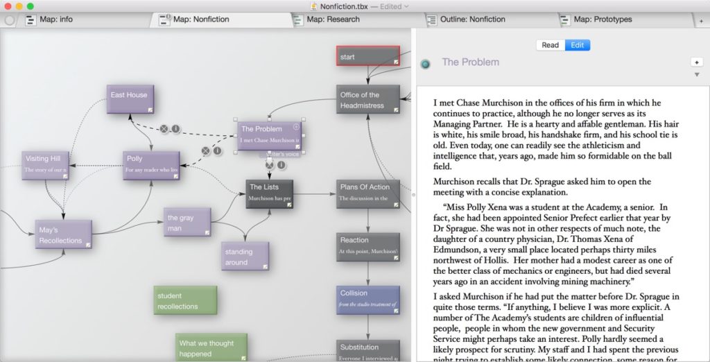
The co-creator of Storyspace and the author of afternoon was Michael Joyce, a professor of language and literature at Jackson Community College in Jackson, Michigan. Shortly after completing his first print novel in 1981, Joyce had bought his first computer, an Apple II, and immediately been captivated by what he saw as a whole new world of writing possibility. Responding to what he described as his frustration with the limitations of linear storytelling, he cultivated an eclectic web of friendships to pursue his interest in exploring new narrative structures enabled by computers. Most prominent among this group were Howard Becker, a sociologist at Northwestern University and fellow Apple enthusiast (he provided Joyce with a steady flow of pirated games, including many Infocom titles); Natalie Dehn, a researcher at Yale’s Artificial Intelligence Lab; and Jay David Bolter, a classicist at the University of North Carolina who was investigating generative storytelling on computers as a sideline. After upgrading to the new Apple Macintosh soon after its release, Joyce and Bolter, the latter of whom was a self-taught programmer, began working in earnest on Storyspace. From the beginning, Bolter took advantage of the Macintosh GUI to make the system accessible to non-programmers like Joyce. A snapshot of the work in progress from 1985:

The program currently represents structure as a map or network of rectangular cells and straight lines. Cells are units of text that may range in size from one character to 30,000. The author creates cells, labels them, positions them on the screen using the mouse, and attaches text. Stacking cells inside other cells indicates hierarchical relationships, while drawing and labeling lines from one to another indicates associative links. The author may then use the created structure to control or review the presentation of the text.

The pace of Storyspace development accelerated that same year when Joyce and Bolter won a grant from the Markle Foundation, allowing them to employ other programmers on the project.

The current Storyspace version 3 is not at all different conceptually from the system that Joyce and Bolter came up with in the 1980s. Nodes of text are represented as onscreen cells, to be connected together by the author using the mouse. The system is very accessible for non-programmers, but, because there is no real facility for tracking state, much less for modeling a world “behind” the surface text, it can also be very limiting. How much the character of the works created with Storyspace was down to ideology in the abstract and how much was down to ideology molding itself to the limitations of the technology is a little questionable.

In years to come, Michael Joyce and his fellow proponents of serious hypertext would seem willfully determined to disassociate themselves from existing commercial software — and especially from computer games. It’s interesting therefore to note that Joyce and Bolter’s original descriptions of Storyspace to potential funders didn’t describe it strictly as the tool for the academic avant garde that it would eventually become. The Markle Foundation funded Storyspace’s development based on a pitch that emphasized its applicability to business and to more mainstream, Choose Your Own Adventure-style branching narratives.

Still, someone had to be the first to make something in Storyspace. A new development system of any stripe can always benefit from a killer app to demonstrate its capabilities, and Storyspace was no exception, as Joyce’s friend Howard Becker pointed out to him: “One thing that will really help nerds like me see how to use this will be a couple of good examples, spelled out in real detail, and included on the disk. Like a story by you…” afternoon, a story, the most famous, most read, and most analyzed work of the Eastgate school, was thus created with the rather practical goal of simply showing off what Storyspace could do to potential investors and customers. Joyce began to write it in March of 1987, and had completed it in time to bring it to Chapel Hill, North Carolina, in November for the ACM hypertext conference, hosted by Jay David Bolter’s employer the University of North Carolina. Joyce and Bolter gave out copies of afternoon to conference attendees after their presentation on Storyspace. [1]afternoon, a story would go through multiple revisions over a period of years, but these would largely be to polish the existing text and, most of all, to add many more links between the extant textual nodes. In terms of word count, in other words, the version of afternoon that Joyce passed out at the conference was substantially the same as the one that is available today. History hasn’t recorded in any detail the computer scientists’ reaction to Joyce’s daunting work of postmodern literature, but we’re on firmer ground on the subject of the authoring system he had used to create it: Storyspace became the hit of the conference.

Following that rapturous reception, Joyce and Bolter, joined now by a University of North Carolina computer scientist named John B. Smith, formed a company they named Riverrun and started pitching Storyspace to software publishers. They talked for some time with Brøderbund, who went so far as to lend them hardware and expertise to further the project after the Markle Foundation’s funding ran out. But in February of 1989 Brøderbund bowed out in response to, as historian Matthew Kirschenbaum puts it, “lingering confusion over exactly what the tool did and who its potential audience was.” Brøderbund was seemingly skeptical whether this group of academics was truly capable of creating a product that would appeal to the mainstream of Middle America, the commercial sweet spot Brøderbund was almost uniquely adept among their peers at reaching with products like The Print Shop and the Carmen Sandiego series.

Having been rejected by Brøderbund and the rest of the consumer-software industry, who were going through troubled times and growing ever more risk-averse thanks to the Nintendo onslaught, Joyce, Bolter, and Smith turned to Mark Bernstein, founder of a tiny company called Eastgate Systems dedicated to researching future applications of hypertext. In 1990, Eastgate published Storyspace at last, and also published afternoon, a story as their debut work of hypertext fiction. Both garnered modest interest in the mainstream press as curiosities and possible harbingers of the future. Indeed, Eastgate had big plans for the future. Occupying some hazy middle ground between software publisher and book publisher, they would for much of the 1990s publish multiple works of hypertext fiction and nonfiction each year alongside the Storyspace software that was used to create them. For a time they even published their own magazine, The Eastgate Quarterly Review of Hypertext, full of theory on the one hand and news about their latest products on the other, like a highbrow version of Infocom’s old New Zork Times. In 1992, Robert Coover, like Michael Joyce a print novelist turned hypertext evangelist, published an opinion piece in The New York Times that served as a manifesto of sorts for what the Eastgate school of writers believed would become a major — indeed, potentially revolutionary — literary movement. We’ll return to that a little later. But first, more on afternoon, a story itself and the works it spawned.

Authors of the Eastgate school, who were almost universally academics working in the humanities, saw themselves as pushing the literary novel to the next stage of its formal evolution. For this reason, many or most of their works have as much or more to do with explicating certain ways of thinking about literature and literary criticism as they do with plot, character, or any of the other attributes of traditional novels. Their works are steeped in the post-structuralist school of literary criticism, which is itself an outgrowth of the postmodern philosophy of thinkers like Jacques Derrida. While I do understand that an extended discussion of such topics probably won’t set your hearts aflutter with anticipation, I do think a little background is necessary to an understanding of what the Eastgate school was all about. So, please bear with me while I set the stage as painlessly as I can manage.

The road to the Eastgate school really does begin with Jacques Derrida, who from the 1960s until his death in 2004 remained the preeminent voice of postmodernism as it applied to literary criticism and many other endeavors. It was Derrida who invented the concept of deconstruction — a concept that, like many of the concepts associated with postmodern philosophy, seems virtually impossible to fully define. In writings that must stand as some of the most impenetrable ever committed to paper, Derrida himself did such a baffling, self-contradictory job of it that he’s often been accused of not knowing quite what it was himself, and of attempting to obscure that lack through sheer weight of verbiage. The problem was only complicated in later days by the mainstream media’s latching onto the term and using it constantly as little more than a synonym for “analyze.”

Still, if we stay safely at the shallow end of the pool, deconstruction can be a very straightforward, noncontroversial idea: the idea that one can learn much about a text by teasing out the unexamined assumptions of its author. Herman Wouk, to take an example, doubtless considered himself quite an enlightened man when he published The Caine Mutiny in 1951, but his condescending descriptions of the titular minesweeper’s black kitchen staff says much about the racist attitudes of his time. At this level, then, deconstruction implies little more than a skeptical reading between the author’s lines, and a willingness to seek context outside of the work itself.

At the deeper end of the pool, however, we come to the claims that nothing can ultimately mean anything at all. Derrida rejected the notion, underpinning in different ways both religion and science, that there is an absolute Truth out there somewhere which we can approach if not reach via earnest inquiry. In Derrida’s view, any absolute Truth must belong to the realm of metaphysics — a realm in which he refused to believe. Instead of Truth, he saw a multiplicity of individual, subjective “truths,” hierarchies of constructed meaning — thus meanings ripe for deconstruction — tied to hierarchies of social power. Deconstructionism has always walked hand in hand with Marxism and other radical political ideologies. Just as Marxism envisions an end to the privileges of authority, deconstructionist thought seeks an end to the privilege accorded to the author as the final authority on her work’s meaning.

At the risk of being accused of getting too cute or playing games of gotcha!, I can’t resist pointing out the logical contradiction inherent in the supposed objective Truth that there is no objective Truth. More seriously, though, the idea that all meaning is constructed and subjective is one that will doubtless continue to strike each incoming group of humanities undergraduates as a profound revelation, and to strike those of us who have been around it for a few years — those of us who haven’t become Derrida scholars, that is — as the most tedious of hobby horses to continue flogging. It seems to me that the problem with radical deconstructionism and, indeed, postmodernism in general is that it’s very hard to know what to really do with them. What’s the point of saying anything if you don’t believe it’s possible to say anything that bears any relationship to any Truth outside itself? Much rationalization has been done in an attempt to avoid the nihilism to which postmodernism would seem inevitably to lead, but the arguments have never struck me as terribly convincing.

Of course, any attempt to fully capture Truth in writing, whether on the grand scale of history or the empathetic scale of an individual character, must inevitably fail at some level, must run afoul of subjectivity and the limits of the author’s cognition and experience. This is a Truth that any competent writer or historian — and I do like to believe I manage to be both on a good day — must always keep in mind. Still, the point of the endeavor is the striving, the point is to come as close as you can to the ideal of a captured Truth. If you don’t believe there is anything out there to be striven for, why bother? The debate is not strictly an academic one. Taken to an extreme, a refusal to believe in the existence of verifiable facts is not just absurd but actively dangerous, as the current president of my country is so masterfully demonstrating as I write these words.

But now let’s turn our attention back to afternoon, a story, a work steeped in postmodern thought, to see what effect those patterns had on this work of literary hypertext.

I try to recall winter. < As if it were yesterday? > she says, but I do not signify one way or another.

By five the sun sets and the afternoon melt freezes again across the blacktop into crystal octopi and palms of ice  — rivers and continents beset by fear, and we walk out to the car, the snow moaning beneath our boots and the oaks exploding in series along the fenceline on the horizon, the shrapnel settling like relics, the echoing thundering off the far ice.

<Poetry > she says, without emotion one way or another.

Do you want to hear about it?

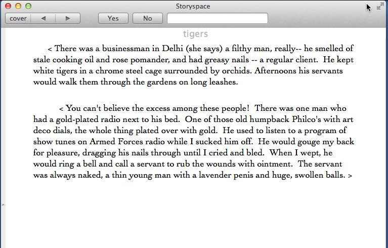
And so, with this passage that could only have issued from an overwrought teenager or a tenured academic, we begin our “story” — a word, one has to assume, that Joyce means ironically, for replying that yes, we do want to hear about it, yields anything but a straightforward story. This is not an exercise in “What do you want to do next?” It’s rather a web of allusions and musings, with no foregrounded action at all. As near as I’ve been able to divine through much feverish clicking, our story, such as it is, is that of Peter, a man who has just witnessed a car crash that may have killed his ex-wife and his son. If we are persistent enough, we may eventually arrive at a node that seems to say that Peter himself may be responsible for their deaths in some way. But that’s the closest we can ever get to any sort of resolution; this alleged “story” of more than 500 nodes is not only nonlinear but endless, every node always looping back onto other nodes.

“A thin young man with a lavender penis and huge, swollen balls,” huh? Don’t threaten me with a good time!

In terms of interface, afternoon must strike us today as a strange beast, and it’s a little hard to determine how much of that strangeness is down to conscious intent and how much is down to the era when it was first created, well before our modern expectations for a hypertext interface had been set in stone. Those sections of the text which lead to other sections — in Joyce’s preferred parlance, those “words that yield” — are not highlighted in any way. Indeed, in later editions of afternoon every word in the text will lead you somewhere else, albeit all too often to one of the same set of uninteresting cul de sacs. There is at least a back button for when you get caught in one of these, along with a forward button that will yield a default next node if you don’t wish to choose one — but, typically for this work that seems so self-consciously designed to stymie and frustrate its reader, traversing the entire text using the default option only winds you up in one of those uninteresting cul de sacs. And then there are also “yes” and “no” buttons, which you can use to respond to occasional explicit questions or just click for the hell of it at any time to go somewhere else. Given that afternoon consists of more than 500 nodes, and that the relationships between them all are intuitive at best, random at worst — certainly anything but logical — trying to get a sense of it all is a fairly monumental endeavor.

But people have certainly tried, and therein lies a noteworthy tension between what afternoon believes itself to be and what it actually is. Michael Joyce and many others of the Eastgate school were always determined to disassociate their work from games, even “literary” games like those of Infocom. [2]The most amusing of the rare collisions between literary hypertext and the hobbyist interactive-fiction community must be the history of the Usenet newsgroup rec.arts.int-fiction. Being apparently unaware that for many thousands of people the term “interactive fiction” meant text adventures — especially the text adventures of Infocom — literary-hypertext practitioners tried to appropriate the term for themselves around the time of Eastgate’s release of afternoon, setting up rec.arts.int-fiction to discuss their own very different interests. It was promptly invaded by vastly greater numbers of text-adventure fans wanting to talk about the old Infocom games, whereupon the literary-hypertext people departed in a huff, leaving the newsgroup, alongside its companion group rec.games.int-fiction, to become the central discussion forum of the Interactive Fiction Renaissance of the 1990s. Yet to say that afternoon isn’t a game in the same sense that Infocom’s interactive fictions are games goes against the way that almost everyone responds to it. (Whether adventure “games” and similar interactive works really are games in the same sense that competitive zero-sum exercises are games is a separate discussion which we’ll have to leave unaddressed today.) Confronted with this word salad, we want to figure it out, to make sense of it, to find out what the hell Peter is on about. Thus there is a puzzle to be unraveled here, an implicit ludic challenge to be confronted. Even much of the academic writing on afternoon obsesses over this process of figuring it out. In this sense, then, afternoon is not so far from an Infocom game — or for that matter a mystery novel — as Joyce might prefer to believe. Whether it constitutes a good game or puzzle is of course another question entirely.

And on that subject, I have to be honest: afternoon, a story bores the living daylights out of me. If it was interested in empathetically exploring the feelings of Peter, it might have been a moving work. If it was interested in letting the reader get to the definitive bottom of what really happened to Peter’s ex-wife and son, it might have been an intriguing one. If it could have shown even a flash from time to time of self-awareness or humor instead of remaining so relentlessly, pretentiously po-faced, it might at least have been a little more likeable. But, sadly in my view, Michael Joyce isn’t interested in doing any of these things. What Joyce is interested in is, in the words of critic Janet Murray, “intentionally ‘problematizing’ our expectations of storytelling, challenging us to construct our own text from the fragments he has provided.” Yet the text he has provided is so leaden and dull that the only type of interest such an exercise can muster is theoretical interest in the mind of a post-structuralist literary critic. I find this sort of self-reflexive art — art about nothing more than the process of its own creation, or the process of its own reception — to be a betrayal of art’s potential to move and change us. “Problematizing our expectations of storytelling” is a thin foundation on which to build a work of deathless literature.

So, we return now to that zeitgeist-capturing New York Times piece of 1992, written by Robert Coover, who would go on to become something of an elder statesman for the Eastgate school. It was entitled “The End of Books.” Like so many zeitgeist-capturing pieces, it comes across as almost hilariously dated today, but nevertheless remains the logical next stop for anyone trying to understand what the Eastgate school was all about. First, the article’s opening. Afterward, in the spirit of turnabout being fair play, we shall indulge in a little of what some might refer to as deconstruction of our own.

In the real world nowadays, that is to say, in the world of video transmissions, cellular phones, fax machines, computer networks, and in particular out in the humming digitalized precincts of avant-garde computer hackers, cyberpunks and hyperspace freaks, you will often hear it said that the print medium is a doomed and outdated technology, a mere curiosity of bygone days destined soon to be consigned forever to those dusty unattended museums we now call libraries. Indeed, the very proliferation of books and other print-based media, so prevalent in this forest-harvesting, paper-wasting age, is held to be a sign of its feverish moribundity, the last futile gasp of a once vital form before it finally passes away forever, dead as God.

Which would mean of course that the novel, too, as we know it, has to come to its end. Not that those announcing its demise are grieving. For all its passing charm, the traditional novel, which took center stage at the same time that industrial mercantile democracies arose — and which Hegel called “the epic of the middle-class world” — is perceived by its would-be executioners as the virulent carrier of the patriarchal, colonial, canonical, proprietary, hierarchical and authoritarian values of a past that is no longer with us.

Much of the novel’s alleged power is embedded in the line, that compulsory author-directed movement from the beginning of a sentence to its period, from the top of the page to the bottom, from the first page to the last. Of course, through print’s long history, there have been countless strategies to counter the line’s power, from marginalia and footnotes to the creative innovations of novelists like Laurence Sterne, James Joyce, Raymond Queneau, Julio Cortazar, Italo Calvino and Milorad Pavic, not to exclude the form’s father, Cervantes himself. But true freedom from the tyranny of the line is perceived as only really possible now at last with the advent of hypertext, written and read on the computer, where the line in fact does not exist unless one invents and implants it in the text.

“Hypertext” is not a system but a generic term, coined a quarter of a century ago by a computer populist named Ted Nelson to describe the writing done in the nonlinear or nonsequential space made possible by the computer. Moreover, unlike print text, hypertext provides multiple paths between text segments, now often called “lexias” in a borrowing from the pre-hypertextual but prescient Roland Barthes. With its webs of linked lexias, its networks of alternate routes (as opposed to print’s fixed unidirectional page-turning) hypertext presents a radically divergent technology, interactive and polyvocal, favoring a plurality of discourses over definitive utterance and freeing the reader from domination by the author. Hypertext reader and writer are said to become co-learners or co-writers, as it were, fellow travelers in the mapping and remapping of textual (and visual, kinetic and aural) components, not all of which are provided by what used to be called the author.

Coover comes across like a caricature of the pretentious academic with his name-dropping irrelevant asides to demonstrate his erudition (“what Hegel called ‘the epic of the middle-class world'”) and his painful attempts to capture the spirit of William Gibson (“the humming digitalized precincts of avant-garde computer hackers”). The language of deconstruction and post-structuralism is everywhere. The conventional reader is forever being “dominated” and “tyrannized” by the “patriarchal,” “colonial,” “canonical,” “proprietary,” “hierarchical,” “authoritarian” author. But, even setting the loaded language aside, is she really so much under the author’s thumb? It seems to me that the reader always has the ultimate veto power over the author in the form of the ability to put the book down and not read it anymore. If she chooses to continue, to follow the line to the end, she is doing so willingly, and can hardly be considered a subjugated victim.

Further, is the “tyranny of the line” truly a tyranny? Far from being compelled to follow the author “from the first page to the last,” the reader is always free to skip around in a text, to read the parts that interest her in the order she prefers. Why else do tables of contents and indexes exist? Those of us who made it through a graduate program in the humanities were all forced by the sheer amount of reading that is assigned to learn how to delicately but mercilessly fillet a book in order to extract exactly what we need from it in the minimum length of time. Far from being subjected to the author’s tyranny, we learned to rip the beating heart out of the author’s little darling and dissect it on our desktops. It’s a skill that still serves me well in the work I do today, as the bloody remains of this article’s list of sources lying strewn around me right now will attest.

And then is the best way to achieve a “plurality of discourses” really to try to stuff them all into a single nonlinear book? Wouldn’t it perhaps make more sense to just, you know, read several books?

But most problematic of all is the article’s core premise/prophecy: that hypertext will lead to the “end of books.” The end of print, Coover tells us, will “of course mean that the novel, too, as we know it, has to come to its end.” In reality, there’s no “of course” about this proposition at all. Coover demonstrates a colossal failure of imagination in conflating the literary form of the novel with print, the physical medium on which novels were almost exclusively delivered in 1992. As the thriving modern ebook market demonstrates, the medium is not necessarily the message in this case. Let’s give him the benefit of the doubt, though, and look past even this confusion. As long as we’re talking about tyranny, we should note that Coover’s essay never asks what real-world readers actually want. Do they really wish to become “co-learners” and “co-writers”? I think most would reply that writing is what they’re paying the author to do, and that the author had damn well better learn her subject on her own time, before she starts trying to sell them a book about it.

Which isn’t to say that there isn’t room for interactive texts, and now more so than ever. As many readers of this blog are doubtless aware, choice-based stories like those published by Choice Of Games have achieved a certain degree of commercial success as the heirs to the Choose Your Own Adventure gamebooks of yore, while more poetic hypertext explorations created with tools like Twine reach their own audience of readers. Granted, the audiences for both styles of work remain by all indications fairly small, but they nevertheless dwarf the numbers that have ever read the literary hypertexts of the Eastgate school. So, while we are far, far from any end of books — and thank God for that! — there obviously is a readership for hypertext fiction, one that may even grow considerably in the future. The fact that the works which people are reading are so divorced from the works of the Eastgate school has everything to do with the failure of said school to write hypertext novels that people want to read. Summing up the heyday of the Eastgate school, scholar Adam Hammond says that “the most enduring legacy of this period is theoretical rather than creative.” It’s not really meant as a criticism of the works themselves, yet it’s hard for me to think of a better one.

Writing about the status of serious hypertext as of 2016, Hammond notes that it “is one of the few digital literary forms that can be plausibly regarded as dead”: “The works that seemed so revolutionary and world-altering were not only seldom read in their own time, but are today literally unreadable, languishing in antiquated software and hardware formats inaccessible to the contemporary reader.” Eastgate soldiers on somehow, still selling Storyspace — in fact, a new version was recently released — alongside a collection of hypertext novels that virtually all date from those halcyon days of the 1990s. Yet it’s hard to figure out to whom they could be selling this stuff as of 2017. They’ve done, as Hammond says, an horrendous job of keeping up to date with the changing times. I recently bought three hypertext novels from Eastgate: afternoon, a story, King of Space, and Victory Garden. The first of this group is the most famous work ever published by Eastgate, while the last is among the two or three next most famous. And yet none of them will Just Work on a modern computer. afternoon, a story comes the closest: it comes on a USB stick that will work on Mac OS X — but only on versions released prior to 2011. Victory Garden, meanwhile, won’t run on a 64-bit operating system of any stripe, while King of Space requires, incredibly, a version of Mac OS prior to OS X. (“1 M of memory and hard disk required,” announces the packaging.) I’m a fairly technical guy, and thus can get all this stuff running, but how many other prospective readers can make the same claim? When I placed my order, I was greeted with emails explaining the situation and asking if I really wanted to pay all this money for these relics, which Eastgate still sells for $25 or more apiece. There then followed more elementary questions about delivery methods and the like. Everyone was very nice, but I couldn’t help myself from conjuring a scene that ought to be a Saturday Night Live skit if it isn’t one already, taking place in a disused office space somewhere inhabited by a couple of dozing employees: “Hey, wake up! We actually have a customer!”

As should be obvious by now, I have little truck with most of what I’ve seen of the Eastgate school. I’m always skeptical of writers who make a point of telling me they are writing “serious” works, for it always leads me to think about the greatest writer I’ve ever read, William Shakespeare, who never laid claim to being more than a working playwright feeding the public’s appetite for new entertainments. Writers in my opinion should simply write, and leave the judgments to the critics and, most of all, to history. Given this bias of mine as well as all of the other problematic (to me) rhetoric surrounding the Eastgate school, and given that it so conspicuously failed to set the world on fire as promised in Coover’s article, you might well be asking why I’ve bothered to write all these words about its origins. It’s a fair question, and one to which I will, if you’ll bear with me just a little longer, give three answers.

The first answer is that there is some real historical interest here in the context of more contemporary choice-based narratives. Storyspace was the first of its kind, the urtext of systems like Twine and the Choice Of Games engine. While it has generally been used to create works of a very different character than those more recent systems, there is no reason why it couldn’t create, say, a contemporary take on Choose Your Own Adventure full of concrete choices — “I want to go here and do that!” — instead of more abstracted explorations of a writerly space.

The second answer is that the movement simply deserves an evaluation — or an obituary if you must — from someone outside its orbit. I may very well not be the person who is best-qualified to provide that evaluation, but for right now anyway I’m all it’s got.

But it’s the third answer that may be the real answer. This blog has always been, among other things, a chronicle of my personal journey through the history of interactive entertainment. And the fact is that, while I’ve seen the big flagship works and not been overly impressed, much of what languishes in the Eastgate catalog is completely unknown to me, and much of it sounds rather intriguing despite that whisper from my worse if wiser self that tells me I’m probably in for more disappointment. I wonder for instance about the aforementioned King of Space, a hypertext novel I’ve purchased but haven’t yet tried; in addition to what certainly reads like an extant and even intriguing plot, it contains, Eastgate tells us sotto voce, “elements of gaming.” (Shhh!) So, I do plan to dig into this and other Eastgate hypertext novels, to find out whether there are hidden away in their catalog works with some real meat on their bones and life flowing through their veins. I’ll continue to explore, and if I find that to be the case I’ll report back here. If not, this may well be my one and only article on the subject — mission accomplished, duty to history satisfied. We shall see.

In the meanwhile, how about we talk about an adventure game next time? Sound good to you? Well, at this point it sounds pretty good to me too.

(Sources: Literature in the Digital Age: An Introduction by Adam Hammond; Mechanisms: New Media and the Forensic Imagination by Matthew G. Kirschenbaum; “Postmodernism and Science Fiction” by Andrew M. Butler, from The Cambridge Companion to Science Fiction; Narrative as Virtual Reality and Avatars of Story by Marie-Laure Ryan; Cybertext: Perspectives on Ergodic Literature by Espen J. Aarseth; Hamlet on the Holodeck: The Future of Narrative in Cyberspace by Janet H. Murray; The New York Times of June 21, 1992.)

Footnotes

Footnotes
1 afternoon, a story would go through multiple revisions over a period of years, but these would largely be to polish the existing text and, most of all, to add many more links between the extant textual nodes. In terms of word count, in other words, the version of afternoon that Joyce passed out at the conference was substantially the same as the one that is available today.
2 The most amusing of the rare collisions between literary hypertext and the hobbyist interactive-fiction community must be the history of the Usenet newsgroup rec.arts.int-fiction. Being apparently unaware that for many thousands of people the term “interactive fiction” meant text adventures — especially the text adventures of Infocom — literary-hypertext practitioners tried to appropriate the term for themselves around the time of Eastgate’s release of afternoon, setting up rec.arts.int-fiction to discuss their own very different interests. It was promptly invaded by vastly greater numbers of text-adventure fans wanting to talk about the old Infocom games, whereupon the literary-hypertext people departed in a huff, leaving the newsgroup, alongside its companion group rec.games.int-fiction, to become the central discussion forum of the Interactive Fiction Renaissance of the 1990s.
 
37 Comments

Posted by on February 10, 2017 in Digital Antiquaria, Interactive Fiction


Tags: ,

TADS

For text-adventure fans confronting the emerging reality of a post-Infocom world, AGT was a godsend, allowing amateurs for the first time to create games that at a quick glance might appear to match those of Infocom. Still, AGT was far from the answer to every prayer, for the fact remained that it would have to be a very quick glance indeed. David Malmberg, the developer of AGT, was ingenious and motivated, but he was also a self-taught programmer with little background in the complexities of programming languages and compiler design. He had built AGT by adding to Mark Welch’s profoundly limited GAGS system for creating generic database-driven text adventures a scripting language that ignored pretty much all of the precepts of good language design. What he had ended up with was almost a sort of technological folk art, clever and creative and practical in its way, but rather horrifying to anyone with a deeper grounding in computing theory. The best argument in favor of AGT was that it worked — basically. While the system was undoubtedly more capable than anything that had been available to hobbyists before, it still didn’t take much poking at an AGT game before the rickety edifice’s seams began to show.  A number of authors would push the system to unforeseen heights, in the process creating a number of classic games, but it was obvious that AGT could never work quite well enough to create games as polished as those of Infocom. To do that, a language would be needed that was truly designed rather than improvised. Enter Michael J. Roberts with his Text Adventure Development System, or TADS.

Roberts had first started programming on his school’s DEC PDP-11 system in the 1970s at the age of 12, and thereafter had ridden the first wave of the PC revolution. In those early days, text adventures were among the most popular games there were. Like so many of his peers, Roberts studied the BASIC listings published in books and magazines carefully, and soon started trying to write adventures of his own. And like so many of those among his peers who became really serious about the business, he soon realized that each game he wrote was similar enough to each other game that it made little sense to continually reinvent the wheel by writing every one from scratch. Roberts:

It occurred to me that lots of the code could be generalized to any adventure game. So, I tried to write a little library of common functions — the functions operated on a set of data files that specified the vocabulary words, room descriptions, and so on.

This was a nice approach in some ways; the idea was that the game would be described entirely with these data files. The problem that I kept running into was that I’d have to write special-purpose functions for certain rooms, or certain commands — you couldn’t write an entire game with just the data files, because you always had to customize the library functions for each game. What I really wanted was a way to put programming commands into the data files themselves, so I didn’t have to modify the library routines.

Once you start putting procedural code into data files, you essentially have a programming language. At first, I tried to avoid the work of writing a real language interpreter by making the language very limited and easy to parse. That was better than just the data files, but it was tedious to write programs in a limited language. I eventually saw that you really needed a good language that was easy to use to be able to write decent games.

Roberts, in other words, was discovering for himself the limitations and inelegancies that were inherent to a system like AGT — the limitations and inelegancies of grafting a scripting language onto a generic database engine.

But it wasn’t until he went off to the California Institute of Technology that his experiments progressed further. Despite his official status as a physics major, Caltech offered plenty of opportunity for a motivated young hacker like him to immerse himself in the latest thinking about programming languages and compiler design. In the air all around him was computer science’s hot new buzzword of “object-oriented” design. By allowing the programmer to gather together data and the code that manipulates that data into semi-autonomous “objects,” an object-oriented programming language was an ideal fit for the problems of constructing a text adventure. (Indeed, it was such an ideal fit that Infocom had developed a heavily object-oriented language of their own in the form of their in-house adventure-programming language ZIL years before the buzzword came to prominence.) Following yet another trend, Roberts based his new adventure language’s syntax largely on that of C, the language that was quickly become the lingua franca of the world of computer programming in general.

On the theory that a worked example is worth a thousand abstractions, and following the precedent I set with my article on AGT, I’d like to show you a little bit of TADS code taken from a real game. You may want to refer back to my AGT article to contemplate the comparisons I’m about to make between the two languages. Taken together, the two articles will hopefully lead to a fuller understanding of just how TADS evolved the text-adventure-programming state of the art over AGT.

The game we’ll be looking at this time is Ditch Day Drifter, a perfectly playable standalone adventure that was also used by Mike Roberts as his example game for TADS learners. Once again following my AGT precedent, I’ll focus on that most essential piece of equipment for any old-school adventurer: a light source. Here we see Ditch Day Drifter‘s flashlight.

flashlight: container, lightsource
    sdesc = "flashlight"
    noun = 'flashlight' 'light'
    adjective = 'flash'
    location = security
    ioPutIn( actor, dobj ) =
    {
        if ( dobj <> battery )
        {
            "You can't put "; dobj.thedesc; " into the flashlight. ";
        }
        else pass ioPutIn;
    }
    Grab( obj ) =
    {
        /*
         *   Grab( obj ) is invoked whenever an object 'obj' that was
         *   previously located within me is removed.  If the battery is
         *   removed, the flashlight turns off.
         */
        if ( obj = battery ) self.islit := nil;
    }
    ldesc =
    {
        if ( battery.location = self )
        {
            if ( self.islit )
                "The flashlight (which contains a battery) is turned on
                and is providing a warm, reassuring beam of light. ";
            else
                "The flashlight (which contains a battery) is currently off. ";
        }
        else
        {
            "The flashlight is off. It seems to be missing a battery. ";
        }
    }
    verDoTurnon( actor ) =
    {
        if ( self.islit ) "It's already on! ";
    }
    doTurnon( actor ) =
    {
        if ( battery.location = self )
        {
            "The flashlight is now on. ";
            self.islit := true;
        }
        else "The flashlight won't turn on without a battery. ";
    }
    verDoTurnoff( actor ) =
    {
        if ( not self.islit ) "It's not on. ";
    }
    doTurnoff( actor ) =
    {
        "Okay, the flashlight is now turned off. ";
        self.islit := nil;
    }
; 
 

Unlike the case of our AGT example, for which we had to pull together several snippets taken from entirely separate files, we have here everything the game needs to know about the flashlight, all in one place thanks to TADS’s object-oriented design. Let’s step through it bit by bit.

The first line tells us that the flashlight is an object which inherits many details from two generic classes of objects included in the standard TADS library: it’s both a container, meaning we can put things in it and remove them, and a light source. The rest of the new object’s definition fleshes out and sometimes overrides the very basic implementations of these two things provided by the TADS library. The few lines after the first will look very familiar to veterans of my AGT article. So, the flashlight has a short description, to be used in inventory listings and so forth, of simply “flashlight.” The parser recognizes it as “flashlight” or “light” or “flash light,” and at the beginning of the game it’s in the room called “security.”

After this point, though, we begin to see the differences between TADS’s object-oriented approach and that of AGT. Remember that adding customized behaviors to AGT’s objects could be accomplished only by checking the player’s typed commands one by one against a long series of conditions. The scripts to do so were entirely divorced from the objects they manipulated, a state of affairs which could only become more and more confusing for the author as a game grew. Like those created using many other self-consciously beginner-friendly programming languages, AGT programs become more and more of a tangle as their authors’ ambitions grow, until one reaches a point where working with the allegedly easy language becomes far more difficult than working with the allegedly difficult one. Contrast this with TADS’s cleaner approach, which, like Infocom’s ZIL, places all the code and data pertaining to the flashlight together in one tidy package.

Continuing to read through the TADS snippet above, we override the generic container’s handling of the player attempting to put something into it, specifying that this particular container can only contain one particular object: the battery. Then we specify that if the player removes the battery from the flashlight when the flashlight is turned on, its status changes to not lit — i.e., it goes out.

Next we have the flashlight’s “long description,” meaning what will happen in response to the player attempting to “examine” it. TADS allows us to insert code here to describe the flashlight differently depending on whether it’s on or off, and, if it’s in the latter state, depending on whether it contains the battery.

Finally, we override the generic light source’s handling of the player turning it on or off, to tie the written description of these actions to the specific case of a flashlight and to reckon with the presence or absence of the battery. Again, note how much cleaner this is than the AGT implementation of the same concepts. In AGT, we were forced to rely on several different versions of the flashlight object, which we swapped in and out of play in response to changes in the conceptual flashlight. In TADS, concept and code can remain one, and the steps necessary to implement even a huge adventure game can continue to be tackled in relative isolation from one another.

Instructive though it is to compare the divergent approaches of the two systems, it is important to state that TADS wasn’t created in reaction to AGT. Computing communities were much more segregated in those days than they are today, and thus Roberts wasn’t even aware of AGT’s existence when he began developing TADS. Beginning as a language tailored strictly to his own needs as a would-be text-adventure author, it only gradually over the course of the latter 1980s morphed in his mind into something that might be suitable for public consumption. What it morphed into was, nevertheless, something truly remarkable: the first publicly available system that in the hands of a sufficiently motivated author really could create text adventures as sophisticated as those of Infocom. If anything, TADS had the edge on ZIL: its syntax was cleaner, its world model more thorough and consistent, and it ran in a virtual machine of its own that would prove as portable as the Z-Machine but was free of the latter’s brutal size constraints.

As TADS was rounding into this very impressive state, Roberts set up a company with a friend of his named Steve McAdams. In tribute to Roberts’s degree in physics, they called it High Energy Software, and, following in the footsteps of David Malmberg’s little AGT enterprise, planned to sell TADS as shareware through it. Version 1.0 of TADS was released in September of 1990, alongside two games to show it off. One was the afore-referenced freebie example game Ditch Day Drifter, while the other was Deep Space Drifter, a bigger game released as a shareware product in its own right. Both games tread well-worn pathways in terms of subject matter, the former being yet another “life at my university” scenario, the latter a science-fiction scenario with some of the feel of Infocom’s Starcross. Both games are a little sparse and workmanlike in their writing and construction, and some elements of them, like the 160-room maze in Deep Space Drifter, are hopelessly old school. (It’s not a maze in the conventional drop-and-map sense, and the puzzle behind it is actually very clever, but still… 160 rooms, Mike? Was that really necessary?) On the positive side, however, both games are quite unusual for their era in being scrupulously fair — as long, that is, as you don’t consider the very idea of a huge maze you have to map out for yourself to be a crime against humanity.

But undoubtedly the most ambitious and, in their way, the most impressive of the early TADS games came not from High Energy Software but rather from a pair of University of Maryland students named David Leary and David Baggett, who started a company they called Adventions to sell TADS text adventures via the shareware model. Of all the folks dabbling in shareware text adventures during the early 1990s, it was Adventions who made the most concerted and sustained effort at building a real business out of it. Their flagship series came to encompass three big unabashed Zork homages — Unnkulian Underworld: The Unknown Unventure, Unnkulian Unventure II: The Secret of Acme, and Unnkulia Zero: The Search for Amanda — alongside Unnkulia One-Half: The Salesman Triumphant, a free snack-sized sampler game.

When the first Unnkulia game was released remarkably quickly on the heels of TADS itself — Mike Roberts can’t recall for sure, but believes Leary and Baggett likely developed it with an early beta copy of the system — it stood as easily the most immediately impressive amateur text adventure ever. The text was polished in a way that few text-adventure developers outside of Infocom, whether amateur or professional, had ever bothered to do, being free of the self-conscious meta-textual asides and atrocious grammar that had always marked the genre. Adventions’s text, by contrast, looked like it had actually been proof-read, and possibly several times at that. Likewise, the game took full advantage of the sophisticated TADS world model to offer puzzles of an intricacy that just wasn’t possible with a tool like AGT. The first Unnkulia game and those which followed were almost in a league of their own for some time in all these respects.

On the other hand, though, the Unnkulia games strike me as curiously unlikable. You can get a good idea of their personality just by looking at their names. If the name Unnkulia — be sure to say it out loud — strikes you as hilarious, congratulations, you may have found your new favorite series. If it instead just strikes you as stupid, as it does me, perhaps not so much. (I admit that my attitude may be affected by having to type the damn thing over and over again; no matter how hard I try, I just can’t seem to remember how to spell it.) Much of the humor inside the games for some reason involves “cheez” — and yes, it’s spelled just like that. The humor has always been, at best, polarizing, and I have no doubt on which side I stand. In addition to just not being all that funny, there’s a certain self-satisfied smugness about the whole enterprise that rubs me the wrong way. At the risk of over-personalizing my reaction to it, I’ll say that it feels like the work of two young men who are nowhere near as witty as they think they are. In short, there’s something about these games that I find insufferable.

In terms of design, the Unnkulia games are an equally odd brew. It’s clear that they’ve been quite rigorously tested — another thing that sets them apart from most text adventures of their era — and they’re free of mazes, guess-the-verb puzzles, and the other most-loathed aspects of their genre. Yet the puzzle design still isn’t all that satisfying. There’s an obsession with hiding objects behind, under, and inside unlikely things — an obsession which is ironically enabled by the TADS world model, which was the first to really allow this sort of thing. Sometimes, including in the very first room of the very first game, you even have to look twice to find everything. Hiding surprises in plain view is okay once or twice, but Baggett and Leary lean on it so hard that it quickly starts to feel lazy. When they do get more ambitious with their puzzles, however, they have a tendency to get too ambitious, losing sight in that peculiar way so many text-adventure authors have of how things actually work in a real physical environment. Let me offer a quick example.

So, let’s set up the situation (spoilers ahoy!). You have a bronze plate, but you need a bronze coin to feed to a vending machine. During your wanderings in search of that among other things, you come upon the room below. (These passages should also convey some more of the, shall we say, unique flavor of the writing and humor.)

Inner Temple of Duhdism

This chamber is the temple of Duhdism, the religion of the ancients. It's rather a letdown, after all Kuulest told you about it. A small altar with a round hole in the center is in the center of the chamber. Carved in stone on the far wall is some writing, the legend of Duhdism. The only exit from this chamber is back to the east. You feel at peace in this room, as if you could sleep here - or maybe you're just kind of bored.

>read writing
"The Legend of Duhdha and the Shot to Heaven:

One fine summer day, Duhdha was loading a catapult with rocks. When his students asked what he was doing, the great Duhdha just smiled and said, "Something real neat." Soon, the catapult was full, and Duhdha pulled the lever as his students looked on. The stones crushed the annoying students, leaving the great man to ponder the nature of mankind. Not only did the rocks eliminate distraction from Duhdha's life, but they fell to the ground in a pattern which has since become a standard opening for the intellectual game of "Went." Since then, the altar at the Temple of Duhdha fires a small stone into the air soon after a worshipper enters, to honor Duhdha - who taught his students not to ask stupid questions and to pretty much just leave him alone."

>x altar
The altar is about two feet by one foot, and about three feet tall. There's a small round hole in the exact center of the top surface. The altar is covered with rock dust. There's nothing else on the Duhdist altar.

>z
Time passes...
A rock shoots into the air from the hole in the altar, shattering on the ceiling and spreading rock dust on the altar.  From the outer chamber, you hear the old monk cry "Praise Duhdha!."

We obviously need to do something with this rock-spewing altar, but it’s far from clear what that might be, and fiddling with it in various ways offers no other clues. Putting things on it has no effect on either the thing that’s just been put there or the rocks that keep flying out — except in the case of one thing: the bronze plate we’re carrying around with us.

>put plate on altar
Done.

>z
Time passes...
A rock shoots from the altar at high velocities, puncturing the plate in the center. The rock shatters on the ceiling, spraying rock dust. You hear a tinkling sound as a tiny bronze disc falls on the floor. From the outer chamber, you hear the monk shout "Praise Duhdha!"


*** Your score has just changed. ***

When you reach this solution either by turning to the walkthrough or through sheer dogged persistence — I maintain that no one would ever anticipate this result — you might then begin to wonder what physical laws govern the world of Unnkulia. In the world we live in, there’s no way that the flying rock would punch a perfect hole neatly through the middle of a bronze plate that happened to just be lying on the altar. Without something to hold it in place, the plate would, of course, simply be thrown into the air to come down elsewhere, still intact. The ironic thing is that this puzzle could so easily have been fixed, could have even become a pretty good one, with the addition of a set of grooves or notches of some sort on the altar to hold the plate in place. Somehow this seems emblematic of the Unnkulia series as a whole.

Like everyone else who dreamed of making a living from shareware text adventures, Leary and Baggett found it to be a dispiriting exercise, although one certainly can’t fault them for a lack of persistence. With some bitterness — “It’s disappointing that although there are so many IF enthusiasts out there, so few are willing to pay a fair price for such strong work,” said Baggett — they finally gave up in time to release their final game, 1994’s very interesting The Legend Lives! — more on that in a future article —  for free before exiting from the text-adventure scene entirely.

The same dispiriting lack of paying customers largely applied to makers of text-adventure languages as well. Mike Roberts estimates that his rate of TADS registrations peaked “on that same order” as David Malmberg’s pace of 100 AGT registrations per year, or “maybe a little lower. I’d remember if it had been much higher because I’d have been spending all day stuffing envelopes.” Whatever their respective rates of registration, far more AGT than TADS games continued to be released in the early 1990s. While that may have struck some — not least among them Mike Roberts — as disappointing, the reasons behind it aren’t hard to divine. AGT had a head start of several years, it had an annual competition to serve as an incentive for people to finish their games, and, perhaps most of all, it presented a much less daunting prospect for the non-programming beginner. Its kind and gentle manual was superb, and it was possible to get started making simple games using it without doing any programming at all, just by filling in fields representing rooms and objects. TADS, by contrast, offered a manual that was complete but much drier, and was on the whole a much more programmer-oriented experience. The initial learning curve undoubtedly put many people off who, had they persisted, would have found TADS a much better tool for realizing their dreams of adventures in text than AGT.

Some time after the Adventions guys and David Malmberg gave up on their respective shareware products, Roberts and his partner Steve McAdams also decided that they just weren’t making enough money from TADS to bother continuing to sell it. And so they made TADS as well free. And with those decisions, the brief-lived era of shareware interactive fiction passed into history.

But, despite the disappointments, Mike Roberts and TADS weren’t going anywhere. Unlike Leary, Baggett, and Malmberg, he stayed on the scene after giving up on the shareware thing, continuing to support TADS as open-source software. It took its place alongside a newer — and also free — language called Inform as one of the two great technical catalyzers of what some came to call, perhaps a little preciously, the Interactive Fiction Renaissance of the mid- to late-1990s. So, I’ll have much, much more to write about TADS and the games made using it in years to come. One might even say that the system wouldn’t really come into its own as a creative force until Roberts made that important decision to make it free.

Still, the importance of TADS’s arrival in September of 1990 shouldn’t be neglected. Somewhat underutilized though it may initially have been, it nevertheless remained the first development system that was capable of matching Infocom’s best games. If the amateur scene still largely failed to meet that lofty mark, they could no longer blame their technology. On a more personal note, the emergence of Mike Roberts on the scene marks the arrival of the first of the stalwarts who would go on to build the modern interactive-fiction community. We’re still in an era that will strike even most of the most dedicated fans of modern interactive fiction as murky prehistory, but some people and artifacts we recognize are beginning to emerge from the primordial ooze. More than a quarter of a century later, Mike Roberts and TADS are still with us.

(Sources: SynTax issues 17 and 36; SPAG issues 5 and 33; Mike Roberts’s interview for Jason Scott’s Get Lamp documentary, which Jason was kind of enough to share with me in its entirety. And my thanks to Mike Roberts himself, who answered many questions personally via email.

Ditch Day Drifter and Deep Space Drifter are available on the IF Archive for play via a TADS interpreter. The Adventions games are available there as well.)


Tags: , ,