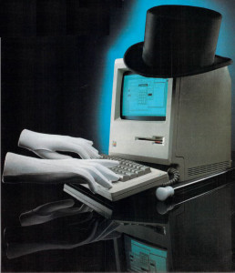
In the Macintosh software artists confronted that rarest of things, a completely new canvas. It wasn’t just a case of the Mac being better than the PCs that had come before; they’d had plenty of experience already dealing with that. No, the Mac was not so much better as fundamentally different. For all the possibilities opened up by the Mac’s mouse, its toolbox of GUI widgets accessible by any program, its crisp high-resolution screen, and its ability to make practical use of sampled sound recorded from the real world, there were also lots of caveats and restrictions. The black-and-white display and the lack of handy joysticks, not to mention the lack of obvious ways to get out of the windows-and-mouse paradigm, meant that many or most existing games would make little sense on the Mac. All Mac software, games included, would have to strike off in entirely new directions rather than building on the stuff that was already out there. That, of course, was very much how Steve Jobs and company had intended things to be on their paradigm-shifting creation. The original Mac team has mentioned almost to a person how excited they were at the launch to see what people would make with Macintosh, what they could do with this new set of tools. Game programmers were as eager as anyone to take up the challenge.
And some of them were to be found right there at Apple. Indeed, the Mac’s first great game far predates the launch. Like so much else on the Mac, it was born on the Lisa.
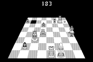
At some point in the middle stages of the Lisa’s long gestation, a programmer specializing in printer interfacing named Steve Capps started tinkering in his spare time with Alice, a game inspired by the chess motif running through Lewis Carroll’s Through the Looking Glass. The player moved a piece representing Alice in real time around a chess board which was laid out in a striking 3D perspective, trying to stomp on all of the opposing pieces before they stomped on her. It was a simple concept, but, what with the player being subject to the normal movement rules of whatever chess piece she chose to play as in the beginning, one admitting of surprising depth. None other than the Lisa team’s head of systems programming, Bruce Daniels, introduced the Mac people to Alice. With the affable Daniels acting as intermediary, Capps soon received a Mac prototype along with the Mac team’s heartfelt request that he port Alice to it, a request to which he quickly acceded. It made a better fit to the Lisa’s more playful younger brother anyway, and, thanks to the Mac’s 3 extra MHz of clock speed, even ran more smoothly.
Alice became an obsession of the Mac team, with marketer Joanna Hoffman a particular devotee. She complained constantly that the game was too easy, prompting the obliging Capps to tweak it to increase the challenge. As Capps himself has since acknowledged, this probably wasn’t all to the good; the game that would eventually see commercial release is extremely challenging. Other suggestions, like the one from Steve Wozniak that the mouse cursor should shrink as it moved “deeper” into the board to emphasize the 3D perspective, were perhaps more productive. Steve Jobs showed little interest in the game itself (one of the many constants running through his career is an almost complete disinterest in games), but was very intrigued by the programming talent it demonstrated. Alice became Capps’s ticket to the Mac team in January of 1983, where he did stellar work on the Finder and other critical parts of the first version of MacOS.
As the big launch approached, Capps was understandably eager to explore the commercial potential of this game that had entranced so many of his colleagues. Trip Hawkins, who had continued to stay in touch with goings-on inside Apple even after resigning from the Lisa team, was sniffing around with proposals to release Alice under the Electronic Arts aegis, with whose accessible-but-arty early lineup it would have made an excellent fit. Steve Jobs, however, had other ideas. Feeling that the game should come out under Apple’s own imprint, he delivered a classically Jobsian carrot — that Apple would do an excellent job packaging and promoting the game — and stick — that, since Alice had been created by an Apple employee on the Apple campus using prototype Apple hardware and proprietary Apple software, it was far from clear that the game belonged to said employee in the first place, and legal trouble might just be the result if Capps decided to assume it did. And so Capps agreed to allow his game to become the first and only such that Apple themselves would ever release for the Mac.
The discovery of a database application already trading under the name of “Alice” necessitated a name change to the less satisfactory Through the Looking Glass. But otherwise Apple’s packaging of the game, made to look like an original edition of the novel that had inspired it — albeit one sporting a hidden Dead Kennedys logo, a tribute to Capps’s favorite band — was beautiful and perfect. EA couldn’t have done any better.
The marketing, though, was another story. Through the Looking Glass became a victim of Apple’s determination in the wake of the Lisa’s failure to reposition the Mac as their serious business computer, to shove the fun aspects of the machine under the carpet as something shameful and dangerous. Thus Capps’s game got nary a mention in Apple’s voluminous advertising that first year, and mostly languished as a dusty curiosity on dealers’ shelves. The game has gone on to become something of a cult classic as well as a treasured piece of Macintosh lore, but Trip Hawkins would doubtless have done a much better job of actually selling the thing.
Others also had good reason to be frustrated with Apple’s fear of fun. Infocom received a visit from Guy Kawasaki, today the most famous of all Apple’s early “Mac evangelists,” well before the Mac’s launch. In the words of Dan Horn, head of Infocom’s Micro Group, Kawasaki “begged” Infocom to get their games onto the Mac, and delivered several prototypes to make it happen. It turned out to be unexpectedly challenging. The pre-release version of MacOS that Infocom received with the prototypes was so buggy that they finally decided to throw it out altogether. They wrote their own simple window and menu manager instead, packaging it onto self-booting disks that dumped the player straight into the game. When the Mac debuted, Infocom’s catalog of ten games represented something like 50% of the machine’s extant software base. But by now the winds of change had blown at Apple, and Infocom couldn’t get Kawasaki or anyone else to even return their phone calls. No matter; Mac early adopters were a more accepting lot than much of Apple’s executive wing. Infocom did quite well on the Macintosh, especially in those earliest days when, Through the Looking Glass and a bare few others excepted, their games were the only ones in town.
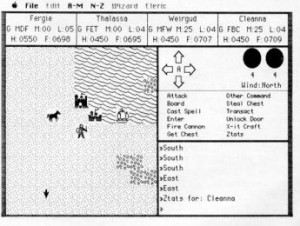
Still, Infocom was hardly the only gaming veteran to test the Macintosh waters. Sierra and Origin Systems demonstrated how pointless it could be to try to force old paradigms into new via their ports of, respectively, Ultima II and III to the Mac. The latter is a particular lowlight, with Ultima‘s traditional alphabet soup of single-letter commands just jumbled into a couple of long menus helpfully labeled “A-M” and “N-Z.” Thankfully, most either did original work or took a lot more care to make their ports feel like native-born citizens of the Macintosh.
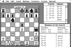
Dan and Kathleen Spracklen, creators of the long-lived Sargon line of chess programs, ported the latest iteration Sargon III to the Mac complete with a new mouse-based interface and absolutely loads of learning aids and convenience features hanging from its menus. None other than Bill Atkinson, architect of QuickDraw and MacPaint, paused to note how the Mac version of Sargon III changed his very concept of what a chess program was, from an opponent to be cowed to something more positive and friendly, like the Mac itself.
I have to set Sargon III on the easy level. The challenge used to be seeing if the computer could beat you. The challenge now is for the computer to teach you, by leading you, giving you hints, letting you take back moves.
Bill Budge ported Pinball Construction Set, the program whose GUI interface presaged a largely Mac-inspired revolution in games when it appeared on the Apple II, to the Mac itself. As he himself noted, however, what was revolutionary on the Apple II was “just another program” on the Mac. Still, the Mac Pinball Construction Set did let you load your MacPaint pictures in as fodder for your custom pinball tables, a demonstration of one of the less immediately obvious parts of the new Mac Way: its emphasis on crafting applications that cooperate and complement rather than compete with one another.
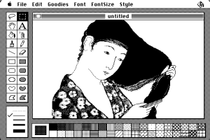
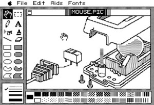
Budge also went the other way, creating what amounted to an Apple II port of MacPaint called MousePaint that copied the original right down to the little Apple logo in the upper left of the menu bar. Packaged with Apple’s first mouse for the II line, MousePaint is one of the more obvious examples of the impact the Mac was already having on more modest platforms. (Budge also claimed to be working on a space simulation, but, like his vaunted Construction Set Construction Set and so much else during his years in the wilderness, it would never see the light of day.)
Much other early Mac entertainment also evinced the Pinball Construction Set approach of giving you ways to make your own fun, an ethos very much in keeping with that of the machine itself. MasterPieces, for instance, let you carve your MacPaint drawings up into jigsaw puzzles, while MacMatch let you use them to create matched-pair puzzles like the old game show Concentration. Still other programs weren’t technically games at all, but no less entertaining for it: things like Animation Toolkit; MusicWorks, which made the first spectacular use of the Mac’s four-voice sound capabilities; HumanForms, which let you make people, Mr. Potato Head-style, out of assorted body parts. Defender clones may have been in short supply on the Mac, but this heady, intellectual stripe of playfulness was everywhere by the time the machine entered its troubled second year. Thus Balance of Power felt like a perfect fit when it arrived that summer.
A creation of programmer, designer, writer, theorist, and industry gadfly Chris Crawford, Balance of Power is an ambitious geopolitical simulation of the contemporary world circa 1985. It places you in charge of either the United States or the Soviet Union, seeking to extend your sphere of influence over as many as possible of the sixty other countries in the game in a high-stakes game of Cold War brinksmanship. It’s a grandiose concept indeed, and becomes even more so when you consider the sheer amount of information Crawford has packed in — stuff such as number of physicians per million people, average daily caloric intake, and average school enrollment for each country. Not only would earlier machines have drowned under such a tsunami of data, but making it accessible and relatable would also have been nearly impossible. In Balance of Power, it’s all organized into neat menus and windows, as fine an example of the Mac’s ability to make information visually immediate and relevant as anything that came out those first couple of years. Before too long all grand strategy games would be like this.
Significant as it is as a waystation on the road to Civilization, Balance of Power is also a huge landmark of the serious-games movement. Simply put, this game has a rhetorical agenda. Boy, does it have an agenda. Pushing your opponent too far results in nuclear war, and the most famous piece of text Crawford has ever written.
You have ignited a nuclear war. And no, there is no animated display of a mushroom cloud with parts of bodies flying through the air. We do not reward failure.
It’s as powerful a statement now as then on not only the foolishness of jingoist brinksmanship but also on the seemingly perpetual adolescence of much of the mainstream games industry. Yet, and speaking here as someone who is quite sympathetic to Crawford’s agenda on both counts, it’s also kind of disingenuous and unfair and, well, just kind of cheap.
The problem here is that the game simply assumes bad faith on my part, that I’ve touched off a nuclear war so I can see body parts and mushroom clouds. In actuality, however, the body-parts-and-mushroom-clouds crowd is highly unlikely to have ever gotten this far with the cerebral exercise that is Balance of Power. It’s more likely that I’ve tried to play the game within the rules Crawford has given me and simply failed, simply pushed a bit too hard. It’s important to note here that playing within Crawford’s rules requires that I engage in brinksmanship; I can win only by pushing my luck, aggressively trying to spread my political agenda through as much of the world as possible at my fellow superpower’s expense so that I can end up with more “prestige points” than them. There is neither a reward nor any real mechanism for engendering détente and with it a safer world. Given that vacuum, I don’t really like being scolded for playing the game the only way that gives me any hope of success on the game’s own terms. To compound the problem, it’s often all but impossible to figure out how close your opponent actually is to the proverbial big red button, hard to know whether, say, Indonesia is really considered worth going to war over or not. Nuclear war, when it comes, can seem almost random, arising from a seemingly innocuous exchange after half a dozen computerized Cuban Missile Crises have passed harmlessly. There may arguably be a certain amount of rhetorical truth to that, but it hardly makes for a satisfying game. Perhaps more attention paid to presenting a real picture of the state of mind of your opponent and less to that mountain of 95% useless statistics could have helped — an ironic complaint to make about a game by Chris Crawford, coiner of the term “process intensity” and perpetual complainer about the prevalence of static data as opposed to interactive code in modern games.
I don’t want to belabor this too much more lest our real purpose here get entirely derailed, but will just note that Balance of Power falls into the trap of too many serious games to come as well as too many of Crawford’s own games in simply being not much fun to play. Crawford would doubtless simultaneously agree with and dismiss my complaints as a product of a body-parts-and-mushroom-clouds sensibility while noting that he aspires to something higher than mere fun. Which is fair enough, but I tend to feel that for a game to achieve any other rhetorical goal it must be engrossing in a way that Balance of Power just isn’t. Anyway, everything of ultimate note that it has to tell us about geopolitics is contained in the quote above. If like in the movie War Games the only way to win is not to play, why charge people $50 for the non-experience? Suffice to say that, like plenty of other works I’ve written about on this blog, Balance of Power garners historical importance and even a certain nobility simply for existing when it did and trying the things it did.
I want to end this little survey today with a less rarefied game that’s of at least equal historical importance. It’s the product of a small Chicago-area company called ICOM Simulations which had already been kicking around the industry for a few years under the name of TMQ Software. Formed by Tod Zipnick in 1981, TMQ’s most ambitious pre-Mac product had been File-Fax, a database manager for the Apple II that garnered a positive review or two but few sales. Other than that, they’d mostly specialized in doing action-game ports to various platforms for the likes of Atarisoft, Coleco, and even EA. When the Mac arrived, they figured their odds of making a splash with original games in that new ecosystem were far better than they were on the congested likes of the Apple II.
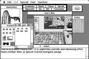
ICOM’s big idea was to translate the traditional parser-driven adventure game into the new visual paradigm of the Mac. The goal was essentially to do for the adventure what MacOS had done for the command-line-driven operating systems that preceded it, in pretty much exactly the same ways. The underlying world model of the MacVenture engine is that of a text adventure, divided into discrete interconnected rooms which can contain other objects with their own unique properties, including the one representing you the player. In a MacVenture, however, you interact with objects not by typing sentences but by constructing them visually, tapping one of eight verbs and an object to go with it — whether something in the room that you see represented graphically before you, something in your inventory (also represented as a set of draggable pictographs), an exit, or just your “Self.” You can add an indirect object by “OPERATING” one object (first click) on another (second click). You can pick up an object in the room just by dragging it to your inventory; drop it by dragging it back into the room. Objects can and often do contain other objects: you can “OPEN” the trench coat in your inventory to open a window showing you what’s in its pockets, “OPEN” the wallet you find there to open still another window with its contents, and so on down the hierarchy tree.
In the fall of 1985, when the first MacVenture debuted in the form of a two-fisted private-eye caper called Déjà Vu, it was an absolute stunner, the sort of thing that could stop people in their tracks when they stumbled across it running on an in-store computer. And it’s still a fine interface, very intuitive and, a few quibbles about clutter resulting from the small screens of its era aside, very practical and enjoyable today.
It’s all too typical in the industry for a game with the shiny technical innovations of Déjà Vu to coast on them, for the actual design inside the engine to be little more than a tech demo. Nor is ICOM’s pedigree as a collection of hardcore programmer’s programmers all that comforting. I thus didn’t expect to think too much of Déjà Vu as a game when I played it for this article. I must say, though, that ICOM surprised me there.
Déjà Vu begins on December 7, 1941(!), when you wake up in a bathroom stall inside a deserted bar with no memory of who you are or how you got there or who or what you emptied three shots from your revolver into or why you seem to have a veritable cocktail of drugs flowing through your veins. Yes, amnesia is a cliché premise in adventure games, not least because it’s so damn convenient for a genre that’s really good at exploration and backstory but usually not so good at here-and-now plotting. Yet it can also be a compelling premise, in mystery fiction as well as games, and it works here. The mystery of who you are and how you got to that bathroom stall is intriguing, its unraveling compelling, with complications like the dead mobster that you soon also find in the bar (with three of your bullets in him, naturally) coming thick and fast. In contrast to so many games of its era, Déjà Vu is also pretty solvable. Oh, it’s very old school, with an unforgiving time limit — the drugs in your system will eventually kill you if you can’t find the antidote — and the occasional random death. You’ll need to save early and often and plan your forays carefully. Yet if you’re willing to do that you’ll find you can probably crack the case pretty much unassisted, and have a pretty good time doing it.
Déjà Vu doesn’t take itself all that seriously, but it doesn’t treat its whole premise as just a breeding ground for jokes either. As a relatively coherent work of fiction, it stands amongst the top tier of 1980s adventure games. The jokes that are there mostly fit to the setting and are, shocker of shockers, genuinely funny as often as not. Much of the humor pokes fun at the protagonist, hardly unusual for early adventure games, but it doesn’t feel so personally insulting here because the game does a good enough job with characterization that you actually feel it to be sneering at the character you’re playing rather than you personally. About the only unfortunate aspect is an ugly series of juvenile jokes about an overweight woman, the sort of thing that can trigger a mild epiphany today about just how much certain social mores have changed — and, mind you, very much for the better — in the last thirty years.
Credit for Déjà Vu‘s surprisingly satisfying design largely goes to Craig Erickson. The story behind it was written by Kurt Nelson, Mark Waterman did the visuals, and Darin Adler, Steve Hays, and Todd Squires were the technical architects of the engine itself. Like Balance of Power, Déjà Vu was published by Mindscape, a company dating like EA from the big second wave of publishers and which, also like EA, was publishing some of the most interesting and audacious games in the industry during the mid-1980s. (That said, ICOM fell in with Mindscape largely out of convenience, because they were literally right down the road in an adjacent suburb of Chicago.) And also like Balance of Power, Déjà Vu was a hit by the modest standards of the early Macintosh software market, the big breakthrough that ICOM had been seeking for years. Tod Zipnick soon put his programmers to good use porting the MacVenture engine to other platforms, including not only the Mac’s mice-and-windows-and-68000-based competitors the Atari ST and Commodore Amiga but also the likes of the IBM PC, the Commodore 64, eventually even (in ports done by the Japanese company Kemco) the Nintendo Entertainment System — yet another sign of the importance of the Mac not just as a platform but as a concept and an engine of innovation.
ICOM has tended to be overlooked in histories of the graphic adventure, which mostly dwell on Sierra (whose King’s Quest debuted the year before Déjà Vu) and LucasArts (whose Maniac Mansion debuted two years after). In truth, however, the MacVenture engine is at least as important as Sierra’s AGI or LucasArts’s SCUMM engines. While King’s Quest is a deserved landmark simply for mixing interactive graphics with adventure at all, the AGI engine is also something of an evolutionary dead end with some fairly intractable problems, most notably that of trying to translate the objects you see graphically on the screen into words the parser will understand. LucasArts’s innovations, meanwhile, are more formal than technical, a declaration that it is possible to write challenging, enjoyable graphic adventures without random deaths, unforeseeable dead ends, and incomprehensible puzzles. The actual interface mechanics of the early LucasArts games are essentially a hybrid of AGI and MacVenture that is more playable than the former but not quite so slick as the latter. Déjà Vu gave its players in 1985 a preview of what virtually all commercial adventure games would be like in five or seven years. For a fan of prose and parsers like me and presumably many of you, that makes its debut something of a bittersweet moment, representing as it does one more huge nail in the slowly building coffin of the commercial text adventure. But such is progress.
Three more MacVenture games followed Déjà Vu, one of them a direct sequel. We’ll revisit ICOM at some future date to talk more about them, as we also will the ongoing cottage industry that was Mac software in general. In the meantime, you can play Déjà Vu and all of the other MacVentures online courtesy of Sean Kasun.
Their days may be numbered, but there’s still plenty to be written about the prose-and-parser people as well. We’ll take up that thread again next time, when we start to look at yet another of Infocom’s would-be challengers.
(Significant magazine sources: Electronic Games of March 1985; Byte of March 1986; Family Computing of April 1986. Jason Scott’s interviews with Steve Meretzky and Dan Horn for Get Lamp were invaluable as always; thanks, Jason! See a retrospective by Tom Chick for another take on Balance of Power. The picture that opens this article was taken from the March 1985 Electronic Games, who I wish had lasted longer; in addition to great art that I love to steal, the magazine had an unusually thoughtful editorial voice.)
