When we left Ken and Roberta, they had just made the momentous decision to use the Apple II’s bitmap graphics capabilities to create an adventure game that featured pictures in addition to text. Roberta would be the first to admit that she was no artist, but she was up to creating some sketches that would suit the purpose; in a world with no graphic adventures at all, people after all wouldn’t be too inclined to criticize the aesthetics of the first one to appear. Still, pulling it off would require them to overcome two other challenges: how to get the pictures into the Apple II in the first place, and how to store them in such a way that they didn’t consume too much space on disk. This latter problem arose because Ken and Roberta were determined to provide pictures for every single location in the game, amounting to some 30 illustrations in all.
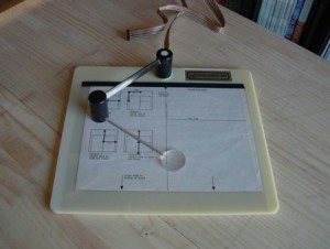
Creating pictures on the Apple II was a dicey proposition in early 1980, due not only to a dearth of usable paint programs but also to the lack of a suitable input device to use with them; mice were still years away, while drawing with a joystick, trackball, or keyboard was an inevitably sloppy, frustrating process. Ken and Roberta therefore ended up purchasing an ungainly contraption called a VersaWriter.
The VersaWriter was far too persnickety to allow for free-hand drawing. The user was rather expected to insert a sketch under the transparent surface of the drawing area, and then to trace it using the stylus. The device was marketed as a tool for getting diagrams — flowcharts, circuit diagrams, floor plans, etc. — into the Apple II; its packaged software did not deal very well with the irregular lines and patterns typical of full-blown pictures. Apple itself had actually released a drawing tablet much more suitable for illustrations the previous year. Apple’s tablet, however, cost $650, while the VersaWriter could be had for less than $200. Still uncertain about this whole enterprise and desiring to do it on the cheap, Ken went with the VersaWriter. Now he needed to find a way to make it work. Like a good hacker, he promptly set to work writing his own software to operate it. In doing so, he actually solved his second challenge almost accidentally.
Storing 30 or more images on disk as simple grids of pixels would consume far more space than Ken had available on a single disk. If he wished to avoid the hassle of shipping the game on many disks and asking the user to swap among them, he needed to find a better way. With compressed graphics standards still unheard of (and likely too taxing on the little Apple’s 6502 if they had been), Ken hit upon the idea of storing each picture not as the data that made up the final product, but rather as a series of drawing commands that could be used to create it afresh. In other words, instead of being fetched from disk, the pictures in Mystery House are “drawn” anew by the computer each time they appear. (Or, for the more technically inclined: they are stored as vector graphics, not raster graphics.) The really elegant bit is that the drawing statements used to create them correspond with the motions of the stylus that traced them on the VersaWriter. Thus to store his graphics Ken needed only “record” the motions of the stylus as it traced Roberta’s simple drawings, then “play back” those motions on the screen when called for in the game. It’s a masterful little hack, one that shows how far Ken had come as a programmer from his days as a drone-in-training at Control Data Institute.
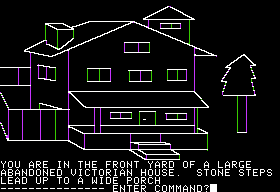
Combined with a simple parser and world model about on the level of the Scott Adams games, the final product looked like this.
No, the graphics aren’t exactly lush. If you can bear with me getting just a bit technical for a moment, it makes a great exercise in platform studies to ask just why they look like they do.
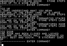
The Apple II’s normal “Hi-Res” graphics mode provides a bitmap display of 280X192 pixels. The programmer can, however, optionally choose to reserve the bottom 32 pixels of the screen to display the bottom of the Apple II’s regular text screen, which lives elsewhere in memory. This mode proved perfect for a game like Mystery House, as well as plenty of others soon to come from On-Line Systems and others. Because the text screen persists elsewhere, one convenience feature is very easy to program: the player can, just by hitting enter on a blank input line, make the picture disappear, revealing her last several turns.
Another tap of the enter key instantly restores the hi-res overlay, which has remained in memory. This was quite slick stuff in 1980, and the Apple II makes it trivial. It’s perfect for a game like Mystery House, almost as if Wozniak had anticipated this application when he designed it.
But, you might be wondering, why the bizarre coloration in the illustrations? To answer that, we need to look a bit more deeply at the way that hi-res mode works.
A bitmap graphics display is normally stored in memory as a long string of bits which are constantly fetched and painted to the screen. The exact amount of memory needed for the purpose obviously depends on the resolution of the display. But slightly less obviously, it also depends on the number of colors in our palette. If we allow just 2 colors (probably black and white), we need but one bit for each pixel. If we want to allow more, though, we need more memory. A 256-color palette, for instance, requires 8 bits, or 1 byte, to store each individual pixel. You are probably reading these words on a 24-bit color screen with a palette of well over 16 million colors, which must devote 3 full bytes to representing every pixel. (This mode is often inaccurately termed 32-bit color because modern hardware is happy to waste one full byte on every pixel to keep things aligned in a tidy way.)
Numbers like these were, of course, inconceivable in 1980. The Apple II Plus offered just 6 colors in hi-res mode. If you apply what you learned back in Computer Literacy, you can quickly conclude that we would need to devote 3 bits to each pixel to store an Apple II bitmap in the conventional way. (Using 3 bits actually gives a range of possible numbers between 0 and 7, which is overkill; 2 bits, however, is too few.) Let’s do a quick calculation: 3 bits per pixel * 280 horizontal pixels * 192 vertical pixels = 161,280 bits, or (dividing by 8) 20,160 bytes (a bit under 20 K). Now consider that we have 48 K of memory total available on the Apple II; devoting almost half of it to the display is untenable if we also want to be able to write programs of any complexity at all to actually take advantage of hi-res mode.
These realities weren’t lost on Wozniak. As in so many other areas of the Apple II, he came up with a way to do more with less. Rather than devote 3 bits to each pixel, he devoted just 1 — but reserved one bit in each byte for a special purpose, about which more in a moment. Then he defined a set of simple rules to determine what color each pixel would be. If a bit is not set, the pixel it corresponds to on the screen is also “off,” or black. If a bit is on, and the bit to either its left and/or its right is also on, that pixel appears as white. If a bit is on, is on an even x-coordinate, and the adjacent bits are both off, that pixel appears as violet or blue, depending on whether that eighth, reserved bit is set or not. A bit on an odd x-coordinate in the same situation follows the same rules to arrive at a green or orange pixel. This setup allows us to store a 280X192 6-color screen using only 7680 bytes. It brings with it, however, a collection of restrictions:
- A white pixel must have at least 1 other white pixel to its left or right. (In other words, a vertical white line drawn on the screen must be at least 2 pixels wide.)
- A pixel on an even horizontal coordinate can allegedly be white, black, violet, or blue, but not green or orange. If, however, the bit in question is off, and a colored pixel is adjacent, that color “bleeds over” to color in this supposedly black pixel.
- Similarly, a pixel on an odd horizontal coordinate can allegedly be white, black, green, or orange, but not violet or blue, subject to the same process as above.
- Each horizontal line consists of 280 pixels, but these are divided into 40 groups of 7. Pixels within each group can be violet or green, or blue or orange, but combinations are not allowed. (In other words, a single group of 7 cannot contain both violet and blue, green and orange, etc., pixels.)
- For any given pixel to be colored black onscreen, at least one bit adjacent to the bit in memory that represents it must also be black. (In other words, a black vertical line like a white vertical line must always be at least 2 pixels wide.)
With all that in mind (and yes, I know it hurts), we realize it’s perhaps more accurate to say that the Apple II has a horizontal resolution of just 140 pixels, since each pixel’s color is controlled so thoroughly by the pixel adjacent to it. And given that combined with what a royal bitch the hi-res mode was to work with for programmers, it’s worth asking whether this whole baroque scheme is really worth the headache. Woz’s tendency to produce stuff like this in the name of efficiency is one of the more problematic aspects of a generally brilliant engineer. (Remember, Atari had to redo Woz’s Breakout design because no one else could figure it out. This fact, legendary as it has become as a sort of proof of Woz’s genius, might reflect more poorly on him than it does on Atari’s engineers from a certain point of view…) Have a look at the image above once again. Notice how the vertical lines are all in green or violet, while the horizontals are in white? Ken could only have made those vertical lines white by doubling their thickness, and throwing all of the proportions off. The Apple II literally does not permit the simple black-and-white sketches he really wants to display. Crazy stuff, huh?
These odd patterns of coloration, not to mention the distinctive pastel tones of the colors themselves, make an Apple II display, then as well as now, instantly recognizable to anyone who’s spent any time at all with one. While its display is unusually idiosyncratic, the Apple II is by no means alone here. Displays from most early microcomputers exhibit telltale traces of their origin. It’s one of the things that make these old machines so appealing to some living in our modern world of anonymous technological perfection. Call it personality, or, if you must, call it soul.
Which doesn’t, of course, mean that contemporary users didn’t struggle like mad to find ways to overcome basic limitations like these. More on that later. But next time, we’ll see how Mystery House actually plays as a game, and ask what it means in historical context.






S. John Ross
October 8, 2011 at 11:59 pm
I hope the spirit of this compliment is taken as its meant: you make even the most tedious techno-stuff very readable and interesting :)
Jimmy Maher
October 9, 2011 at 2:05 am
Telling him he makes boring stuff interesting is about the nicest compliment you can give a writer. So, whether I’m deserving or not, thanks!
gnome
October 9, 2011 at 7:22 am
Besides loving the article I finally know why those Apple II graphics can look so odd. Keep up the excellent work!
Felix Pleșoianu
October 9, 2011 at 8:20 am
And people were laughing at the ZX Spectrum for its color bleeding issue. But compared to this, the Speccy used a positively elegant storage scheme.
decora
October 26, 2011 at 12:01 am
no offense dude, but if you think these graphics are silly, look at how CGA worked on the old IBM 5050. perhaps you are already familiar with it? Im just saying. that stuff was bizarro. but those were what was required back in those old days.
even modern machines are full of black magic, particularly the back-ends of compilers, and makefile systems (automake, autoconf)
Sean Gugler
June 19, 2015 at 9:50 am
It should be noted that black-and-white TVs were still fairly commonplace at the time. Some games (e.g. “Taxman”) actually asked the player “color or b&w?” before starting, and the contemporary Atari VCS console (later called 2600) had a physical color/bw switch that was honored by games into the 80s. Even Apple’s own monitors were initially monochrome.
On such screens, no color artifacts are present, and individual pixels appear where you expect them with full horizontal resolution. It’s possible, though I haven’t any research to support this claim, the Williams’ simply disregarded color displays while developing Mystery House.
(Aside: one could argue that a monochrome display actually offered DOUBLE the ostensible 280-wide resolution, since the hidden palette bit effected a half-pixel horizontal shift. The restrictions on neighboring pixels remain, but sub-pixel shifting could for example reduce “jaggies” on a vertical slanted line. The concept of sub-pixel rendering is actually used in practice today on LCD displays, with technologies such as ClearType.)
Jan Heijmans
May 9, 2023 at 6:51 am
“Rather than devote 3 bits to each color, he devoted just 1”
I think this should be: “3 bits to each pixel”.
I remember trying to directly set pixels from assembly code on the Apple II. It was much too difficult for an inexperienced teenager like me. Dividing by 7 to get the horizontal byte offset was really tricky and slow on a processor that didn’t have a division instruction. And getting the byte offset for the line was another difficult calculation because of the double interleave of 64 and 8 lines. In the end I could paint a single pixel with a routine that was much too slow for any serious graphics stuff.
Thanks for all your great articles!
Jimmy Maher
May 11, 2023 at 1:08 pm
Thanks!
Michael Schmidt
November 13, 2023 at 3:36 am
I am wondering if there is an HLSL shader out there that could duplicate the effect of the Apple II color scheme. To me that style is incredibly nostalgic and I want to reproduce it in a game I am working on…
Jeff Sampson
April 16, 2025 at 3:51 am
Been dealing with pixels in code recently for a Windows project, the fourth byte to bring a pixel to 32-bit alignment is not only padding these days, it can now also set the transparency, via what’s called the alpha value. 0 is fully transparent, 255 is fully opaque, everything in between is partially transparent on the 0 to 255 scale. You’ll sometimes see pixel values referred to as RGBA in code(there are other representations, but RGBA is common).
Transparency isn’t going to be used terribly often of course, but it’s there. Some AI service could probably dig up when it was introduced, my guess would be in the 90s when we got “32-bit” color on the desktop.