Mystery House has been widely canonized as the “first graphic adventure.” To evaluate that claim, our obvious first step must be to decide just what a “graphic adventure” actually is.
Today, the term is generally taken to refer to mouse-driven games in which the user clicks hotspots on an image of her avatar’s surroundings to manipulate the environment. That’s more of a default configuration than a definition, though; other paradigms for interaction have been and still are sometimes taken to fall under the category. So, we need to do better. We have to be particularly careful in deciding just where the boundary between the text and the graphic adventure should lie. A few years on from the point we’ve made it to in this blog (1980), many text adventures would be available that offered up occasional pictures to accompany their textual descriptions. Whatever they added, these pictures were not interactive, and in fact often completely optional; the purist could simply turn them off and play in pure text with no consequences. Games like these are better termed illustrated text adventures than graphic adventures. The latter term implies that the graphics should be essential to the experience, not a mere ancillary add-on. In fact, that’s a pretty good start on a definition right there. Let’s further add that the graphics should be interactive, subject to manipulation by the player rather than mere storybook-style illustrations. So, let’s try this:
A graphic adventure is a form of ludic narrative which bears many similarities to the text adventure (or interactive fiction), favoring puzzles and story development over reflex-oriented action. However, the player and the program communicate with one another primarily through images rather than text. These images should be interactive — subject to manipulation by the player — and essential to the experience of the work.
Given those requirements, my first instinct was to pooh-pooh the idea of Mystery House as the first graphic adventure when I recently picked it up again after many years. It was, I thought, obviously the first illustrated text adventure — a significant development in its own right — but at heart it was still “merely” a text adventure. Boy, was I wrong. It actually leapfrogs over the logical next step — the illustrated text adventure — to do something much more audacious. Much of the core of the game does indeed play out not in text but in pictures.
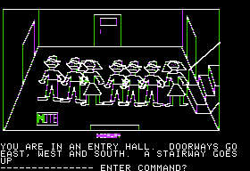
Let me show you what I mean. Here we are at the beginning of the game, having just walked into the entry hall of the mansion.
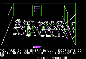
That note (helpfully labeled “NOTE” in giant letters) at the bottom left is not described anywhere in the text; we know it is there only through the picture. Now, look what happens when we pick it up.
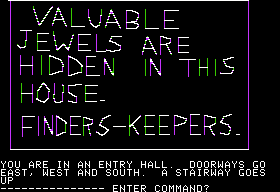
It disappears! These are not mere static images, but genuinely interactive graphics. When we read the note, the results once more appear not in the text but in the graphics area.
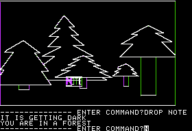
If we take the note somewhere else and drop it, sure enough, it appears again in the scene.
Easy as it might seem to laugh at the scrawled, stick-figure pictures themselves, this was remarkable, remarkable stuff for its time. The Williams are prototyping here a whole new paradigm for adventuring while even the text adventure was still in its relative infancy. The novelty of the technology on display here alone was sufficient to generate many thousands of sales.
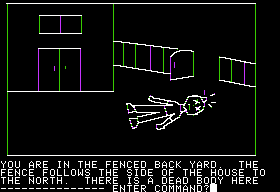
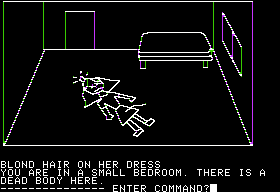
And that’s fortunate, because the game itself is no better than it ought to be given the inexperience of Roberta. It’s allegedly a mystery story, but it’s an oddly static mystery; as soon as we depart from the entry hall for the first time, five of the seven people we saw there are immediately distributed around the house as dead bodies, giving us no chance to avert any of the deaths. We can only hunt around through the typical adventure-game secret passages and mazes until we arrive at the final confrontation with the obvious murderer; in no sense do we “solve” the mystery at all, unless by process of counting up who is alive and, in the climax, who tries to kill us. The Count, still the gold standard for dynamic ludic narrative at this time, has nothing to fear. As if herself doubtful of her choice of genre, Roberta even shoehorns in the treasure-hunt subplot alluded to in the note shown above to move us back onto more traditional adventuring ground. The effect of this is to make Mystery House a cold-blooded, even morbid little game that’s blackly humorous in its absurdity. We wander around discovering corpse after corpse, but in finest adventure-game-protagonist fashion never let them deter us from hunting for those jewels.
The graphics make possible annoyances that are worse than typical for even this era, including perhaps the cruelest maze that had yet been seen in an adventure game. Even “normal” navigation is a constant struggle; the game’s instructions tell us that north is usually up on the screen, south down, etc., but it then proceeds to violate that guideline literally from the very first picture we see. The result is that we never feel entirely sure which way we’re facing, and thus never can orientate ourselves properly. Not that it would necessarily do much good; this is a classic adventure-game house in which nothing aligns properly with anything else, like a creation of a Victorian architect with an M.C. Escher fetish.
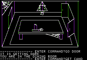
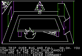
The dining room is a particularly noteworthy chamber of horrors.
That object on the table is a candle, drawn a bit roughly but identifiable I suppose. That triangular… thing… on the back wall is supposed to represent a hole in the wall which for no apparent reason contains a crucial key. If we try to interact with the hole while carrying the lit candle or matches, we promptly trip, set the carpet on fire, and die if we don’t happen to be carrying a pitcher of water or cannot figure out in a single turn the syntax needed to use it on the fire.
Oh, and in this case north is left and south is right, not that it’s possible to determine this through anything but trial and error.
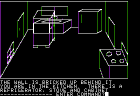
A major “puzzle” has us MOVing a cabinet in the kitchen for no apparent reason, and even though the game has stubbornly disclaimed knowledge of that verb up to this point.
After burrowing through the bricked-up hole that is revealed, we inexplicably find a fresh murder victim in the disused old secret passage beyond. Mimesis is not strong with this one.
So, no, Mystery House is not a very good game. In fact, it’s a sometimes hilariously bad collection of the worst adventure-game cliches. In light of its pedigree and its very real formal innovations, though, I’ve probably already harped on its many failings too much. Most of its contemporaries weren’t much better, and they weren’t also inventing a whole new paradigm of adventure gaming while they were about it. (I can, however, fault Roberta for continuing to design similarly bad puzzles long after she should have known better — but that’s material for later posts.)
If you’d like to experience Mystery House for yourself, I’d definitely recommend you treat it as an artifact of history rather than a serious gaming or narrative experience in its own right. In other words, use a walkthrough so you can laugh at its absurdities rather than cry. The easiest way to play it is via Java through the Virtual Apple II website.
